` | Basic view container, often used for layout capabilities, stylization, and wrapping other elements. |
| [`
`](/api/elements/built-in/text.md) | `TextView` | `UITextView` | `Text` | `` | Used for displaying text content. Specific text styles can be aligned. |
| [``](/api/elements/built-in/image.md) | `ImageView` | `UIImageView` | `Image` | `![]() ` | Used for displaying different types of images, including web images, static resources, and local disk images. |
| [``](/api/elements/built-in/scroll-view.md) | `ScrollView` | `UIScrollView` | `Scroll` | `
` | Used for displaying different types of images, including web images, static resources, and local disk images. |
| [``](/api/elements/built-in/scroll-view.md) | `ScrollView` | `UIScrollView` | `Scroll` | `` with `overflow:scroll` | Basic scrollable element that supports horizontal and vertical scrolling. Allows users to scroll to display more content. |
| [`
`](/api/elements/built-in/list.md) | `RecyclerView` | `UICollectionView` | `List` | None | High-performance scrollable element that reduces memory pressure through lazy loading and view reuse. |
| [``](/api/elements/built-in/page.md) | `ViewRootImpl` of a page | `UIViewController.view` of a page | A custom component decorated with `@Entry` | Non-resizable `` | Root node of a page, usually doesn't need to be added manually. |


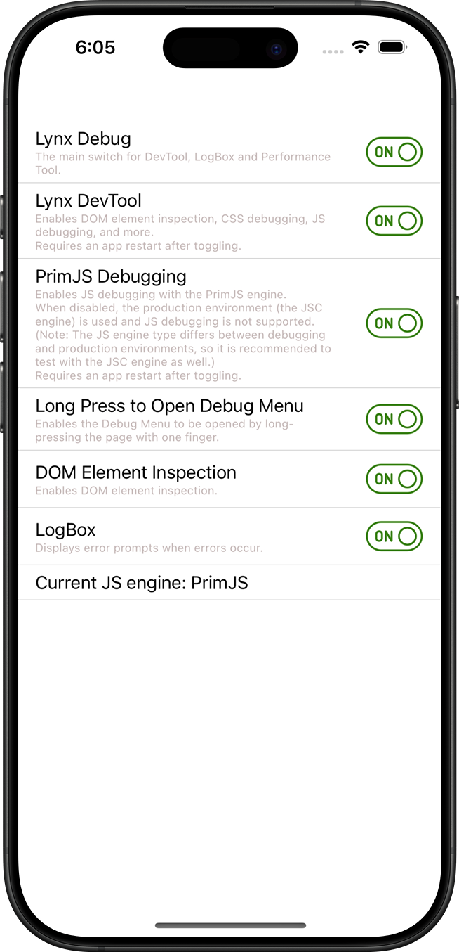 Ensure that the Lynx Debug and Lynx DevTool switches are enabled in the Switch page of Lynx Explorer.
### Run Lynx DevTool Desktop Application
:::tip Get Lynx DevTool Desktop Application
You can visit [Lynx DevTool](https://github.com/lynx-family/lynx-devtool/releases) to get the latest version of Lynx DevTool desktop application.
:::
Launch Lynx DevTool Desktop Application.
### Use Data Cable to Connect Debugging Device
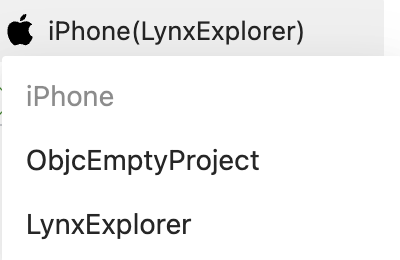
Use a data cable to connect the debugging device, and Lynx DevTool Desktop Application will automatically recognize the debugging device and display the Lynx app information on the debugging device.
## View Device Connection Status
Ensure that the Lynx Debug and Lynx DevTool switches are enabled in the Switch page of Lynx Explorer.
### Run Lynx DevTool Desktop Application
:::tip Get Lynx DevTool Desktop Application
You can visit [Lynx DevTool](https://github.com/lynx-family/lynx-devtool/releases) to get the latest version of Lynx DevTool desktop application.
:::
Launch Lynx DevTool Desktop Application.
### Use Data Cable to Connect Debugging Device
Use a data cable to connect the debugging device, and Lynx DevTool Desktop Application will automatically recognize the debugging device and display the Lynx app information on the debugging device.
## View Device Connection Status
 In the toolbar, you can view the connection status of the current device.
- USB represents that the device is connected via USB cable.
- Time represents the delay of communication with the device.
## Choose Debugging Device
In the toolbar, you can view the connection status of the current device.
- USB represents that the device is connected via USB cable.
- Time represents the delay of communication with the device.
## Choose Debugging Device
 In the toolbar, you can click this button, and select other connected devices from the pop-up menu.
 :::tip Tip
After switching devices, please ensure that the Lynx app on the device is running in the foreground.
:::
## Common Issues and Troubleshooting
**Question**: Why can't Lynx DevTool desktop application recognize my debugging device?
**Answer**: Make sure you have connected your development device (e.g., your MacBook) and the device running the Lynx application (e.g., your phone) using a data cable.
For iOS devices, ensure that you have installed Xcode and iOS SDK with matching versions on your development device.
For Android devices, in addition to ensuring a data cable connection, you also need to enable Developer Mode and USB debugging on your Android device:
1. Enable Developer Mode on your Android device - specific steps may vary between devices, please refer to the [Android Developer Documentation](https://developer.android.com/studio/debug/dev-options)
2. Enable "USB Debugging" in the developer options
3. When the device is connected to your computer, an authorization prompt will appear, click "Allow"
You can try launching Xcode or Android Studio to compile and run an application to verify that you can connect to the device properly.
## Compatibility
**Error:** No compatibility data found for `devtool.integration.connection`
## Provide Feedback
Welcome to experience Lynx DevTool. If you need a hand, please file an issue in [Lynx Issues](https://github.com/lynx-family/lynx-devtool/issues). Thank you!
---
# Source: https://lynxjs.org/guide/ui/elements-components.md
# Composing Elements
A Lynx page may contain various visual elements such as text and images, presented in different layouts to create diverse page styles. This section aims to help everyone understand how to construct the most basic views.
## Element tag: UI Building Blocks
Lynx defines content and structure using a markup language, with the most basic unit being an [element tag](/guide/spec.md#element-tag). The concept of an element tag is similar to [HTML elements](https://developer.mozilla.org/en-US/docs/Glossary/Element), which can be used to encapsulate different parts of the content to present or operate in a specific manner.
Unlike HTML, Lynx uses some unique element tags such as [`
:::tip Tip
After switching devices, please ensure that the Lynx app on the device is running in the foreground.
:::
## Common Issues and Troubleshooting
**Question**: Why can't Lynx DevTool desktop application recognize my debugging device?
**Answer**: Make sure you have connected your development device (e.g., your MacBook) and the device running the Lynx application (e.g., your phone) using a data cable.
For iOS devices, ensure that you have installed Xcode and iOS SDK with matching versions on your development device.
For Android devices, in addition to ensuring a data cable connection, you also need to enable Developer Mode and USB debugging on your Android device:
1. Enable Developer Mode on your Android device - specific steps may vary between devices, please refer to the [Android Developer Documentation](https://developer.android.com/studio/debug/dev-options)
2. Enable "USB Debugging" in the developer options
3. When the device is connected to your computer, an authorization prompt will appear, click "Allow"
You can try launching Xcode or Android Studio to compile and run an application to verify that you can connect to the device properly.
## Compatibility
**Error:** No compatibility data found for `devtool.integration.connection`
## Provide Feedback
Welcome to experience Lynx DevTool. If you need a hand, please file an issue in [Lynx Issues](https://github.com/lynx-family/lynx-devtool/issues). Thank you!
---
# Source: https://lynxjs.org/guide/ui/elements-components.md
# Composing Elements
A Lynx page may contain various visual elements such as text and images, presented in different layouts to create diverse page styles. This section aims to help everyone understand how to construct the most basic views.
## Element tag: UI Building Blocks
Lynx defines content and structure using a markup language, with the most basic unit being an [element tag](/guide/spec.md#element-tag). The concept of an element tag is similar to [HTML elements](https://developer.mozilla.org/en-US/docs/Glossary/Element), which can be used to encapsulate different parts of the content to present or operate in a specific manner.
Unlike HTML, Lynx uses some unique element tags such as [`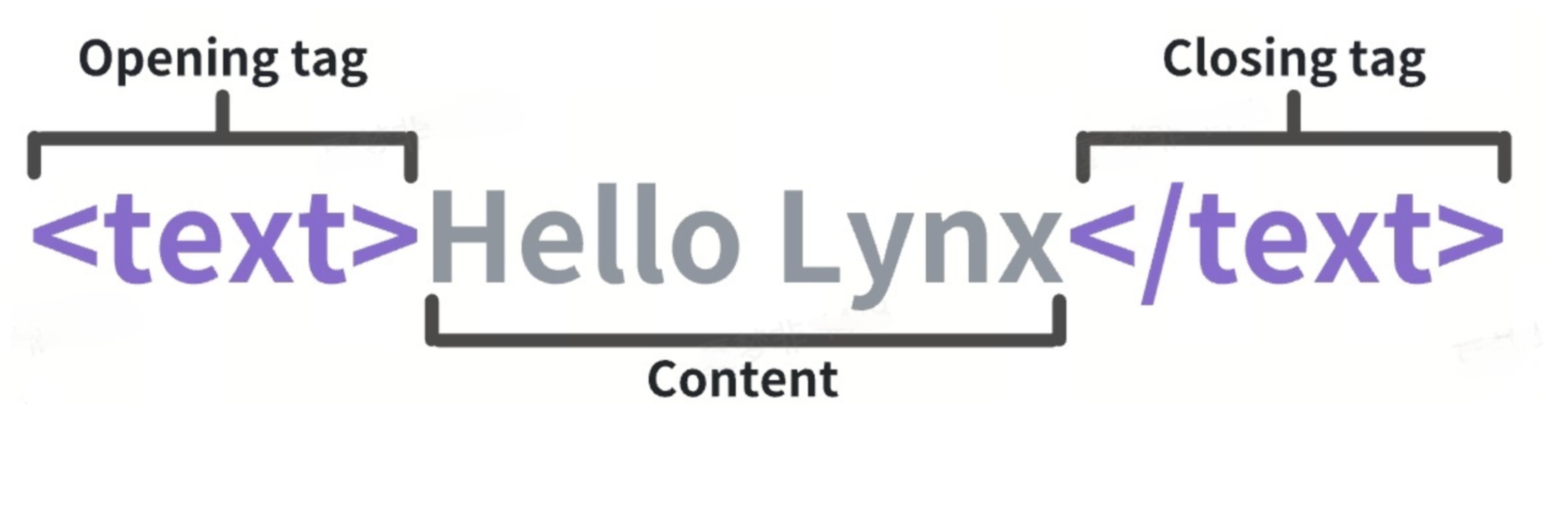 Each element tag consists of the following parts:
1. **Start tag**: Includes the name of the element tag (in this case, text) surrounded by angle brackets, indicating where the element tag begins.
2. **End tag**: Similar to the start tag but includes a forward slash before the element tag's name, indicating where the element tag ends.
3. **Content**: The content of the element tag, which for the `
Each element tag consists of the following parts:
1. **Start tag**: Includes the name of the element tag (in this case, text) surrounded by angle brackets, indicating where the element tag begins.
2. **End tag**: Similar to the start tag but includes a forward slash before the element tag's name, indicating where the element tag ends.
3. **Content**: The content of the element tag, which for the `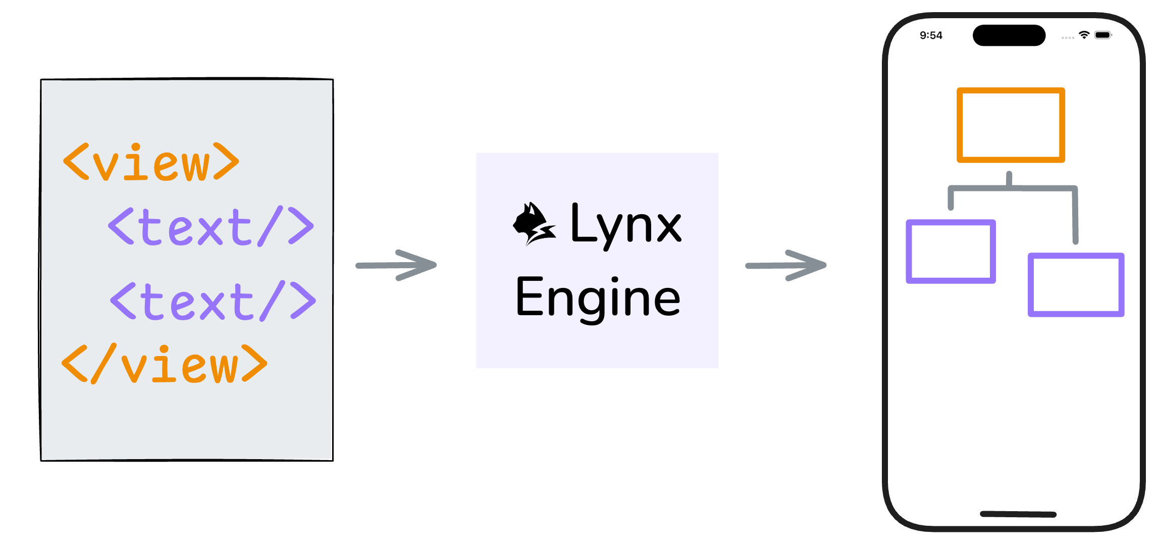 ## Built-in Elements
The Lynx Engine comes with some built-in elements by default to help you quickly build pages.
### View
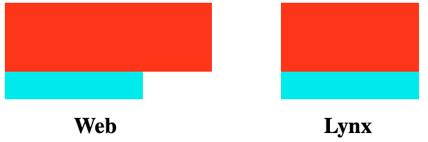
The `
## Built-in Elements
The Lynx Engine comes with some built-in elements by default to help you quickly build pages.
### View
The ` ### Text
As mentioned earlier, the `
### Text
As mentioned earlier, the ` ### Image
The `
### Image
The ` ### More Built-in Elements
For all built-in Lynx elements, refer to [Built-in Elements Documentation](/api/elements/built-in/view.md).
## Behind the Elements: Native Rendering
### More Built-in Elements
For all built-in Lynx elements, refer to [Built-in Elements Documentation](/api/elements/built-in/view.md).
## Behind the Elements: Native Rendering
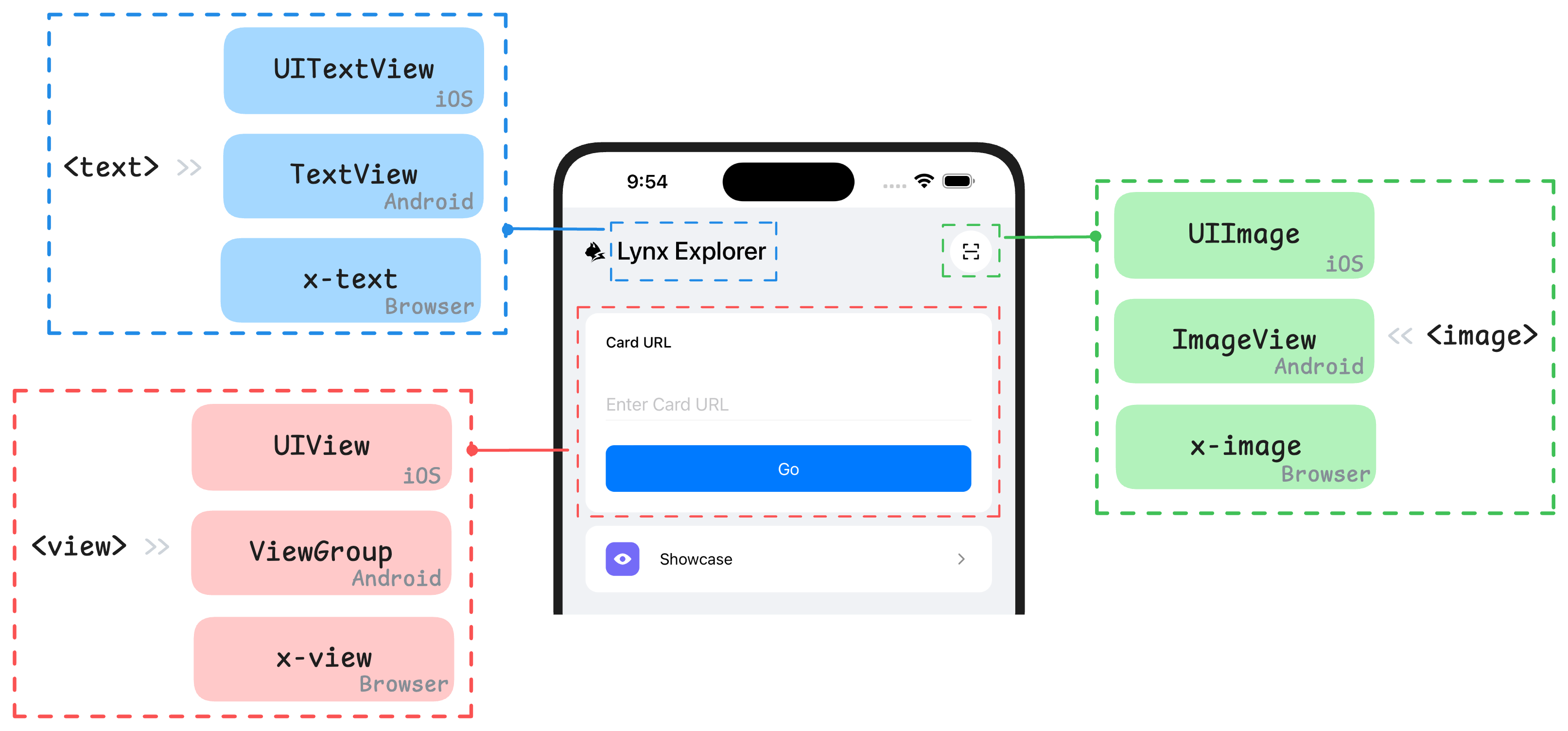 Lynx elements are designed to be platform-agnostic. They are rendered natively by the Lynx Engine into the UI primitives for each platforms, such as iOS and Android views, or HTML elements (including [custom elements](https://developer.mozilla.org/en-US/docs/Web/API/Web_components/Using_custom_elements)) on the Web.
Lynx enables cross-platform application development based on the web technology, with its core being the establishment of a unified rendering system through element abstraction. Understanding the mapping relationship between the native views of the platform and Lynx elements is crucial to mastering the design concepts of elements within this framework. Below are some of the built-in elements and their corresponding concepts or analogues in different platforms:
Lynx elements are designed to be platform-agnostic. They are rendered natively by the Lynx Engine into the UI primitives for each platforms, such as iOS and Android views, or HTML elements (including [custom elements](https://developer.mozilla.org/en-US/docs/Web/API/Web_components/Using_custom_elements)) on the Web.
Lynx enables cross-platform application development based on the web technology, with its core being the establishment of a unified rendering system through element abstraction. Understanding the mapping relationship between the native views of the platform and Lynx elements is crucial to mastering the design concepts of elements within this framework. Below are some of the built-in elements and their corresponding concepts or analogues in different platforms:
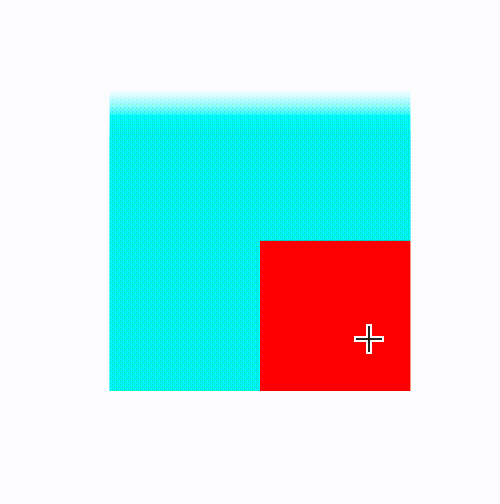
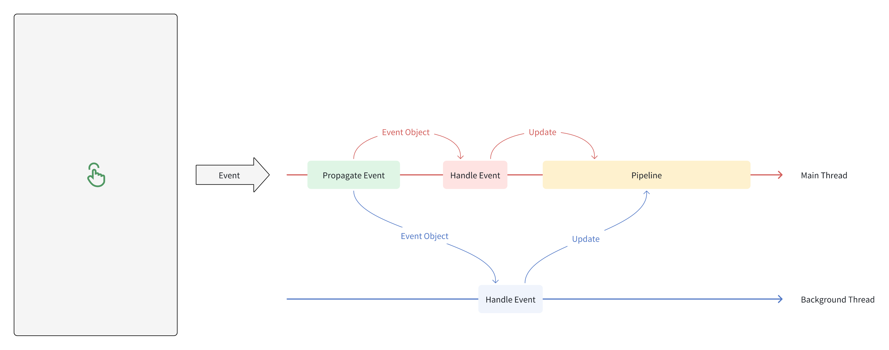 As shown in the figure, developers can choose to handle the event in the main thread or the background thread.
- When timely event response is not required, you can choose to handle the event in the background thread, and the event processing of the background thread will not block the main thread.
- When timely event response is required, you can choose to handle the event in the main thread, which can avoid event delays caused by cross-threading, but it should be noted that excessive event processing may cause the main thread to be busy.
Specifically, if developers want to listen to the click event of a certain node, they can set the event handler property of type `bind` on the node:
```tsx
As shown in the figure, developers can choose to handle the event in the main thread or the background thread.
- When timely event response is not required, you can choose to handle the event in the background thread, and the event processing of the background thread will not block the main thread.
- When timely event response is required, you can choose to handle the event in the main thread, which can avoid event delays caused by cross-threading, but it should be noted that excessive event processing may cause the main thread to be busy.
Specifically, if developers want to listen to the click event of a certain node, they can set the event handler property of type `bind` on the node:
```tsx
 ## Monitor exposure of the entire page
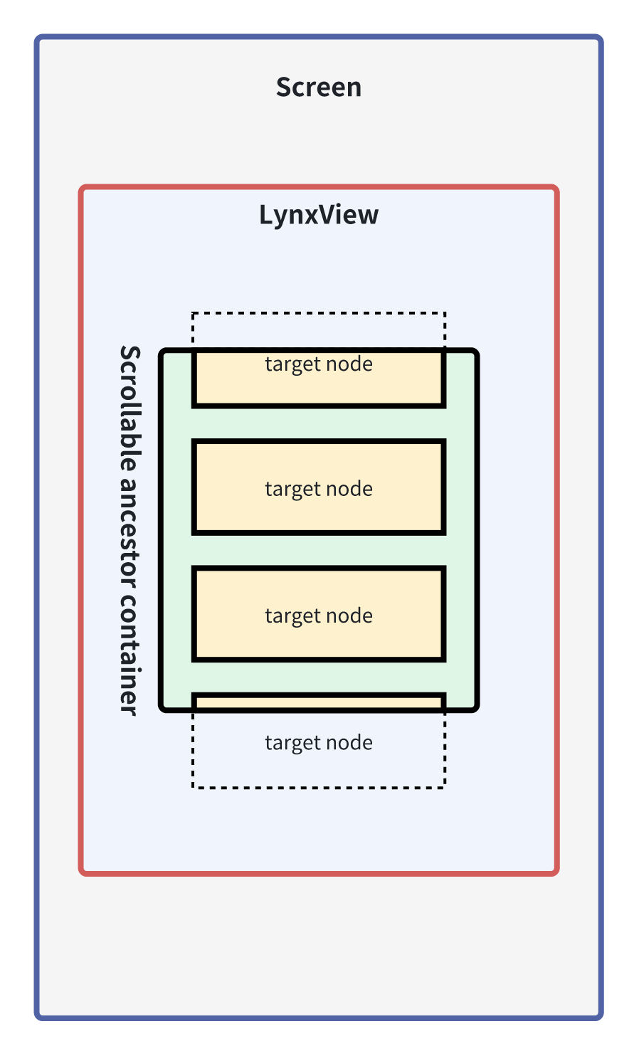
When developers need to monitor exposure/anti-exposure events of nodes in the entire page, they can subscribe to the exposure event [`exposure`](/api/lynx-api/event/global-event.md#exposure) and anti-exposure event [`disexposure`](/api/lynx-api/event/global-event.md#disexposure) of the node with the [`exposure-id`](/api/elements/built-in/view.md#exposure-id) attribute set through [`GlobalEventEmitter`](/guide/interaction/event-handling/event-propagation.md#globaleventemitter).
In the following example, the developer uses [`GlobalEventEmitter`](/guide/interaction/event-handling/event-propagation.md#globaleventemitter) to monitor whether the node in `ComponentA` is exposed, and outputs the exposed node [`exposure-id`](/api/elements/built-in/view.md#exposure-id) when it is exposed.
**Example 1:**
**This is an example below: event**
**Entry:** `src/visibility_expose_global`
**Bundle:** `dist/visibility_expose_global.lynx.bundle` | Web: `dist/visibility_expose_global.web.bundle`
```tsx {8-12,14-21,56}
import { root, useState } from "@lynx-js/react";
import { useLynxGlobalEventListener } from "@lynx-js/react";
export function ComponentA() {
const [eventLog, setEventLog] = useState
## Monitor exposure of the entire page
When developers need to monitor exposure/anti-exposure events of nodes in the entire page, they can subscribe to the exposure event [`exposure`](/api/lynx-api/event/global-event.md#exposure) and anti-exposure event [`disexposure`](/api/lynx-api/event/global-event.md#disexposure) of the node with the [`exposure-id`](/api/elements/built-in/view.md#exposure-id) attribute set through [`GlobalEventEmitter`](/guide/interaction/event-handling/event-propagation.md#globaleventemitter).
In the following example, the developer uses [`GlobalEventEmitter`](/guide/interaction/event-handling/event-propagation.md#globaleventemitter) to monitor whether the node in `ComponentA` is exposed, and outputs the exposed node [`exposure-id`](/api/elements/built-in/view.md#exposure-id) when it is exposed.
**Example 1:**
**This is an example below: event**
**Entry:** `src/visibility_expose_global`
**Bundle:** `dist/visibility_expose_global.lynx.bundle` | Web: `dist/visibility_expose_global.web.bundle`
```tsx {8-12,14-21,56}
import { root, useState } from "@lynx-js/react";
import { useLynxGlobalEventListener } from "@lynx-js/react";
export function ComponentA() {
const [eventLog, setEventLog] = useState