
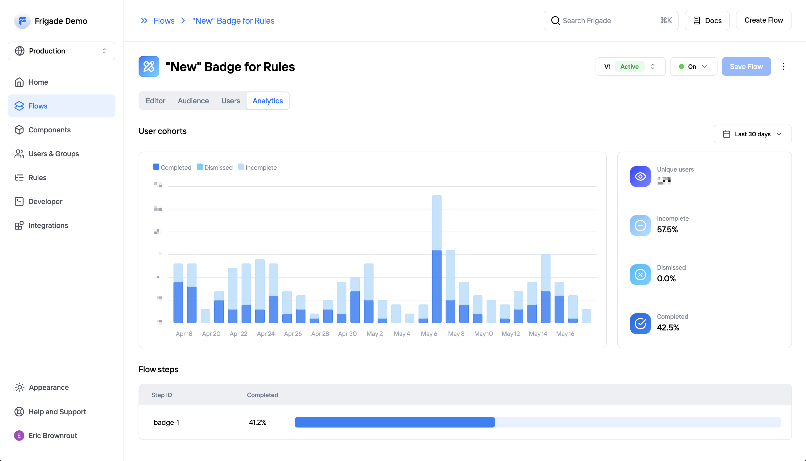
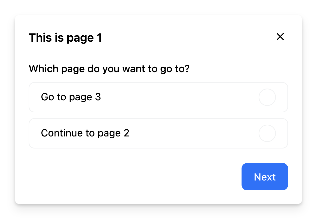
 ### Flow cohorts
Frigade analytics are based on user cohorts. Frigade will group users into daily cohorts based on the date they first interacted with the Flow.
You can see detailed breakdowns by hovering on any given day in the graph. Statuses include completing the Flow, dismissing or quitting the Flow, or not yet completing the Flow.
### Time windows
You can change the time range for the stats by clicking on the dropdown in the top right corner of the analytics page. You can choose between `Last 7 days`, `Last 30 days`, or `All time`. The metrics on the right side represent the totals for the selected time window, and the graph and step completion rates below will also adjust to the selected time window.
### Flow versions
Each time a new [version](/platform/versioning) of a Flow is published it will its own analytics. This allows you to review the performance of different versions of the same Flow over time.
## External Analytics
***
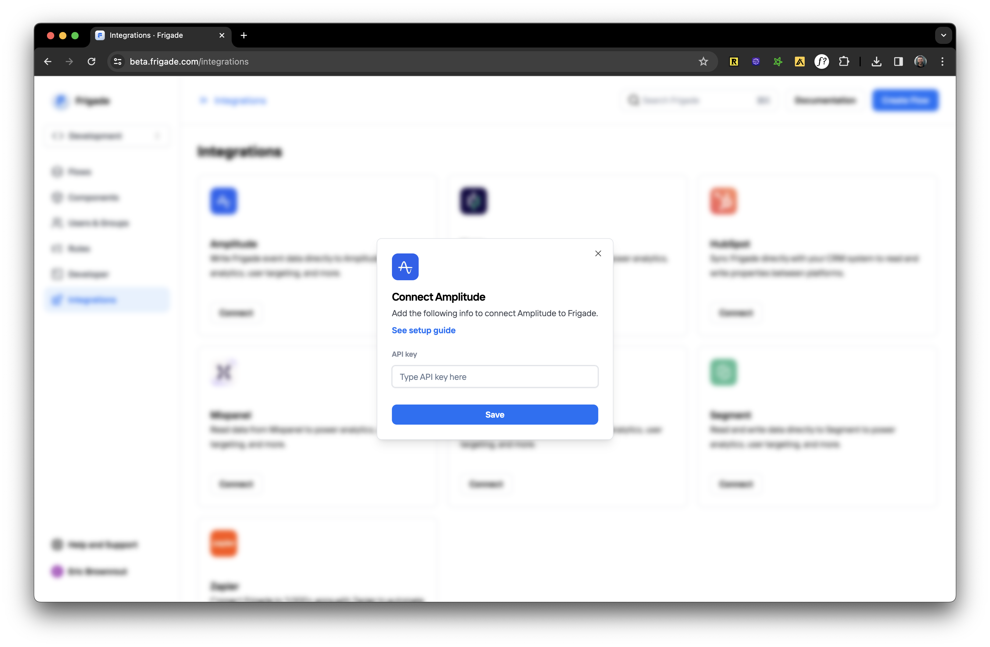
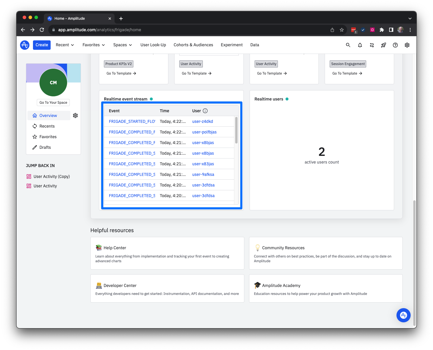
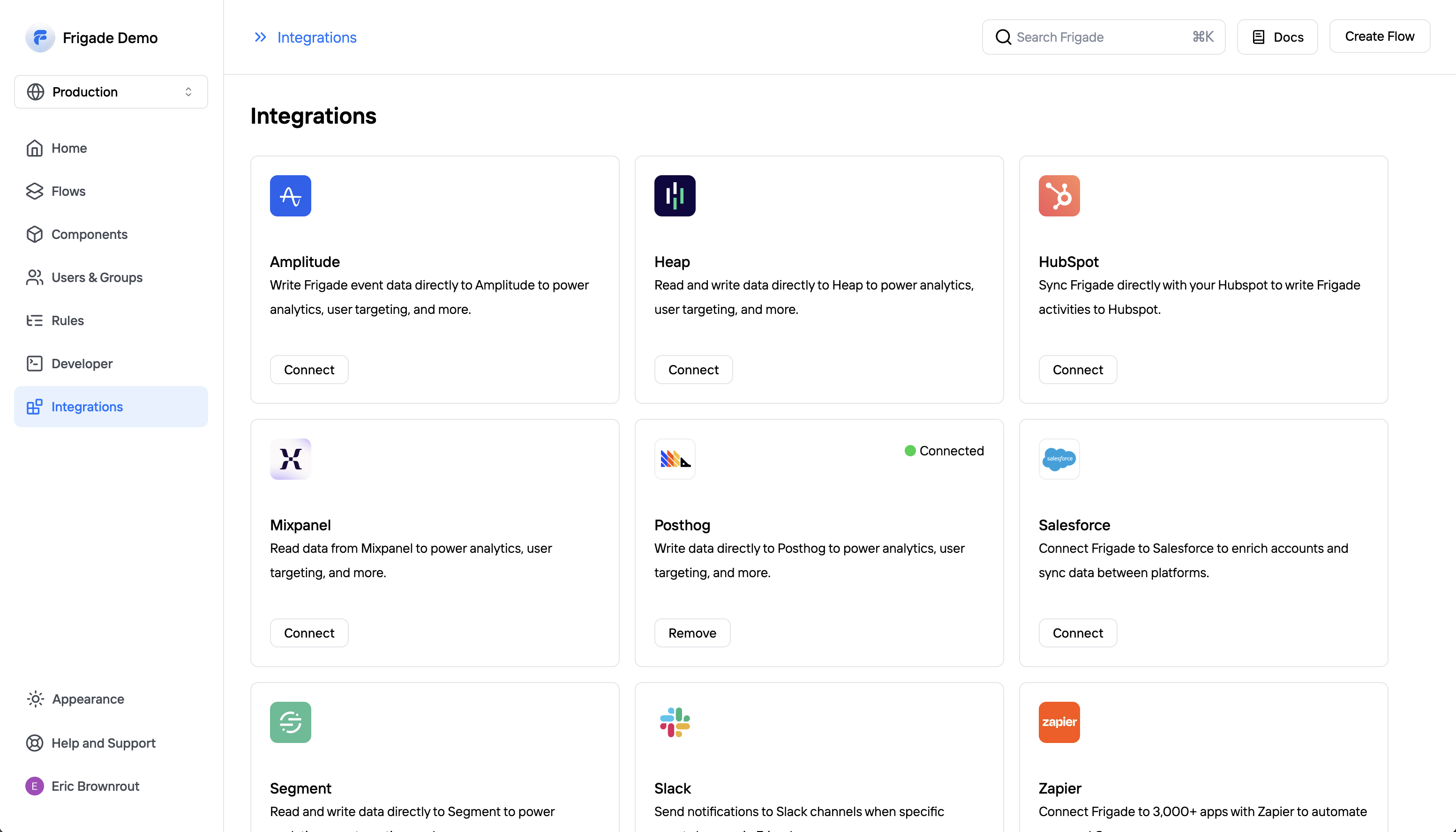
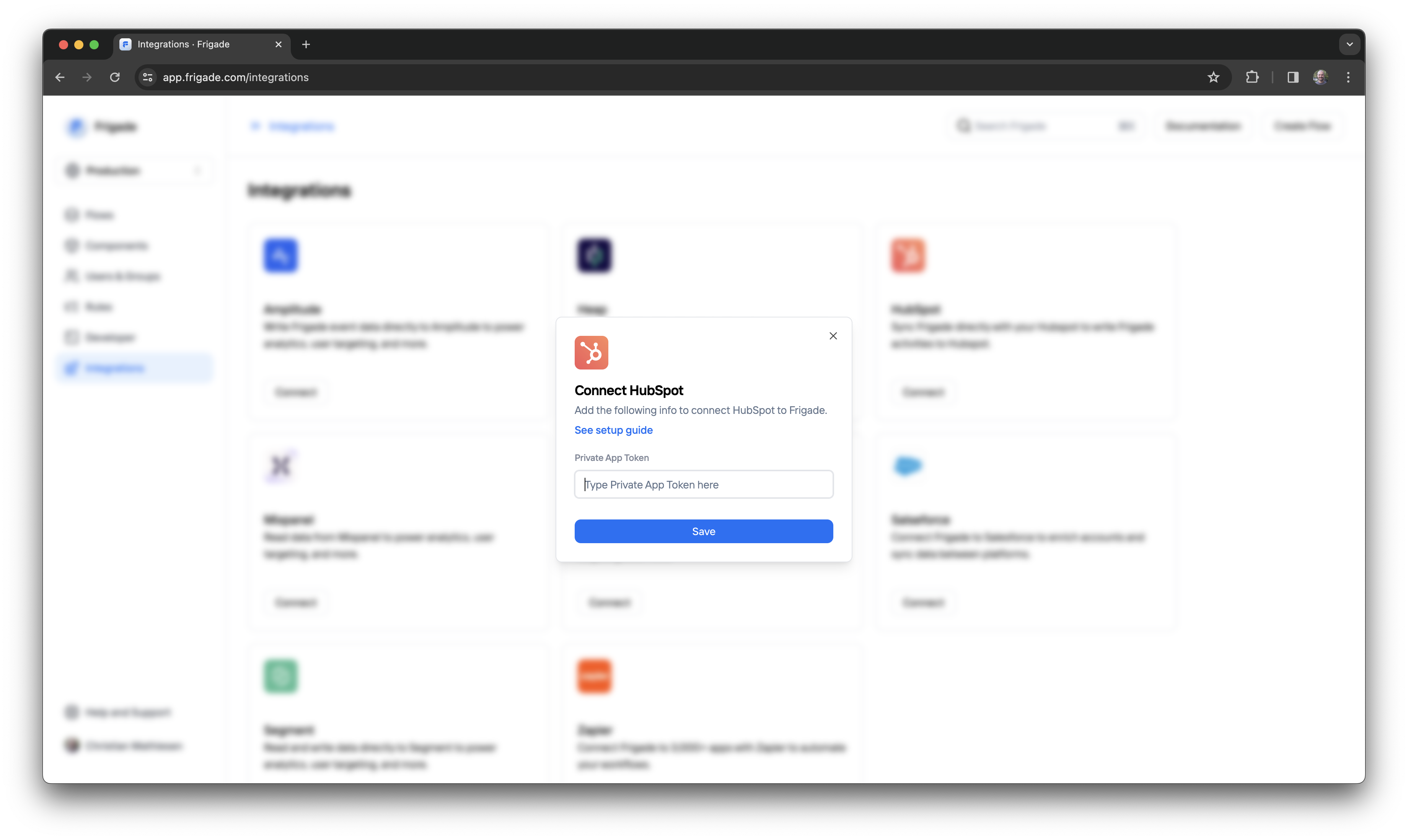
You can send Frigade tracking events to an external analytics platform for dashboards and reporting. Check out the [integrations](/integrations/) section to see our supported platforms.
Additionally, you can always connect Frigade to the analytics platform of your choice using webhooks. See the [webhooks](/api-reference/webhooks) documentation for more information.
### Flow cohorts
Frigade analytics are based on user cohorts. Frigade will group users into daily cohorts based on the date they first interacted with the Flow.
You can see detailed breakdowns by hovering on any given day in the graph. Statuses include completing the Flow, dismissing or quitting the Flow, or not yet completing the Flow.
### Time windows
You can change the time range for the stats by clicking on the dropdown in the top right corner of the analytics page. You can choose between `Last 7 days`, `Last 30 days`, or `All time`. The metrics on the right side represent the totals for the selected time window, and the graph and step completion rates below will also adjust to the selected time window.
### Flow versions
Each time a new [version](/platform/versioning) of a Flow is published it will its own analytics. This allows you to review the performance of different versions of the same Flow over time.
## External Analytics
***
You can send Frigade tracking events to an external analytics platform for dashboards and reporting. Check out the [integrations](/integrations/) section to see our supported platforms.
Additionally, you can always connect Frigade to the analytics platform of your choice using webhooks. See the [webhooks](/api-reference/webhooks) documentation for more information.
 ---
# Source: https://docs.frigade.com/component/announcement.md
> ## Documentation Index
> Fetch the complete documentation index at: https://docs.frigade.com/llms.txt
> Use this file to discover all available pages before exploring further.
# Announcement
> Communicate information or drive action via modal-based announcements
---
# Source: https://docs.frigade.com/component/announcement.md
> ## Documentation Index
> Fetch the complete documentation index at: https://docs.frigade.com/llms.txt
> Use this file to discover all available pages before exploring further.
# Announcement
> Communicate information or drive action via modal-based announcements
 ## About this component
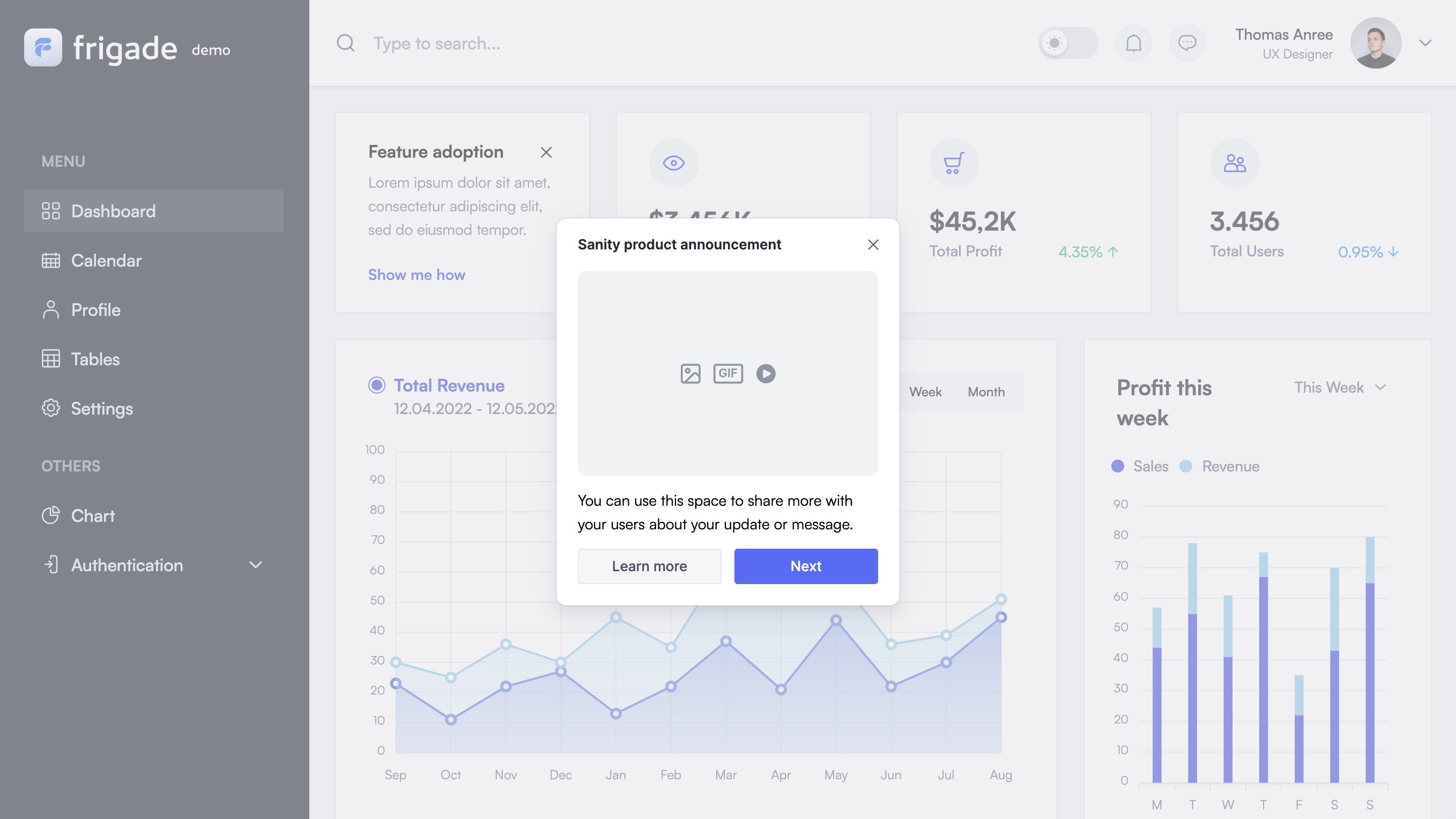
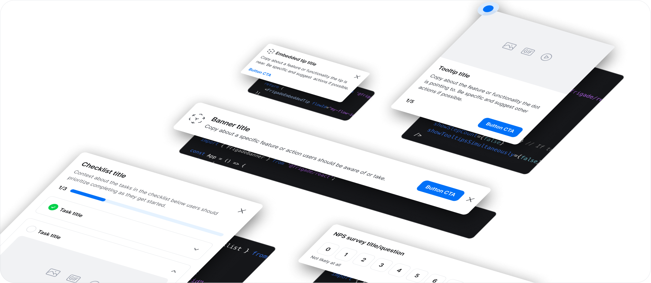
The `Announcement` component is a flexible communication tool that’s perfect for sharing important information or driving user action. They’re especially effective for getting the word out about new feature launches, upcoming webinars, or welcoming users to new areas of your product.
**When to Use Announcements:**
* **Key Communications:** Use announcements to highlight significant updates or events that need immediate user attention.
* **Transactional Flows:** They’re also great for welcoming users or guiding them to explore new features, like kicking off a product tour.
**Advantages of Announcements:**
* **Grab Attention:** Announcements often interrupt workflows in a way that demands attention, making sure users don’t miss out on important info.
* **Visual Impact:** You have ample space for visual assets (videos, images, GIF), which can help draw users in and keep the message engaging.
**Best Practices for Effective Announcements:**
* **Limit Frequency:** To avoid overwhelming users, try to keep announcements to once a session per user, and ideally once a week. This helps maintain their impact and prevents the dreaded “wack-a-mole” effect.
* **Be Concise:** Keep your messages short and to the point. The easier they are to digest, the more likely users will engage with them.
* **Target Your Audience:** Make sure your announcements are relevant and reach the right people by targeting on user properties, events and other signals.
* **Clear Calls to Action:** Use actionable phrases like “Learn more” and direct links over passive language like "Got it" or "Okay".
* **Utilize Collections:** Use Frigade Collections to manage in-app UI channels effectively, ensuring that only one announcement is displayed at a time.
* **Less Critical Info:** For non-essential information, consider launching announcements in the corner of the screen without background blurs for a subtler touchpoint.
## Resources
* [Launch announcements](/platform/collections#launch-with-collections) in minutes with no-code via Collections
* Target your announcement to specific users with [Targeting](/platform/targeting)
## Demo
* See announcements in action in our [live demo](https://demo.frigade.com/modals)
## Installation
## Targeting announcements
You can target [announcements](/component/announcement) to specific groups of users using the [Targeting](/platform/targeting) section on the flow detail page.
By default, an announcement will show up for all users once the flow code is live in production.
## Launching additional announcements without code changes
We recommend using the [Dialogs Collection](/platform/collections) to launch new announcements without updating your product codebase. The Dialogs Collection is built-in to the Frigade SDK and can be used to launch Frigade Announcements, Surveys, and other Dialog-based components.
## Launching another Flow from an Announcement
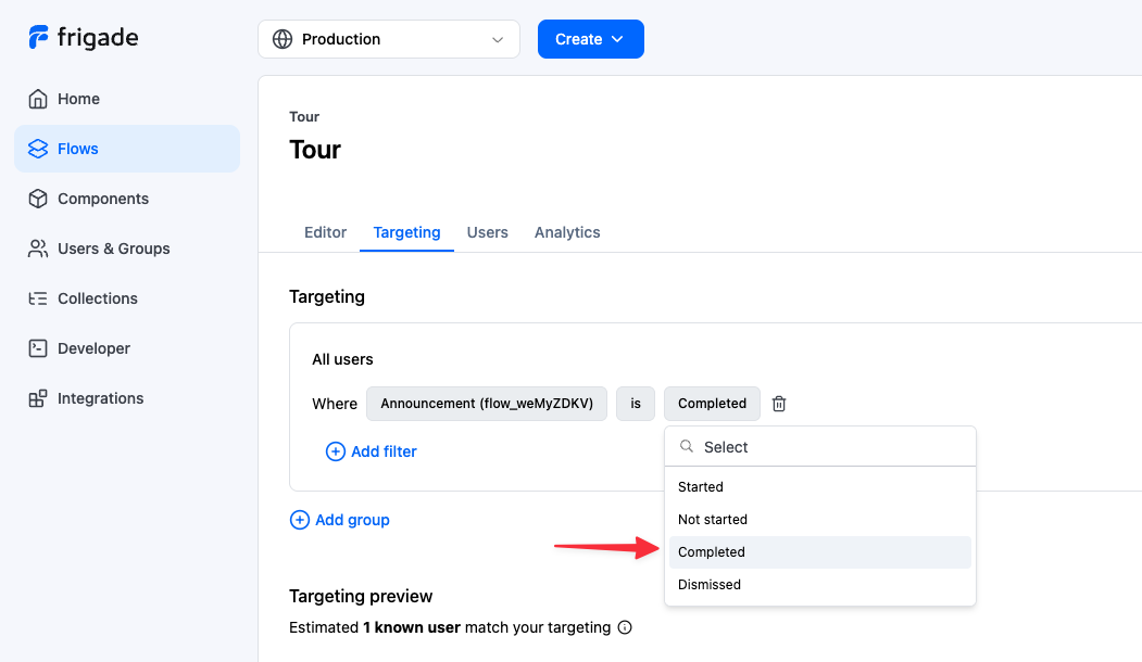
You may want to launch another Flow when a user clicks on the primary button of a different Flow. For example, you can launch a tour Flow when a user clicks on the primary button of an announcement. You can achieve this my modifying the [Targeting](/platform/targeting) of the tour Flow directly in the Frigade dashboard, locating the given announcement under **Flows** and selecting **Completed** (typically initiated by the primary button) or **Dismissed** (if the user clicks the X button in the announcement).
## About this component
The `Announcement` component is a flexible communication tool that’s perfect for sharing important information or driving user action. They’re especially effective for getting the word out about new feature launches, upcoming webinars, or welcoming users to new areas of your product.
**When to Use Announcements:**
* **Key Communications:** Use announcements to highlight significant updates or events that need immediate user attention.
* **Transactional Flows:** They’re also great for welcoming users or guiding them to explore new features, like kicking off a product tour.
**Advantages of Announcements:**
* **Grab Attention:** Announcements often interrupt workflows in a way that demands attention, making sure users don’t miss out on important info.
* **Visual Impact:** You have ample space for visual assets (videos, images, GIF), which can help draw users in and keep the message engaging.
**Best Practices for Effective Announcements:**
* **Limit Frequency:** To avoid overwhelming users, try to keep announcements to once a session per user, and ideally once a week. This helps maintain their impact and prevents the dreaded “wack-a-mole” effect.
* **Be Concise:** Keep your messages short and to the point. The easier they are to digest, the more likely users will engage with them.
* **Target Your Audience:** Make sure your announcements are relevant and reach the right people by targeting on user properties, events and other signals.
* **Clear Calls to Action:** Use actionable phrases like “Learn more” and direct links over passive language like "Got it" or "Okay".
* **Utilize Collections:** Use Frigade Collections to manage in-app UI channels effectively, ensuring that only one announcement is displayed at a time.
* **Less Critical Info:** For non-essential information, consider launching announcements in the corner of the screen without background blurs for a subtler touchpoint.
## Resources
* [Launch announcements](/platform/collections#launch-with-collections) in minutes with no-code via Collections
* Target your announcement to specific users with [Targeting](/platform/targeting)
## Demo
* See announcements in action in our [live demo](https://demo.frigade.com/modals)
## Installation
## Targeting announcements
You can target [announcements](/component/announcement) to specific groups of users using the [Targeting](/platform/targeting) section on the flow detail page.
By default, an announcement will show up for all users once the flow code is live in production.
## Launching additional announcements without code changes
We recommend using the [Dialogs Collection](/platform/collections) to launch new announcements without updating your product codebase. The Dialogs Collection is built-in to the Frigade SDK and can be used to launch Frigade Announcements, Surveys, and other Dialog-based components.
## Launching another Flow from an Announcement
You may want to launch another Flow when a user clicks on the primary button of a different Flow. For example, you can launch a tour Flow when a user clicks on the primary button of an announcement. You can achieve this my modifying the [Targeting](/platform/targeting) of the tour Flow directly in the Frigade dashboard, locating the given announcement under **Flows** and selecting **Completed** (typically initiated by the primary button) or **Dismissed** (if the user clicks the X button in the announcement).
 ---
# Source: https://docs.frigade.com/api-reference/authorization.md
> ## Documentation Index
> Fetch the complete documentation index at: https://docs.frigade.com/llms.txt
> Use this file to discover all available pages before exploring further.
# API Authorization
The Frigade API is secured using authorization tokens.
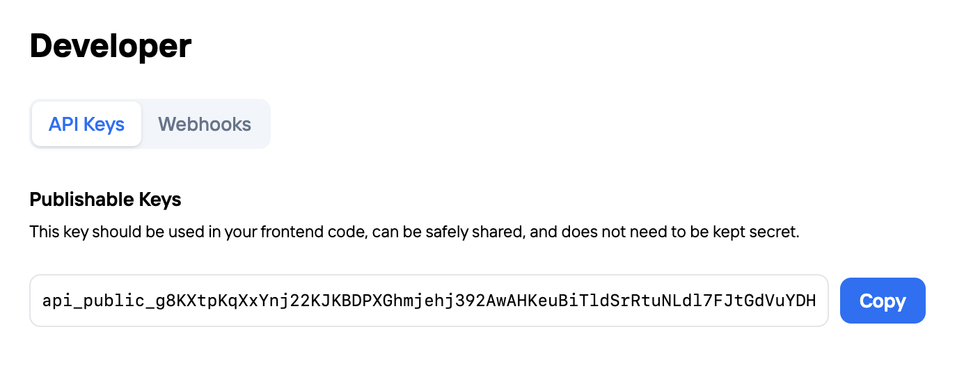
These api keys are used to authenticate your requests to the API. You can create and manage your api keys in the [Frigade Dashboard](https://app.frigade.com/developer).
Frigade provides two scopes of API keys: public and private. Below, we describe the differences between the two.
## Public API keys
This key can be exposed publicly (i.e. in your frontend code) and is used to access the public API endpoints.
These endpoints are prefixed with the `public` namespace in the API url (e.g. `https://api.frigade.com/v1/public/flows`).
## Private API keys
This key should be kept secret and is used to access the private API endpoints. It can be used to both access public and private API endpoints.
## Sample API request
The key should be passed in the `Authorization: Bearer
---
# Source: https://docs.frigade.com/api-reference/authorization.md
> ## Documentation Index
> Fetch the complete documentation index at: https://docs.frigade.com/llms.txt
> Use this file to discover all available pages before exploring further.
# API Authorization
The Frigade API is secured using authorization tokens.
These api keys are used to authenticate your requests to the API. You can create and manage your api keys in the [Frigade Dashboard](https://app.frigade.com/developer).
Frigade provides two scopes of API keys: public and private. Below, we describe the differences between the two.
## Public API keys
This key can be exposed publicly (i.e. in your frontend code) and is used to access the public API endpoints.
These endpoints are prefixed with the `public` namespace in the API url (e.g. `https://api.frigade.com/v1/public/flows`).
## Private API keys
This key should be kept secret and is used to access the private API endpoints. It can be used to both access public and private API endpoints.
## Sample API request
The key should be passed in the `Authorization: Bearer  ## About this component
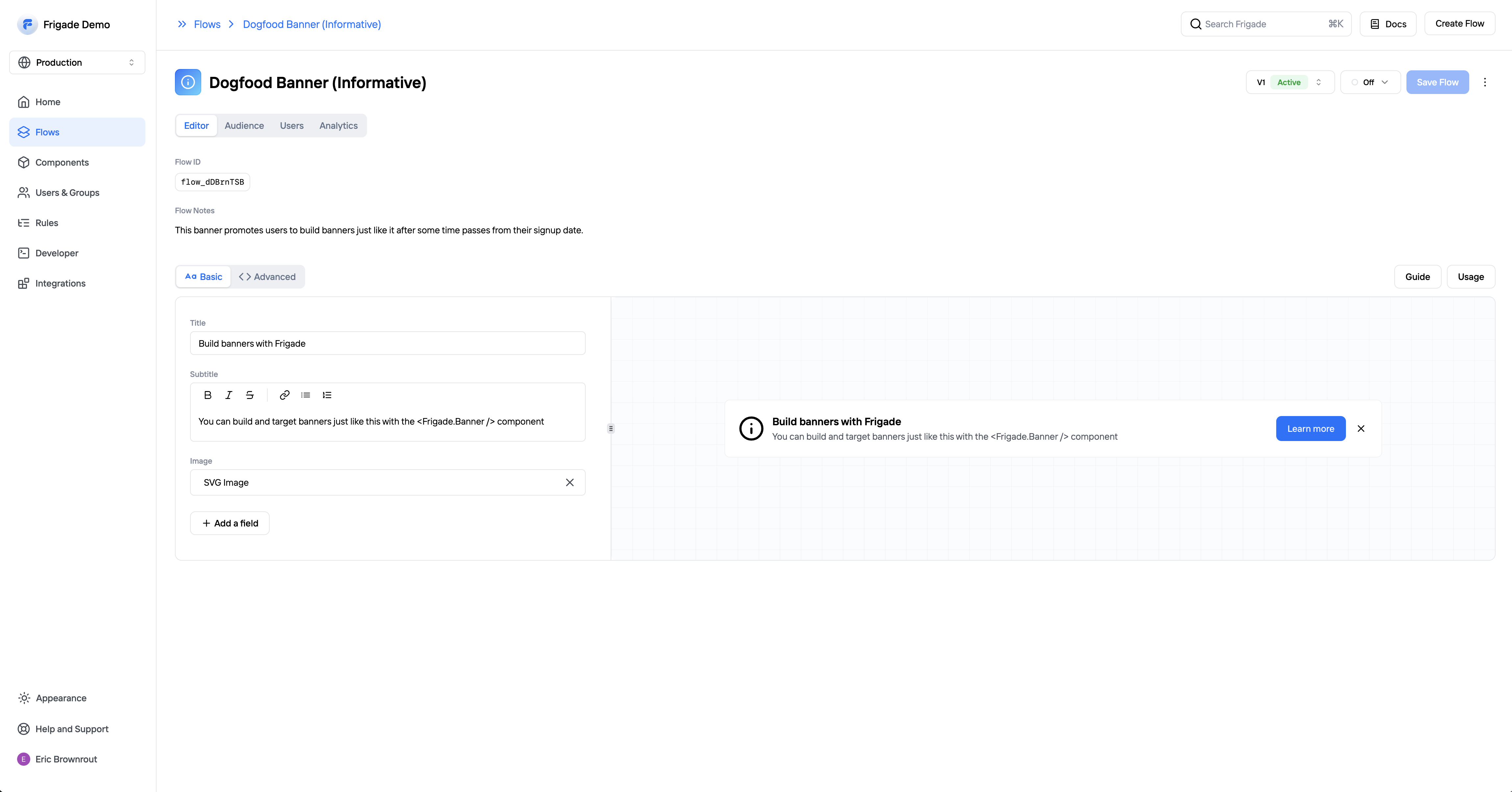
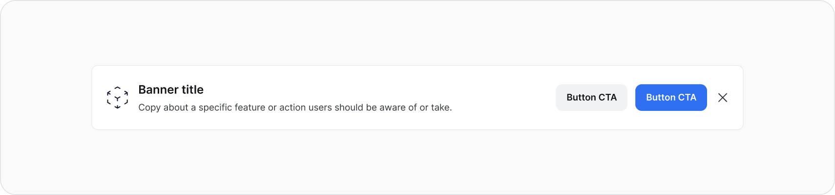
The `Banner` component is a versatile, persistent UI component that typically span the full width of a page or container, often at the top or bottom of the page. They serve as an unobtrusive way to communicate important information and promote additional offerings without disrupting the user’s workflow.
**When to use Banners:**
* **Alerts:** Ideal for notifying users about critical updates, such as free trial expirations or scheduled maintenance.
* **Lightweight Up-sells:** Effective for promoting related products or features, banners can be strategically targted and placed next to relevant content.
**Advantages of Banners:**
* **Non-Disruptive Communication:** Since banners remain visible without interrupting the user experience, they allow users to continue their tasks while still being informed.
* **Flexible Design Options:** Banners can be customized with full-bleed graphics and images, making them visually appealing and engaging. Frigade supports custom components including on-brand, eye-catching banners.
**Best Practices for Banners:**
* **Use Collections:** Leverage Collections to define reusable in-app UI channels, enabling teams to efficiently manage and launch banners across different pages, such as your product dashboard or a specific product pages.
* **Regulate Frequency:** Control the frequency of banner displays to ensure they remain relevant and engaging without overwhelming users.
* **Make Dismissible:** Most often, banners are easily dismissible for the best user expeirence. In select cases, banners may be non-dismissible to communicate a critical message for some time (e.g. product downtime).
## Resources
* Launch banners with no-code using custom [Collections](/platform/collections#inline-ui-components)
* Target your banner to specific users with [Targeting](/platform/targeting)
* See [industry examples](https://www.productonboarding.com/?type=banner) of banners
## Demo
* See banners in action in our [live demo](https://demo.frigade.com/cards)
## Installation
## About this component
The `Banner` component is a versatile, persistent UI component that typically span the full width of a page or container, often at the top or bottom of the page. They serve as an unobtrusive way to communicate important information and promote additional offerings without disrupting the user’s workflow.
**When to use Banners:**
* **Alerts:** Ideal for notifying users about critical updates, such as free trial expirations or scheduled maintenance.
* **Lightweight Up-sells:** Effective for promoting related products or features, banners can be strategically targted and placed next to relevant content.
**Advantages of Banners:**
* **Non-Disruptive Communication:** Since banners remain visible without interrupting the user experience, they allow users to continue their tasks while still being informed.
* **Flexible Design Options:** Banners can be customized with full-bleed graphics and images, making them visually appealing and engaging. Frigade supports custom components including on-brand, eye-catching banners.
**Best Practices for Banners:**
* **Use Collections:** Leverage Collections to define reusable in-app UI channels, enabling teams to efficiently manage and launch banners across different pages, such as your product dashboard or a specific product pages.
* **Regulate Frequency:** Control the frequency of banner displays to ensure they remain relevant and engaging without overwhelming users.
* **Make Dismissible:** Most often, banners are easily dismissible for the best user expeirence. In select cases, banners may be non-dismissible to communicate a critical message for some time (e.g. product downtime).
## Resources
* Launch banners with no-code using custom [Collections](/platform/collections#inline-ui-components)
* Target your banner to specific users with [Targeting](/platform/targeting)
* See [industry examples](https://www.productonboarding.com/?type=banner) of banners
## Demo
* See banners in action in our [live demo](https://demo.frigade.com/cards)
## Installation
 ## About this component
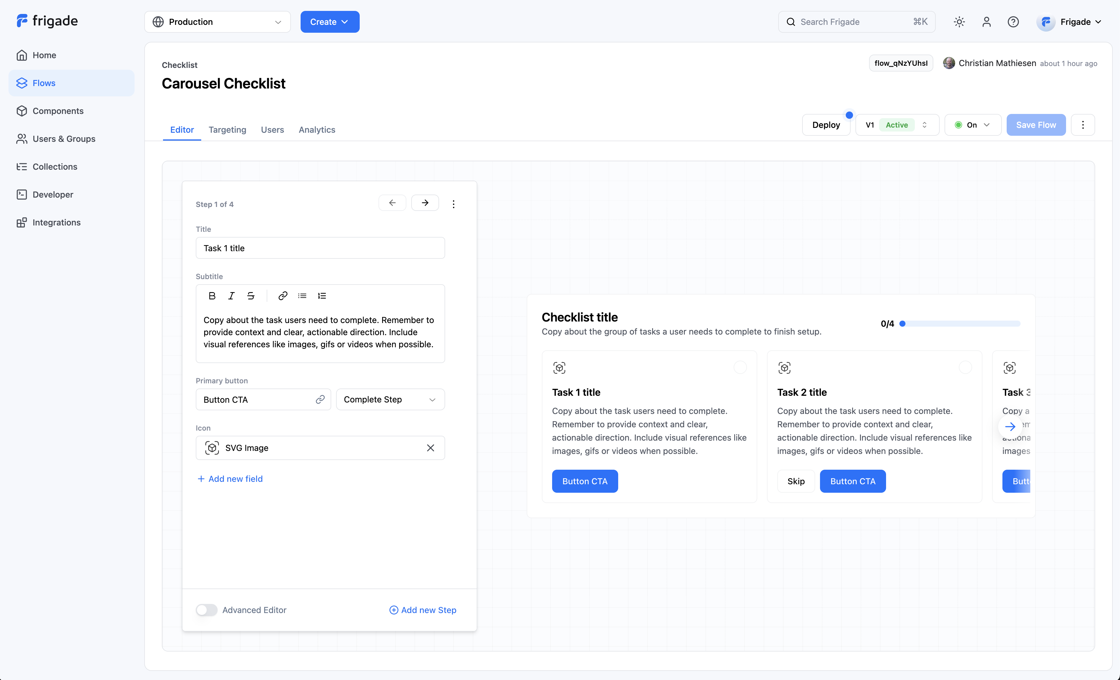
The `Checklist` component is one of Frigade’s most popular tools, especially for user onboarding and activation. They’re super handy for guiding users through their journey, whether it’s at the start of their experience or when they’re setting up a new product vertical or a complex feature.
**When to Use Checklists:**
* **Onboarding and Activation:** Checklists are perfect for helping users get started and ensuring they complete essential tasks. They provide a clear path forward and help users feel more confident as they navigate your product.
**Advantages of Announcements::**
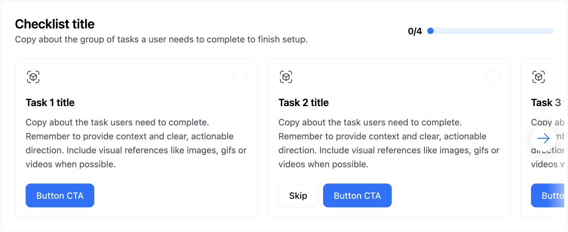
* **Two Default Versions:** Frigade offers two out-of-the-box checklist formats—carousel and collapsible—so you can choose what fits best for your users. Plus, if you need something custom, you can easily build one using the Frigade SDK/API.
* **Deeply integrated:** The most effective checklists measure actual in-product results. Frigade makes it easy to connect checklist steps to automatically complete from actual in-product actions and milestones.
**Best Practices for Checklists:**
* **Limit the Number of Tasks:** Keep your checklists manageable. Too many tasks can overwhelm users, so aim for a concise list that’s easy to follow.
* **Pre-Complete Steps Where Applicable:** For example, marking “Set up account” complete after sign up can show users progress from the start and create a sense of momentum (like showing 20% done instead of 0%).
* **Avoid Basic “Mark Done” Steps:** Whenever possible, tie checklist steps to actual workflows and tasks. Deep linking users to complete actions is way more effective. It’s okay to have “Skip” or “Mark done” as secondary options for non-essential steps.
* **Include a CTA to Hide the Checklist:** Giving users the option to hide the checklist can help them feel more in control of their setup and UI.
* **Break Large Workflows into Smaller Segments:** If you have a hefty checklist (like 12 steps), consider phasing it and breaking it into smaller groups (like two groups of 6). This makes it feel less daunting.
* **Measure Completion Rates:** Keep track of how users are progressing through each step and the entire checklist. This data can help you identify areas for improvement for future iterations.
## Resources
* Target your checklist to specific users with [Targeting](/platform/targeting)
* [Dynamically mark a step complete](/sdk/advanced/completing-a-step#programmatically-marking-steps-complete)
* Create shared checklists using [Group Properties](/sdk/hooks/group) and [completion criteria](/sdk/advanced/completing-a-step#automatically-marking-steps-complete)
* See [industry examples](https://www.productonboarding.com/?type=checklist) of checklists
## Demo
* See checklists in action in our [live demo](https://demo.frigade.com/checklists)
## Installation
## About this component
The `Checklist` component is one of Frigade’s most popular tools, especially for user onboarding and activation. They’re super handy for guiding users through their journey, whether it’s at the start of their experience or when they’re setting up a new product vertical or a complex feature.
**When to Use Checklists:**
* **Onboarding and Activation:** Checklists are perfect for helping users get started and ensuring they complete essential tasks. They provide a clear path forward and help users feel more confident as they navigate your product.
**Advantages of Announcements::**
* **Two Default Versions:** Frigade offers two out-of-the-box checklist formats—carousel and collapsible—so you can choose what fits best for your users. Plus, if you need something custom, you can easily build one using the Frigade SDK/API.
* **Deeply integrated:** The most effective checklists measure actual in-product results. Frigade makes it easy to connect checklist steps to automatically complete from actual in-product actions and milestones.
**Best Practices for Checklists:**
* **Limit the Number of Tasks:** Keep your checklists manageable. Too many tasks can overwhelm users, so aim for a concise list that’s easy to follow.
* **Pre-Complete Steps Where Applicable:** For example, marking “Set up account” complete after sign up can show users progress from the start and create a sense of momentum (like showing 20% done instead of 0%).
* **Avoid Basic “Mark Done” Steps:** Whenever possible, tie checklist steps to actual workflows and tasks. Deep linking users to complete actions is way more effective. It’s okay to have “Skip” or “Mark done” as secondary options for non-essential steps.
* **Include a CTA to Hide the Checklist:** Giving users the option to hide the checklist can help them feel more in control of their setup and UI.
* **Break Large Workflows into Smaller Segments:** If you have a hefty checklist (like 12 steps), consider phasing it and breaking it into smaller groups (like two groups of 6). This makes it feel less daunting.
* **Measure Completion Rates:** Keep track of how users are progressing through each step and the entire checklist. This data can help you identify areas for improvement for future iterations.
## Resources
* Target your checklist to specific users with [Targeting](/platform/targeting)
* [Dynamically mark a step complete](/sdk/advanced/completing-a-step#programmatically-marking-steps-complete)
* Create shared checklists using [Group Properties](/sdk/hooks/group) and [completion criteria](/sdk/advanced/completing-a-step#automatically-marking-steps-complete)
* See [industry examples](https://www.productonboarding.com/?type=checklist) of checklists
## Demo
* See checklists in action in our [live demo](https://demo.frigade.com/checklists)
## Installation
 ## About this component
The `Checklist` component is one of Frigade’s most popular tools, especially for user onboarding and activation. They’re super handy for guiding users through their journey, whether it’s at the start of their experience or when they’re setting up a new product vertical or a complex feature.
**When to Use Checklists:**
* **Onboarding and Activation:** Checklists are perfect for helping users get started and ensuring they complete essential tasks. They provide a clear path forward and help users feel more confident as they navigate your product.
**Advantages of Announcements::**
* **Two Default Versions:** Frigade offers two out-of-the-box checklist formats—carousel and collapsible—so you can choose what fits best for your users. Plus, if you need something custom, you can easily build one using the Frigade SDK/API.
* **Deeply integrated:** The most effective checklists measure actual in-product results. Frigade makes it easy to connect checklist steps to automatically complete from actual in-product actions and milestones.
**Best Practices for Checklists:**
* **Limit the Number of Tasks:** Keep your checklists manageable. Too many tasks can overwhelm users, so aim for a concise list that’s easy to follow.
* **Pre-Complete Steps Where Applicable:** For example, marking “Set up account” complete after sign up can show users progress from the start and create a sense of momentum (like showing 20% done instead of 0%).
* **Avoid Basic “Mark Done” Steps:** Whenever possible, tie checklist steps to actual workflows and tasks. Deep linking users to complete actions is way more effective. It’s okay to have “Skip” or “Mark done” as secondary options for non-essential steps.
* **Include a CTA to Hide the Checklist:** Giving users the option to hide the checklist can help them feel more in control of their setup and UI.
* **Break Large Workflows into Smaller Segments:** If you have a hefty checklist (like 12 steps), consider phasing it and breaking it into smaller groups (like two groups of 6). This makes it feel less daunting.
* **Measure Completion Rates:** Keep track of how users are progressing through each step and the entire checklist. This data can help you identify areas for improvement for future iterations.
## Resources
* Target your checklist to specific users with [Targeting](/platform/targeting)
* [Dynamically mark a step complete](/sdk/advanced/completing-a-step#programmatically-marking-steps-complete)
* Create shared checklists using [Group Properties](/sdk/hooks/group) and [completion criteria](/sdk/advanced/completing-a-step#automatically-marking-steps-complete)
* See [industry examples](https://www.productonboarding.com/?type=checklist) of checklists
## Demo
* See checklists in action in our [live demo](https://demo.frigade.com/checklists)
## Code
## About this component
The `Checklist` component is one of Frigade’s most popular tools, especially for user onboarding and activation. They’re super handy for guiding users through their journey, whether it’s at the start of their experience or when they’re setting up a new product vertical or a complex feature.
**When to Use Checklists:**
* **Onboarding and Activation:** Checklists are perfect for helping users get started and ensuring they complete essential tasks. They provide a clear path forward and help users feel more confident as they navigate your product.
**Advantages of Announcements::**
* **Two Default Versions:** Frigade offers two out-of-the-box checklist formats—carousel and collapsible—so you can choose what fits best for your users. Plus, if you need something custom, you can easily build one using the Frigade SDK/API.
* **Deeply integrated:** The most effective checklists measure actual in-product results. Frigade makes it easy to connect checklist steps to automatically complete from actual in-product actions and milestones.
**Best Practices for Checklists:**
* **Limit the Number of Tasks:** Keep your checklists manageable. Too many tasks can overwhelm users, so aim for a concise list that’s easy to follow.
* **Pre-Complete Steps Where Applicable:** For example, marking “Set up account” complete after sign up can show users progress from the start and create a sense of momentum (like showing 20% done instead of 0%).
* **Avoid Basic “Mark Done” Steps:** Whenever possible, tie checklist steps to actual workflows and tasks. Deep linking users to complete actions is way more effective. It’s okay to have “Skip” or “Mark done” as secondary options for non-essential steps.
* **Include a CTA to Hide the Checklist:** Giving users the option to hide the checklist can help them feel more in control of their setup and UI.
* **Break Large Workflows into Smaller Segments:** If you have a hefty checklist (like 12 steps), consider phasing it and breaking it into smaller groups (like two groups of 6). This makes it feel less daunting.
* **Measure Completion Rates:** Keep track of how users are progressing through each step and the entire checklist. This data can help you identify areas for improvement for future iterations.
## Resources
* Target your checklist to specific users with [Targeting](/platform/targeting)
* [Dynamically mark a step complete](/sdk/advanced/completing-a-step#programmatically-marking-steps-complete)
* Create shared checklists using [Group Properties](/sdk/hooks/group) and [completion criteria](/sdk/advanced/completing-a-step#automatically-marking-steps-complete)
* See [industry examples](https://www.productonboarding.com/?type=checklist) of checklists
## Demo
* See checklists in action in our [live demo](https://demo.frigade.com/checklists)
## Code
{flow.subtitle}
{flow.owner}
}} ## API Methods
You can also mark steps completed via the [flowStates](/api-reference/flows/flow-states-post) API endpoint.
---
# Source: https://docs.frigade.com/sdk/styling/css-overrides.md
> ## Documentation Index
> Fetch the complete documentation index at: https://docs.frigade.com/llms.txt
> Use this file to discover all available pages before exploring further.
# CSS Overrides
## CSS Prop
We use [Emotion's css prop](https://emotion.sh/docs/css-prop#use-the-css-prop) under the hood in our components. You can pass a `css` object in at the top level of any of our components to create scoped styles for that specific instance of that component.
Since the `css` prop is scoped to each component, you can treat it as though it were a `style` prop with added functionality. For example:
```tsx theme={"system"}
// This CSS will be compiled at runtime by Emotion and applied to
// the `.fr-card` wrapper at the top level of the Card component
## API Methods
You can also mark steps completed via the [flowStates](/api-reference/flows/flow-states-post) API endpoint.
---
# Source: https://docs.frigade.com/sdk/styling/css-overrides.md
> ## Documentation Index
> Fetch the complete documentation index at: https://docs.frigade.com/llms.txt
> Use this file to discover all available pages before exploring further.
# CSS Overrides
## CSS Prop
We use [Emotion's css prop](https://emotion.sh/docs/css-prop#use-the-css-prop) under the hood in our components. You can pass a `css` object in at the top level of any of our components to create scoped styles for that specific instance of that component.
Since the `css` prop is scoped to each component, you can treat it as though it were a `style` prop with added functionality. For example:
```tsx theme={"system"}
// This CSS will be compiled at runtime by Emotion and applied to
// the `.fr-card` wrapper at the top level of the Card component
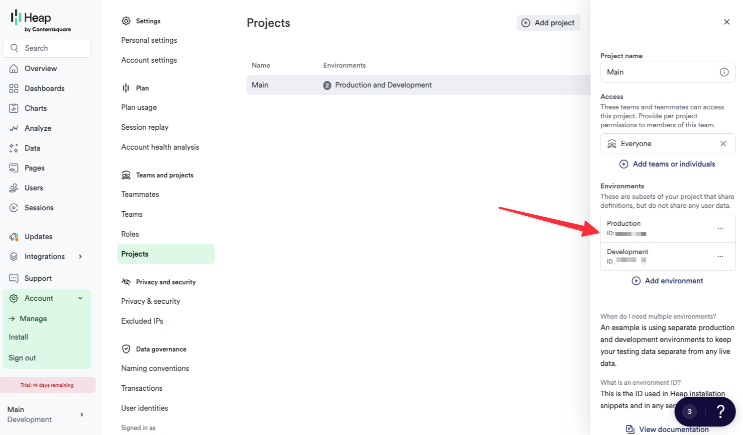
 ## Manage Flow across environments
***
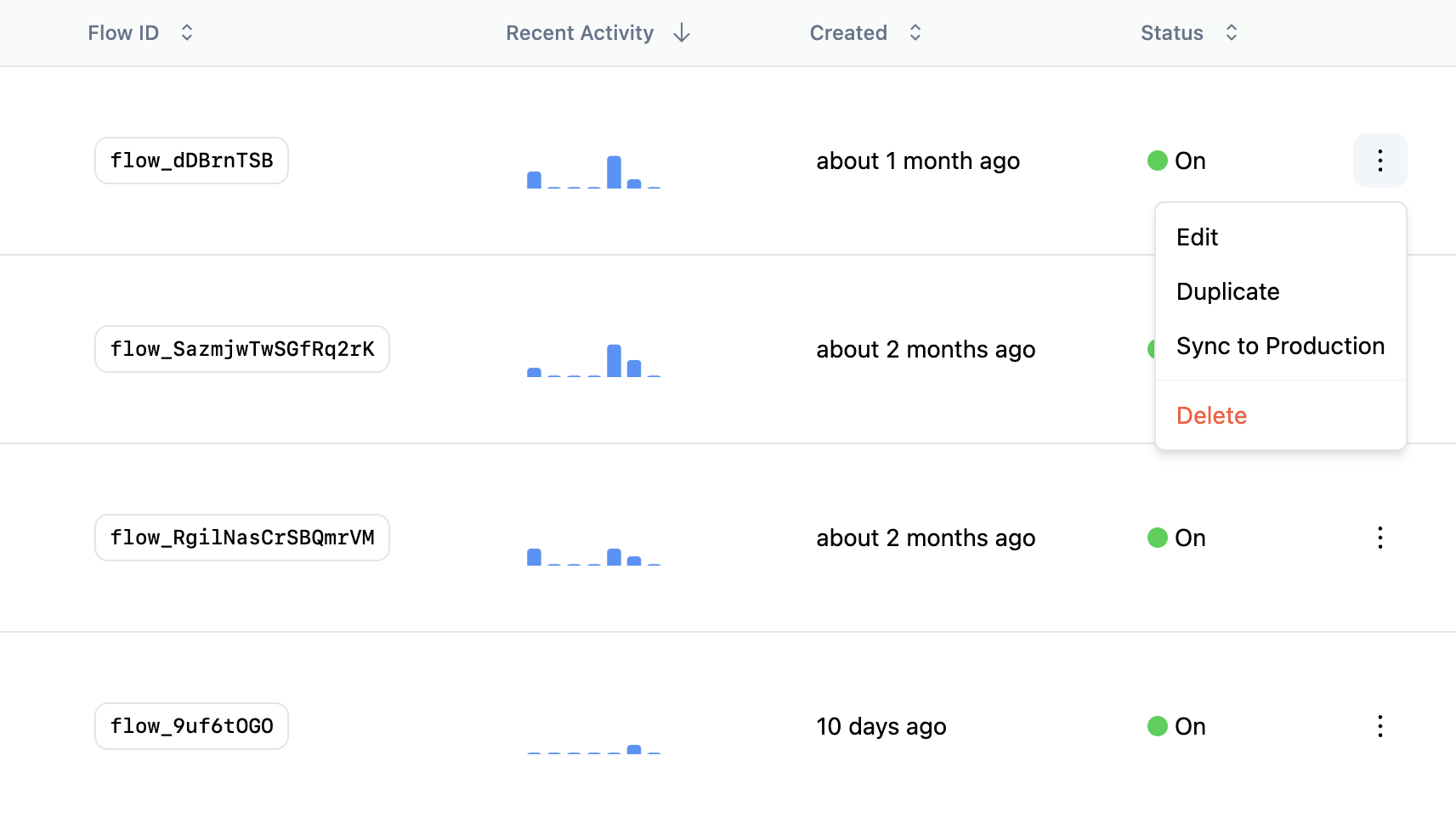
By default, Flow IDs are unique to each environment. However, if you want to use the same Flow ID across environments, you can use **Sync to Production** to link a Flow between Development and Production.
### Sync Flows to Production
When you are ready to move a Flow from Development to Production, you can simply **Sync to Production** from the overflow menu on the Flows page. This will create a new Production Flow with the same ID, content, targeting, and properties.
If the Flow ID already exists in Production, then **Sync to Production** will give you the choice to overwrite the Flow or create a new draft version with your changes.
## Manage Flow across environments
***
By default, Flow IDs are unique to each environment. However, if you want to use the same Flow ID across environments, you can use **Sync to Production** to link a Flow between Development and Production.
### Sync Flows to Production
When you are ready to move a Flow from Development to Production, you can simply **Sync to Production** from the overflow menu on the Flows page. This will create a new Production Flow with the same ID, content, targeting, and properties.
If the Flow ID already exists in Production, then **Sync to Production** will give you the choice to overwrite the Flow or create a new draft version with your changes.
 ---
# Source: https://docs.frigade.com/guides/custom/flow-component.md
> ## Documentation Index
> Fetch the complete documentation index at: https://docs.frigade.com/llms.txt
> Use this file to discover all available pages before exploring further.
# Flow Component
`
---
# Source: https://docs.frigade.com/guides/custom/flow-component.md
> ## Documentation Index
> Fetch the complete documentation index at: https://docs.frigade.com/llms.txt
> Use this file to discover all available pages before exploring further.
# Flow Component
`
{flow.subtitle}
Currently on step {flow.getCurrentStep().id}
 ## User Lifecycle
Users can have state in Flows and in the Steps within a Flow. The lifecycle of a user's state in a Flow is as follows:
1. **Not started**: The user has not seen or engaged with the Flow.
2. **Started**: The user has seen the Flow and may have completed or skipped one or more Steps.
3. **Completed** or **Dismissed**: The user has completed or dismissed the Flow.
Once a Flow is completed or dismissed, it will remain in this state for the user unless the Flow is restarted via the SDK, API, or the **Reset in Flow** button in the Frigade Dashboard. This is true even if the Flow has new Steps added or a Step's state is reset.
## Frequently Asked Questions
***
## User Lifecycle
Users can have state in Flows and in the Steps within a Flow. The lifecycle of a user's state in a Flow is as follows:
1. **Not started**: The user has not seen or engaged with the Flow.
2. **Started**: The user has seen the Flow and may have completed or skipped one or more Steps.
3. **Completed** or **Dismissed**: The user has completed or dismissed the Flow.
Once a Flow is completed or dismissed, it will remain in this state for the user unless the Flow is restarted via the SDK, API, or the **Reset in Flow** button in the Frigade Dashboard. This is true even if the Flow has new Steps added or a Step's state is reset.
## Frequently Asked Questions
***
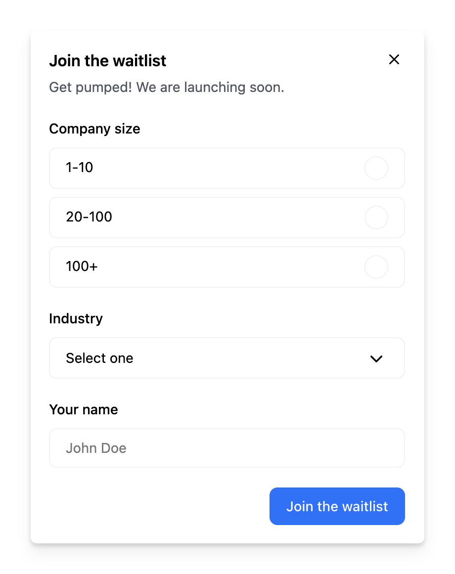
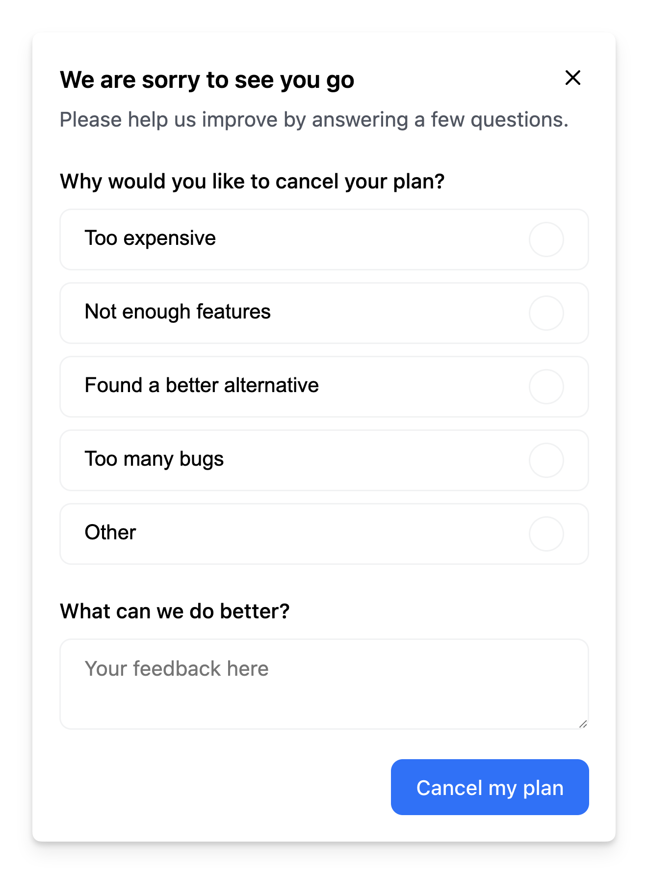
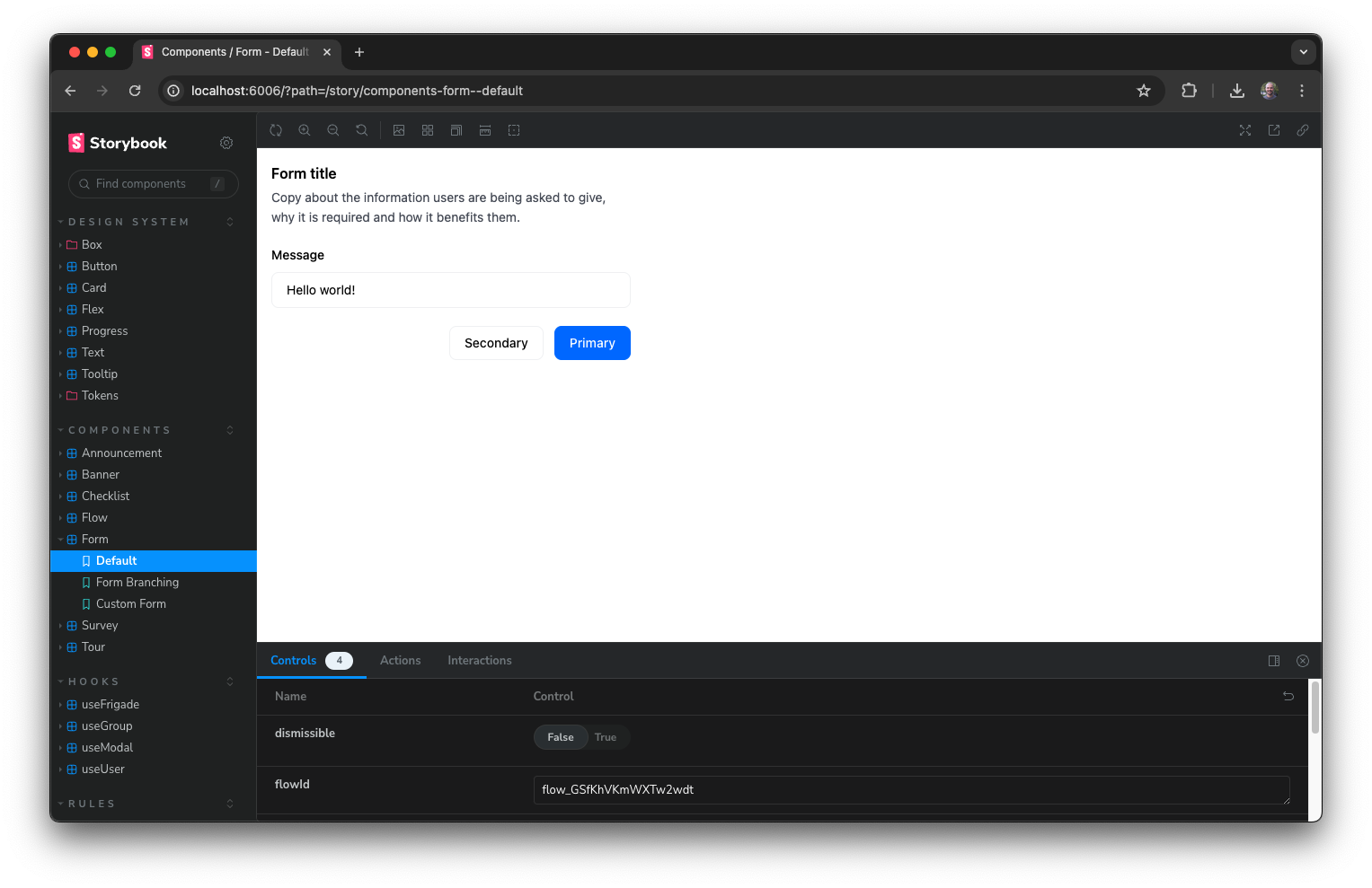
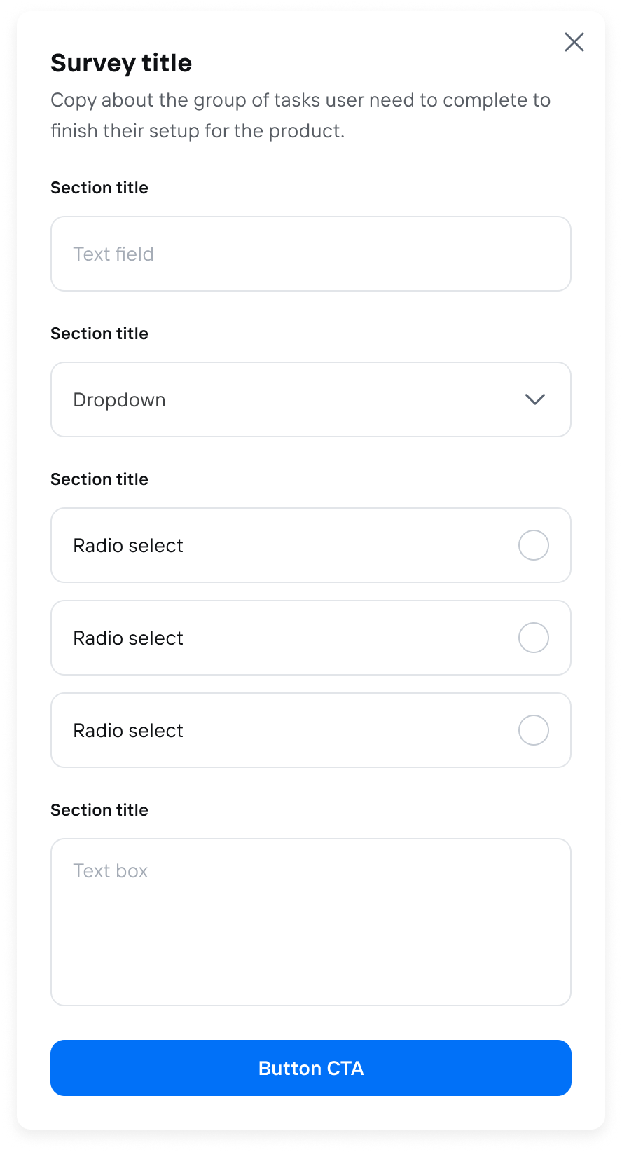 ## About this component
The `Form` component is a super versatile tool that can fit right into your product UI or pop up in a modal for things like surveys. They can be used for wide range of use cases including registration flows, surveys, feedback forms, and more. The component supports form validation (client and server-side), conditional fields, branching logic, and multi-step Flows.
**When to Use Forms:**
* **Embedded in UI:** Forms work great for tasks like product registration, helping users get started smoothly without leaving the page.
* **Modal Surveys:** Use forms in modals for surveys or feedback, making it easy for users to share their thoughts without disrupting their experience.
**Why Forms Are Powerful:**
* **Conditional and Branching Logic:** Forms can adapt based on user responses, guiding them through a tailored experience that feels intuitive.
* **Custom React Steps:** You can embed custom React components to invite teammates or perform API lookups, adding a personal touch to your forms.
* **Customizable Input Types:** With a variety of built-in input types—like text fields, multiple-choice options, and dropdowns—you can design forms that suit your specific needs.
**Best Practices for Forms:**
* **Provide Progress Indicators:** Adding progress bars or step indicators (like "Step X of Y") can help users see how far they've come and what's left to do. This makes the process feel less daunting and more manageable.
* **Streamlined Data Collection:** Frigade makes it easy to create new forms quickly, allowing you to gather user data and send it wherever you need it in your system.
## Resources
* Create a form and [send events to Slack](/guides/form-video-demo)
* Launch pop-up forms and surveys with no-code using [Collections](/platform/collections#announcements-surveys-and-dialogs)
* Target your form to specific users with [Targeting](/platform/targeting)
* See [industry examples](https://www.productonboarding.com/?type=form) of forms
## Demo
* See forms in action in our [live demo](https://demo.frigade.com/forms)
## Customization
To learn about how to customize Frigade components, see the [customization documentation](/sdk/styling/) and [examples](https://demo.frigade.com) of custom themes in action.
## Examples
The following section includes ready-made examples and code for various form use cases.
### Simple Modal Form
## About this component
The `Form` component is a super versatile tool that can fit right into your product UI or pop up in a modal for things like surveys. They can be used for wide range of use cases including registration flows, surveys, feedback forms, and more. The component supports form validation (client and server-side), conditional fields, branching logic, and multi-step Flows.
**When to Use Forms:**
* **Embedded in UI:** Forms work great for tasks like product registration, helping users get started smoothly without leaving the page.
* **Modal Surveys:** Use forms in modals for surveys or feedback, making it easy for users to share their thoughts without disrupting their experience.
**Why Forms Are Powerful:**
* **Conditional and Branching Logic:** Forms can adapt based on user responses, guiding them through a tailored experience that feels intuitive.
* **Custom React Steps:** You can embed custom React components to invite teammates or perform API lookups, adding a personal touch to your forms.
* **Customizable Input Types:** With a variety of built-in input types—like text fields, multiple-choice options, and dropdowns—you can design forms that suit your specific needs.
**Best Practices for Forms:**
* **Provide Progress Indicators:** Adding progress bars or step indicators (like "Step X of Y") can help users see how far they've come and what's left to do. This makes the process feel less daunting and more manageable.
* **Streamlined Data Collection:** Frigade makes it easy to create new forms quickly, allowing you to gather user data and send it wherever you need it in your system.
## Resources
* Create a form and [send events to Slack](/guides/form-video-demo)
* Launch pop-up forms and surveys with no-code using [Collections](/platform/collections#announcements-surveys-and-dialogs)
* Target your form to specific users with [Targeting](/platform/targeting)
* See [industry examples](https://www.productonboarding.com/?type=form) of forms
## Demo
* See forms in action in our [live demo](https://demo.frigade.com/forms)
## Customization
To learn about how to customize Frigade components, see the [customization documentation](/sdk/styling/) and [examples](https://demo.frigade.com) of custom themes in action.
## Examples
The following section includes ready-made examples and code for various form use cases.
### Simple Modal Form
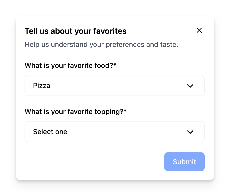 Sometimes you may want to conditionally render a dynamic field based on the value of another field. The example above dynamically changes the second dropdown based on the value of the first dropdown.
 This example shows how to implement branching in a form based on the user's choice in the first step.
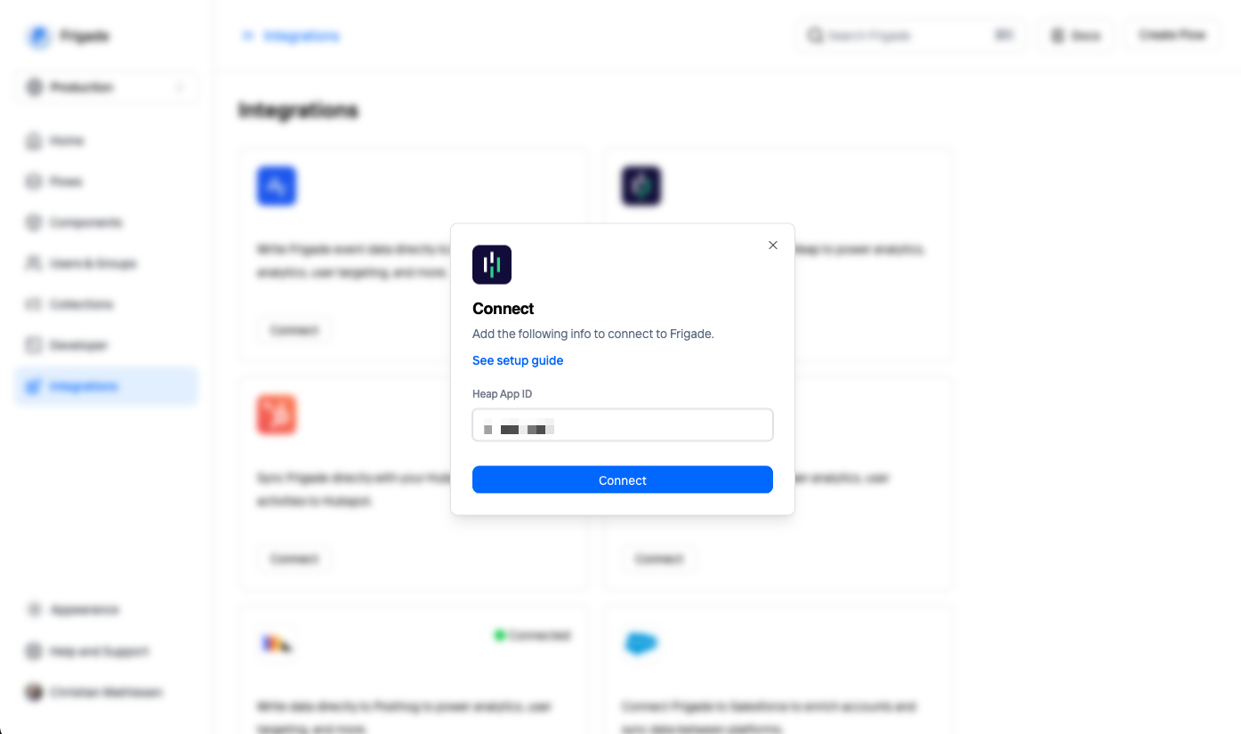 You will be asked to enter your Heap Environment ID. Click **Connect** to save and activate the integration. Shortly after, events will start streaming from Frigade in real-time.
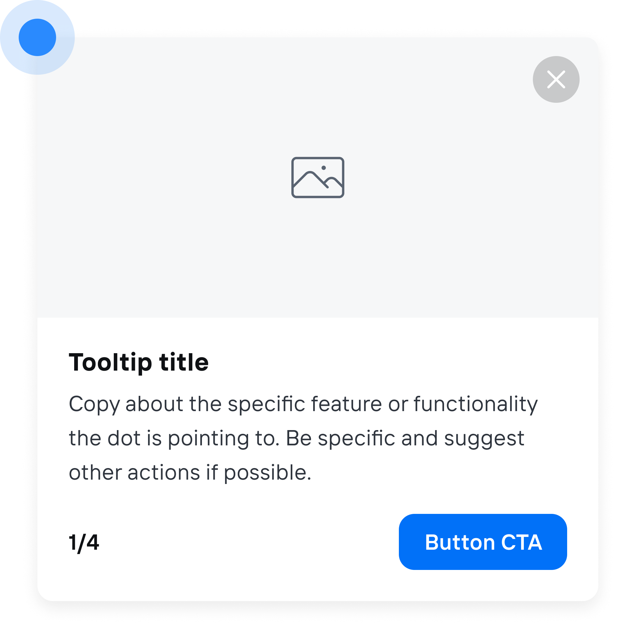
 ## About this component
The `Hint` component provides users with contextual guidance without interrupting their workflow. Unlike tours, hints are not sequential and are closed by default, allowing users to engage with them at their own pace. This design choice minimizes disruption and enhances the user experience by offering assistance when needed.
**When to Use Hints:**
* **Contextual Assistance:** Provide users with relevant tips or information based on their current task or location within the app.
* **Feature Highlights:** Draw attention to new or underutilized features without overwhelming users with a full tour.
* **Error Prevention:** Offer guidance that helps users avoid common mistakes or pitfalls as they navigate the application.
**Best Practices for Hints:**
* **Visibility:** Ensure hints are easily noticeable but not obtrusive. Use subtle animations or colors to draw attention without being distracting.
* **Actionable Content:** Like tours, hints should provide actionable advice. For example, instead of stating “This is the settings page,” a hint could say, “Click here to adjust your notification preferences.”
* **Dismissible:** Hints should be easily dismissible. Users should feel in control and not forced to engage with hints if they choose not to.
## Demo
* See hints in action in our [live demo](https://demo.frigade.com/hints)
## Installation
## About this component
The `Hint` component provides users with contextual guidance without interrupting their workflow. Unlike tours, hints are not sequential and are closed by default, allowing users to engage with them at their own pace. This design choice minimizes disruption and enhances the user experience by offering assistance when needed.
**When to Use Hints:**
* **Contextual Assistance:** Provide users with relevant tips or information based on their current task or location within the app.
* **Feature Highlights:** Draw attention to new or underutilized features without overwhelming users with a full tour.
* **Error Prevention:** Offer guidance that helps users avoid common mistakes or pitfalls as they navigate the application.
**Best Practices for Hints:**
* **Visibility:** Ensure hints are easily noticeable but not obtrusive. Use subtle animations or colors to draw attention without being distracting.
* **Actionable Content:** Like tours, hints should provide actionable advice. For example, instead of stating “This is the settings page,” a hint could say, “Click here to adjust your notification preferences.”
* **Dismissible:** Hints should be easily dismissible. Users should feel in control and not forced to engage with hints if they choose not to.
## Demo
* See hints in action in our [live demo](https://demo.frigade.com/hints)
## Installation
`
* ``
* `
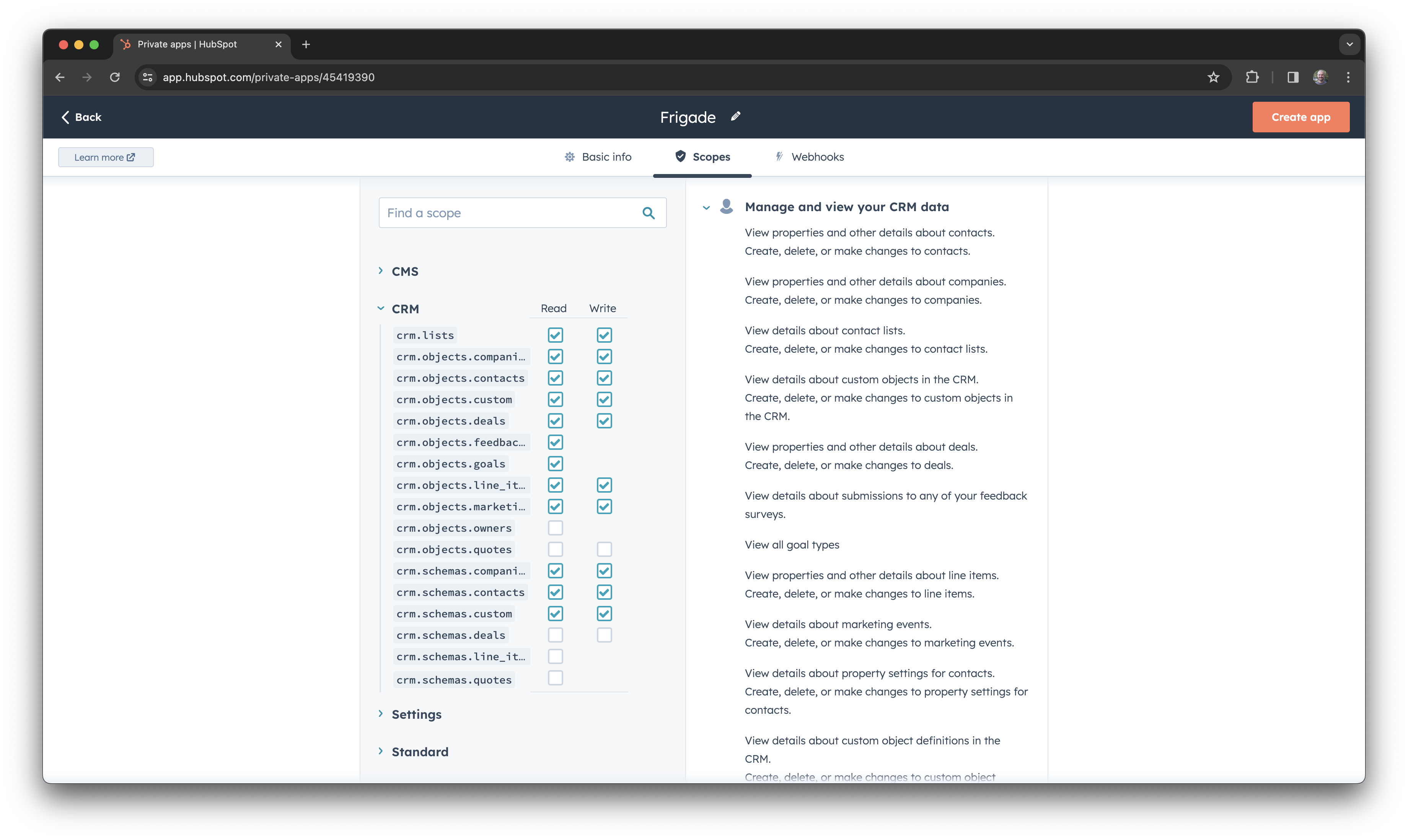 Once you have set the permissions, click on the **Create app** button.
 ## About this component
The `Card` component is a handy little UI element that’s great for showing off promotional materials and important info in a visually appealing way. While they share some similarities with banners, cards have their own unique vibe and offer flexibility in placement.
**When to Use Cards:**
* **Promotional Materials:** Think of cards as your go-to swiss-army knife for inline promotions. For instance, showcasing new features, nudging users with onboarding tips, or encouraging user referrals.
**Advantages of Cards:**
* **Inline Placement:** You’ll usually find cards sitting neatly within in the main UI, like in a sidebar or alongside other product elements. This makes them easy to spot without getting in the way of the user experience.
* **Visual Appeal:** Cards can be designed with eye-catching images, icons, and text, making them interesting and engaging for users.
* **Versatile Use:** Whether you’re promoting a feature or sharing a helpful resource, cards can handle a variety of content types, making them super flexible.
**Best Practices for Cards:**
* **Strategic Placement:** Think about where you put your cards. Positioning them where users can easily see them can boost engagement.
* **Keep It Consistent:** Stick to a consistent design and placement across all your cards. These patterns helps create a cohesive look and feel throughout your app, which increases engagement.
* **Clear Calls to Action:** Make sure each card has a clear call to action, like “Learn More” or “Request Demo.” This encourages users to take that next step.
## Resources
* Launch cards with no-code using custom [Collections](/platform/collections#inline-ui-components)
* Target your card to specific users with [Targeting](/platform/targeting)
* See [industry examples](https://www.productonboarding.com/?type=card) of cards
## Demo
* See cards in action in our [live demo](https://demo.frigade.com/cards)
## Installation
## About this component
The `Card` component is a handy little UI element that’s great for showing off promotional materials and important info in a visually appealing way. While they share some similarities with banners, cards have their own unique vibe and offer flexibility in placement.
**When to Use Cards:**
* **Promotional Materials:** Think of cards as your go-to swiss-army knife for inline promotions. For instance, showcasing new features, nudging users with onboarding tips, or encouraging user referrals.
**Advantages of Cards:**
* **Inline Placement:** You’ll usually find cards sitting neatly within in the main UI, like in a sidebar or alongside other product elements. This makes them easy to spot without getting in the way of the user experience.
* **Visual Appeal:** Cards can be designed with eye-catching images, icons, and text, making them interesting and engaging for users.
* **Versatile Use:** Whether you’re promoting a feature or sharing a helpful resource, cards can handle a variety of content types, making them super flexible.
**Best Practices for Cards:**
* **Strategic Placement:** Think about where you put your cards. Positioning them where users can easily see them can boost engagement.
* **Keep It Consistent:** Stick to a consistent design and placement across all your cards. These patterns helps create a cohesive look and feel throughout your app, which increases engagement.
* **Clear Calls to Action:** Make sure each card has a clear call to action, like “Learn More” or “Request Demo.” This encourages users to take that next step.
## Resources
* Launch cards with no-code using custom [Collections](/platform/collections#inline-ui-components)
* Target your card to specific users with [Targeting](/platform/targeting)
* See [industry examples](https://www.productonboarding.com/?type=card) of cards
## Demo
* See cards in action in our [live demo](https://demo.frigade.com/cards)
## Installation
${stepsCompleted}/${totalSteps}
${step.name}
`; html += ``; html += `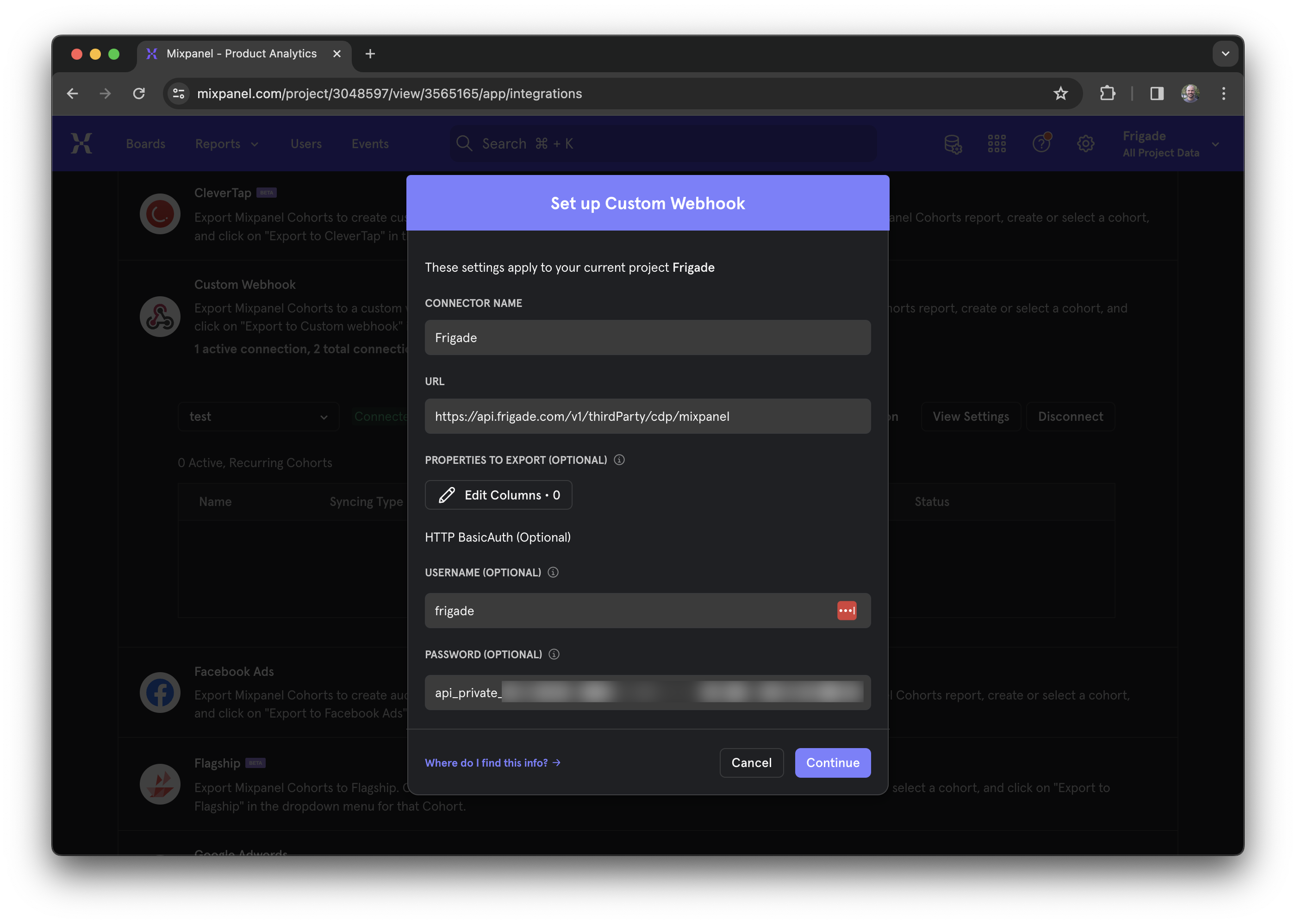
 ## About this component
The `Survey` component is a fantastic way to engage users right when it matters and gather valuable feedback or data. Whether you’re looking to measure satisfaction or collect insights, targeted in-app surveys can help you connect with users at key moments in their journey.
**When to Use Surveys:**
* **User Research:** Deploy surveys like NPS (Net Promoter Score) right after users complete specific actions. This is a great way to capture their feelings while the experience is fresh in their minds.
* **Data Collection:** Use surveys to collect additional data after user signups, helping you enrich your CRM and tailor your communications.
**Best Practices for Surveys:**
* **Flexible Display Options:** By default, NPS surveys typically float on the screen, ensuring they don’t take over the entire user experience. This keeps the process smooth and non-intrusive.
* **Full-Screen Takeovers:** For the highest engagement rates, for custom surveys or other input forms, they can be displayed inline within the page or as a full page modal. Just be sure to use these methods thoughtfully to avoid annoying users.
**Custom Surveys:**
* **Built on Forms:** Custom surveys utilize the same underlying components as Forms, which means you can refer to the Forms documentation for more details on how to create and implement them effectively.
## Resources
* Launch surveys with no-code using [Collections](/platform/collections#announcements-surveys-and-dialogs)
* Target your survey to specific users with [Targeting](/platform/targeting)
* See [industry examples](https://www.productonboarding.com/?type=survey) of surveys
## Demo
* See surveys in action in our [live demo](https://demo.frigade.com/modals)
## Alternative scales
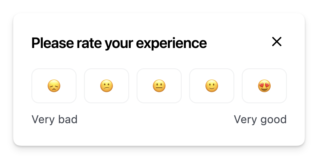
The component comes with a default NPS scale of 0-10. You can also use a custom scale by passing the `options` property either directly in the React component or in the YAML config via the `props` property. For instance, in the example below, we're using an emoji scale:
## About this component
The `Survey` component is a fantastic way to engage users right when it matters and gather valuable feedback or data. Whether you’re looking to measure satisfaction or collect insights, targeted in-app surveys can help you connect with users at key moments in their journey.
**When to Use Surveys:**
* **User Research:** Deploy surveys like NPS (Net Promoter Score) right after users complete specific actions. This is a great way to capture their feelings while the experience is fresh in their minds.
* **Data Collection:** Use surveys to collect additional data after user signups, helping you enrich your CRM and tailor your communications.
**Best Practices for Surveys:**
* **Flexible Display Options:** By default, NPS surveys typically float on the screen, ensuring they don’t take over the entire user experience. This keeps the process smooth and non-intrusive.
* **Full-Screen Takeovers:** For the highest engagement rates, for custom surveys or other input forms, they can be displayed inline within the page or as a full page modal. Just be sure to use these methods thoughtfully to avoid annoying users.
**Custom Surveys:**
* **Built on Forms:** Custom surveys utilize the same underlying components as Forms, which means you can refer to the Forms documentation for more details on how to create and implement them effectively.
## Resources
* Launch surveys with no-code using [Collections](/platform/collections#announcements-surveys-and-dialogs)
* Target your survey to specific users with [Targeting](/platform/targeting)
* See [industry examples](https://www.productonboarding.com/?type=survey) of surveys
## Demo
* See surveys in action in our [live demo](https://demo.frigade.com/modals)
## Alternative scales
The component comes with a default NPS scale of 0-10. You can also use a custom scale by passing the `options` property either directly in the React component or in the YAML config via the `props` property. For instance, in the example below, we're using an emoji scale:
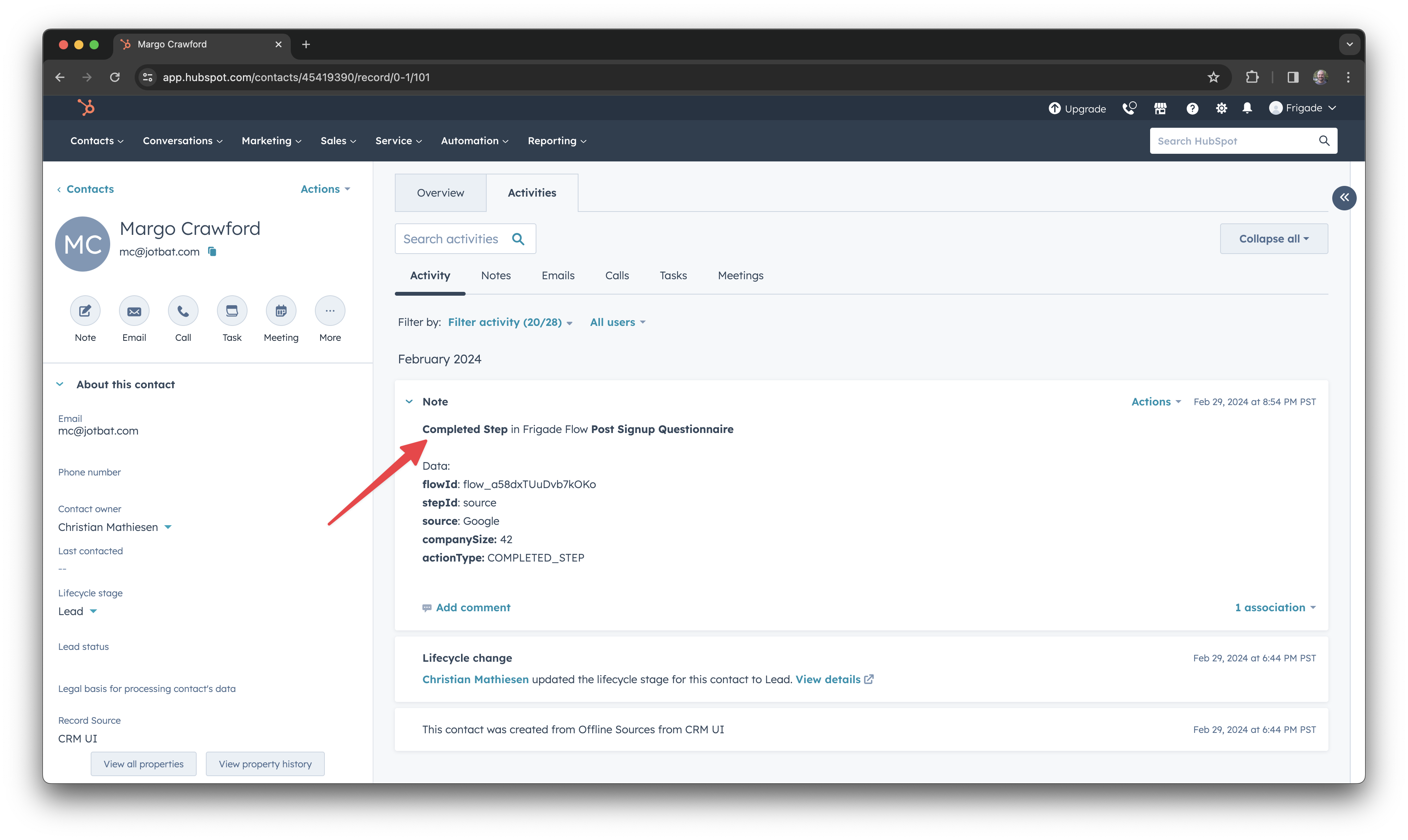
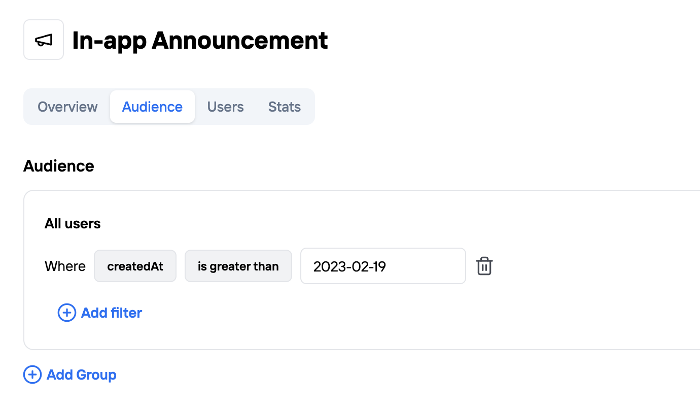 And that's it! Now your Flow will only be shown to users who signed up in the period you specified. If you already have audiences set up with another analytics tool, be sure to check out our [Integrations](/integrations) to connect and use them in Frigade.
---
# Source: https://docs.frigade.com/component/progress-badge.md
> ## Documentation Index
> Fetch the complete documentation index at: https://docs.frigade.com/llms.txt
> Use this file to discover all available pages before exploring further.
# Progress Badge
> Display a user's progress through a Flow
And that's it! Now your Flow will only be shown to users who signed up in the period you specified. If you already have audiences set up with another analytics tool, be sure to check out our [Integrations](/integrations) to connect and use them in Frigade.
---
# Source: https://docs.frigade.com/component/progress-badge.md
> ## Documentation Index
> Fetch the complete documentation index at: https://docs.frigade.com/llms.txt
> Use this file to discover all available pages before exploring further.
# Progress Badge
> Display a user's progress through a Flow
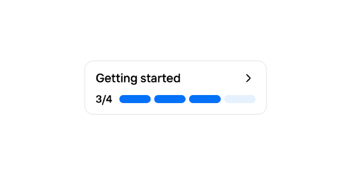
 ## About this component
The Progress Badge component is unlike other components in that it doesn't have its own Flow. It exists to remind a user where they left off in an existing Flow (e.g. Checklist), and to help get them jump back in and complete it.
## Demo
* See progress badges in action in our [live demo](https://demo.frigade.com/checklists)
## Installation
## About this component
The Progress Badge component is unlike other components in that it doesn't have its own Flow. It exists to remind a user where they left off in an existing Flow (e.g. Checklist), and to help get them jump back in and complete it.
## Demo
* See progress badges in action in our [live demo](https://demo.frigade.com/checklists)
## Installation
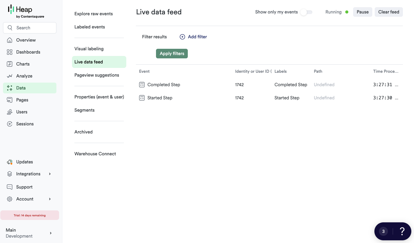
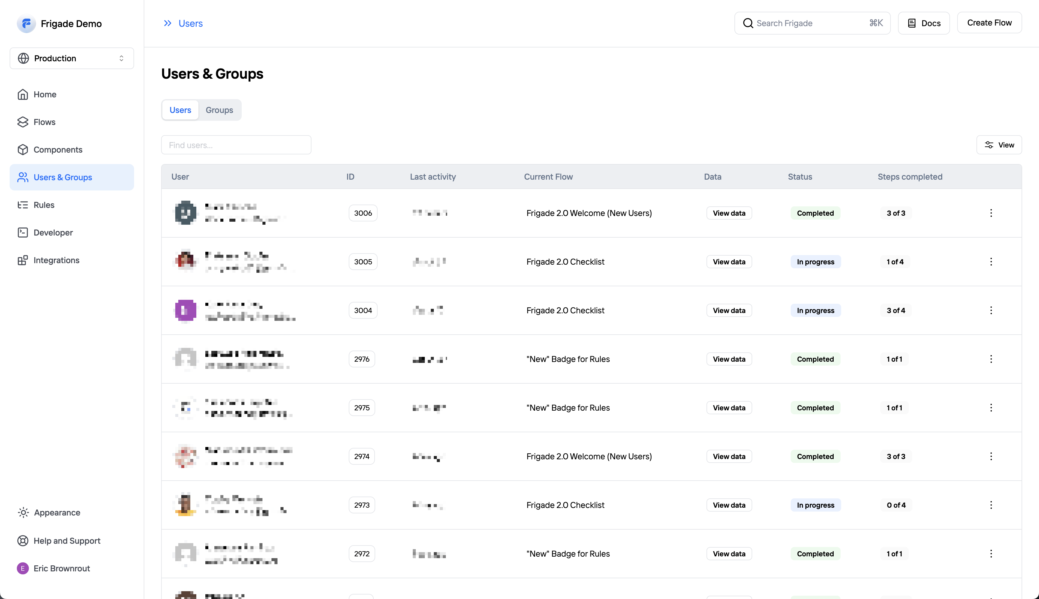
 **See users in the Flow**
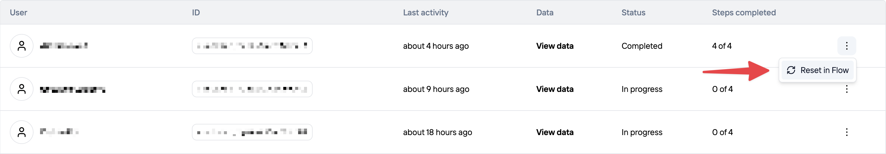
Once you interact with the Flow in your application, you should see your user appear in the users tab of the Flow detail page. You can reset a user's progress in the Flow from here, which is especially useful for testing.
**See users in the Flow**
Once you interact with the Flow in your application, you should see your user appear in the users tab of the Flow detail page. You can reset a user's progress in the Flow from here, which is especially useful for testing.
 Finally, set **Enable Batching?** to **Yes**. Optionally, you can send a test event to verify that the webhook is working. Click **Save** to save the webhook.
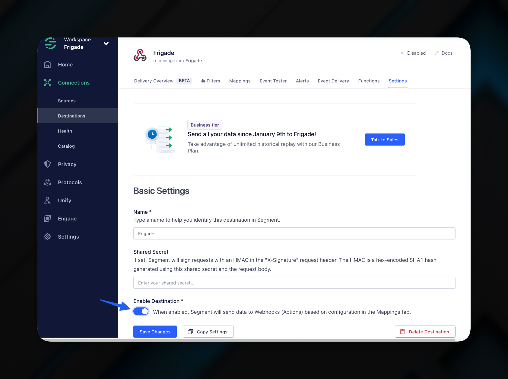 Congratulations! You have successfully set up Frigade as a destination for Segment. You can now use Frigade's [Targeting](/platform/targeting) with your Segment data to create personalized experiences for your users.
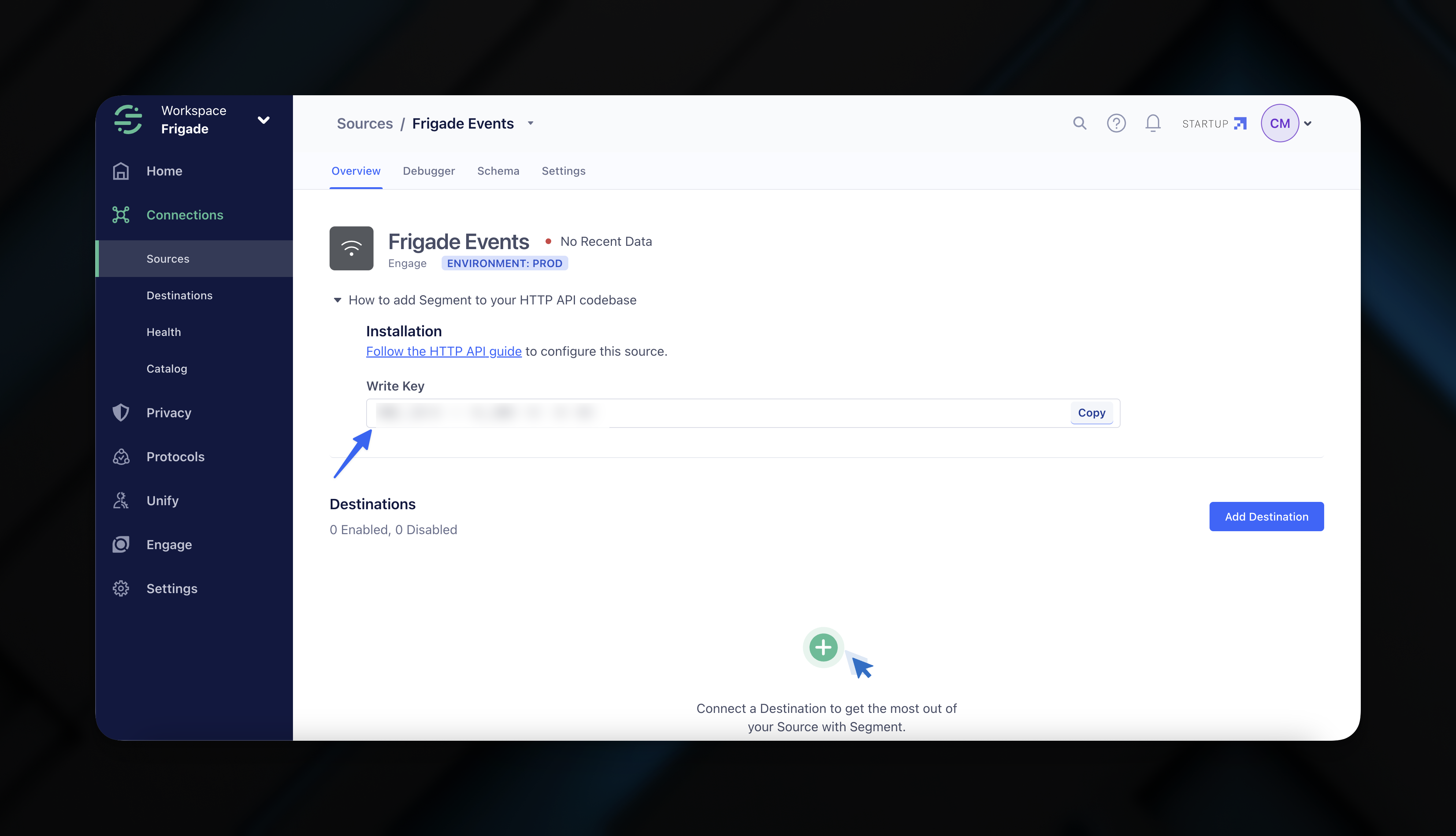
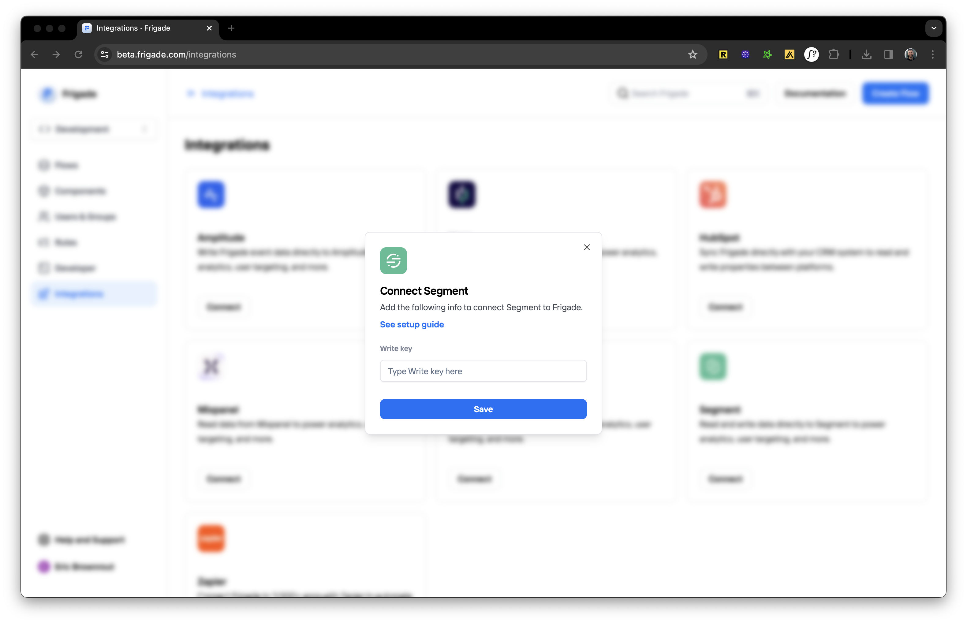 You will be asked to enter your Segment write key. Click **Connect** to save the integration. Shortly after, events will start streaming from Frigade in real-time.
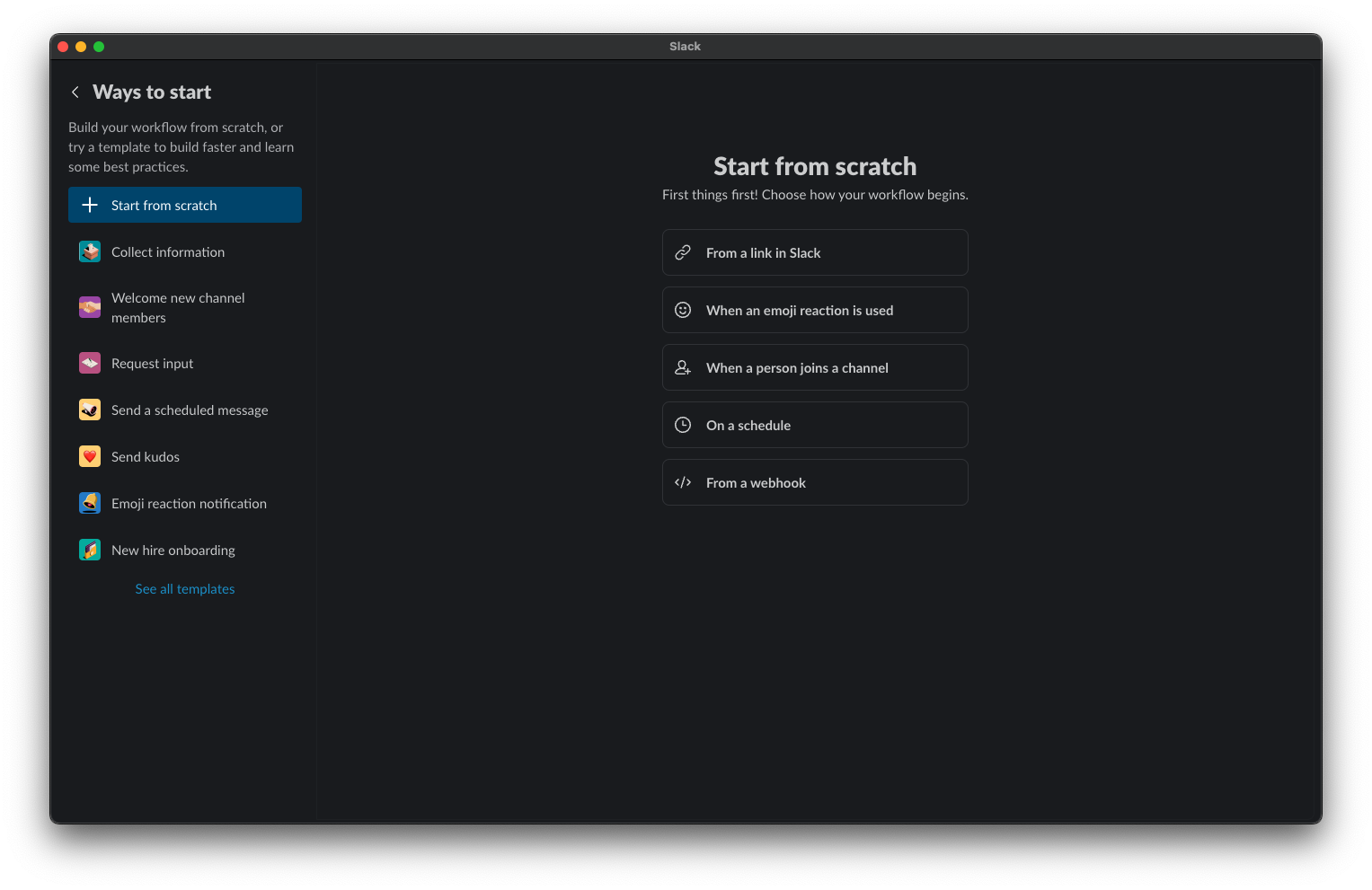
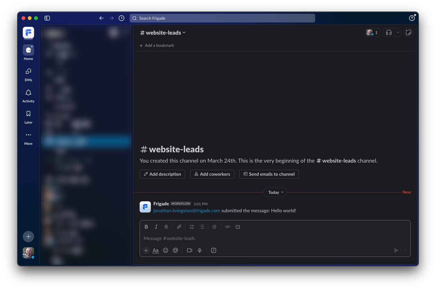
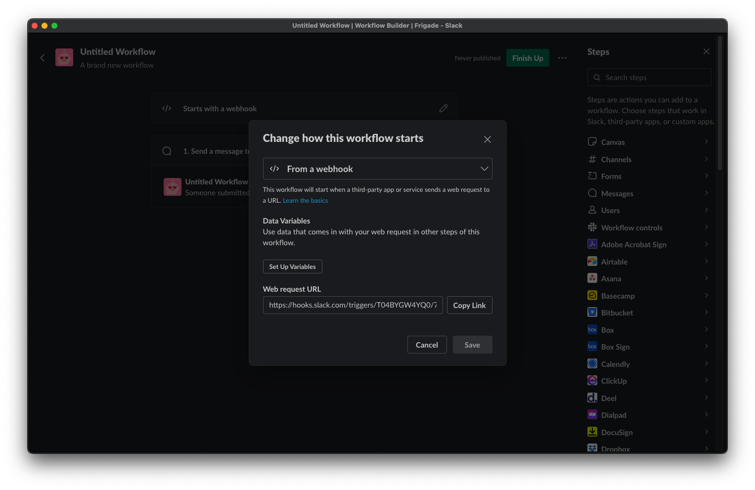 In the Frigade dashboard, navigate to the **Developer** section and click on **Webhooks**. Click the **New webhook** button and fill in the details as shown below with your Flow of choice. In this example, we use a simple [Form Flow](/component/form):
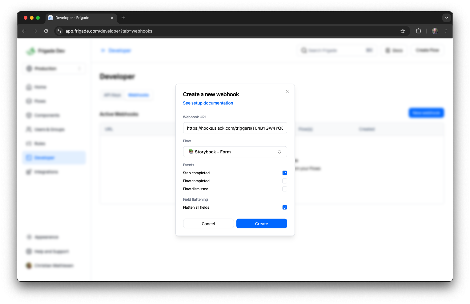
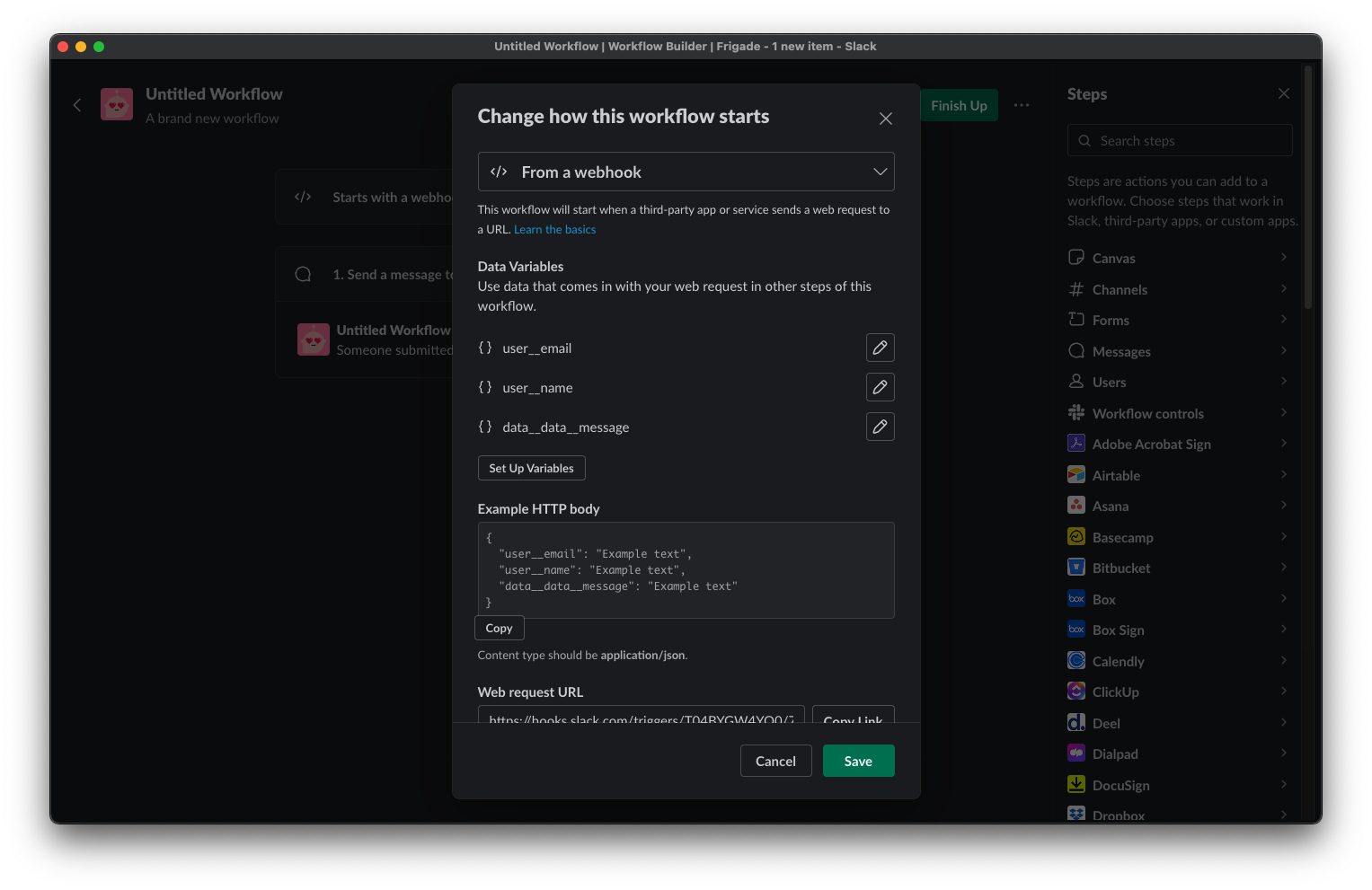 By default Frigade sends `user__email` and `user__name` for the given user if the data has been [provided in the SDK](/sdk/hooks/user). In this case, we also want to send the value of the `message` field from the Form Flow. To do this, we add a new variable `data__data__message` to map it to the field. You can target any field in a Frigade Form by prefixing the variable name with `data__data__`.
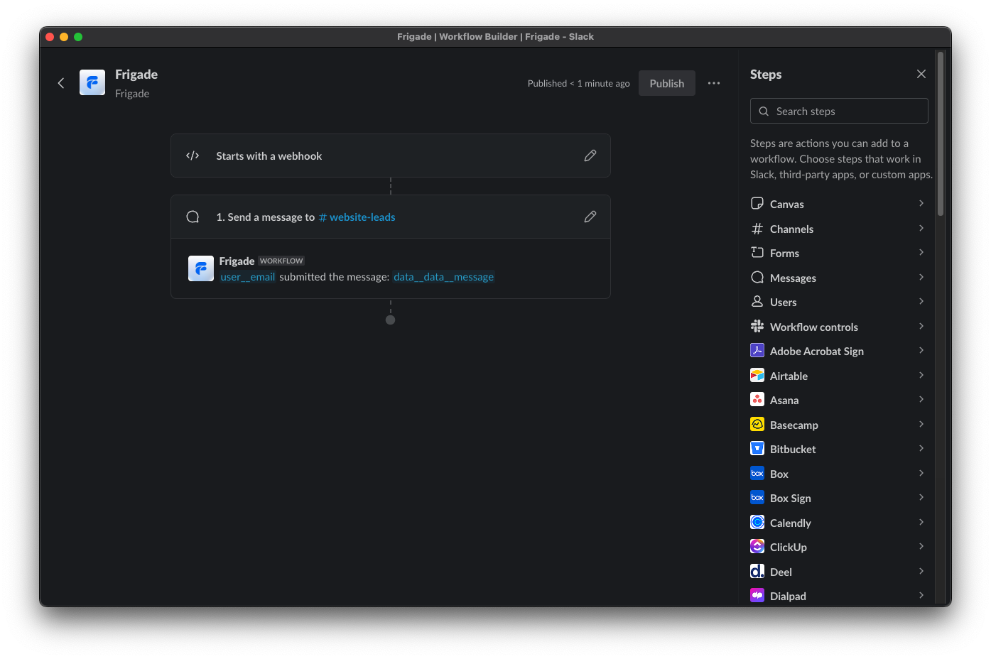 Finally, hit the **Publish** button in the top right corner to make your Slack Workflow live.
 After completing a step in the Frigade Flow, you should now see the following show up in your Slack channel:
 ### Example use cases
Here are some common ways we see developers using Flow targeting:
* Only show a Flow to newly created accounts
* Show a Flow to users with a certain job function or user property
* Show a Flow to users who have taken a specific action in the product (e.g. an upsell once they use something 10 times)
* Show a Flow to users who have completed another Flow (e.g. a "next steps" Flow after a user completes an initial onboarding Flow)
* Show a Flow only after X days have passed since completing another Flow
### Example use cases
Here are some common ways we see developers using Flow targeting:
* Only show a Flow to newly created accounts
* Show a Flow to users with a certain job function or user property
* Show a Flow to users who have taken a specific action in the product (e.g. an upsell once they use something 10 times)
* Show a Flow to users who have completed another Flow (e.g. a "next steps" Flow after a user completes an initial onboarding Flow)
* Show a Flow only after X days have passed since completing another Flow
 ### Example use cases
Here are some common ways we see developers using Step targeting:
* Mark a Step complete based on a condition [using steps\[\].completionCriteria](/sdk/advanced/completing-a-step#automatically-marking-steps-complete)
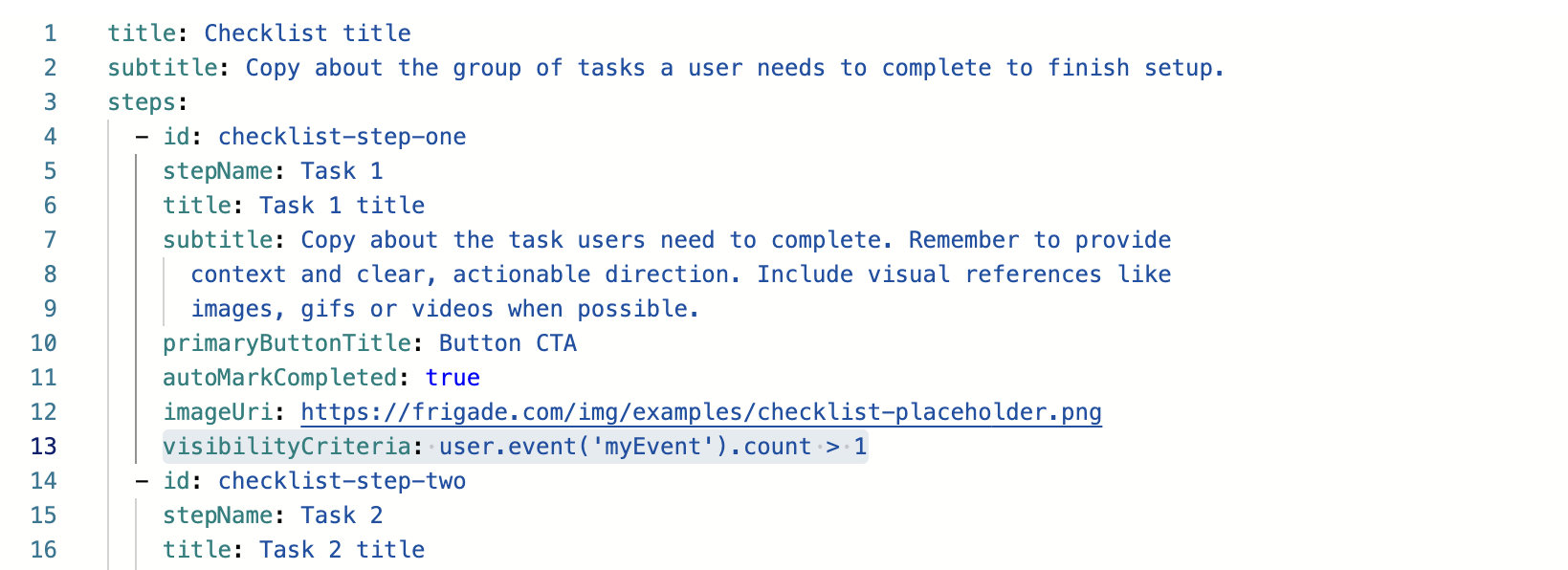
* Show or hide a Step based on a condition [using steps\[\].visibilityCriteria](/component/tour#flow-configuration)
* Mark a Step started based on a condition [using steps\[\].startCriteria](/component/tour#flow-configuration)
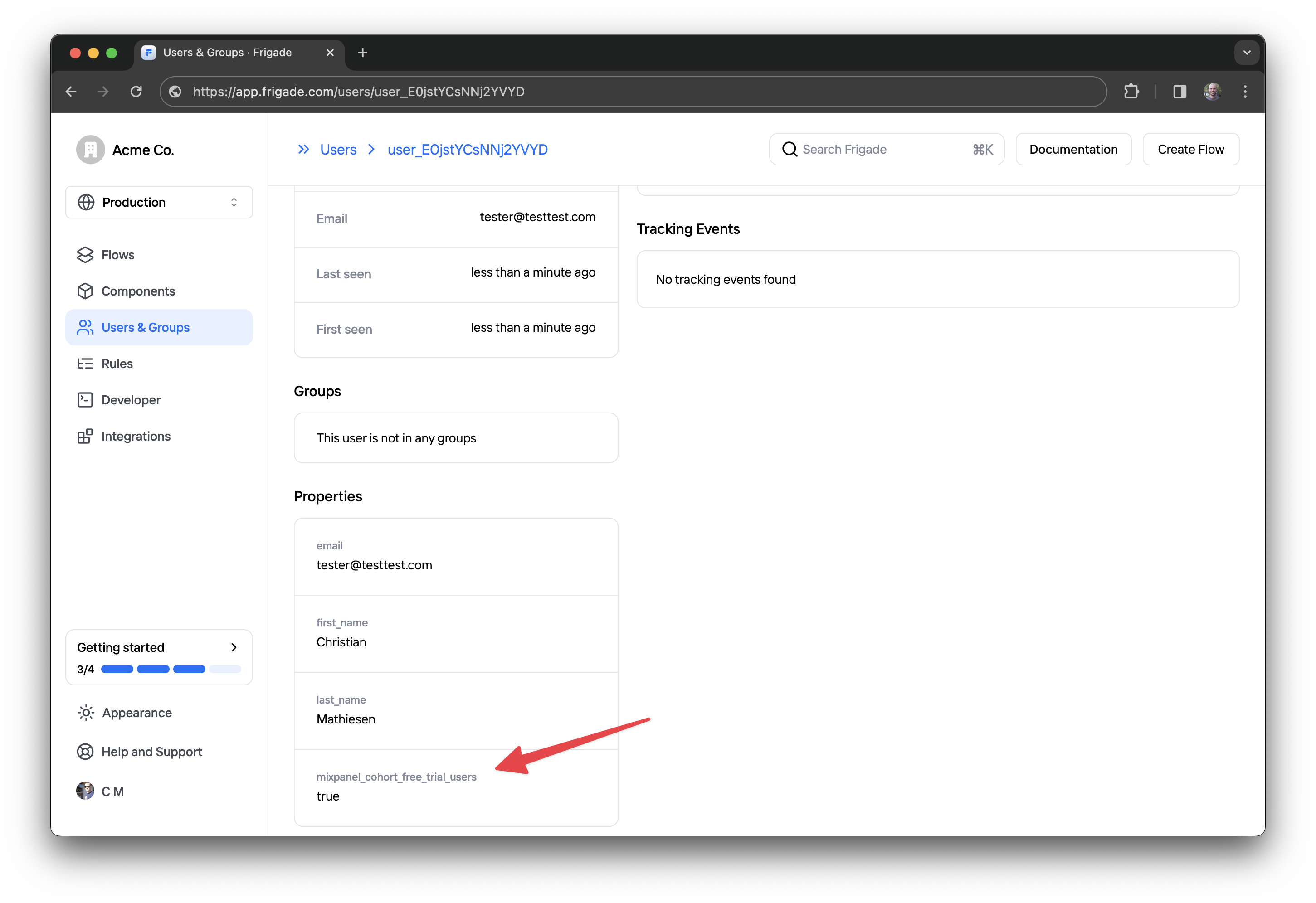
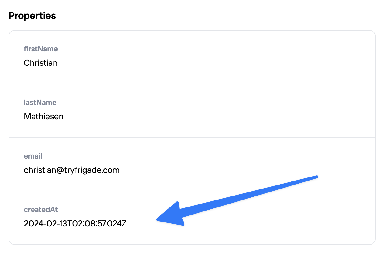
## User props
***
All data you've made available to Frigade can be used in your targeting logic, including the properties below supported on [users](/sdk/hooks/user). You can also sync with your [existing analytics platform](/integrations/) to leverage [user properties and events](/sdk/hooks/user) you're already tracking.
### Example use cases
Here are some common ways we see developers using Step targeting:
* Mark a Step complete based on a condition [using steps\[\].completionCriteria](/sdk/advanced/completing-a-step#automatically-marking-steps-complete)
* Show or hide a Step based on a condition [using steps\[\].visibilityCriteria](/component/tour#flow-configuration)
* Mark a Step started based on a condition [using steps\[\].startCriteria](/component/tour#flow-configuration)
## User props
***
All data you've made available to Frigade can be used in your targeting logic, including the properties below supported on [users](/sdk/hooks/user). You can also sync with your [existing analytics platform](/integrations/) to leverage [user properties and events](/sdk/hooks/user) you're already tracking.
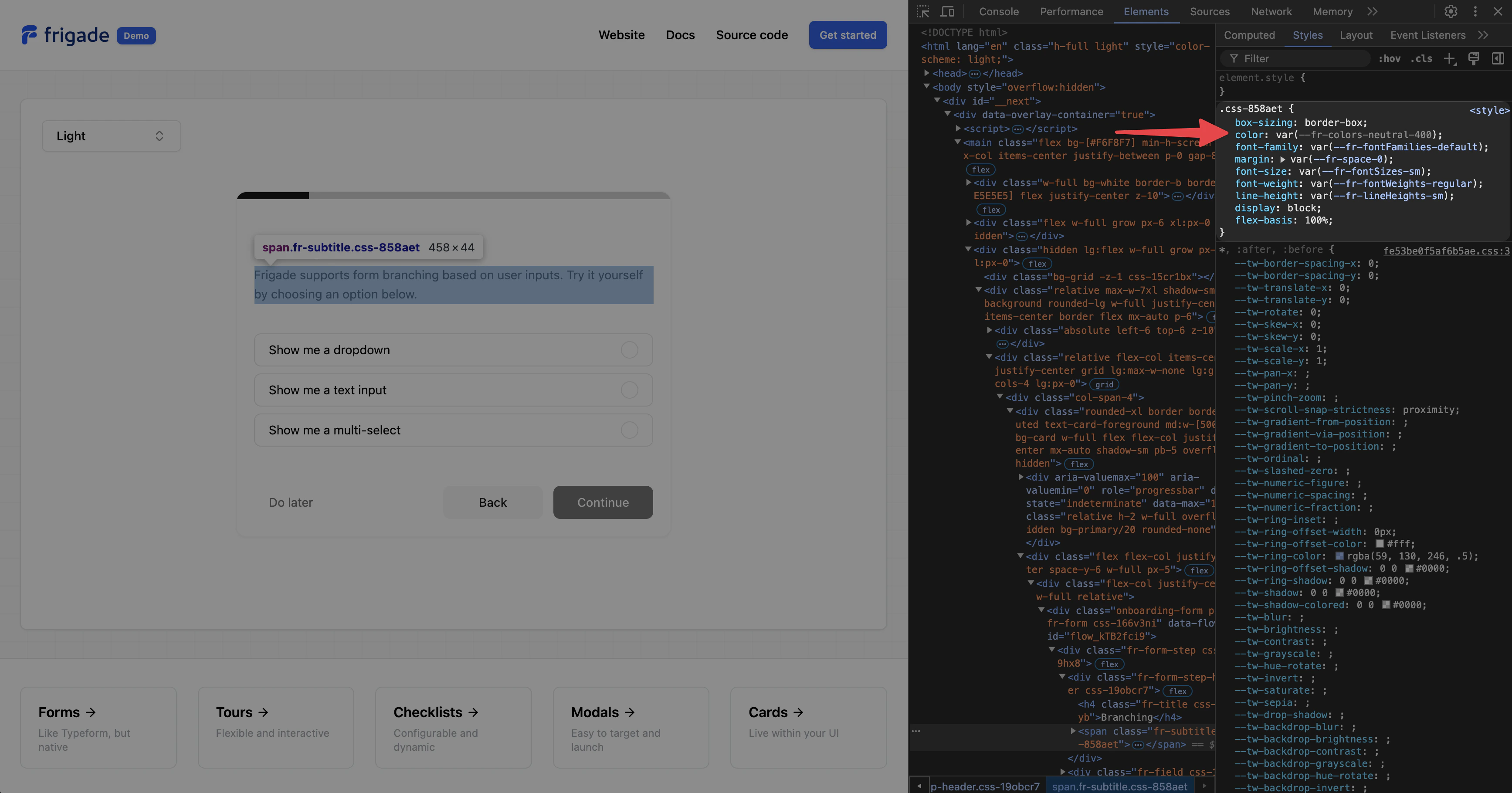 In the above example, we see that the theme variable is `--fr-colors-neutral-400`, which also corresponds to `colors.neutral.400` in the theme object.
---
# Source: https://docs.frigade.com/component/tour.md
> ## Documentation Index
> Fetch the complete documentation index at: https://docs.frigade.com/llms.txt
> Use this file to discover all available pages before exploring further.
# Tour
> Guide users through a specific product flow or feature
In the above example, we see that the theme variable is `--fr-colors-neutral-400`, which also corresponds to `colors.neutral.400` in the theme object.
---
# Source: https://docs.frigade.com/component/tour.md
> ## Documentation Index
> Fetch the complete documentation index at: https://docs.frigade.com/llms.txt
> Use this file to discover all available pages before exploring further.
# Tour
> Guide users through a specific product flow or feature
 ## About this component
The `Tour` component is a sequential walkthrough designed to guide users through in-app steps. While tours can be one of the most effective ways to onboard users, they can also be a bit controversial. A poorly designed tour can be frustrating, especially if it interrupts users when they have a task in mind. We’ve all been there—logging into an app only to be confronted by an intrusive tour that disrupts our focus. This often leads to users rushing to close or ignore the tour, resulting in a net negative experience.
**When to Use Tours:**
* **Product Onboarding:** Show new users around critical workflows to get started
* **Feature Launches:** Increase adoption of a new feature by showing users how it workflows
* **Ongoing Education:** Automatically trigger tours for users once they reach a certain usage threshold, or give users the ability to request a tour themselves if they get stuck
**Best Practices for Announcements:**
* **Opt-In Design:** Tours should ideally be opt-in. Asking users if they want guidance results in much higher engagement compared to forcing a tour upon them. Users can opt in from a checklist, announcement, inline card, or help hub.
* **Actionable Steps:** Avoid generic and obvious statements like “This is the X page.” Instead, make tours actionable by connecting them to actual user actions. For example, a step that completes only when a user enters specific input or successfully finishes a task.
* **Keep It Short:** Tours should be concise—avoid lengthy, 16-step tours that can overwhelm users.
* **Dismissible:** Generally, tours should be dismissible. Be cautious about creating a tour that cannot be closed.
* **Relaunch Hub:** If relevant, consider providing a hub where users can relaunch specific tours. This is helpful if they are not ready or don’t have time when prompted.
## Resources
* [Create your first product tour](/guides/tours) in just a few minutes
* See [industry examples](https://www.productonboarding.com/?type=tour) of tours
## Demo
* See tours in action in our [live demo](https://demo.frigade.com/tours)
## Installation
## About this component
The `Tour` component is a sequential walkthrough designed to guide users through in-app steps. While tours can be one of the most effective ways to onboard users, they can also be a bit controversial. A poorly designed tour can be frustrating, especially if it interrupts users when they have a task in mind. We’ve all been there—logging into an app only to be confronted by an intrusive tour that disrupts our focus. This often leads to users rushing to close or ignore the tour, resulting in a net negative experience.
**When to Use Tours:**
* **Product Onboarding:** Show new users around critical workflows to get started
* **Feature Launches:** Increase adoption of a new feature by showing users how it workflows
* **Ongoing Education:** Automatically trigger tours for users once they reach a certain usage threshold, or give users the ability to request a tour themselves if they get stuck
**Best Practices for Announcements:**
* **Opt-In Design:** Tours should ideally be opt-in. Asking users if they want guidance results in much higher engagement compared to forcing a tour upon them. Users can opt in from a checklist, announcement, inline card, or help hub.
* **Actionable Steps:** Avoid generic and obvious statements like “This is the X page.” Instead, make tours actionable by connecting them to actual user actions. For example, a step that completes only when a user enters specific input or successfully finishes a task.
* **Keep It Short:** Tours should be concise—avoid lengthy, 16-step tours that can overwhelm users.
* **Dismissible:** Generally, tours should be dismissible. Be cautious about creating a tour that cannot be closed.
* **Relaunch Hub:** If relevant, consider providing a hub where users can relaunch specific tours. This is helpful if they are not ready or don’t have time when prompted.
## Resources
* [Create your first product tour](/guides/tours) in just a few minutes
* See [industry examples](https://www.productonboarding.com/?type=tour) of tours
## Demo
* See tours in action in our [live demo](https://demo.frigade.com/tours)
## Installation
 ## In this guide
1. [Adding a Tour to your application](#adding-a-tour-to-your-application)
2. [Adding Hints to your application](#adding-hints-to-your-application)
3. [Tips and tricks](#tips-and-tricks)
## Adding a Tour to your application
## In this guide
1. [Adding a Tour to your application](#adding-a-tour-to-your-application)
2. [Adding Hints to your application](#adding-hints-to-your-application)
3. [Tips and tricks](#tips-and-tricks)
## Adding a Tour to your application
 This will log if a selector is not found on the current page.
### Controlling the z-index of Steps
By default, Steps are rendered with a z-index of 9999. To change this, you can use the `zIndex` prop on a Tour:
```tsx theme={"system"}
This will log if a selector is not found on the current page.
### Controlling the z-index of Steps
By default, Steps are rendered with a z-index of 9999. To change this, you can use the `zIndex` prop on a Tour:
```tsx theme={"system"}
 First, create a new Flow in the Frigade Dashboard by navigating to the **Flows** tab and clicking **Create Flow**. Select **Custom Flow** as the Flow type.
You can use any code you wish for the YAML configuration, however, we recommend starting with the following example:
```yaml theme={"system"}
steps:
# Only the id field is required per step.
- id: unique-step-id-1
title: Some title
# You can add any custom fields here.
# They will automatically be available in the Flow object.
foo: bar
- id: unique-step-id-2
title: Some title
- id: unique-step-id-3
title: Some title
```
We're now ready to wire in the frontend code. Start by simply importing the `useFlow` hook. We'll then use the hook to get the flow data and calculate the number of steps completed and the total number of steps:
```jsx theme={"system"}
import { useFlow } from '@frigade/react';
export function ProgressBadge() {
const flowId = 'flow_RgilNasCrSBQmrVM'; // Replace this with the Flow ID found in the Frigade dashboard
const { flow } = useFlow(flowId);
const stepsCompleted = flow?.getNumberOfCompletedSteps();
const totalSteps = flow?.getNumberOfAvailableSteps();
}
```
To see the full list of methods and fields in the `flow` object, see the [Flow API Reference](/sdk/js/flow).
Now, all we have left to do is to build the UI. We'll use the `Box` and `Text` components from the Frigade Engage React SDK to build the UI. We'll also use the `IconRender` component to render the ChevronRight icon from the `lucide-react` package:
```jsx theme={"system"}
import { Box, Text, useFlow } from '@frigade/react';
import { ChevronRight } from 'lucide-react';
export function ProgressBadge() {
const flowId = 'flow_RgilNasCrSBQmrVM';
const { flow } = useFlow(flowId);
const stepsCompleted = flow?.getNumberOfCompletedSteps();
const totalSteps = flow?.getNumberOfAvailableSteps();
if (!flow) {
return null;
}
// This flag is automatically set to false if the Flow is not visible to the user.
// Flows will automatically be hidden if the user has already
// finished the Flow or if they don't fit the audience.
if (!flow.isVisible) {
return null;
}
return (
First, create a new Flow in the Frigade Dashboard by navigating to the **Flows** tab and clicking **Create Flow**. Select **Custom Flow** as the Flow type.
You can use any code you wish for the YAML configuration, however, we recommend starting with the following example:
```yaml theme={"system"}
steps:
# Only the id field is required per step.
- id: unique-step-id-1
title: Some title
# You can add any custom fields here.
# They will automatically be available in the Flow object.
foo: bar
- id: unique-step-id-2
title: Some title
- id: unique-step-id-3
title: Some title
```
We're now ready to wire in the frontend code. Start by simply importing the `useFlow` hook. We'll then use the hook to get the flow data and calculate the number of steps completed and the total number of steps:
```jsx theme={"system"}
import { useFlow } from '@frigade/react';
export function ProgressBadge() {
const flowId = 'flow_RgilNasCrSBQmrVM'; // Replace this with the Flow ID found in the Frigade dashboard
const { flow } = useFlow(flowId);
const stepsCompleted = flow?.getNumberOfCompletedSteps();
const totalSteps = flow?.getNumberOfAvailableSteps();
}
```
To see the full list of methods and fields in the `flow` object, see the [Flow API Reference](/sdk/js/flow).
Now, all we have left to do is to build the UI. We'll use the `Box` and `Text` components from the Frigade Engage React SDK to build the UI. We'll also use the `IconRender` component to render the ChevronRight icon from the `lucide-react` package:
```jsx theme={"system"}
import { Box, Text, useFlow } from '@frigade/react';
import { ChevronRight } from 'lucide-react';
export function ProgressBadge() {
const flowId = 'flow_RgilNasCrSBQmrVM';
const { flow } = useFlow(flowId);
const stepsCompleted = flow?.getNumberOfCompletedSteps();
const totalSteps = flow?.getNumberOfAvailableSteps();
if (!flow) {
return null;
}
// This flag is automatically set to false if the Flow is not visible to the user.
// Flows will automatically be hidden if the user has already
// finished the Flow or if they don't fit the audience.
if (!flow.isVisible) {
return null;
}
return (
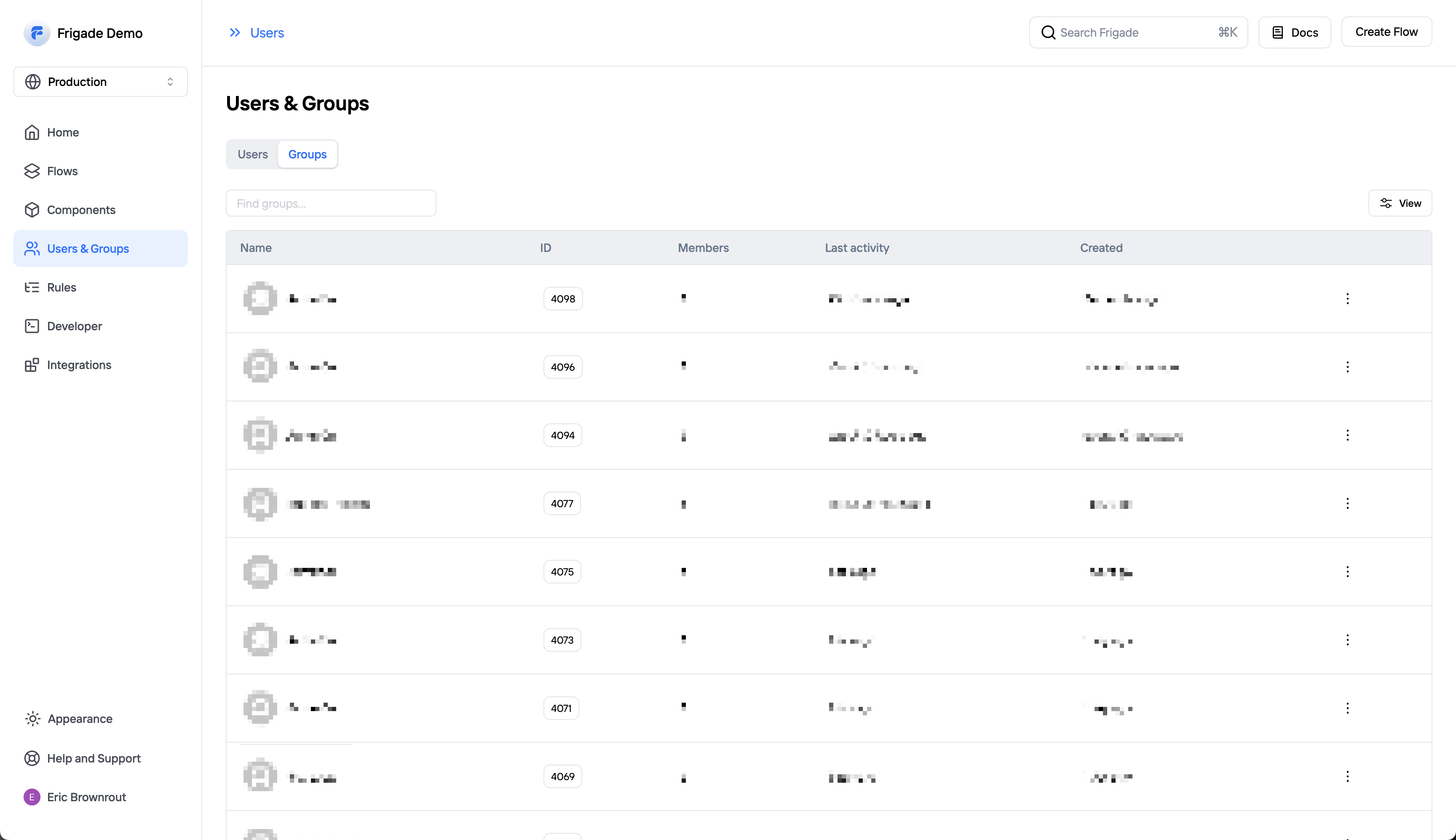
 ## Group Management
***
You can view all of your groups and their associated data on the groups page. Groups allows you to associate an individual user with a group (e.g. a company, organization, account, project, or team).
Groups will automatically show up in Frigade once they have been identified in your app (see [SDK](/sdk/hooks/group) or [API](/api-reference/groups) docs for more info).
The group detail page will show all of a group's members and where they are in your onboarding Flows. Groups are especially helpful if you have any tasks in your product that are shared across a group of users.
For example, you may want to implement a checklist with a Step that can be completed by any user in the group (e.g. connecting a third party API). You can use groups to ensure once that Step is completed by one user it will be completed for all users.
### Standardized Group Fields
When sending group properties to Frigade, the platform will automatically decorate the following fields on the group:
* `name`
* `imageUrl`
* `website`
## Group Management
***
You can view all of your groups and their associated data on the groups page. Groups allows you to associate an individual user with a group (e.g. a company, organization, account, project, or team).
Groups will automatically show up in Frigade once they have been identified in your app (see [SDK](/sdk/hooks/group) or [API](/api-reference/groups) docs for more info).
The group detail page will show all of a group's members and where they are in your onboarding Flows. Groups are especially helpful if you have any tasks in your product that are shared across a group of users.
For example, you may want to implement a checklist with a Step that can be completed by any user in the group (e.g. connecting a third party API). You can use groups to ensure once that Step is completed by one user it will be completed for all users.
### Standardized Group Fields
When sending group properties to Frigade, the platform will automatically decorate the following fields on the group:
* `name`
* `imageUrl`
* `website`
 ---
# Source: https://docs.frigade.com/api-reference/users/users-delete.md
> ## Documentation Index
> Fetch the complete documentation index at: https://docs.frigade.com/llms.txt
> Use this file to discover all available pages before exploring further.
# Delete a User
## OpenAPI
````yaml delete /v1/users
openapi: 3.0.0
info:
title: Frigade API
description: Official Frigade API documentation
version: '1.0'
contact: {}
servers: []
security: []
tags: []
paths:
/v1/users:
delete:
tags:
- users
summary: Delete a user by foreign id
operationId: UsersController_delete
parameters:
- name: foreignId
required: false
in: query
deprecated: true
description: Deprecated. Use userId instead.
schema:
type: string
- name: userId
required: true
in: query
description: The ID of the user
schema:
type: string
responses:
'200':
description: The user has been successfully deleted.
'404':
description: The user was not found.
security:
- bearer: []
components:
securitySchemes:
bearer:
scheme: bearer
bearerFormat: JWT
type: http
description: >-
Authentication header of the form `Bearer:
---
# Source: https://docs.frigade.com/api-reference/users/users-delete.md
> ## Documentation Index
> Fetch the complete documentation index at: https://docs.frigade.com/llms.txt
> Use this file to discover all available pages before exploring further.
# Delete a User
## OpenAPI
````yaml delete /v1/users
openapi: 3.0.0
info:
title: Frigade API
description: Official Frigade API documentation
version: '1.0'
contact: {}
servers: []
security: []
tags: []
paths:
/v1/users:
delete:
tags:
- users
summary: Delete a user by foreign id
operationId: UsersController_delete
parameters:
- name: foreignId
required: false
in: query
deprecated: true
description: Deprecated. Use userId instead.
schema:
type: string
- name: userId
required: true
in: query
description: The ID of the user
schema:
type: string
responses:
'200':
description: The user has been successfully deleted.
'404':
description: The user was not found.
security:
- bearer: []
components:
securitySchemes:
bearer:
scheme: bearer
bearerFormat: JWT
type: http
description: >-
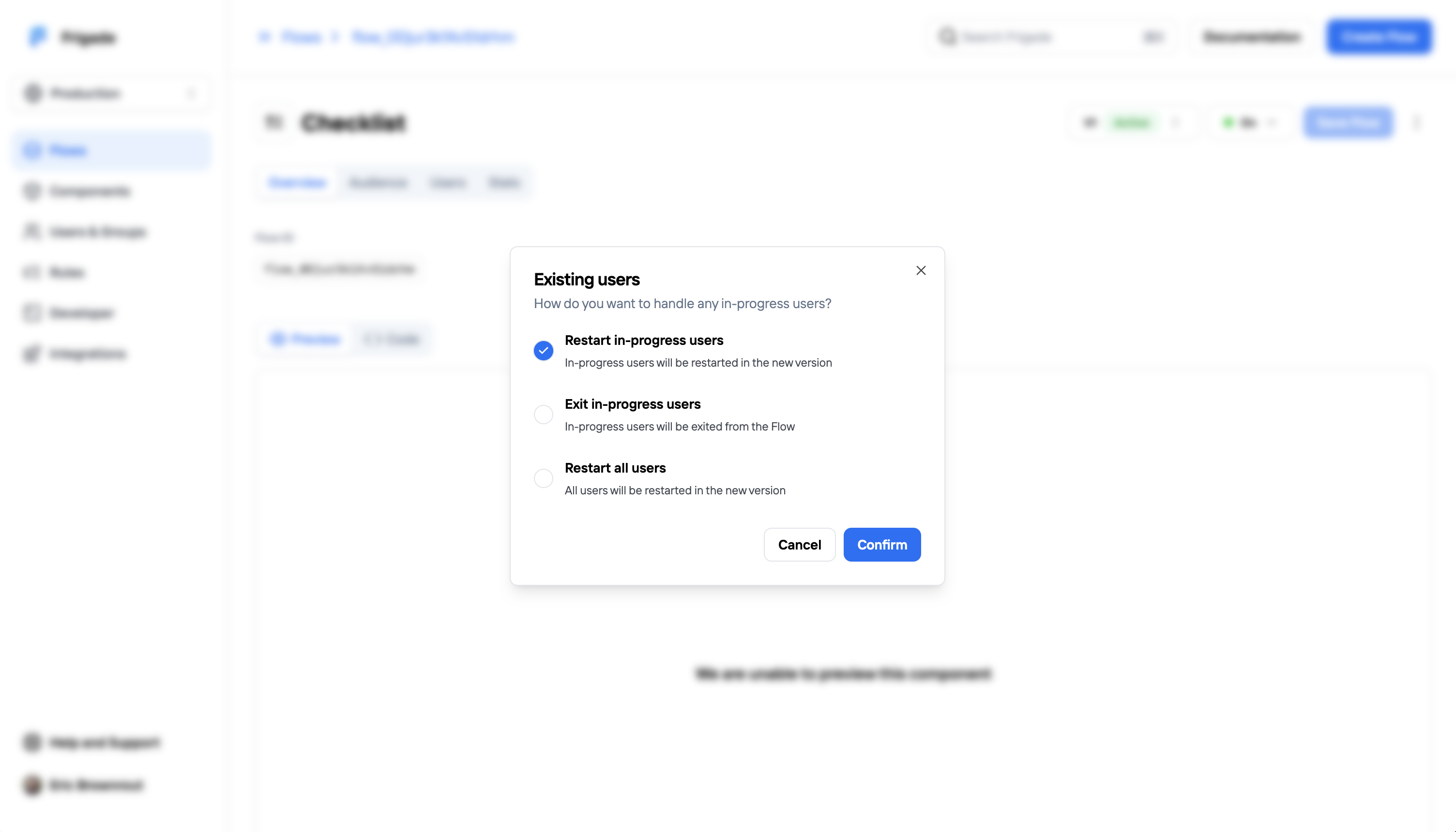
Authentication header of the form `Bearer: 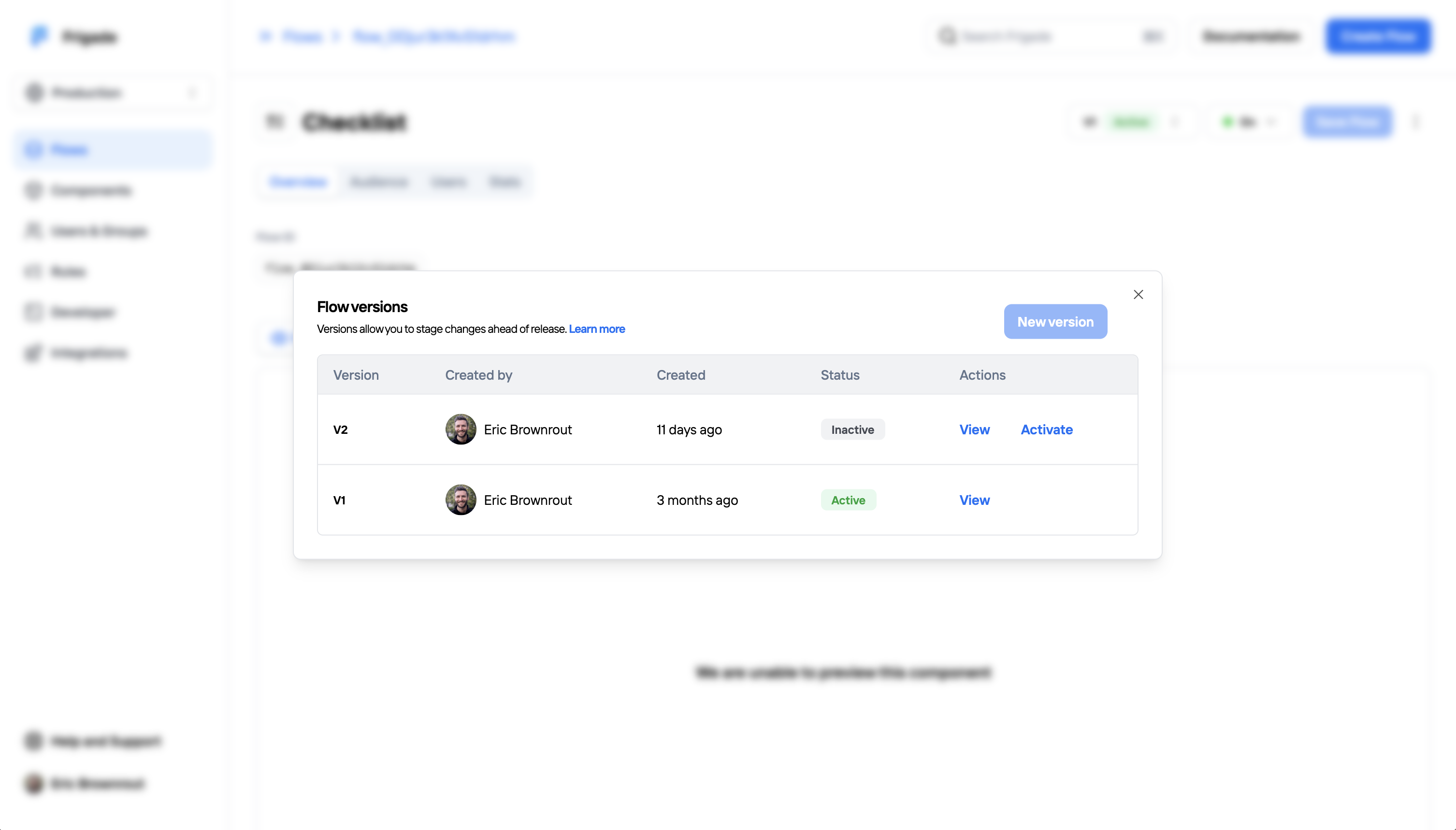 ## Activating a draft version
***
Once your draft version is ready to go live, click **Activate** to publish it. If there are existing users in your Flow, you will have a choice on how to transition users:
## Activating a draft version
***
Once your draft version is ready to go live, click **Activate** to publish it. If there are existing users in your Flow, you will have a choice on how to transition users:
 ## Old versions
***
Once a draft has been activated, old versions of the Flow become read-only. Analytics for old versions will be preserved and can be viewed by clicking the **View** button on an old version.
---
# Source: https://docs.frigade.com/api-reference/webhooks.md
> ## Documentation Index
> Fetch the complete documentation index at: https://docs.frigade.com/llms.txt
> Use this file to discover all available pages before exploring further.
# Webhooks
Webhooks allow you to receive notifications from Frigade when certain events occur.
You can use webhooks to receive notifications about your users when they start a Flow and as they progress through it.
## Creating a webhook
To add a new webhook, open the **Developer** page from the left sidebar, pick the **Webhooks** tab and click the "New webhook" button.
## Old versions
***
Once a draft has been activated, old versions of the Flow become read-only. Analytics for old versions will be preserved and can be viewed by clicking the **View** button on an old version.
---
# Source: https://docs.frigade.com/api-reference/webhooks.md
> ## Documentation Index
> Fetch the complete documentation index at: https://docs.frigade.com/llms.txt
> Use this file to discover all available pages before exploring further.
# Webhooks
Webhooks allow you to receive notifications from Frigade when certain events occur.
You can use webhooks to receive notifications about your users when they start a Flow and as they progress through it.
## Creating a webhook
To add a new webhook, open the **Developer** page from the left sidebar, pick the **Webhooks** tab and click the "New webhook" button.
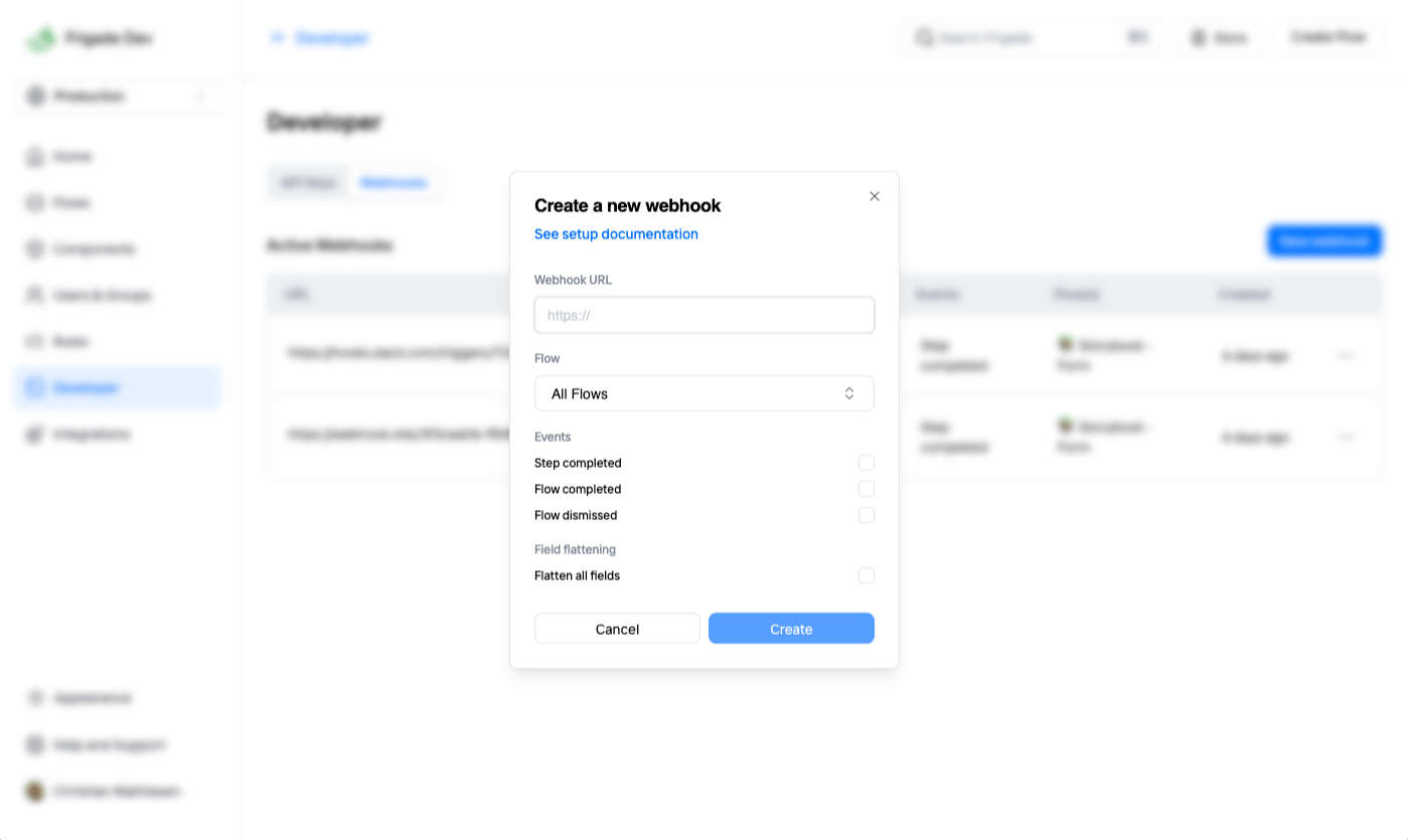 ## Supported events
The following events are currently supported:
## Supported events
The following events are currently supported: