({})`
If you encounter build issues after upgrade, try removing any manually specified generic types and let them be inferred.
### Theme type
It's now easier to provide a type for `Theme`. Instead of creating custom instances (like before) you can augment the builtin `Theme` interface like this:
```ts
import '@emotion/react'
declare module '@emotion/react' {
export interface Theme {
primaryColor: string
secondaryColor: string
}
}
```
### css prop types
The way in which we provide TypeScript support for the `css` prop has changed. Based on the usage of our JSX factories, we can add support for `css` prop only for components that support `className` prop (as our JSX factory functions take the provided `css` prop, resolve it and pass the generated `className` to the rendered component).
For the classic runtime this has been implemented using technique described [here](https://www.typescriptlang.org/docs/handbook/jsx.html#factory-functions). What is important - we no longer extend any global interfaces, so people shouldn't bump anymore into type conflicts for the `css` prop when using different libraries with `css` prop support, such as `styled-components`.
For the automatic runtime this has been implemented by exporting `JSX` namespace from the appropriate entries but this is only supported in **TypeScript 4.1 or higher**.
However, if you are stuck with older version of TypeScript or using the classic runtime implicitly by using our `@emotion/babel-preset-css-prop` then it's not possible to leverage `css` prop support being added conditionally based on a type of rendered component. For those cases we have added a special file that can be imported once to add support for the `css` prop globally, for all components. Use it like this:
```ts
///
```
In this particular case we are forced to extend the existing `React.Attributes` interface. Previously we've been extending both `React.DOMAttributes` and `JSX.IntrinsicAttributes`. This change is really minor and shouldn't affect any consuming code.
## Stylis v4
The parser we use ([Stylis](https://github.com/thysultan/stylis.js)) got upgraded. It fixes some long-standing parsing edge cases while being smaller and faster 🚀
It has been completely rewritten and comes with some breaking changes. The most notable ones that might affect Emotion users are:
- plugins written for the former Stylis v3 are not compatible with the new version. To learn more on how to write a plugin for Stylis v4 you can check out its [README](https://github.com/thysultan/stylis.js#middleware) and the source code of core plugins.
- vendor-prefixing was previously customizable using `prefix` option. This was always limited to turning off all of some of the prefixes as all available prefixes were on by default. The `prefix` option is gone and to customize which prefixes are applied you need to fork (copy-paste) the prefixer plugin and adjust it to your needs. While this being somewhat more problematic to setup at first we believe that the vast majority of users were not customizing this anyway. By not including the possibility to customize this through an extra option the final solution is more performant because there is no extra overhead of checking if a particular property should be prefixed or not.
- the prefixer is now just a plugin which happens to be included in the default `stylisPlugins`. If you plan to use custom `stylisPlugins` and you want to have your styles prefixed automatically you must include prefixer in your custom `stylisPlugins`. You can import `prefixer` from the `stylis` module to do that.
- `@import` rules are no longer special-cased. The responsibility to put them first has been moved to the author of the styles. They also can't be nested within other rules now. It's only possible to write them at the top level of global styles.
## Emotion's caches
The `key` option is now required when creating a custom instance of a cache. Please make sure it's unique (and not equal to `'css'`) as it's used for linking styles to your cache. If multiple caches share the same key they might "fight" for each other's style elements.
The new `prepend` option can make Emotion add style tags at the beginning of the specified DOM container instead of the end.
## Other
There are a lot of less substantial changes than what has been described here, some of them might even be breaking changes but are not relevant to the majority of users. Therefore to learn more about all of the changes please read through the full list of changes contained in the respective changelogs:
[`@emotion/babel-plugin`](https://github.com/emotion-js/emotion/blob/main/packages/babel-plugin/CHANGELOG.md#1100)
[`@emotion/babel-preset-css-prop`](https://github.com/emotion-js/emotion/blob/main/packages/babel-preset-css-prop/CHANGELOG.md#1100)
[`@emotion/cache`](https://github.com/emotion-js/emotion/blob/main/packages/cache/CHANGELOG.md#1100)
[`@emotion/css`](https://github.com/emotion-js/emotion/blob/main/packages/css/CHANGELOG.md#1100)
[`@emotion/eslint-plugin`](https://github.com/emotion-js/emotion/blob/main/packages/eslint-plugin/CHANGELOG.md#1100)
[`@emotion/is-prop-valid`](https://github.com/emotion-js/emotion/blob/main/packages/is-prop-valid/CHANGELOG.md#100)
[`@emotion/jest`](https://github.com/emotion-js/emotion/blob/main/packages/jest/CHANGELOG.md#1100)
[`@emotion/native`](https://github.com/emotion-js/emotion/blob/main/packages/native/CHANGELOG.md#1100)
[`@emotion/primitives-core`](https://github.com/emotion-js/emotion/blob/main/packages/primitives-core/CHANGELOG.md#1100)
[`@emotion/primitives`](https://github.com/emotion-js/emotion/blob/main/packages/primitives/CHANGELOG.md#1100)
[`@emotion/react`](https://github.com/emotion-js/emotion/blob/main/packages/react/CHANGELOG.md#1100)
[`@emotion/serialize`](https://github.com/emotion-js/emotion/blob/main/packages/serialize/CHANGELOG.md#100)
[`@emotion/server`](https://github.com/emotion-js/emotion/blob/main/packages/server/CHANGELOG.md#1100)
[`@emotion/sheet`](https://github.com/emotion-js/emotion/blob/main/packages/sheet/CHANGELOG.md#100)
[`@emotion/styled`](https://github.com/emotion-js/emotion/blob/main/packages/styled/CHANGELOG.md#1100)
[`@emotion/utils`](https://github.com/emotion-js/emotion/blob/main/packages/utils/CHANGELOG.md#100)
---
# Emotion Documentation
# Source: https://raw.githubusercontent.com/emotion-js/emotion/main/docs/eslint-plugin-react.mdx
# Path: docs/eslint-plugin-react.mdx
---
title: 'eslint-plugin-react'
---
The [`react/no-unknown-property` rule](https://github.com/jsx-eslint/eslint-plugin-react/blob/master/docs/rules/no-unknown-property.md) from [eslint-plugin-react](https://github.com/jsx-eslint/eslint-plugin-react) will produce an error if the `css` prop is passed to a DOM element. This violation of the rule can be safely ignored because `@emotion/react` intercepts the `css` prop before it is applied to the DOM element.
The rule can be configured to ignore the `css` prop like so:
```json
{
"rules": {
"react/no-unknown-property": ["error", { "ignore": ["css"] }]
}
}
```
---
# Emotion Documentation
# Source: https://raw.githubusercontent.com/emotion-js/emotion/main/docs/extract-static.mdx
# Path: docs/extract-static.mdx
---
title: 'Extract Static'
---
# Static Extraction has been removed from Emotion, this page only exists to explain the decision
###### [requires babel plugin](/docs/babel.mdx)
## DEPRECATED
extractStatic is deprecated and will be removed in emotion@10. We recommend disabling extractStatic or using other libraries like [linaria](https://github.com/callstack-io/linaria) or [css-literal-loader](https://github.com/4Catalyzer/css-literal-loader).
### Why is extractStatic being deprecated?
Static extraction was made for earlier versions of emotion which had a very different architecture to the architecture emotion has today. As emotion has gotten more performant and features such as [composition](/docs/composition.mdx) have been added, static extraction has become less important. Because most of the community is leveraging the composition and `extractStatic` is rarely used, the time spent maintaining `extractStatic` is much higher than the benefits we get from it. Libraries such as [linaria](https://github.com/callstack-io/linaria) and [css-literal-loader](https://github.com/4Catalyzer/css-literal-loader) do static extraction well and the people working on them are focused on this specific problem. As a team, we believe that projects like [prepack](https://github.com/facebook/prepack), when they are ready, will provide a better and more powerful way to pre-compile styles.
The `extractStatic` option to `babel-plugin-emotion` allows you to extract styles with no interpolations into external css files. **`extractStatic` is not recommended** because it **breaks [composition](/docs/composition.mdx)** and other powerful patterns from libraries like [facepaint](https://github.com/emotion-js/facepaint).
**If you want to use dynamic values you must use css variables.**
```javascript
const Button = styled('button')`
background-color: var(--bg);
padding: 10px;
`
```
Configure babel
```bash
yarn add --dev babel-plugin-emotion
```
**.babelrc**
```json
{
"plugins": [["emotion", { "extractStatic": true }]]
}
```
This js file, `h1.js`
```jsx
import styled from 'react-emotion'
const H1 = styled('h1')`
color: #ffd43b;
`
```
During babel compilation emotion will create `h1.emotion.css` and add `import './h1.emotion.css'` to the top of `h1.js`
```css
/* h1.emotion.css */
.css-H1-duiy4a {
color: blue;
}
```
`h1.js` after babel compilation
```jsx
import './h1.emotion.css'
import styled from 'react-emotion'
const H1 = styled('h1', {
e: 'css-duiy4a'
})()
```
---
# Emotion Documentation
# Source: https://raw.githubusercontent.com/emotion-js/emotion/main/docs/for-library-authors.mdx
# Path: docs/for-library-authors.mdx
---
title: 'For Library Authors'
---
**If you are writing a component library, carefully consider whether your library will depend on Emotion.** A simple alternative is to include a regular CSS file in your package, which your users bring in via a normal `import` statement.
If you're reading this, you probably know about Emotion's many benefits. **Here are some drawbacks to consider:**
- Consuming applications will have to use the same version of Emotion as the library. There will be issues if, for example, your library depends on Emotion 11 but a user's application depends on Emotion 10.
- If your package only contains a handful of small components, Emotion may significantly increase your package's bundle size.
- Emotion may be more error prone than a simple CSS file in certain edge cases. For example, in a previous version of [react-loading-skeleton](https://github.com/dvtng/react-loading-skeleton) which utilized Emotion 10, we received reports of styles not working in production builds, iframes, and the shadow DOM.
If you do choose to use Emotion in your library, it is best to list the Emotion packages as **peer dependencies** in your `package.json`. This ensures that your library and the consuming application get the same instance of each Emotion package.
---
# Emotion Documentation
# Source: https://raw.githubusercontent.com/emotion-js/emotion/main/docs/globals.mdx
# Path: docs/globals.mdx
---
title: 'Global Styles'
---
Sometimes you might want to insert global css like resets or font faces. You can use the `Global` component to do this. It accepts a `styles` prop which accepts the same values as the `css` prop except it inserts styles globally. Global styles are also removed when the styles change or when the Global component unmounts.
```jsx
// @live
import { Global, css } from '@emotion/react'
render(
)
```
---
# Emotion Documentation
# Source: https://raw.githubusercontent.com/emotion-js/emotion/main/docs/install.mdx
# Path: docs/install.mdx
---
title: 'Install'
---
There are lots of ways to use Emotion, if you're using React, the easiest way to get started is to use the [`@emotion/react` package](/packages/react). If you're not using React, you should use [the `@emotion/css` package](#vanilla).
```bash
yarn add @emotion/react
```
or if you prefer npm
```bash
npm install --save @emotion/react
```
To use it, import what you need, for example use [the css prop](/docs/css-prop.mdx) to create class names with styles.
```jsx
// @live
import { css } from '@emotion/react'
const style = css`
color: hotpink;
`
const SomeComponent = ({ children }) => (
Some hotpink text.
{children}
)
const anotherStyle = css({
textDecoration: 'underline'
})
const AnotherComponent = () => (
Some text with an underline.
)
render(
)
```
## With [`styled`](/docs/styled.mdx)
`styled` is a way to create React components that have styles attached to them.
```bash
# assuming you already have @emotion/react installed
yarn add @emotion/styled
```
or if you prefer npm
```bash
npm install --save @emotion/styled
```
```jsx
// @live
import styled from '@emotion/styled'
const Button = styled.button`
color: hotpink;
`
render()
```
## With [`@emotion/babel-plugin`](/packages/babel-plugin)
> Note:
>
> If you're using Create React App, you can use the [Babel macro](/docs/babel-macros.mdx)
Emotion has an optional [Babel](https://babeljs.io/) plugin that optimizes styles by compressing and hoisting them and creates a better developer experience with source maps and labels.
```bash
yarn add --dev @emotion/babel-plugin
```
or if you prefer npm
```bash
npm install --save-dev @emotion/babel-plugin
```
## .babelrc
_`"emotion"` must be the **first plugin** in your babel config `plugins` list._
```json
{
"plugins": ["@emotion"]
}
```
If you are using Babel's env option emotion must also be first for each environment.
```json
{
"env": {
"production": {
"plugins": ["@emotion", ...otherBabelPlugins]
}
},
"plugins": ["@emotion"]
}
```
## Vanilla
If you're not using React, you can use vanilla Emotion from the `@emotion/css` package. Most of the documentation here focuses on the React-specific version of Emotion, but most of the concepts in the React-specific version also apply to vanilla Emotion.
```bash
yarn add @emotion/css
```
```jsx
import { css } from '@emotion/css'
const app = document.getElementById('root')
const myClassName = css`
color: hotpink;
`
app.classList.add(myClassName)
```
---
# Emotion Documentation
# Source: https://raw.githubusercontent.com/emotion-js/emotion/main/docs/introduction.mdx
# Path: docs/introduction.mdx
---
title: 'Introduction'
---
Emotion is a library designed for writing css styles with JavaScript. It provides powerful and predictable style composition in addition to a great developer experience with features such as source maps, labels, and testing utilities. Both string and object styles are supported.
---
There are two primary methods of using Emotion. The first is framework agnostic and the second is for use with React.
### Framework Agnostic
```bash
npm i @emotion/css
```
**[`@emotion/css` documentation](https://emotion.sh/docs/@emotion/css)**
The [@emotion/css](https://www.npmjs.com/package/@emotion/css) package is framework agnostic and the simplest way to use Emotion.
- Requires no additional setup, babel plugin, or other config changes.
- Has support for auto vendor-prefixing, nested selectors, and media queries.
- You simply prefer to use the `css` function to generate class names and `cx` to compose them.
- Server side rendering requires [additional work to set up](/docs/ssr.mdx#api)
```jsx
// @live
import { css } from '@emotion/css'
const color = 'white'
render(
Hover to change color.
)
```
### React
```bash
npm i @emotion/react
```
The [@emotion/react](https://www.npmjs.com/package/@emotion/react) package requires React and is recommended for users of that framework if possible.
- Best when using React with a build environment that can be configured.
- `css` prop support
- Similar to the `style` prop, but also has support for auto vendor-prefixing, nested selectors, and media queries.
- Allows developers to skip the `styled` API abstraction and style components and elements directly.
- The `css` prop also accepts a function that is called with your theme as an argument allowing developers easy access to common and customizable values.
- Reduces boilerplate when composing components and styled with emotion.
- Server side rendering with zero configuration.
- Theming works out of the box.
- ESLint plugins available to ensure proper patterns and configuration are set.
**[`@emotion/react` css prop documentation](/docs/css-prop.mdx)**
```jsx
// @live
import { css } from '@emotion/react'
const color = 'white'
render(
Hover to change color.
)
```
```bash
npm i @emotion/styled @emotion/react
```
The [@emotion/styled](https://www.npmjs.com/package/@emotion/styled) package is for those who prefer to use the `styled.div` style API for creating components.
**[`@emotion/styled` documentation](/docs/styled.mdx)**
```jsx
// @live
import styled from '@emotion/styled'
const Button = styled.button`
padding: 32px;
background-color: hotpink;
font-size: 24px;
border-radius: 4px;
color: black;
font-weight: bold;
&:hover {
color: white;
}
`
render()
```
### Browser requirements
Emotion supports all popular browsers and Internet Explorer 11.
### Libraries that Inspired Us
- ["original" glam](https://github.com/threepointone/glam/tree/e9bca3950f12503246ed7fccad5cf13e5e9c86e3)
- [glam](https://github.com/threepointone/glam)
- [glamor](https://github.com/threepointone/glamor)
- [styled-components](https://www.styled-components.com/)
- [glamorous](https://glamorous.rocks)
---
# Emotion Documentation
# Source: https://raw.githubusercontent.com/emotion-js/emotion/main/docs/keyframes.mdx
# Path: docs/keyframes.mdx
---
title: 'Keyframes'
---
You can define animations using the `keyframes` helper from `@emotion/react`. `keyframes` takes in a css keyframe definition and returns an object you can use in styles. You can use strings or objects just like `css`.
```jsx
// @live
import { css, keyframes } from '@emotion/react'
const bounce = keyframes`
from, 20%, 53%, 80%, to {
transform: translate3d(0,0,0);
}
40%, 43% {
transform: translate3d(0, -30px, 0);
}
70% {
transform: translate3d(0, -15px, 0);
}
90% {
transform: translate3d(0,-4px,0);
}
`
render(
some bouncing text!
)
```
---
# Emotion Documentation
# Source: https://raw.githubusercontent.com/emotion-js/emotion/main/docs/labels.mdx
# Path: docs/labels.mdx
---
title: 'Labels'
---
Emotion adds a CSS property called `label` which is appended to the generated class name to make it more readable. `@emotion/babel-plugin` adds these labels automatically based on the variable name and other information, so they don't need to be manually specified.
```jsx
// @live
import { css } from '@emotion/react'
let style = css`
color: hotpink;
label: some-name;
`
let anotherStyle = css({
color: 'lightgreen',
label: 'another-name'
})
let ShowClassName = ({ className }) => (
{className}
)
render(
)
```
## Automatic Labeling at Runtime
If you are not using `@emotion/babel-plugin`, you can still get automatic labels in development by setting the following global flag:
```js
globalThis.EMOTION_RUNTIME_AUTO_LABEL = true
```
This feature is opt-in because:
- If you use server-side rendering and test your site in Safari, you may get spurious hydration warnings because the label computed on the server does not match the label computed in Safari.
- This feature may degrade performance if the number of elements using the `css` prop is very large.
---
# Emotion Documentation
# Source: https://raw.githubusercontent.com/emotion-js/emotion/main/docs/media-queries.mdx
# Path: docs/media-queries.mdx
---
title: 'Media Queries'
---
Using media queries in emotion works just like using media queries in regular css except you don't have to specify a selector inside the block, you can put your css directly in the css block.
```jsx
// @live
import { css } from '@emotion/react'
render(
Some text!
)
```
## Reusable Media Queries
Media queries can be useful to create responsive apps but repeating them is annoying and can lead to inconsistencies. Instead of rewriting them each time you use them, you can move them into constants and refer to the variable each time you want to use them like this.
```jsx
// @live
import { css } from '@emotion/react'
const breakpoints = [576, 768, 992, 1200]
const mq = breakpoints.map(bp => `@media (min-width: ${bp}px)`)
render(
Some text!
Some other text!
)
```
### facepaint
While defining media queries in constants is much easier than rewriting media queries each time, they're still quite verbose since you usually want to change the same property at different breakpoints. [facepaint](https://github.com/emotion-js/facepaint) makes this easier by allowing you to define what each css property should be at each media query as an array.
> Note:
>
> `facepaint` only works with object styles.
```bash
yarn add facepaint
# or if you use npm
npm install --save facepaint
```
```jsx
// @live
import facepaint from 'facepaint'
const breakpoints = [576, 768, 992, 1200]
const mq = facepaint(breakpoints.map(bp => `@media (min-width: ${bp}px)`))
render(
Some text.
)
```
---
# Emotion Documentation
# Source: https://raw.githubusercontent.com/emotion-js/emotion/main/docs/migrating-to-emotion-10.mdx
# Path: docs/migrating-to-emotion-10.mdx
---
title: 'Migrating to Emotion 10'
---
Emotion 10 is a significant change to Emotion, so it requires some changes to your code. Some of the changes can be done automatically via a codemod, and the rest can be done incrementally.
> Note
>
> This page only applies if you're using Emotion with React. If you're not using Emotion with React, you don't have to change anything.
> Note
>
> Emotion 10 requires `React` 16.3 or greater.
## Thinking
The most significant change in Emotion 10 is that it doesn't let you easily access the underlying class names. Instead of thinking in class names, you have to think in terms of styles and composing them together (you can still use class names directly if you want to, but you won't get new features like zero-config server rendering).
For example, in Emotion 9, you might have had two classes from `css` and compose them together with `cx`, but in Emotion 10, you create two styles and compose them together in the `css` prop like this:
```jsx
// Emotion 9
import { css, cx } from 'emotion'
let basic = css`
color: green;
`
let important = css`
color: hotpink;
`
const SomeComponent = props => (
)
```
```jsx
// Emotion 10
/** @jsx jsx */
import { css, jsx } from '@emotion/core'
let basic = css`
color: green;
`
let important = css`
color: hotpink;
`
const SomeComponent = props => (
)
```
## Incremental Migration
Incremental migration is something really important to Emotion because we don't want anyone to have to rewrite their entire app.
The upgrades to Emotion 10 are split into two parts. The first part can be done automatically by using [`eslint-plugin-emotion`](./eslint-plugin-emotion#emotion-10-codemods).
### Codemoddable
- Change all `react-emotion` imports so that `styled` is imported from `@emotion/styled` and all the `emotion` exports are split into a second import.
```jsx
import styled, { css } from 'react-emotion'
// ↓ ↓ ↓ ↓ ↓ ↓
import styled from '@emotion/styled'
import { css } from 'emotion'
```
- Add a `css` call to the `css` prop when a template literal is used.
```jsx
let element = (
)
// ↓ ↓ ↓ ↓ ↓ ↓
import { css } from '@emotion/core'
let element = (
)
```
- Add a `jsx` import and set the jsx pragma at the top of the source file.
```jsx
import { css } from '@emotion/core'
let element = (
)
// ↓ ↓ ↓ ↓ ↓ ↓
/** @jsx jsx */
import { css, jsx } from '@emotion/core'
let element = (
)
```
### Manual Steps
- Add compat cache with provider
This step is necessary if you still use `css`, `keyframes` or `injectGlobal` from `emotion`. Once you remove all the usages of them in your app, you can remove this.
```jsx
import { render } from 'react-dom'
import App from './App'
import { cache } from 'emotion'
import { CacheProvider } from '@emotion/core'
render(
,
rootNode
)
```
### Manual Steps Over Time
- Change `css` usage to `css` prop
```jsx
import { css } from 'emotion'
let element = (
)
// ↓ ↓ ↓ ↓ ↓ ↓
/** @jsx jsx */
import { jsx, css } from '@emotion/core'
let element = (
)
```
If you have components that accepts props like `wrapperClassName`, etc., you can use the [`ClassNames` component](/docs/class-names.mdx).
```jsx
import { css } from 'emotion'
import { SomeComponent } from 'somewhere'
let element = (
)
// ↓ ↓ ↓ ↓ ↓ ↓
import { ClassNames } from '@emotion/core'
import { SomeComponent } from 'somewhere'
let element = (
{({ css }) => (
)}
)
```
- Replace `injectGlobal` with `Global` styles
```jsx
import { injectGlobal } from 'emotion'
injectGlobal`
* {
box-sizing: border-box;
}
`
// ↓ ↓ ↓ ↓ ↓ ↓
import { Global, css } from '@emotion/core'
;
```
---
# Emotion Documentation
# Source: https://raw.githubusercontent.com/emotion-js/emotion/main/docs/nested.mdx
# Path: docs/nested.mdx
---
title: 'Nested Selectors'
---
Sometimes it's useful to nest selectors to target elements inside the current class or React component. An example with an element selector is shown below.
```jsx
// @live
import { css } from '@emotion/react'
const paragraph = css`
color: turquoise;
a {
border-bottom: 1px solid currentColor;
cursor: pointer;
}
`
render(
Some text. A link with a bottom border.
)
```
You can use `&` to select the current class nested in another element:
```jsx
// @live
import { css } from '@emotion/react'
const paragraph = css`
color: turquoise;
header & {
color: green;
}
`
render(
This is turquoise since it's not inside a header.
)
```
---
# Emotion Documentation
# Source: https://raw.githubusercontent.com/emotion-js/emotion/main/docs/object-styles.mdx
# Path: docs/object-styles.mdx
---
title: 'Object Styles'
---
Writing styles with objects is a powerful pattern built directly into the core of emotion. Instead of writing css properties in `kebab-case` like regular css, you write them in `camelCase`, for example `background-color` would be `backgroundColor`. Object styles are especially useful with the css prop because you don't need a css call like with string styles but object styles can also be used with styled.
### Examples
#### With the css prop
```jsx
// @live
render(
This is darkorchid.
)
```
#### With `styled`
```jsx
// @live
import styled from '@emotion/styled'
const Button = styled.button(
{
color: 'darkorchid'
},
props => ({
fontSize: props.fontSize
})
)
render()
```
### Child Selectors
```jsx
// @live
render(
This is darkorchid.
This is orange
This is orange on a big screen and darkorchid on a small screen.
)
```
### Numbers
When numbers are the value of a css property, `px` is appended to the number unless it is a css property that is unitless.
```jsx
// @live
render(
This has 8px of padding and a z-index of 200.
)
```
### Arrays
Nested arrays are flattened.
```jsx
// @live
render(
This is darkorchid with a hotpink background and 8px of padding.
)
```
### Fallbacks
Define fallback values for browsers that don't support features with arrays.
```jsx
// @live
render(
This has a gradient background in browsers that support gradients and is red
in browsers that don't support gradients
)
```
### With `css`
You can also use `css` with object styles.
```jsx
// @live
import { css } from '@emotion/react'
const hotpink = css({
color: 'hotpink'
})
render(
)
```
### Composition
[Learn more composition in Emotion](/docs/composition.mdx).
```jsx
// @live
import { css } from '@emotion/react'
const hotpink = css({
color: 'hotpink'
})
const hotpinkHoverOrFocus = css({
'&:hover,&:focus': hotpink
})
const hotpinkWithBlackBackground = css(
{
backgroundColor: 'black',
color: 'green'
},
hotpink
)
render(
This is hotpink
This has a black background and is hotpink. Try moving where hotpink is in
the css call and see if the color changes.
)
```
---
# Emotion Documentation
# Source: https://raw.githubusercontent.com/emotion-js/emotion/main/docs/package-summary.mdx
# Path: docs/package-summary.mdx
---
title: "Package Summaries"
---
Below is a list of most of Emotion's packages and a summary of what it's for and how it relates to other Emotion packages.
## @emotion/react
Contains the react-specific version of Emotion. use this if you’re using React. Has different functionality and APIs from @emotion/css and doesn’t work the same way under the hood.
Depends on @emotion/cache
## @emotion/styled
Contains the styled API, uses @emotion/react under the hood and wraps it with a different API.
Depends on @emotion/react
## @emotion/css
Contains a framework agnostic version of Emotion. Has different functionality and APIs from @emotion/react and doesn’t work the same way under the hood.
Depends on @emotion/cache which can be customized by creating a custom instance at @emotion/css/create-instance
## @emotion/cache
A cache used by both of the main Emotion APIs. Can be used to provide a custom cache in @emotion/react with its CacheProvider. To customize the equivalent options for @emotion/css, @emotion/css/create-instance can create another instance of @emotion/css and it accepts
Depended upon by @emotion/react and @emotion/css
## @emotion/babel-plugin
A Babel plugin to optimise for @emotion/css, @emotion/react and @emotion/styled
## @emotion/eslint-plugin
ESLint rules for @emotion/css, @emotion/react and @emotion/styled
## @emotion/server
Contains APIs for server rendering with @emotion/css. Can also work with @emotion/react if emotion’s cache is passed to @emotion/react’s CacheProvider
Has an optional peer dependency on @emotion/css for when @emotion/server is used directly but it’s an optional so that @emotion/server/create-instance can be used with any cache created by @emotion/cache
## @emotion/jest
Contains a Jest snapshot serializer and matchers for use with all Emotion packages
Depends on the behaviour of @emotion/cache so it therefore works with @emotion/react and @emotion/css
## @emotion/native
Contains the styled API for React Native along with a css function similar to the ones from @emotion/css and @emotion/react except that it returns a React Native style object
## @emotion/primitives
Contains the styled API for React Primitives along with a css function similar to the ones from @emotion/css and @emotion/react except that it returns a React Native style object.
## @emotion/babel-preset-css-prop
A Babel preset to allow usage of the css prop everywhere without importing it
Uses @emotion/react and @emotion/babel-plugin
---
# Emotion Documentation
# Source: https://raw.githubusercontent.com/emotion-js/emotion/main/docs/performance.mdx
# Path: docs/performance.mdx
---
title: 'Performance'
---
Emotion is a highly performant library and will not be a performance bottleneck in most applications. That said, if you are experiencing poor performance, the tips on this page can help. As always, remember the golden rule of programming: premature optimization is the root of all evil!
**The first step in improving your app's performance is to profile it using the React DevTools.** Use the profiler results to determine whether the slowdown is caused by Emotion or something else.
**If Emotion-related code is indeed slowing down your app, here are some optimizations you can attempt:**
- Reduce the frequency at which your components render using `React.memo` and other standard optimization techniques.
- Reduce the number of component instances that use Emotion. For example: suppose you need to render 10,000 instances of a component that uses the css prop. Emotion has to do a small amount of work for each of the 10,000 component instances. A more performant approach is to use the css prop on a single parent element, using a CSS selector to target each of the 10,000 elements with the same piece of CSS:
```tsx
render(
{/* render the 10,000 instances of MyComponent here */}
)
```
- Use the css prop for static styles and the `style` prop for dynamic styles. The [Best Practices page](/docs/best-practices#use-the-style-prop-for-dynamic-styles) has more details on this.
- Call `css` on your object style or CSS string **outside** your component so that the styles are only serialized once instead of on every render. The [Best Practices page](/docs/best-practices#consider-defining-styles-outside-your-components) has an example of this.
- Use [@emotion/babel-plugin](/docs/babel.mdx), which peforms some compile-time optimizations to the css prop.
---
# Emotion Documentation
# Source: https://raw.githubusercontent.com/emotion-js/emotion/main/docs/source-maps.mdx
# Path: docs/source-maps.mdx
---
title: 'Source Maps'
---
> Note:
>
> `@emotion/babel-plugin` is required for source maps
Emotion supports source maps for styles authored in JavaScript.

Required For Source Maps:
1. `@emotion/babel-plugin` must be in your Babel setup. [[documentation]](/docs/install.mdx)
2. `process.env.NODE_ENV` must be any value except `"production"`
> Note:
>
> Source maps are on by default in @emotion/babel-plugin but they will be removed in production builds
---
# Emotion Documentation
# Source: https://raw.githubusercontent.com/emotion-js/emotion/main/docs/ssr.mdx
# Path: docs/ssr.mdx
---
title: 'Server Side Rendering'
---
Server side rendering in Emotion 10 has two approaches, each with their own trade-offs. The default approach works with streaming and requires no additional configuration, but does not work with nth child or similar selectors. It's strongly recommended that you use the default approach unless you need nth child or similar selectors.
## Default Approach
Server side rendering works out of the box in Emotion 10 and above if you're only using `@emotion/react` and `@emotion/styled`. This means you can call React's [`renderToString`](https://reactjs.org/docs/react-dom-server.html#rendertostring) or [`renderToNodeStream`](https://reactjs.org/docs/react-dom-server.html#rendertonodestream) methods directly without any extra configuration.
```jsx
import { renderToString } from 'react-dom/server'
import App from './App'
let html = renderToString()
```
The rendered output will insert a `
Text
```
> Warning: This approach can interfere with nth child and similar selectors as it inserts style tags directly into your markup. You will get a warning if you use such selectors when using this approach.
## Advanced Approach
> Note: If you're not using nth child or similar selectors, you don't need to do this. Use the default approach.
You can also use the advanced integration, it requires more work but does not have limitations on nth child and similar selectors. This approach does not work with the streaming APIs.
### On server
#### When using `@emotion/react`
```jsx
import { CacheProvider } from '@emotion/react'
import { renderToString } from 'react-dom/server'
import createEmotionServer from '@emotion/server/create-instance'
import createCache from '@emotion/cache'
const key = 'custom'
const cache = createCache({ key })
const { extractCriticalToChunks, constructStyleTagsFromChunks } = createEmotionServer(cache)
const html = renderToString(
)
const chunks = extractCriticalToChunks(html)
const styles = constructStyleTagsFromChunks(chunks)
res
.status(200)
.header('Content-Type', 'text/html')
.send(`
My site
${styles}
${html}
`);
```
#### When using `@emotion/css`
```jsx
import { CacheProvider } from '@emotion/react'
import { renderToString } from 'react-dom/server'
import createEmotionServer from '@emotion/server/create-instance'
import createCache from '@emotion/cache'
const key = 'custom'
const cache = createCache({ key })
const { extractCritical } = createEmotionServer(cache)
let element = (
)
let { html, css, ids } = extractCritical(renderToString(element))
res
.status(200)
.header('Content-Type', 'text/html')
.send(`
My site
${html}
`);
```
### On client
```jsx
// Hydration of the ids in `data-emotion-css` will automatically occur when the cache is created
const cache = createCache()
ReactDOM.hydrate(
,
document.getElementById('root')
)
```
In this approach you have to create your own cache and emotion server then use extractCritical
## API Reference
### renderStylesToString
This returns a string of html that inlines the critical css required right before it's used.
```jsx
import { renderToString } from 'react-dom/server'
import { renderStylesToString } from '@emotion/server'
import App from './App'
const html = renderStylesToString(renderToString())
```
### renderStylesToNodeStream
This returns a [Node Stream Writable](https://nodejs.org/api/stream.html#stream_class_stream_writable) that can be used to insert critical css right before it's required. This can be used with [React's streaming API](https://reactjs.org/docs/react-dom-server.html#rendertonodestream).
```jsx
import { renderToNodeStream } from 'react-dom/server'
import { renderStylesToNodeStream } from '@emotion/server'
import App from './App'
const stream = renderToNodeStream().pipe(renderStylesToNodeStream())
```
### extractCritical
This returns an object with the properties `html`, `ids` and `css`. It pulls out Emotion rules that are actually used in the rendered HTML, but it still includes all global rules because they don't appear in the rendered HTML as they might affect any elements on the page.
> Note:
>
> If you have dynamic global styles it's advised to create cache **per** single render to avoid global styles from different renders leaking into the extracted `css`.
```jsx
import { renderToString } from 'react-dom/server'
import { extractCritical } from '@emotion/server'
import App from './App'
const { html, ids, css } = extractCritical(renderToString())
```
#### hydrate
`hydrate` should be called on the client with the `ids` that `extractCritical` returns. If you don't call it then Emotion will reinsert all the rules. `hydrate` is **only** required for `extractCritical`, **not** for `renderStylesToString` or `renderStylesToNodeStream`, hydration occurs automatically with `renderStylesToString` and `renderStylesToNodeStream`.
```jsx
import { hydrate } from '@emotion/css'
hydrate(ids)
```
## Next.js
To use emotion's SSR with Next.js you need a custom `Document` component in `pages/_document.js` that renders the styles and inserts them into the ``. [An example of Next.js with emotion can be found in the Next.js repo](https://github.com/vercel/next.js/tree/master/examples/with-emotion-vanilla).
> Note:
>
> This only applies if you're using vanilla Emotion or a version of Emotion prior to v10. For v10 and above, SSR just works in Next.js.
## Gatsby
To use emotion's SSR with Gatsby, you can use `gatsby-plugin-emotion` or you can do it yourself with emotion and Gatsby's various APIs but it's generally recommended to use `gatsby-plugin-emotion`. [There's an example available in the Gatsby repo](https://github.com/gatsbyjs/gatsby/tree/master/examples/using-emotion) or [you can look at this site which is built with Gatsby!](https://github.com/emotion-js/emotion/tree/main/site)
```bash
yarn add gatsby-plugin-emotion
```
gatsby-config.js
```jsx
module.exports = {
plugins: [...otherGatsbyPlugins, 'gatsby-plugin-emotion']
}
```
If using a [custom cache](./cache-provider), ensure you are creating a new cache per server render within `gatsby-ssr.js`. This will differ from the implementation within `gatsby-browser.js`.
create-emotion-cache.js
```jsx
import createCache from '@emotion/cache'
export const createMyCache = () =>
createCache({
key: 'my-prefix-key',
stylisPlugins: [
/* your plugins here */
],
})
export const myCache = createMyCache()
```
gatsby-ssr.js
```jsx
import { CacheProvider } from '@emotion/react'
import { createMyCache } from './create-emotion-cache'
export const wrapRootElement = ({ element }) => (
{element}
)
```
gatsby-browser.js
```jsx
import { CacheProvider } from '@emotion/react'
import { myCache } from './create-emotion-cache'
export const wrapRootElement = ({ element }) => (
{element}
)
```
> Note:
>
> While Emotion 10 and above supports SSR out of the box, it's still recommended to use gatsby-plugin-emotion as gatsby-plugin-emotion will enable @emotion/babel-plugin and other potential future optimisations.
## Puppeteer
If you are using Puppeteer to prerender your application, emotion's `speedy` option has to be disabled so that the CSS is rendered into the DOM.
index.js
```jsx
// This has to be run before emotion inserts any styles so it's imported before the App component
import './disable-speedy'
import ReactDOM from 'react-dom'
import App from './App'
const root = document.getElementById('root')
// Check if the root node has any children to detect if the app has been prerendered
if (root.hasChildNodes()) {
ReactDOM.hydrate(, root)
} else {
ReactDOM.render(, root)
}
```
disable-speedy.js
```js
import { sheet } from '@emotion/css'
// Check if the root node has any children to detect if the app has been preprendered
// speedy is disabled when the app is being prerendered so that styles render into the DOM
// speedy is significantly faster though so it should only be disabled during prerendering
if (!document.getElementById('root').hasChildNodes()) {
sheet.speedy(false)
}
```
> Note:
>
> The `sheet.speedy` call has to be run before anything that inserts styles so it has to be put into it's own file that's imported before anything else.
---
# Emotion Documentation
# Source: https://raw.githubusercontent.com/emotion-js/emotion/main/docs/styled.mdx
# Path: docs/styled.mdx
---
title: 'Styled Components'
---
`styled` is a way to create React components that have styles attached to them. It's available from [@emotion/styled](/packages/styled). `styled` was heavily inspired by [styled-components](https://www.styled-components.com/) and [glamorous](https://glamorous.rocks/).
### Styling elements and components
`styled` is very similar to `css` except you call it with an html tag or React component and then call that with a template literal for string styles or a regular function call for object styles.
```jsx
// @live
import styled from '@emotion/styled'
const Button = styled.button`
color: turquoise;
`
render()
```
### Changing based on props
Any interpolations or arguments that are functions in `styled` are called with `props`, this allows you to change the styles of a component based on the props.
```jsx
// @live
import styled from '@emotion/styled'
const Button = styled.button`
color: ${props => (props.primary ? 'hotpink' : 'turquoise')};
`
const Container = styled.div(props => ({
display: 'flex',
flexDirection: props.column && 'column'
}))
render(
)
```
### Styling any component
`styled` can style any component as long as it accepts a `className` prop.
```jsx
// @live
import styled from '@emotion/styled'
const Basic = ({ className }) => Some text
const Fancy = styled(Basic)`
color: hotpink;
`
render()
```
### Change the rendered tag using `withComponent`
Sometimes you want to create some styles with one component but then use those styles again with another component, the `withComponent` method can be used for this. This was inspired by [styled-components' `withComponent`](https://www.styled-components.com/docs/api#withcomponent).
```jsx
// @live
import styled from '@emotion/styled'
const Section = styled.section`
background: #333;
color: #fff;
`
// this component has the same styles as Section but it renders an aside
const Aside = Section.withComponent('aside')
render(
)
```
### Targeting another emotion component
Similar to [styled-components](https://www.styled-components.com/docs/faqs#can-i-refer-to-other-components), emotion allows for emotion components to be targeted like regular CSS selectors when using [@emotion/babel-plugin](/packages/babel-plugin).
```jsx
// @live
import styled from '@emotion/styled'
const Child = styled.div`
color: red;
`
const Parent = styled.div`
${Child} {
color: green;
}
`
render(
Green because I am inside a Parent
Red because I am not inside a Parent
)
```
Component selectors can also be used with object styles.
```jsx
// @live
import styled from '@emotion/styled'
const Child = styled.div({
color: 'red'
})
const Parent = styled.div({
[Child]: {
color: 'green'
}
})
render(
)
```
### Object styles
```jsx
// @live
import styled from '@emotion/styled'
const H1 = styled.h1(
{
fontSize: 20
},
props => ({ color: props.color })
)
render(This is lightgreen.
)
```
This API was inspired by [glamorous](https://github.com/paypal/glamorous). ❤️
### Customizing prop forwarding
By default, Emotion passes all props (except for `theme`) to custom components and only props that are valid html attributes for string tags. You can customize this by passing a custom `shouldForwardProp` function. You can also use `@emotion/is-prop-valid` (which is used by emotion internally) to filter out props that are not valid as html attributes.
```jsx
// @live
import isPropValid from '@emotion/is-prop-valid'
import styled from '@emotion/styled'
const H1 = styled('h1', {
shouldForwardProp: prop => isPropValid(prop) && prop !== 'color'
})(props => ({
color: props.color
}))
render(This is lightgreen.
)
```
### Composing dynamic styles
You can create dynamic styles that are based on props and use them in styles.
```jsx
// @live
import styled from '@emotion/styled'
import { css } from '@emotion/react'
const dynamicStyle = props =>
css`
color: ${props.color};
`
const Container = styled.div`
${dynamicStyle};
`
render(This is lightgreen.)
```
### `as` prop
To use styles from a styled component but change the element that's rendered, you can use the `as` prop.
```jsx
// @live
import styled from '@emotion/styled'
const Button = styled.button`
color: hotpink;
`
render(
)
```
This API was inspired by [styled-components](https://www.styled-components.com). ❤️
The `as` prop is only used by styled when it's not forwarded to the underlying element. By default, this means that the `as` prop is used for html tags and forwarded for components. To change this, you can pass a custom [`shouldForwardProp`](#customizing-prop-forwarding) which returns `true` for `'as'` to forward it or returns `false` for `'as'` to use it and not forward it.
### Nesting components
We can nest selectors using `&`:
```jsx
// @live
import styled from '@emotion/styled'
const Example = styled('span')`
color: lightgreen;
& > strong {
color: hotpink;
}
`
render(
This is nested.
)
```
---
# Emotion Documentation
# Source: https://raw.githubusercontent.com/emotion-js/emotion/main/docs/testing.mdx
# Path: docs/testing.mdx
---
title: 'Snapshot Testing'
---
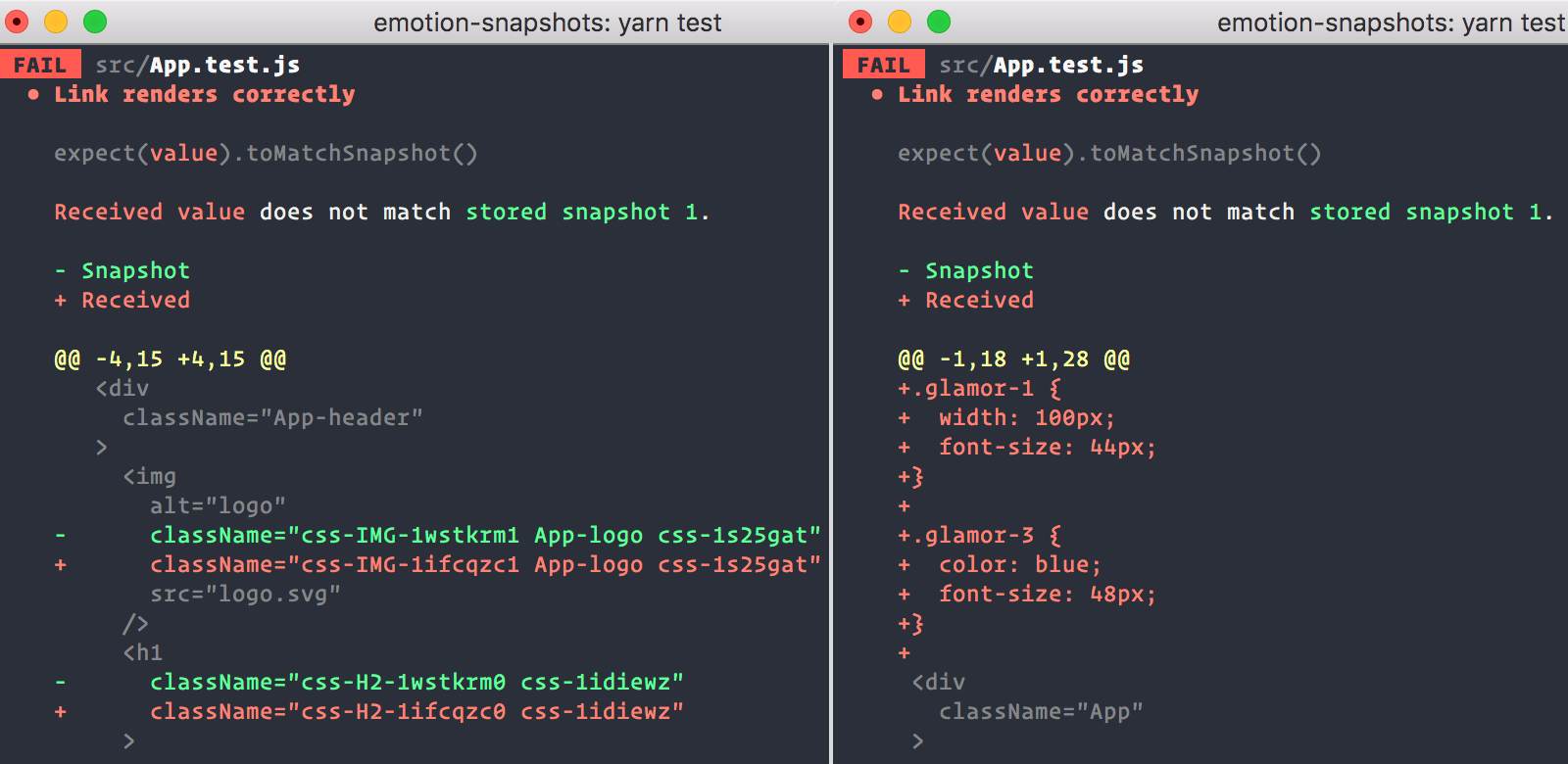
Adding [snapshot tests with Jest](https://facebook.github.io/jest/docs/en/snapshot-testing.html) is a great way to help avoid unintended changes to your app's UI.
By diffing the serialized value of your React tree Jest can show you what changed in your app and allow you to fix it or update the snapshot.
By default snapshots with emotion show generated class names. Adding [@emotion/jest](https://github.com/emotion-js/emotion/tree/main/packages/jest) allows you to output the actual styles being applied.
 ### Installation
```bash
npm install --save-dev @emotion/jest
```
Add the `"@emotion/jest/serializer"` to the [`snapshotSerializers`](https://jestjs.io/docs/en/configuration#snapshotserializers-arraystring) option.
```json
{
"snapshotSerializers": ["@emotion/jest/serializer"]
}
```
Or use `expect.addSnapshotSerializer` to add it.
```javascript
import { createSerializer } from '@emotion/jest'
expect.addSnapshotSerializer(createSerializer())
```
When using Enzyme, you can add `"@emotion/jest/enzyme-serializer"` instead.
```json
{
"snapshotSerializers": ["@emotion/jest/enzyme-serializer"]
}
```
Or use `expect.addSnapshotSerializer` to add it like this:
```javascript
// also adds the enzyme-to-json serializer
import { createEnzymeSerializer } from '@emotion/jest/enzyme-serializer'
expect.addSnapshotSerializer(createEnzymeSerializer())
```
### Writing a test
Writing a test with `@emotion/jest` involves creating a snapshot from the `react-test-renderer` or `enzyme-to-json`'s resulting JSON.
```jsx
import React from 'react'
import renderer from 'react-test-renderer'
const Button = props => (
)
test('Button renders correctly', () => {
expect(
renderer.create().toJSON()
).toMatchSnapshot()
})
```
It'll create a snapshot that looks like this.
```jsx
// Jest Snapshot v1, https://goo.gl/fbAQLP
exports[`Button renders correctly 1`] = `
.emotion-0 {
color: hotpink;
}
### Installation
```bash
npm install --save-dev @emotion/jest
```
Add the `"@emotion/jest/serializer"` to the [`snapshotSerializers`](https://jestjs.io/docs/en/configuration#snapshotserializers-arraystring) option.
```json
{
"snapshotSerializers": ["@emotion/jest/serializer"]
}
```
Or use `expect.addSnapshotSerializer` to add it.
```javascript
import { createSerializer } from '@emotion/jest'
expect.addSnapshotSerializer(createSerializer())
```
When using Enzyme, you can add `"@emotion/jest/enzyme-serializer"` instead.
```json
{
"snapshotSerializers": ["@emotion/jest/enzyme-serializer"]
}
```
Or use `expect.addSnapshotSerializer` to add it like this:
```javascript
// also adds the enzyme-to-json serializer
import { createEnzymeSerializer } from '@emotion/jest/enzyme-serializer'
expect.addSnapshotSerializer(createEnzymeSerializer())
```
### Writing a test
Writing a test with `@emotion/jest` involves creating a snapshot from the `react-test-renderer` or `enzyme-to-json`'s resulting JSON.
```jsx
import React from 'react'
import renderer from 'react-test-renderer'
const Button = props => (
)
test('Button renders correctly', () => {
expect(
renderer.create().toJSON()
).toMatchSnapshot()
})
```
It'll create a snapshot that looks like this.
```jsx
// Jest Snapshot v1, https://goo.gl/fbAQLP
exports[`Button renders correctly 1`] = `
.emotion-0 {
color: hotpink;
}
This is hotpink.
`
```
When the styles of a component change, the snapshot will fail and you'll be able to update the snapshot or fix the component.
---
# Emotion Documentation
# Source: https://raw.githubusercontent.com/emotion-js/emotion/main/docs/theming.mdx
# Path: docs/theming.mdx
---
title: 'Theming'
---
Theming is included in the [`@emotion/react`](https://emotion.sh/docs/@emotion/react) package.
Add `ThemeProvider` to the top level of your app and access the theme with `props.theme` in a styled component or provide a function that accepts the theme as the css prop.
## Table of Contents
- [Examples](#examples)
- [API](#api)
- [ThemeProvider](#themeprovider-reactcomponenttype)
- [withTheme](#withthemecomponent-reactcomponenttype-reactcomponenttype)
- [useTheme](#usetheme)
- [Credits](#credits)
## Examples
### css prop
```jsx
// @live
import { ThemeProvider } from '@emotion/react'
const theme = {
colors: {
primary: 'hotpink'
}
}
render(
({ color: theme.colors.primary })}>some other text
)
```
### styled
```jsx
// @live
import { ThemeProvider } from '@emotion/react'
import styled from '@emotion/styled'
const theme = {
colors: {
primary: 'hotpink'
}
}
const SomeText = styled.div`
color: ${props => props.theme.colors.primary};
`
render(
some text
)
```
### useTheme hook
```jsx
// @live
import { ThemeProvider, useTheme } from '@emotion/react'
const theme = {
colors: {
primary: 'hotpink'
}
}
function SomeText(props) {
const theme = useTheme()
return
}
render(
some text
)
```
## API
### ThemeProvider: React.ComponentType
A React component that passes the theme object down the component tree via [context](https://reactjs.org/docs/context.html). Additional `ThemeProvider` components can be added deeper in the tree to override the original theme. The theme object will be merged into its ancestor as if by [`Object.assign`](https://developer.mozilla.org/en-US/docs/Web/JavaScript/Reference/Global_Objects/Object/assign). If a function is passed instead of an object it will be called with the ancestor theme and the result will be the new theme.
_Accepts:_
- **`children`: React.Node**
- **`theme`: Object|Object => Object** - An object or function that provides an object.
```jsx
import * as React from 'react'
import styled from '@emotion/styled'
import { ThemeProvider, withTheme } from '@emotion/react'
// object-style theme
const theme = {
backgroundColor: 'green',
color: 'red'
}
// function-style theme; note that if multiple are used,
// the parent theme will be passed as a function argument
const adjustedTheme = ancestorTheme => ({ ...ancestorTheme, color: 'blue' })
class Container extends React.Component {
render() {
return (
Boom shaka laka!
)
}
}
```
> Note:
>
> Make sure to hoist your theme out of render otherwise you may have performance problems.
### withTheme(component: React.ComponentType): React.ComponentType
A higher-order component that provides the current theme as a prop to the wrapped child and listens for changes. If the theme is updated, the child component will be re-rendered accordingly.
```jsx
import * as PropTypes from 'prop-types'
import * as React from 'react'
import { withTheme } from '@emotion/react'
class TellMeTheColor extends React.Component {
render() {
return The color is {this.props.theme.color}.
}
}
TellMeTheColor.propTypes = {
theme: PropTypes.shape({
color: PropTypes.string
})
}
const TellMeTheColorWithTheme = withTheme(TellMeTheColor)
```
### useTheme
A React hook that provides the current theme as its value. If the theme is updated, the child component will be re-rendered accordingly.
```jsx
// @live
import { ThemeProvider, useTheme } from '@emotion/react'
import styled from '@emotion/styled'
const theme = {
colors: {
primary: 'hotpink'
}
}
function SomeText(props) {
const theme = useTheme()
return
}
render(
some text
)
```
## Credits
Thanks goes to the [styled-components team](https://github.com/styled-components/styled-components) and [their contributors](https://github.com/styled-components/styled-components/graphs/contributors) who designed this API.
---
# Emotion Documentation
# Source: https://raw.githubusercontent.com/emotion-js/emotion/main/docs/typescript.mdx
# Path: docs/typescript.mdx
---
title: 'TypeScript'
---
Emotion includes TypeScript definitions for `@emotion/react` and `@emotion/styled`. These definitions infer types for css properties with the object syntax, HTML/SVG tag names, and prop types.
## @emotion/react
The easiest way to use the css prop with TypeScript is with the new JSX transform and the `jsxImportSource` TSConfig option (available since TS 4.1). For this approach, your TSConfig `compilerOptions` should contain
```json
"jsx": "react-jsx",
"jsxImportSource": "@emotion/react"
```
For most users, this is all the setup that is required. You can now define styles using the object syntax or template literal syntax and pass them to your components via the `css` prop.
```tsx
import { css } from '@emotion/react'
const titleStyle = css({
boxSizing: 'border-box',
width: 300,
height: 200
})
const subtitleStyle = css`
box-sizing: border-box;
width: 100px;
height: 60px;
`
```
Object styles are recommended since they are type checked with the help of the [csstype](https://www.npmjs.com/package/csstype) package. For example, the following code will emit an error.
```tsx
import { css } from '@emotion/react';
const titleStyle = css({
^ Argument of type 'boxSizing: 'bordre-box';' is not assignable [...]
boxSizing: 'bordre-box', // Oops, there's a typo!
width: 300,
height: 200,
});
```
When using our JSX factory, TypeScript only allows the `css` prop on components that accept a `className` prop. This is because `@emotion/react` resolves the value of the `css` prop to a class name and then passes this class name down to the rendered component.
### With the Babel plugin
[`@emotion/babel-plugin`](/docs/babel) is completely optional for TypeScript users. If you are not already using Babel, you probably shouldn't add it to your build tooling unless you truly need one of the features offered by `@emotion/babel-plugin`. On the other hand, there's no reason not to use `@emotion/babel-plugin` if you are already using Babel to transpile your TypeScript code.
### With the old JSX transform
If you are unable to upgrade to the `react-jsx` transform, you will need to specify the JSX factory at the top of every file:
```tsx
/** @jsx jsx */
import { jsx } from '@emotion/react'
```
As a result, you may be not able to use the shorthand syntax `<>` for React fragments, but you can still use ``. This is a limitation of the TypeScript compiler not being able to independently specify jsx pragma and jsxFrag pragma.
You can still use the css helper and pass the className yourself (ensure you are importing from the `@emotion/css` package, not `@emotion/react`).
```tsx
import { css } from '@emotion/css'
const el =
```
It's not possible to leverage `css` prop support being added conditionally based on the type of a rendered component when not using our jsx pragma or the `react-jsx` transform. If you use our pragma implicitly (for example when using our `@emotion/babel-preset-css-prop`) we have a special file that can be imported once to add support for the `css` prop globally, for all components. Use it like this:
```ts
///
```
## @emotion/styled
`@emotion/styled` works with TypeScript without any additional configuration.
### HTML/SVG elements
```tsx
import styled from '@emotion/styled'
const Link = styled('a')`
color: red;
`
const Icon = styled('svg')`
stroke: green;
`
const App = () => Click me
```
```tsx
import styled from '@emotion/styled';
const NotALink = styled('div')`
color: red;
`;
const App = () => (
Click me
^^^^^^^^ Property 'href' does not exist [...]
);
```
### `withComponent`
```tsx
import styled from '@emotion/styled'
const NotALink = styled('div')`
color: red;
`
const Link = NotALink.withComponent('a')
const App = () => Click me
// No errors!
```
### Passing Props
You can type the props of styled components.
```tsx
import styled from '@emotion/styled'
type ImageProps = {
src: string
width: number
}
// Using a css block
const Image0 = styled.div`
width: ${props => props.width};
background: url(${props => props.src}) center center;
background-size: contain;
`
const Image0 = styled('div')`
width: ${props => props.width};
background: url(${props => props.src}) center center;
background-size: contain;
`
// Or with object styles
const Image1 = styled('div')(
{
backgroundSize: 'contain'
},
props => ({
width: props.width,
background: `url(${props.src}) center center`
})
)
```
### React Components
Emotion can also style React components and will infer component props as expected.
```tsx
import React, { FC } from 'react'
import styled from '@emotion/styled'
interface ComponentProps {
className?: string
label: string
}
const Component: FC = ({ label, className }) => (
{label}
)
const StyledComponent0 = styled(Component)`
color: ${props => (props.label === 'Important' ? 'red' : 'green')};
`
const StyledComponent1 = styled(Component)({
color: 'red'
})
const App = () => (
)
```
### Forwarding props
Sometimes you want to wrap an existing component and override the type of a prop. Emotion allows you to specify a `shouldForwardProp` hook to filter properties which should be passed to the wrapped component.
If you make `shouldForwardProp` a [type guard](https://www.typescriptlang.org/docs/handbook/2/narrowing.html#using-type-predicates) then only the props from the type guard will be exposed.
For example:
```ts
const Original: React.FC<{ prop1: string; prop2: string }> = () => null
interface StyledOriginalExtraProps {
// This prop would conflict with the `prop2` on Original
prop2: number
}
const StyledOriginal = styled(Original, {
// Filter prop2 by only forwarding prop1
shouldForwardProp: (propName): propName is 'prop1' => propName === 'prop1'
})(props => {
// props.prop2 will be `number`
return {}
})
// No more type conflict error
;
```
### Passing props when styling a React component
```tsx
import React, { FC } from 'react'
import styled from '@emotion/styled'
interface ComponentProps {
className?: string
label: string
}
const Component: FC = ({
label,
className
}) => {label}
interface StyledComponentProps {
bgColor: string
}
const StyledComponent0 = styled(Component)`
color: red;
background: ${props => props.label ? props.bgColor : 'white'};
`
// or
const StyledComponent1 = styled(Component)(
props => ({
color: 'red'
background: props.label ? props.bgColor : 'white'
})
)
const App = () => (
)
```
### Define a Theme
By default, `props.theme` is an empty object because it's the only thing that is type-safe as a default.
You can define a theme type by extending our type declarations via your own declarations file.
_emotion.d.ts_
```typescript
import '@emotion/react'
declare module '@emotion/react' {
export interface Theme {
color: {
primary: string
positive: string
negative: string
}
}
}
// You are also able to use a 3rd party theme this way:
import '@emotion/react'
import { LibTheme } from 'some-lib'
declare module '@emotion/react' {
export interface Theme extends LibTheme {}
}
```
_Button.tsx_
```tsx
import styled from '@emotion/styled'
const Button = styled('button')`
padding: 20px;
background-color: ${props => props.theme.someLibProperty};
border-radius: 3px;
`
export default Button
```
If you were previously relying on `theme` being an `any` type, you can restore compatibility with:
_emotion.d.ts_
```ts
import '@emotion/react'
declare module '@emotion/react' {
export interface Theme extends Record {}
}
```
---
# Emotion Documentation
# Source: https://raw.githubusercontent.com/emotion-js/emotion/main/docs/with-props.mdx
# Path: docs/with-props.mdx
---
title: 'Attaching Props'
---
Some css-in-js libraries offer APIs to attach props to components, instead of having our own API to do that, we recommend creating a regular react component, using the css prop and attaching props like you would with any other React component.
Note that if css is passed down via props, it will take precedence over the css in the component.
```jsx
// @live
import { css } from '@emotion/react'
const pinkInput = css`
background-color: pink;
`
const RedPasswordInput = props => (
)
render(
)
```
---
# Emotion Documentation
# Source: https://raw.githubusercontent.com/emotion-js/emotion/main/README.md
# Path: README.md

emotion
The Next Generation of CSS-in-JS
> **Emotion 11 has been released 🚀 [See the blog post](https://emotion.sh/docs/emotion-11)**
[](#backers) [](#sponsors) [](https://badge.fury.io/js/emotion)
[](https://circleci.com/gh/emotion-js/emotion)
[](https://codecov.io/gh/emotion-js/emotion)


[](https://join.slack.com/t/emotion-slack/shared_invite/zt-rmtwsy74-2uvyFdz5uxa8OiMguJJeuQ)
Emotion is a performant and flexible CSS-in-JS library. Building on many other CSS-in-JS libraries, it allows you to style apps quickly with string or object styles. It has predictable composition to avoid specificity issues with CSS. With source maps and labels, Emotion has a great developer experience and great performance with heavy caching in production.
# [👀 Demo Sandbox](https://codesandbox.io/s/pk1qjqpw67)
# [📖 Docs](https://emotion.sh/docs/introduction)
Frequently viewed docs:
- [Introduction](https://emotion.sh/docs/introduction)
- [Install](https://emotion.sh/docs/install)
- [CSS Prop](https://emotion.sh/docs/css-prop)
- [Styled Components](https://emotion.sh/docs/styled)
- [Composition](https://emotion.sh/docs/composition)
- [Nested Selectors](https://emotion.sh/docs/nested)
- [Media Queries](https://emotion.sh/docs/media-queries)
### Quick Start
Get up and running with a single import.
```bash
npm install --save @emotion/react
```
```jsx
/** @jsx jsx */
import { jsx } from '@emotion/react'
let SomeComponent = props => {
return (
)
}
```
### Do I Need To Use the Babel Plugin?
The babel plugin is not required, but enables some optimizations and customizations that could be beneficial for your project.
Look here 👉 _[emotion babel plugin feature table and documentation](https://github.com/emotion-js/emotion/tree/main/packages/babel-plugin)_
### Demo Sandbox
[Demo Code Sandbox](https://codesandbox.io/s/pk1qjqpw67)
### Examples
- [emotion website](site) [[Demo Here](https://emotion.sh)]
- [next-hnpwa-guide-kit](https://github.com/tkh44/next-hnpwa-guide-kit) [[Demo Here](https://hnpwa.life)]
- [reactivesearch](https://github.com/appbaseio/reactivesearch), a react UI library for Elasticsearch [[Website](https://opensource.appbase.io/reactivesearch/)]
- [circuit-ui](https://github.com/sumup-oss/circuit-ui), a react component library built at SumUp [[Storybook](https://circuit.sumup.com/?path=/story/introduction-welcome--page)]
- **open a PR and add yours!**
### Ecosystem
- [stylelint](https://github.com/stylelint/stylelint) - A mighty, modern linter that helps you avoid errors and enforce conventions in your styles.
- [facepaint](https://github.com/emotion-js/facepaint)
- [emotion-vue](https://github.com/egoist/emotion-vue)
- [nuxt-community/emotion-module](https://github.com/nuxt-community/emotion-module) - Emotion module for Nuxt.js
- [ember-emotion](https://github.com/alexlafroscia/ember-emotion)
- [CSS to emotion transform](https://transform.now.sh/css-to-emotion/)
- [ShevyJS](https://github.com/kyleshevlin/shevyjs)
- [design-system-utils](https://github.com/mrmartineau/design-system-utils) - Utilities to give better access to your design system.
- [polished](https://github.com/styled-components/polished) - Lightweight set of Sass/Compass-style mixins/helpers for writing styles in JavaScript.
- [monad-ui](https://github.com/muhajirdev/monad-ui/) - Utility First CSS-In-JS
- [css-in-js-media](https://github.com/zx6658/css-in-js-media) - you can deal with responsive design using css-in-js easily with this `css-in-js-media` which is similar with include-media
- [emotion-native-extended](https://github.com/ItsWendell/emotion-native-extended) - Better styling support for Emotion Native with [React Native Extended Stylesheet](https://github.com/vitalets/react-native-extended-stylesheet)
### In the Wild
- [feathery.io](https://feathery.io)
- [frontity.org](https://frontity.org)
- [abacusfi.com](https://abacusfi.com)
- [healthline.com](https://www.healthline.com)
- [nytimes.com](https://www.nytimes.com)
- [vault.crucible.gg](http://vault.crucible.gg/)
- [render.com](https://render.com)
- [gatsbythemes.com](https://gatsbythemes.com/)
- [blazity.com](https://blazity.com/)
- [postmates.com](https://postmates.com/)
- [thedisconnect.co](https://thedisconnect.co/one)
- [zefenify.com](https://zefenify.com/about.html)
- [sentry.io](https://sentry.io)
- [comparett.com](https://comparett.com)
- [Domain.com.au](https://www.domain.com.au)
- [cyberhaven.com](https://cyberhaven.com)
- [CommercialRealEstate.com.au](https://www.commercialrealestate.com.au)
- [codecademy.com](https://www.codecademy.com)
- [Apache Superset](https://superset.apache.org/)
## Sponsors
Support this project by becoming a sponsor. Your logo will show up here with a link to your website. [[Become a sponsor](https://opencollective.com/emotion#sponsor)]


 ## Backers
Thank you to all our backers! 🙏 [[Become a backer](https://opencollective.com/emotion#backer)]
## Backers
Thank you to all our backers! 🙏 [[Become a backer](https://opencollective.com/emotion#backer)]
 ## Contributors
This project exists thanks to all the people who contribute. [[Contribute](CONTRIBUTING.md)].
## Contributors
This project exists thanks to all the people who contribute. [[Contribute](CONTRIBUTING.md)].

 ` | `React.createElement('img', { src: 'avatar.png' })` |
| After | `
` | `React.createElement('img', { src: 'avatar.png' })` |
| After | `