((resolve) => resolve(pokemons)));
return (
{data &&
data.map((pokemon) => {
const props: Partial = showingDetail
? {
detail: (
),
}
: { accessories: [{ text: pokemon.types.join(" ") }] };
return (
setShowingDetail(!showingDetail)} />
}
/>
);
})}
);
}
```
{% endtab %}
{% tab title="ListWithEmptyView\.tsx" %}
```typescript
import { useEffect, useState } from "react";
import { List } from "@raycast/api";
export default function CommandWithCustomEmptyView() {
const [state, setState] = useState({ searchText: "", items: [] });
useEffect(() => {
// perform an API call that eventually populates `items`.
}, [state.searchText]);
return (
setState((previous) => ({ ...previous, searchText: newValue }))}>
{state.searchText === "" && state.items.length === 0 ? (
) : (
state.items.map((item) => )
)}
);
}
```
{% endtab %}
{% endtabs %}
## API Reference
### List
Displays [List.Section](#list.section) or [List.Item](#list.item).
The list uses built-in filtering by indexing the title of list items and additionally keywords.
#### Example
```typescript
import { List } from "@raycast/api";
export default function Command() {
return (
);
}
```
#### Props
| Prop | Description | Type | Default |
| -------------------- | --------------------------------------------------------------------------------------------------------------------------------------------------------------------------------------------------------------------------------------------------------------------------------------------------------------------------------------------------------------------------------------------------------------------------------------------------------------------------------------------------- | ---------------------------------------------------------------- | ------- |
| actions | A reference to an ActionPanel. It will only be shown when there aren't any children. | `React.ReactNode` | - |
| children | List sections or items. If List.Item elements are specified, a default section is automatically created. | `React.ReactNode` | - |
| filtering | Toggles Raycast filtering. When `true`, Raycast will use the query in the search bar to filter the items. When `false`, the extension needs to take care of the filtering. You can further define how native filtering orders sections by setting an object with a `keepSectionOrder` property: When `true`, ensures that Raycast filtering maintains the section order as defined in the extension. When `false`, filtering may change the section order depending on the ranking values of items. | `boolean` or `{ keepSectionOrder: boolean }` | - |
| isLoading | Indicates whether a loading bar should be shown or hidden below the search bar | `boolean` | - |
| isShowingDetail | Whether the List should have an area on the right side of the items to show additional details about the selected item. When true, it is recommended not to show any accessories on the `List.Item` and instead show the additional information in the `List.Item.Detail` view. | `boolean` | - |
| navigationTitle | The main title for that view displayed in Raycast | `string` | - |
| onSearchTextChange | Callback triggered when the search bar text changes. | `(text: string) => void` | - |
| onSelectionChange | Callback triggered when the item selection in the list changes. When the received id is `null`, it means that all items have been filtered out and that there are no item selected | `(id: string) => void` | - |
| pagination | Configuration for pagination | `{ hasMore: boolean; onLoadMore: () => void; pageSize: number }` | - |
| searchBarAccessory | List.Dropdown that will be shown in the right-hand-side of the search bar. | `ReactElement<`[`List.Dropdown.Props`](#props)`, string>` | - |
| searchBarPlaceholder | Placeholder text that will be shown in the search bar. | `string` | - |
| searchText | The text that will be displayed in the search bar. | `string` | - |
| selectedItemId | Selects the item with the specified id. | `string` | - |
| throttle | Defines whether the `onSearchTextChange` handler will be triggered on every keyboard press or with a delay for throttling the events. Recommended to set to `true` when using custom filtering logic with asynchronous operations (e.g. network requests). | `boolean` | - |
### List.Dropdown
A dropdown menu that will be shown in the right-hand-side of the search bar.
#### Example
```typescript
import { List } from "@raycast/api";
type DrinkType = { id: string; name: string };
function DrinkDropdown(props: { drinkTypes: DrinkType[]; onDrinkTypeChange: (newValue: string) => void }) {
const { drinkTypes, onDrinkTypeChange } = props;
return (
{
onDrinkTypeChange(newValue);
}}
>
{drinkTypes.map((drinkType) => (
))}
);
}
export default function Command() {
const drinkTypes: DrinkType[] = [
{ id: "1", name: "Beer" },
{ id: "2", name: "Wine" },
];
const onDrinkTypeChange = (newValue: string) => {
console.log(newValue);
};
return (
}
>
);
}
```
#### Props
| Prop | Description | Type | Default |
| ----------------------------------------- | --------------------------------------------------------------------------------------------------------------------------------------------------------------------------------------------------------------------------------------------------------------------------------------------------------------------------------------------------------------------------------------------------------------------------------------------------------------------------------------------------- | -------------------------------------------- | ------- |
| tooltip\* | Tooltip displayed when hovering the dropdown. | `string` | - |
| children | Dropdown sections or items. If Dropdown.Item elements are specified, a default section is automatically created. | `React.ReactNode` | - |
| defaultValue | The default value of the dropdown. Keep in mind that `defaultValue` will be configured once per component lifecycle. This means that if a user changes the value, `defaultValue` won't be configured on re-rendering. **If you're using `storeValue` and configured it as `true`** ***and***** a Dropdown.Item with the same value exists, then it will be selected.** **If you configure `value` at the same time as `defaultValue`, the `value` will have precedence over `defaultValue`.** | `string` | - |
| filtering | Toggles Raycast filtering. When `true`, Raycast will use the query in the search bar to filter the items. When `false`, the extension needs to take care of the filtering. You can further define how native filtering orders sections by setting an object with a `keepSectionOrder` property: When `true`, ensures that Raycast filtering maintains the section order as defined in the extension. When `false`, filtering may change the section order depending on the ranking values of items. | `boolean` or `{ keepSectionOrder: boolean }` | - |
| id | ID of the dropdown. | `string` | - |
| isLoading | Indicates whether a loading indicator should be shown or hidden next to the search bar | `boolean` | - |
| onChange | Callback triggered when the dropdown selection changes. | `(newValue: string) => void` | - |
| onSearchTextChange | Callback triggered when the search bar text changes. | `(text: string) => void` | - |
| placeholder | Placeholder text that will be shown in the dropdown search field. | `string` | - |
| storeValue | Indicates whether the value of the dropdown should be persisted after selection, and restored next time the dropdown is rendered. | `boolean` | - |
| throttle | Defines whether the `onSearchTextChange` handler will be triggered on every keyboard press or with a delay for throttling the events. Recommended to set to `true` when using custom filtering logic with asynchronous operations (e.g. network requests). | `boolean` | - |
| value | The currently value of the dropdown. | `string` | - |
### List.Dropdown.Item
A dropdown item in a [List.Dropdown](#list.dropdown)
#### Example
```typescript
import { List } from "@raycast/api";
export default function Command() {
return (
}
>
);
}
```
#### Props
| Prop | Description | Type | Default |
| --------------------------------------- | ----------------------------------------------------------------------------------------------------------------------------------------------------------------------------- | -------------------------------------------------------------------------------------------------- | ------- |
| title\* | The title displayed for the item. | `string` | - |
| value\* | Value of the dropdown item. Make sure to assign each unique value for each item. | `string` | - |
| icon | An optional icon displayed for the item. | [`Image.ImageLike`](https://developers.raycast.com/api-reference/icons-and-images#image.imagelike) | - |
| keywords | An optional property used for providing additional indexable strings for search. When filtering the items in Raycast, the keywords will be searched in addition to the title. | `string[]` | - |
### List.Dropdown.Section
Visually separated group of dropdown items.
Use sections to group related menu items together.
#### Example
```typescript
import { List } from "@raycast/api";
export default function Command() {
return (
}
>
);
}
```
#### Props
| Prop | Description | Type | Default |
| -------- | --------------------------------- | ----------------- | ------- |
| children | The item elements of the section. | `React.ReactNode` | - |
| title | Title displayed above the section | `string` | - |
### List.EmptyView
A view to display when there aren't any items available. Use to greet users with a friendly message if the\
extension requires user input before it can show any list items e.g. when searching for a package, an article etc.
Raycast provides a default `EmptyView` that will be displayed if the List component either has no children,\
or if it has children, but none of them match the query in the search bar. This too can be overridden by passing an\
empty view alongside the other `List.Item`s.
Note that the `EmptyView` is *never* displayed if the `List`'s `isLoading` property is true and the search bar is empty.

#### Example
```typescript
import { useEffect, useState } from "react";
import { List } from "@raycast/api";
export default function CommandWithCustomEmptyView() {
const [state, setState] = useState({ searchText: "", items: [] });
useEffect(() => {
// perform an API call that eventually populates `items`.
}, [state.searchText]);
return (
setState((previous) => ({ ...previous, searchText: newValue }))}>
{state.searchText === "" && state.items.length === 0 ? (
) : (
state.items.map((item) => )
)}
);
}
```
#### Props
| Prop | Description | Type | Default |
| ----------- | -------------------------------------------------------- | -------------------------------------------------------------------------------------------------- | ------- |
| actions | A reference to an ActionPanel. | `React.ReactNode` | - |
| description | An optional description for why the empty view is shown. | `string` | - |
| icon | An icon displayed in the center of the EmptyView. | [`Image.ImageLike`](https://developers.raycast.com/api-reference/icons-and-images#image.imagelike) | - |
| title | The main title displayed for the Empty View. | `string` | - |
### List.Item
A item in the [List](#list).
This is one of the foundational UI components of Raycast. A list item represents a single entity. It can be a\
GitHub pull request, a file, or anything else. You most likely want to perform actions on this item, so make it clear\
to the user what this list item is about.
#### Example
```typescript
import { Icon, List } from "@raycast/api";
export default function Command() {
return (
);
}
```
#### Props
| Prop | Description | Type | Default |
| --------------------------------------- | --------------------------------------------------------------------------------------------------------------------------------------------------------------------------------------------------- | ---------------------------------------------------------------------------------------------------------------------------------------------------------------------------------------------------------------------------------------- | ------- |
| title\* | The main title displayed for that item, optionally with a tooltip. | `string` or `{ tooltip?: string; value: string }` | - |
| accessories | An optional array of List.Item.Accessory items displayed on the right side in a List.Item. | [`List.Item.Accessory`](#list.item.accessory)`[]` | - |
| actions | An ActionPanel that will be updated for the selected list item. | `React.ReactNode` | - |
| detail | The `List.Item.Detail` to be rendered in the right side area when the parent List is showing details and the item is selected. | `React.ReactNode` | - |
| icon | An optional icon displayed for the list item. | [`Image.ImageLike`](https://developers.raycast.com/api-reference/icons-and-images#image.imagelike) or `{ tooltip: string; value:` [`Image.ImageLike`](https://developers.raycast.com/api-reference/icons-and-images#image.imagelike) `}` | - |
| id | ID of the item. This string is passed to the `onSelectionChange` handler of the List when the item is selected. Make sure to assign each item a unique ID or a UUID will be auto generated. | `string` | - |
| keywords | An optional property used for providing additional indexable strings for search. When filtering the list in Raycast through the search bar, the keywords will be searched in addition to the title. | `string[]` | - |
| quickLook | Optional information to preview files with Quick Look. Toggle the preview with Action.ToggleQuickLook. | `{ name?: string; path: "fs".PathLike }` | - |
| subtitle | An optional subtitle displayed next to the main title, optionally with a tooltip. | `string` or `{ tooltip?: string; value?: string }` | - |
### List.Item.Detail
A Detail view that will be shown in the right-hand-side of the `List`.
When shown, it is recommended not to show any accessories on the `List.Item` and instead bring those additional information in the `List.Item.Detail` view.

#### Example
```typescript
import { List } from "@raycast/api";
export default function Command() {
return (
}
/>
);
}
```
#### Props
| Prop | Description | Type | Default |
| --------- | ----------------------------------------------------------------------------------------------------------------------------- | ----------------- | ------- |
| isLoading | Indicates whether a loading bar should be shown or hidden above the detail | `boolean` | - |
| markdown | The CommonMark string to be rendered in the right side area when the parent List is showing details and the item is selected. | `string` | - |
| metadata | The `List.Item.Detail.Metadata` to be rendered in the bottom side of the `List.Item.Detail` | `React.ReactNode` | - |
### List.Item.Detail.Metadata
A Metadata view that will be shown in the bottom side of the `List.Item.Detail`.
Use it to display additional structured data about the content of the `List.Item`.
#### Example
{% tabs %}
{% tab title="Metadata + Markdown" %}
```typescript
import { List } from "@raycast/api";
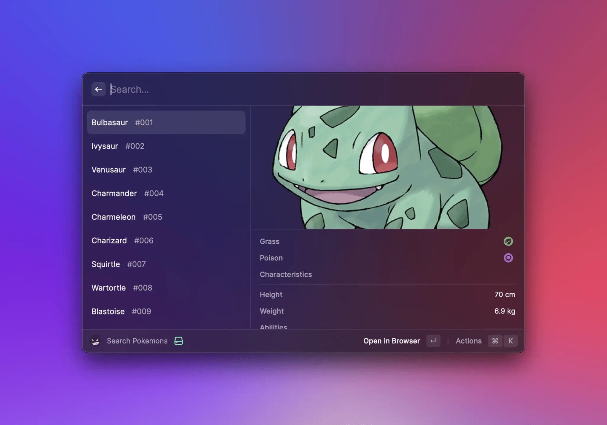
export default function Metadata() {
const markdown = `

There is a plant seed on its back right from the day this Pokémon is born. The seed slowly grows larger.
`;
return (
}
/>
}
/>
);
}
```
{% endtab %}
{% tab title="Metadata Standalone" %}

```typescript
import { List } from "@raycast/api";
export default function Metadata() {
return (
}
/>
}
/>
);
}
```
{% endtab %}
{% endtabs %}
#### Props
| Prop | Description | Type | Default |
| ------------------------------------------ | ---------------------------------- | ----------------- | ------- |
| children\* | The elements of the Metadata view. | `React.ReactNode` | - |
### List.Item.Detail.Metadata.Label
A title with, optionally, an icon and/or text to its right.

#### Example
```typescript
import { List } from "@raycast/api";
export default function Metadata() {
return (
}
/>
}
/>
);
}
```
#### Props
| Prop | Description | Type | Default |
| --------------------------------------- | -------------------------------------------------------------------------------------------------------------------------- | --------------------------------------------------------------------------------------------------------------- | ------- |
| title\* | The title of the item. | `string` | - |
| icon | An icon to illustrate the value of the item. | [`Image.ImageLike`](https://developers.raycast.com/api-reference/icons-and-images#image.imagelike) | - |
| text | The text value of the item. Specifying `color` will display the text in the provided color. Defaults to Color.PrimaryText. | `string` or `{ color?:` [`Color`](https://developers.raycast.com/api-reference/colors#color)`; value: string }` | - |
### List.Item.Detail.Metadata.Link
An item to display a link.

#### Example
```typescript
import { List } from "@raycast/api";
export default function Metadata() {
return (
}
/>
}
/>
);
}
```
#### Props
| Prop | Description | Type | Default |
| ---------------------------------------- | ------------------------------- | -------- | ------- |
| target\* | The target of the link. | `string` | - |
| text\* | The text value of the item. | `string` | - |
| title\* | The title shown above the item. | `string` | - |
### List.Item.Detail.Metadata.TagList
A list of [`Tags`](#list.item.detail.metadata.taglist.item) displayed in a row.

#### Example
```typescript
import { List } from "@raycast/api";
export default function Metadata() {
return (
}
/>
}
/>
);
}
```
#### Props
| Prop | Description | Type | Default |
| ------------------------------------------ | ---------------------------------- | ----------------- | ------- |
| children\* | The tags contained in the TagList. | `React.ReactNode` | - |
| title\* | The title shown above the item. | `string` | - |
### List.Item.Detail.Metadata.TagList.Item
A Tag in a `List.Item.Detail.Metadata.TagList`.
#### Props
| Prop | Description | Type | Default |
| -------- | --------------------------------------------------------------------------------------------------- | -------------------------------------------------------------------------------------------------- | ------- |
| color | Changes the text color to the provided color and sets a transparent background with the same color. | [`Color.ColorLike`](https://developers.raycast.com/api-reference/colors#color.colorlike) | - |
| icon | The optional icon tag icon. Required if the tag has no text. | [`Image.ImageLike`](https://developers.raycast.com/api-reference/icons-and-images#image.imagelike) | - |
| onAction | Callback that is triggered when the item is clicked. | `() => void` | - |
| text | The optional tag text. Required if the tag has no icon. | `string` | - |
### List.Item.Detail.Metadata.Separator
A metadata item that shows a separator line. Use it for grouping and visually separating metadata items.

#### Example
```typescript
import { List } from "@raycast/api";
export default function Metadata() {
return (
}
/>
}
/>
);
}
```
### List.Section
A group of related [List.Item](#list.item).
Sections are a great way to structure your list. For example, group GitHub issues with the same status and order them by priority.\
This way, the user can quickly access what is most relevant.
#### Example
```typescript
import { List } from "@raycast/api";
export default function Command() {
return (
);
}
```
#### Props
| Prop | Description | Type | Default |
| -------- | ---------------------------------------------------------------- | ----------------- | ------- |
| children | The List.Item elements of the section. | `React.ReactNode` | - |
| subtitle | An optional subtitle displayed next to the title of the section. | `string` | - |
| title | Title displayed above the section. | `string` | - |
## Types
### List.Item.Accessory
An interface describing an accessory view in a `List.Item`.
#### Properties
| Property | Description | Type |
| ------------------------------------- | ------------------------------------------------------------------------------------------------------------------------------------------------------------------------------------------------------------------------------------------------------------------------------------------------------------------------------------------------------------------------------- | ------------------------------------------------------------------------------------------------------------------------------------------------------------------------------------------------------------------------------------------------------------------------------------------------------------------------------------------------------------------------------------------- |
| tag\* | A string or Date that will be used as the label, optionally colored. The date is formatted relatively to the current time (for example `new Date()` will be displayed as `"now"`, yesterday's Date will be displayed as "1d", etc.). Color changes the text color to the provided color and sets a transparent background with the same color. Defaults to Color.SecondaryText. | `string` or [`Date`](https://developer.mozilla.org/en-US/docs/Web/JavaScript/Reference/Global_Objects/Date) or `undefined` or `null` or `{ color?:` [`Color.ColorLike`](https://developers.raycast.com/api-reference/colors#color.colorlike)`; value: string` or [`Date`](https://developer.mozilla.org/en-US/docs/Web/JavaScript/Reference/Global_Objects/Date) or `undefined` or `null }` |
| text | An optional text that will be used as the label, optionally colored. Color changes the text color to the provided color. Defaults to Color.SecondaryText. | `string` or `null` or `{ color?:` [`Color`](https://developers.raycast.com/api-reference/colors#color)`; value: string` or `undefined` or `null }` |
| date | An optional Date that will be used as the label, optionally colored. The date is formatted relatively to the current time (for example `new Date()` will be displayed as `"now"`, yesterday's Date will be displayed as "1d", etc.). Color changes the text color to the provided color. Defaults to Color.SecondaryText. | [`Date`](https://developer.mozilla.org/en-US/docs/Web/JavaScript/Reference/Global_Objects/Date) or `null` or `{ color?:` [`Color`](https://developers.raycast.com/api-reference/colors#color)`; value:` [`Date`](https://developer.mozilla.org/en-US/docs/Web/JavaScript/Reference/Global_Objects/Date) or `undefined` or `null }` |
| icon | An optional Image.ImageLike that will be used as the icon. | [`Image.ImageLike`](https://developers.raycast.com/api-reference/icons-and-images#image.imagelike) or `null` |
| tooltip | An optional tooltip shown when the accessory is hovered. | `string` or `null` |
#### Example
```typescript
import { Color, Icon, List } from "@raycast/api";
export default function Command() {
return (
);
}
```
---
# Source: https://developers.raycast.com/information/developer-tools/manage-extensions-command.md
# Manage Extensions Command
Raycast provides a built-in command to manage your extensions.
For each extensions, there are a few actions to manage them.
## Add New Command
One such action is the `Add New Command` action.
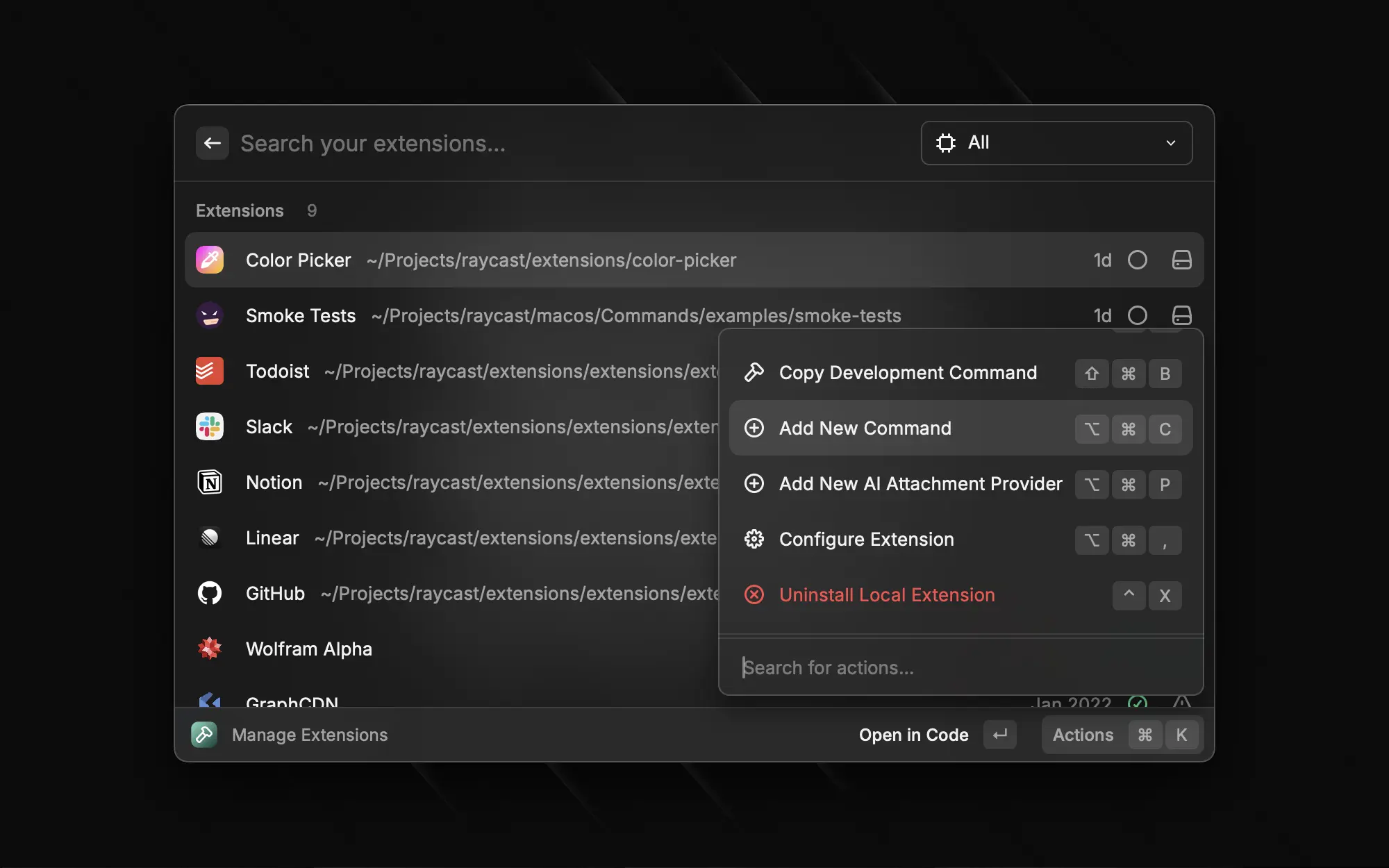
It will prompt you for the information about the new command before updating the manifest of the extension and creating the file for you based on the template you selected.
---
# Source: https://developers.raycast.com/information/manifest.md
# Manifest
The `package.json` manifest file is a superset of npm's `package.json` file. This way, you only need one file to configure your extension. This document covers only the Raycast specific fields. Refer to [npm's documentation](https://docs.npmjs.com/cli/v7/configuring-npm/package-json) for everything else.
Here is a typical manifest file:
```javascript
{
"name": "my-extension",
"title": "My Extension",
"description": "My extension that can do a lot of things",
"icon": "icon.png",
"author": "thomas",
"platforms": ["macOS", "Windows"],
"categories": ["Fun", "Communication"],
"license": "MIT",
"commands": [
{
"name": "index",
"title": "Send Love",
"description": "A command to send love to each other",
"mode": "view"
}
]
}
```
## Extension properties
All Raycast related properties for an extension.
| Property | Description |
| --------------------------------------------- | ---------------------------------------------------------------------------------------------------------------------------------------------------------------------------------------------------------------------------------------- |
| name\* | A unique name for the extension. This is used in the Store link to your extension, so keep it short and URL compatible. |
| title\* | The title of the extension that is shown to the user in the Store as well as the preferences. Use this title to describe your extension well that users can find it in the Store. |
| description\* | The full description of the extension shown in the Store. |
| icon\* | A reference to an icon file in the assets folder. Use png format with a size of 512 x 512 pixels. To support light and dark theme, add two icons, one with `@dark` as suffix, e.g. `icon.png` and `icon@dark.png`. |
| author \* | Your Raycast Store handle (username) |
| platforms \* | An Array of platforms supported by the extension(`"macOS"` or `"Windows"`). If the extension uses some platform-specific APIs, restrict which platform can install it. |
| categories\* | An array of categories that your extension belongs in. |
| commands\* | An array of [commands](https://developers.raycast.com/terminology#command) exposed by the extension, see [Command properties](#command-properties). |
| tools | An array of tools that the AI can use to interact with this extension, see [Tool properties](#tool-properties). |
| ai | Additional information related to the AI capabilities of the extension, see [AI properties](#ai-properties). |
| owner | Used for extensions published under an organisation. When defined, the extension will be [private](https://developers.raycast.com/teams/getting-started) (except when specifying `access`). |
| access | Either `"public"` or `"private"`. Public extensions are downloadable by anybody, while [private](https://developers.raycast.com/teams/getting-started) extensions can only be downloaded by a member of a given organization. |
| contributors | An array of Raycast store handles (usernames) of people who have meaningfully contributed and are maintaining to this extension. |
| pastContributors | An array of Raycast store handles (usernames) of people who have meaningfully contributed to the extension's commands but do not maintain it anymore. |
| keywords | An array of keywords for which the extension can be searched for in the Store. |
| preferences | Extensions can contribute preferences that are shown in Raycast Preferences > Extensions. You can use preferences for configuration values and passwords or personal access tokens, see [Preference properties](#preference-properties). |
| external | An Array of package or file names that should be excluded from the build. The package will not be bundled, but the import is preserved and will be evaluated at runtime. |
## Command properties
All properties for a [command](https://developers.raycast.com/terminology#command).
| Property | Description |
| --------------------------------------------- | ---------------------------------------------------------------------------------------------------------------------------------------------------------------------------------------------------------------------------------------------------------------------------------------------------------------------------------------------------------------------------------------------------------------------------------------- |
| name\* | A unique id for the command. The name directly maps to the entry point file for the command. So a command named "index" would map to `src/index.ts` (or any other supported TypeScript or JavaScript file extension such as `.tsx`, `.js`, `.jsx`). |
| title\* | The display name of the command, shown to the user in the Store, Preferences, and in Raycast's root search. |
| subtitle | The optional subtitle of the command in the root search. Usually, this is the service or domain that your command is associated with. You can dynamically update this property using [`updateCommandMetadata`](https://developers.raycast.com/api-reference/command#updatecommandmetadata). |
| description\* | It helps users understand what the command does. It will be displayed in the Store and in Preferences. |
| icon | An optional reference to an icon file in the assets folder. Use png format with a size of at least 512 x 512 pixels. To support light and dark theme, add two icons, one with @dark as suffix, e.g. icon.png and
If no icon is specified, the extension icon will be used.
|
| mode\* | A value of `view` indicates that the command will show a main view when performed. `no-view` means that the command does not push a view to the main navigation stack in Raycast. The latter is handy for directly opening a URL or other API functionalities that don't require a user interface. `menu-bar` indicates that this command will return a [Menu Bar Extra](https://developers.raycast.com/api-reference/menu-bar-commands) |
| interval | The value specifies that a `no-view` or `menu-bar` command should be launched in the background every X seconds (s), minutes (m), hours (h) or days (d). Examples: 90s, 1m, 12h, 1d. The minimum value is 1 minute (1m). |
| keywords | An optional array of keywords for which the command can be searched in Raycast. |
| arguments | An optional array of arguments that are requested from user when the command is called, see [Argument properties](#argument-properties). |
| preferences | Commands can optionally contribute preferences that are shown in Raycast Preferences > Extensions when selecting the command. You can use preferences for configuration values and passwords or personal access tokens, see [Preference properties](#preference-properties). Commands automatically "inherit" extension preferences and can also override entries with the same `name`. |
| disabledByDefault | Specify whether the command should be enabled by default or not. By default, all commands are enabled but there are some cases where you might want to include additional commands and let the user enable them if they need it.
Note that this flag is only used when installing a new extension or when there is a new command.
|
## Preference properties
All properties for extension or command-specific preferences. Use the [Preferences API](https://developers.raycast.com/api-reference/preferences) to access their values.
| Property | Description |
| --------------------------------------------- | -------------------------------------------------------------------------------------------------------------------------------------------------------------------------------------------------------------------------------------------------------------------------------------------------------------------------------------------------------------------------------------------------------------------------- |
| name\* | A unique id for the preference. |
| title\* | The display name of the preference shown in Raycast preferences.
For "checkbox", "textfield" and "password", it is shown as a section title above the respective input element.
If you want to group multiple checkboxes into a single section, set the title of the first checkbox and leave the title of the other checkboxes empty.
|
| description\* | It helps users understand what the preference does. It will be displayed as a tooltip when hovering over it. |
| type\* | The preference type. We currently support `"textfield"` and `"password"` (for secure entry), `"checkbox"`, `"dropdown"`, `"appPicker"`, `"file"`, and `"directory"`. |
| required\* | Indicates whether the value is required and must be entered by the user before the extension is usable. |
| placeholder | Text displayed in the preference's field when no value has been input. |
| default | The optional default value for the field. For textfields, this is a string value; for checkboxes a boolean; for dropdowns the value of an object in the data array; for appPickers an application name, bundle ID or path.
Additionally, you can specify a different value per plaform by passing an object: { "macOS": ..., "Windows": ... }.
|
Depending on the `type` of the Preference, some additional properties can be required:
### Additional properties for `checkbox` Preference
| Property | Description |
| --------------------------------------- | ------------------------------------------------------ |
| label\* | The label of the checkbox. Shown next to the checkbox. |
### Additional properties for `dropdown` Preference
| Property | Description |
| -------------------------------------- | ---------------------------------------------------------------------------------------------------- |
| data\* | An array of objects with `title` and `value` properties, e.g.: `[{"title": "Item 1", "value": "1"}]` |
## Argument properties
All properties for command arguments. Use the [Arguments API](https://developers.raycast.com/information/lifecycle/arguments) to access their values.
| Property | Description |
| --------------------------------------------- | ------------------------------------------------------------------------------------------------------------------------------------------------------------------------------------------------------------------------------------------------ |
| name\* | A unique id for the argument. This value will be used to as the key in the object passed as [top-level prop](https://developers.raycast.com/lifecycle/arguments#arguments). |
| type\* | The argument type. We currently support `"text"`, `"password"` (for secure entry), and `"dropdown"`. When the type is `password`, entered text will be replaced with asterisks. Most common use case – passing passwords or secrets to commands. |
| placeholder\* | Placeholder for the argument's input field. |
| required | Indicates whether the value is required and must be entered by the user before the command is opened. Default value for this is `false`. |
Depending on the `type` of the Argument, some additional properties can be required:
### Additional properties for `dropdown` Argument
| Property | Description |
| -------------------------------------- | ---------------------------------------------------------------------------------------------------- |
| data\* | An array of objects with `title` and `value` properties, e.g.: `[{"title": "Item 1", "value": "1"}]` |
## Tool Properties
All properties for a tool.
| Property | Description |
| --------------------------------------------- | ----------------------------------------------------------------------------------------------------------------------------------------------------------------------------------------------------------------------------------------------------------------------------------------------------------------------------------------------- |
| name\* | A unique id for the tool. The name directly maps to the entry point file for the tool. So a tool named "index" would map to `src/tools/index.ts` (or any other supported TypeScript file extension such as `.tsx`). |
| title\* | The display name of the tool, shown to the user in the Store and Preferences. |
| description\* | It helps users and the AI understand what the tool does. It will be displayed in the Store and in Preferences. |
| icon | An optional reference to an icon file in the assets folder. Use png format with a size of at least 512 x 512 pixels. To support light and dark theme, add two icons, one with @dark as suffix, e.g. icon.png and
If no icon is specified, the extension icon will be used.
|
## AI Properties
All properties for the AI capabilities of the extension. Alternatively, this object can be written in a `ai.json` (or `ai.yaml`) file at the root of the extension.
| Property | Description |
| ------------ | --------------------------------------------------------------------------------------------------------------------------------------------------------------------------------------------------------------------------------------------------------------------------------------------------------------------------------------------------------------------------------------------------------------------------------------- |
| instructions | A string containing additional instructions for the AI. It will be added as a system message whenever the extension is mentioned. It can for example be used to help the AI respond with a format that makes more sense for the extension: `Always format pull requests and issues as markdown links: [pull-request-title](https://github.com/:org/:repo/pull/:number) and [issue-title](https://github.com/:org/:repo/issues/:number)` |
| evals | Evals for AI Extension. [More details](https://raycastapp.notion.site/AI-Extensions-Evals-15fd6e4a8215800598cad77d8afb5dc8?pvs=73) |
---
# Source: https://developers.raycast.com/api-reference/menu-bar-commands.md
# Menu Bar Commands
The `MenuBarExtra` component can be used to create commands which populate the [extras](https://developer.apple.com/design/human-interface-guidelines/components/system-experiences/the-menu-bar#menu-bar-commands) section of macOS' menu bar.
{% hint style="info" %}
Menubar commands aren't available on Windows.
{% endhint %}
## Getting Started
If you don't have an extension yet, follow the [getting started](https://developers.raycast.com/basics/getting-started) guide and then return to this page. Now that your extension is ready, let's open its `package.json` file and add a new entry to its `commands` array, ensuring its `mode` property is set to `menu-bar`. For this guide, let's add the following:
```json
{
"name": "github-pull-requests",
"title": "Pull Requests",
"subtitle": "GitHub",
"description": "See your GitHub pull requests at a glance",
"mode": "menu-bar"
},
```
{% hint style="info" %}
Check out the [command properties entry](https://developers.raycast.com/information/manifest#command-properties) in the manifest file documentation for more detailed information on each of those properties.
{% endhint %}
Create `github-pull-requests.tsx` in your extensions `src/` folder and add the following:
```typescript
import { MenuBarExtra } from "@raycast/api";
export default function Command() {
return (
{
console.log("seen pull request clicked");
}}
/>
{
console.log("unseen pull request clicked");
}}
/>
);
}
```
If your development server is running, the command should appear in your root search, and running the command should result in the `GitHub` icon appearing in your menu bar.

{% hint style="info" %}
macOS has the final say on whether a given menu bar extra is displayed. If you have a lot of items there, it is possible that the command we just ran doesn't show up. If that's the case, try to clear up some space in the menu bar, either by closing some of the items you don't need or by hiding them using [HiddenBar](https://github.com/dwarvesf/hidden), [Bartender](https://www.macbartender.com/), or similar apps.
{% endhint %}
Of course, our pull request command wouldn't be of that much use if we had to tell it to update itself every single time. To add [background refresh](https://developers.raycast.com/information/lifecycle/background-refresh) to our command, we need to open the `package.json` file we modified earlier and add an `interval` key to the command configuration object:
```json
{
"name": "github-pull-requests",
"title": "Pull Requests",
"subtitle": "GitHub",
"description": "See your GitHub pull requests at a glance",
"mode": "menu-bar",
"interval": "5m"
}
```
Your root search should look similar to:
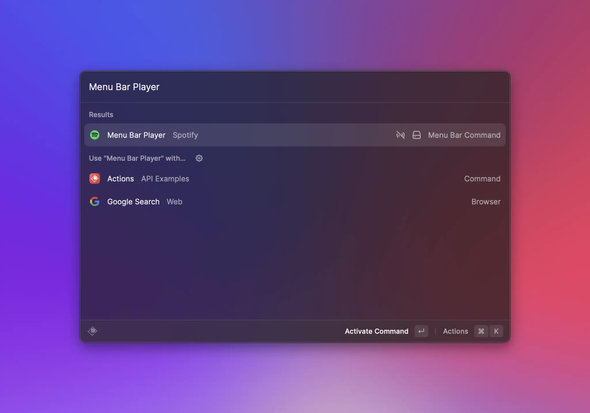
Running it once should activate it to:

## Lifecycle
Although `menu-bar` commands can result in items permanently showing up in the macOS menu bar, they are not long-lived processes. Instead, as with other commands, Raycast loads them into memory on demand, executes their code and then tries to unload them at the next convenient time. There are five distinct events that can result in a `menu-bar`'s item being placed in the menu bar, so let's walk through each one.
### From the root search
Same as any other commands, `menu-bar` commands can be run directly from Raycast's root search. Eventually, they may result in a new item showing up in your menu bar (if you have enough room and if the command returns a `MenuBarExtra`), or in a previous item disappearing, if the command returns `null`. In this case, Raycast will load your command code, execute it, wait for the `MenuBarExtra`'s `isLoading` prop to switch to `false`, and unload the command.
{% hint style="danger" %}
If your command returns a `MenuBarExtra`, it *must* either not set `isLoading` - in which case Raycast will render and immediately unload the command, or set it to `true` while it's performing an async task (such as an API call) and then set it to `false` once it's done. Same as above, Raycast will load the command code, execute it, wait for `MenuBarExtra`'s `isLoading` prop to switch to `false`, and then unload the command.
{% endhint %}
### At a set interval
If your `menu-bar` command also makes use of [background refresh](https://developers.raycast.com/information/lifecycle/background-refresh) *and* it has background refresh activated, Raycast will run the command at set intervals. In your command, you can use `environment.launchType` to check whether it is launched in the background or by the user.
{% hint style="info" %}
To ease testing, commands configured to run in the background have an extra action in development mode:\
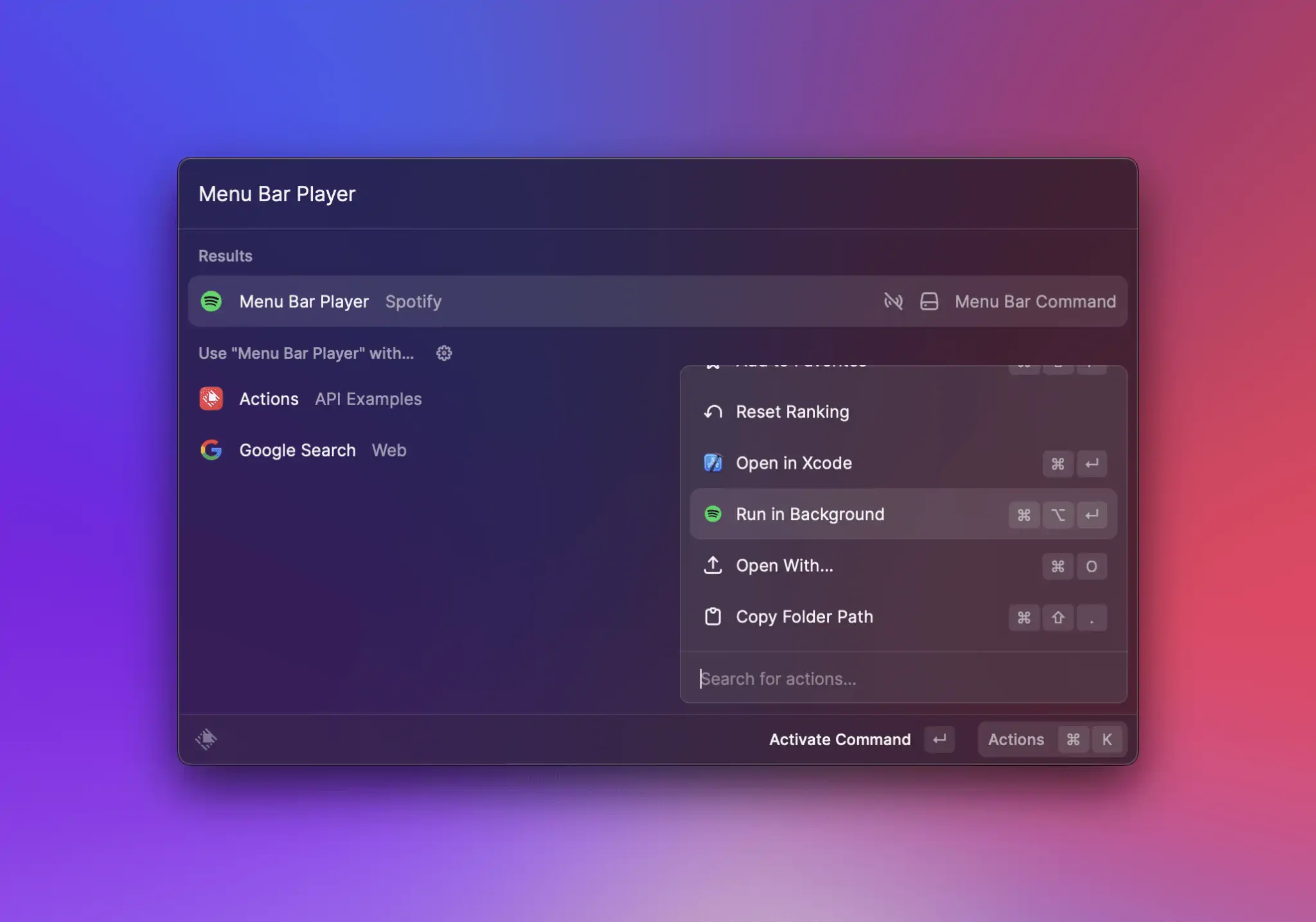
{% endhint %}
### When the user clicks the command's icon / title in the menu bar
One of the bigger differences to `view` or `no-view` commands is that `menu-bar` commands have an additional entry point: when the user clicks their item in the menu bar. If the item has a menu (i.e. `MenuBarExtra` provides at least one child), Raycast will load the command code, execute it and keep it in memory while the menu is open. When the menu closes (either by the user clicking outside, or by clicking a `MenuBarExtra.Item`), the command is then unloaded.
### When Raycast is restarted
This case assumes that your command has run at least once, resulting in an item being placed in the menu bar. If that's the case, quitting and starting Raycast again should put the same item in your menu bar. However, that item will be restored from Raycast's database - *not* by loading and executing the command.
### When a menu bar command is re-enabled in preferences
This case should work the same as when Raycast is restarted.
## Best practices
* make generous use of the [Cache API](https://developers.raycast.com/api-reference/cache) and our [Utilities](https://developers.raycast.com/utilities/getting-started) in order to provide quick feedback and ensure action handlers work as expected
* make sure you set `isLoading` to false when your command finishes executing
* avoid setting long titles in `MenuBarExtra`, `MenuBarExtra.Submenu` or `MenuBarExtra.Item`
* don't put identical `MenuBarExtra.Item`s at the same level (direct children of `MenuBarExtra` or in the same `Submenu`) as their `onAction` handlers will not be executed correctly
## API Reference
### MenuBarExtra
Adds an item to the menu bar, optionally with a menu attached in case its `children` prop is non-empty.
{% hint style="info" %}
`menu-bar` commands don't always need to return a `MenuBarExtra`. Sometimes it makes sense to remove an item from the menu bar, in which case you can write your command logic to return `null` instead.
{% endhint %}
#### Example
```typescript
import { Icon, MenuBarExtra, open } from "@raycast/api";
const data = {
archivedBookmarks: [{ name: "Google Search", url: "www.google.com" }],
newBookmarks: [{ name: "Raycast", url: "www.raycast.com" }],
};
export default function Command() {
return (
{data?.newBookmarks.map((bookmark) => (
open(bookmark.url)} />
))}
{data?.archivedBookmarks.map((bookmark) => (
open(bookmark.url)} />
))}
);
}
```
#### Props
| Prop | Description | Type | Default |
| --------- | ----------------------------------------------------------------------------------------------------------------------------------------------------------------------------------------------------------------------------------------------------------------------------- | --------------------------------------------------------------------------------------------------- | ------- |
| children | `MenuBarExtra.Item`s, `MenuBarExtra.Submenu`s, `MenuBarExtra.Separator` or a mix of either. | `React.ReactNode` | - |
| icon | The icon that is displayed in the menu bar. | [`Image.ImageLike`](https://developers.raycast.com/user-interface/icons-and-images#image.imagelike) | - |
| isLoading | Indicates to Raycast that it should not unload the command, as it is still executing. If you set make use of `isLoading`, you need to make sure you set it to `false` at the end of the task you are executing (such as an API call), so Raycast can then unload the command. | `boolean` | - |
| title | The string that is displayed in the menu bar. | `string` | - |
| tooltip | A tooltip to display when the cursor hovers the item in the menu bar. | `string` | - |
### MenuBarExtra.Item
An item in the [MenuBarExtra](#menubarextra) or in a [MenuBarExtra.Submenu](#menubarextra.submenu).
#### Example
{% tabs %}
{% tab title="ItemWithTitle.tsx" %}
An item that only provides a `title` prop will be rendered as disabled. Use this to create section titles.
```typescript
import { Icon, MenuBarExtra } from "@raycast/api";
export default function Command() {
return (
);
}
```
{% endtab %}
{% tab title="ItemWithTitleAndIcon.tsx" %}
Similarly, an item that provides a `title` and an `icon` prop will also be rendered as disabled.
```typescript
import { Icon, MenuBarExtra } from "@raycast/api";
export default function Command() {
return (
);
}
```
{% endtab %}
{% tab title="ItemWithAction.tsx" %}
An item that provides an `onAction` prop alongside `title` (and optionally `icon`) will *not* be rendered as disabled. When users click this item in the menu bar, the action handler will be executed.
```typescript
import { Icon, MenuBarExtra, open } from "@raycast/api";
export default function Command() {
return (
open("https://raycast.com")} />
);
}
```
{% endtab %}
{% tab title="ItemWithAlternate.tsx" %}
If an item provides another `MenuBarEtra.Item` via its `alternate`, prop, the second item will be shown then the user presses the ⌥ (opt) key. There are a few limitation:
1. The `alternate` item may not have a custom shortcut. Instead, it will inherit its parent's shortcut, with the addition of ⌥ (opt) as a modifier.
2. The `alternate` item may not also specify an alternate.
3. A parent item that provides an `alternate` may not use ⌥ (opt) as a modifier.
```typescript
import { Icon, MenuBarExtra, open } from "@raycast/api";
export default function Command() {
return (
open("https://raycast.com")}
alternate={
open("https://raycast.com/store")}
/>
}
/>
);
}
```
{% endtab %}
{% endtabs %}
#### Props
| Prop | Description | Type | Default |
| --------------------------------------- | ------------------------------------------------------------------------ | --------------------------------------------------------------------------------------------------- | ------- |
| title\* | The main title displayed for this item. | `string` | - |
| alternate | A MenuBarExtra.Item to be displayed when a user presses the ⌥ (opt) key. | `ReactElement<`[`MenuBarExtra.Item.Props`](#props)`>` | - |
| icon | An optional icon for this item. | [`Image.ImageLike`](https://developers.raycast.com/user-interface/icons-and-images#image.imagelike) | - |
| onAction | An action handler called when the user clicks the item. | `(event:` [`MenuBarExtra.ActionEvent`](#menubarextra.actionevent)`) => void` | - |
| shortcut | A shortcut used to invoke this item when its parent menu is open. | [`Keyboard.Shortcut`](https://developers.raycast.com/keyboard#keyboard.shortcut) | - |
| subtitle | The subtitle displayed for this item. | `string` | - |
| tooltip | A tooltip to display when the cursor hovers the item. | `string` | - |
### MenuBarExtra.Submenu
`MenuBarExtra.Submenu`s reveal their items when people interact with them. They're a good way to group items that naturally belong together, but keep in mind that submenus add complexity to your interface - so use them sparingly!
#### Example
{% tabs %}
{% tab title="Bookmarks.tsx" %}
```typescript
import { Icon, MenuBarExtra, open } from "@raycast/api";
export default function Command() {
return (
open("https://raycast.com")} />
open("https://github.com/pulls")} />
open("https://github.com/issues")} />
);
}
```
{% endtab %}
{% tab title="DisabledSubmenu.tsx" %}
Submenus with no children will show up as disabled.
```typescript
import { Icon, MenuBarExtra, open } from "@raycast/api";
export default function Command() {
return (
);
}
```
{% endtab %}
{% endtabs %}
#### Props
| Prop | Description | Type | Default |
| --------------------------------------- | ------------------------------------------------------------------------------------------- | --------------------------------------------------------------------------------------------------- | ------- |
| title\* | The main title displayed for this submenu. | `string` | - |
| children | `MenuBarExtra.Item`s, `MenuBarExtra.Submenu`s, `MenuBarExtra.Separator` or a mix of either. | `React.ReactNode` | - |
| icon | An optional icon for this submenu. | [`Image.ImageLike`](https://developers.raycast.com/user-interface/icons-and-images#image.imagelike) | - |
### MenuBarExtra.Section
An item to group related menu items. It has an optional title and a separator is added automatically between sections.
#### Example
```typescript
import { Icon, MenuBarExtra, open } from "@raycast/api";
const data = {
archivedBookmarks: [{ name: "Google Search", url: "www.google.com" }],
newBookmarks: [{ name: "Raycast", url: "www.raycast.com" }],
};
export default function Command() {
return (
{data?.newBookmarks.map((bookmark) => (
open(bookmark.url)} />
))}
{data?.archivedBookmarks.map((bookmark) => (
open(bookmark.url)} />
))}
);
}
```
#### Props
| Prop | Description | Type | Default |
| -------- | --------------------------------- | ----------------- | ------- |
| children | The item elements of the section. | `React.ReactNode` | - |
| title | Title displayed above the section | `string` | - |
## Types
### MenuBarExtra.ActionEvent
An interface describing Action events in callbacks.
#### Properties
| Property | Description | Type |
| -------------------------------------- | --------------------------------------------------------------------------------------------------------------------------------------------------------------------------------- | --------------------------------- |
| type\* | A type of the action event \* `left-click` is a left mouse click on the MenuBarExtra.Item or a Keyboard.Shortcut \* `right-click` is a right mouse click on the MenuBarExtra.Item | `"left-click"` or `"right-click"` |
#### Example
```typescript
import { MenuBarExtra } from "@raycast/api";
export default function Command() {
return (
console.log("Action Event Type", event.type)}
/>
);
}
```
---
# Source: https://developers.raycast.com/misc/migration.md
# Migration
This section contains guides to help migrate your extension to a newer version of the API.
## How to automatically migrate your extensions
Whenever possible, we provide tools to automate the migration to a newer version of the API using [codemods](https://github.com/facebook/jscodeshift).
To run the codemods, run the following command in your extension directory:
```bash
npx ray migrate
```
or
```bash
npx @raycast/migration@latest .
```
It will detect the version of the API you were previously using and apply all the migrations that have been available since.
After running it, do go through the updated files and make sure nothing is broken - there are always edge cases.
---
# Source: https://developers.raycast.com/api-reference/user-interface/navigation.md
# Navigation
## API Reference
### useNavigation
A hook that lets you push and pop view components in the navigation stack.
You most likely won't use this hook too often. To push a new component, use the [Push Action](https://developers.raycast.com/api-reference/actions#action.push). When a user presses `ESC`, we automatically pop to the previous component.
#### Signature
```typescript
function useNavigation(): Navigation;
```
#### Example
```typescript
import { Action, ActionPanel, Detail, useNavigation } from "@raycast/api";
function Ping() {
const { push } = useNavigation();
return (
push()} />
}
/>
);
}
function Pong() {
const { pop } = useNavigation();
return (
}
/>
);
}
export default function Command() {
return ;
}
```
#### Return
A [Navigation](#navigation) object with [Navigation.push](#navigation) and [Navigation.pop](#navigation) functions. Use the functions to alter the navigation stack.
## Types
### Navigation
Return type of the [useNavigation](#usenavigation) hook to perform push and pop actions.
#### Properties
| Property | Description | Type |
| -------------------------------------- | ----------------------------------------------------- | --------------------------------------------------------- |
| pop\* | Pop current view component from the navigation stack. | `() => void` |
| push\* | Push a new view component to the navigation stack. | `(component: React.ReactNode, onPop: () => void) => void` |
---
# Source: https://developers.raycast.com/utilities/oauth.md
# Source: https://developers.raycast.com/api-reference/oauth.md
# OAuth
## Prerequisites
A Raycast extension can use OAuth for authorizing access to a provider's resources on the user's behalf. Since Raycast is a desktop app and the extensions are considered "public", we only support the [PKCE flow](https://datatracker.ietf.org/doc/html/rfc7636) (Proof Key for Code Exchange, pronounced “pixy”). This flow is the official recommendation for native clients that cannot keep a client secret. With PKCE, the client dynamically creates a secret and uses the secret again during code exchange, ensuring that only the client that performed the initial request can exchange the code for the access token (”proof of possession”).
{% hint style="info" %}
Providers such as Google, Twitter, GitLab, Spotify, Zoom, Asana or Dropbox are all PKCE-ready.
However, if your provider doesn't support PKCE, you can use our [PKCE proxy](https://oauth.raycast.com). It allows extensions to securely use an OAuth flow without exposing any secret.
{% endhint %}
## OAuth Flow

The OAuth flow from an extension looks like this:
1. The extension initiates the OAuth flow and starts authorization
2. Raycast shows the OAuth overlay ("Connect to provider…")
3. The user opens the provider's consent page in the web browser
4. After the user consent, the provider redirects back to Raycast
5. Raycast opens the extension where authorization is completed
When the flow is complete, the extension has received an access token from the provider and can perform API calls.\
The API provides functions for securely storing and retrieving token sets, so that an extension can check whether the user is already logged in and whether an expired access token needs to be refreshed. Raycast also automatically shows a logout preference.
## OAuth App
You first need to register a new OAuth app with your provider. This is usually done in the provider's developer portal. After registering, you will receive a client ID. You also need to configure a redirect URI, see the next section.
Note: Make sure to choose an app type that supports PKCE. Some providers still show you a client secret, which you don't need and should *not* hardcode in the extension, or support PKCE only for certain types such as "desktop", "native" or "mobile" app types.
## Authorizing
An extension can initiate the OAuth flow and authorize by using the methods on [OAuth.PKCEClient](#oauth.pkceclient).
You can create a new client and configure it with a provider name, icon and description that will be shown in the OAuth overlay. You can also choose between different redirect methods; depending on which method you choose, you need to configure this value as redirect URI in your provider's registered OAuth app. (See the [OAuth.RedirectMethod](#oauth.redirectmethod) docs for each method to get concrete examples for supported redirect URI.) If you can choose, use `OAuth.RedirectMethod.Web` and enter `https://raycast.com/redirect?packageName=Extension` (whether you have to add the `?packageName=Extension` depends on the provider).
```typescript
import { OAuth } from "@raycast/api";
const client = new OAuth.PKCEClient({
redirectMethod: OAuth.RedirectMethod.Web,
providerName: "Twitter",
providerIcon: "twitter-logo.png",
description: "Connect your Twitter account…",
});
```
Next you create an authorization request with the authorization endpoint, client ID, and scope values. You receive all values from your provider's docs and when you register a new OAuth app.
The returned [AuthorizationRequest](#oauth.authorizationrequest) contains parameters such as the code challenge, verifier, state and redirect URI as standard OAuth authorization request. You can also customize the authorization URL through [OAuth.AuthorizationOptions](#oauth.authorizationoptions) if you need to.
```typescript
const authRequest = await client.authorizationRequest({
endpoint: "https://twitter.com/i/oauth2/authorize",
clientId: "YourClientId",
scope: "tweet.read users.read follows.read",
});
```
To get the authorization code needed for the token exchange, you call [authorize](#oauth.pkceclient-authorize) with the request from the previous step.\
This call shows the Raycast OAuth overlay and provides the user with an option to open the consent page in the web browser.\
The authorize promise is resolved after the redirect back to Raycast and into the extension:
```typescript
const { authorizationCode } = await client.authorize(authRequest);
```
{% hint style="info" %}
When in development mode, make sure not to trigger auto-reloading (e.g. by saving a file) while you're testing an active OAuth authorization and redirect. This would cause an OAuth state mismatch when you're redirected back into the extension since the client would be reinitialized on reload.
{% endhint %}
Now that you have received the authorization code, you can exchange this code for an access token using your provider's token endpoint. This token exchange (and the following API calls) can be done with your preferred Node HTTP client library. Example using `node-fetch`:
```typescript
async function fetchTokens(authRequest: OAuth.AuthorizationRequest, authCode: string): Promise {
const params = new URLSearchParams();
params.append("client_id", "YourClientId");
params.append("code", authCode);
params.append("code_verifier", authRequest.codeVerifier);
params.append("grant_type", "authorization_code");
params.append("redirect_uri", authRequest.redirectURI);
const response = await fetch("https://api.twitter.com/2/oauth2/token", {
method: "POST",
body: params,
});
if (!response.ok) {
console.error("fetch tokens error:", await response.text());
throw new Error(response.statusText);
}
return (await response.json()) as OAuth.TokenResponse;
}
```
## Token Storage
The PKCE client exposes methods for storing, retrieving and deleting token sets. A [TokenSet](#oauth.tokenset) contains an access token and typically also a refresh token, expires value, and the current scope. Since this data is returned by the provider's token endpoint as standard OAuth JSON response, you can directly store the response ([OAuth.TokenResponse](#oauth.tokenresponse)) or alternatively use [OAuth.TokenSetOptions](#oauth.tokensetoptions):
```typescript
await client.setTokens(tokenResponse);
```
Once the token set is stored, Raycast will automatically show a logout preference for the extension. When the user logs out, the token set gets removed.
The [TokenSet](#oauth.tokenset) also enables you to check whether the user is logged in before starting the authorization flow:
```typescript
const tokenSet = await client.getTokens();
```
## Token Refresh
Since access tokens usually expire, an extension should provide a way to refresh the access token, otherwise users would be logged out or see errors.\
Some providers require you to add an offline scope so that you get a refresh token. (Twitter, for example, needs the scope `offline.access` or it only returns an access token.)\
A basic refresh flow could look like this:
```typescript
const tokenSet = await client.getTokens();
if (tokenSet?.accessToken) {
if (tokenSet.refreshToken && tokenSet.isExpired()) {
await client.setTokens(await refreshTokens(tokenSet.refreshToken));
}
return;
}
// authorize...
```
This code would run before starting the authorization flow. It checks the presence of a token set to see whether the user is logged in and then checks whether there is a refresh token and the token set is expired (through the convenience method `isExpired()` on the [TokenSet](#oauth.tokenset)). If it is expired, the token is refreshed and updated in the token set. Example using `node-fetch`:
```typescript
async function refreshTokens(refreshToken: string): Promise {
const params = new URLSearchParams();
params.append("client_id", "YourClientId");
params.append("refresh_token", refreshToken);
params.append("grant_type", "refresh_token");
const response = await fetch("https://api.twitter.com/2/oauth2/token", {
method: "POST",
body: params,
});
if (!response.ok) {
console.error("refresh tokens error:", await response.text());
throw new Error(response.statusText);
}
const tokenResponse = (await response.json()) as OAuth.TokenResponse;
tokenResponse.refresh_token = tokenResponse.refresh_token ?? refreshToken;
return tokenResponse;
}
```
## Examples
We've provided [OAuth example integrations for Google, Twitter, and Dropbox](https://github.com/raycast/extensions/tree/main/examples/api-examples) that demonstrate the entire flow shown above.
## API Reference
### OAuth.PKCEClient
Use [OAuth.PKCEClient.Options](#oauth.pkceclient.options) to configure what's shown on the OAuth overlay.
#### Signature
```typescript
constructor(options: OAuth.PKCEClient.Options): OAuth.PKCEClient
```
#### Example
```typescript
import { OAuth } from "@raycast/api";
const client = new OAuth.PKCEClient({
redirectMethod: OAuth.RedirectMethod.Web,
providerName: "Twitter",
providerIcon: "twitter-logo.png",
description: "Connect your Twitter account…",
});
```
#### Methods
| Method |
| --------------------------------------------------------------------------------------------------------------- |
| [`authorizationRequest(options: AuthorizationRequestOptions): Promise`](#oauth.pkceclient-authorizationrequest) |
| [`authorize(options: AuthorizationRequest \| AuthorizationOptions): Promise`](#oauth.pkceclient-authorize) |
| [`setTokens(options: TokenSetOptions \| TokenResponse): Promise`](#oauth.pkceclient-settokens) |
| [`getTokens(): Promise`](#oauth.pkceclient-gettokens) |
| [`removeTokens(): Promise`](#oauth.pkceclient-removetokens) |
### OAuth.PKCEClient#authorizationRequest
Creates an authorization request for the provided authorization endpoint, client ID, and scopes. You need to first create the authorization request before calling [authorize](#oauth.pkceclient-authorize).
The generated code challenge for the PKCE request uses the S256 method.
#### Signature
```typescript
authorizationRequest(options: AuthorizationRequestOptions): Promise;
```
#### Example
```typescript
const authRequest = await client.authorizationRequest({
endpoint: "https://twitter.com/i/oauth2/authorize",
clientId: "YourClientId",
scope: "tweet.read users.read follows.read",
});
```
#### Parameters
| Name | Type | Description |
| ----------------------------------------- | ------------------------------------------------------------------- | ----------------------------------------------------- |
| options\* | [`AuthorizationRequestOptions`](#oauth.authorizationrequestoptions) | The options used to create the authorization request. |
#### Return
A promise for an [AuthorizationRequest](#oauth.authorizationrequest) that you can use as input for [authorize](#oauth.pkceclient-authorize).
### OAuth.PKCEClient#authorize
Starts the authorization and shows the OAuth overlay in Raycast. As parameter you can either directly use the returned request from [authorizationRequest](#oauth.authorizationrequest), or customize the URL by extracting parameters from [AuthorizationRequest](#oauth.authorizationrequest) and providing your own URL via [AuthorizationOptions](#oauth.authorizationoptions). Eventually the URL will be used to open the authorization page of the provider in the web browser.
#### Signature
```typescript
authorize(options: AuthorizationRequest | AuthorizationOptions): Promise;
```
#### Example
```typescript
const { authorizationCode } = await client.authorize(authRequest);
```
#### Parameters
| Name | Type | Description |
| ----------------------------------------- | ---------------------------------------------------------------------------------------------------------------- | ------------------------------ |
| options\* | [`AuthorizationRequest`](#oauth.authorizationrequest) `\|` [`AuthorizationOptions`](#oauth.authorizationoptions) | The options used to authorize. |
#### Return
A promise for an [AuthorizationResponse](#oauth.authorizationresponse), which contains the authorization code needed for the token exchange. The promise is resolved when the user was redirected back from the provider's authorization page to the Raycast extension.
### OAuth.PKCEClient#setTokens
Securely stores a [TokenSet](#oauth.tokenset) for the provider. Use this after fetching the access token from the provider. If the provider returns a a standard OAuth JSON token response, you can directly pass the [TokenResponse](#oauth.tokenresponse).\
At a minimum, you need to set the `accessToken`, and typically you also set `refreshToken` and `isExpired`.
Raycast automatically shows a logout preference for the extension when a token set was saved.
If you want to make use of the convenience `isExpired()` method, the property `expiresIn` must be configured.
#### Signature
```typescript
setTokens(options: TokenSetOptions | TokenResponse): Promise;
```
#### Example
```typescript
await client.setTokens(tokenResponse);
```
#### Parameters
| Name | Type | Description |
| ----------------------------------------- | ---------------------------------------------------------------------------------------- | ---------------------------------------- |
| options\* | [`TokenSetOptions`](#oauth.tokensetoptions) `\|` [`TokenResponse`](#oauth.tokenresponse) | The options used to store the token set. |
#### Return
A promise that resolves when the token set has been stored.
### OAuth.PKCEClient#getTokens
Retrieves the stored [TokenSet](#oauth.tokenset) for the client. You can use this to initially check whether the authorization flow should be initiated or the user is already logged in and you might have to refresh the access token.
#### Signature
```typescript
getTokens(): Promise;
```
#### Example
```typescript
const tokenSet = await client.getTokens();
```
#### Return
A promise that resolves when the token set has been retrieved.
### OAuth.PKCEClient#removeTokens
Removes the stored [TokenSet](#oauth.tokenset) for the client.\
Raycast automatically shows a logout preference that removes the token set. Use this method only if you need to provide an additional logout option in your extension or you want to remove the token set because of a migration.
#### Signature
```typescript
removeTokens(): Promise;
```
#### Example
```typescript
await client.removeTokens();
```
#### Return
A promise that resolves when the token set has been removed.
## Types
### OAuth.PKCEClient.Options
The options for creating a new [PKCEClient](#oauth.pkceclient).
#### Properties
| Property | Description | Type |
| ------------------------------------------------ | --------------------------------------------------------------------------------------------------------------------------------------------------------------------------------------------------------------------------------------- | --------------------------------------------------------------------------------------------------- |
| providerName\* | The name of the provider, displayed in the OAuth overlay. | `string` |
| redirectMethod\* | The redirect method for the OAuth flow. Make sure to set this to the correct method for the provider, see OAuth.RedirectMethod for more information. | [`OAuth.RedirectMethod`](#oauth.redirectmethod) |
| description | An optional description, shown in the OAuth overlay. You can use this to customize the message for the end user, for example for handling scope changes or other migrations. Raycast shows a default message if this is not configured. | `string` |
| providerIcon | An icon displayed in the OAuth overlay. Make sure to provide at least a size of 64x64 pixels. | [`Image.ImageLike`](https://developers.raycast.com/user-interface/icons-and-images#image.imagelike) |
| providerId | An optional ID for associating the client with a provider. Only set this if you use multiple different clients in your extension. | `string` |
### OAuth.RedirectMethod
Defines the supported redirect methods for the OAuth flow. You can choose between web and app-scheme redirect methods, depending on what the provider requires when setting up the OAuth app. For examples on what redirect URI you need to configure, see the docs for each method.
#### Enumeration members
| Name | Value |
| ------ | ------------------------------------------------------------------------------------------------------------------------------------------------------------------------------------------------------------------------------------------------------------------------------------------------------------------------------------------------------------------------------------------------------------------------------------------------------------------------------------------------------------------------------------------------------------------------------------------------------------------------------------------------------------------- |
| Web | Use this type for a redirect back to the Raycast website, which will then open the extension. In the OAuth app, configure
(This is a static redirect URL for all extensions.)
If the provider does not accept query parameters in redirect URLs, you can alternatively use extraParameters property. For example add: extraParameters: { "redirect\_uri": "" }
|
| App | Use this type for an app-scheme based redirect that directly opens Raycast. In the OAuth app, configure `raycast://oauth?package_name=Extension` |
| AppURI | Use this type for a URI-style app scheme that directly opens Raycast. In the OAuth app, configure com.raycast:/oauth?package\_name=Extension
(Note the single slash – Google, for example, would require this flavor for an OAuth app where the Bundle ID is com.raycast)
|
### OAuth.AuthorizationRequestOptions
The options for an authorization request via [authorizationRequest](#oauth.authorizationrequest).
| Property | Description | Type |
| ------------------------------------------ | -------------------------------------------------------------------------------------------------------------------------------------------------------------------------------------------------------------------------------------------------------------------------------------- | ---------------------- |
| clientId\* | The client ID of the configured OAuth app. | `string` |
| endpoint\* | The URL to the authorization endpoint for the OAuth provider. | `string` |
| scope\* | A space-delimited list of scopes for identifying the resources to access on the user's behalf. The scopes are typically shown to the user on the provider's consent screen in the browser. Note that some providers require the same scopes be configured in the registered OAuth app. | `string` |
| extraParameters | Optional additional parameters for the authorization request. Note that some providers require additional parameters, for example to obtain long-lived refresh tokens. | `{ [string]: string }` |
### OAuth.AuthorizationRequestURLParams
Values of [AuthorizationRequest](#oauth.authorizationrequest).\
The PKCE client automatically generates the values for you and returns them for [authorizationRequest](#oauth.authorizationrequest)
| Property | Description | Type |
| ----------------------------------------------- | -------------------------------- | -------- |
| codeChallenge\* | The PKCE `code_challenge` value. | `string` |
| codeVerifier\* | The PKCE `code_verifier` value. | `string` |
| redirectURI\* | The OAuth `redirect_uri` value. | `string` |
| state\* | The OAuth `state` value. | `string` |
### OAuth.AuthorizationRequest
The request returned by [authorizationRequest](#oauth.authorizationrequest).\
Can be used as direct input to [authorize](#oauth.pkceclient-authorize), or to extract parameters for constructing a custom URL in [AuthorizationOptions](#oauth.authorizationoptions).
| Property | Description | Type |
| ----------------------------------------------- | -------------------------------- | -------------- |
| codeChallenge\* | The PKCE `code_challenge` value. | `string` |
| codeVerifier\* | The PKCE `code_verifier` value. | `string` |
| redirectURI\* | The OAuth `redirect_uri` value. | `string` |
| state\* | The OAuth `state` value. | `string` |
| toURL\* | | `() => string` |
#### Methods
| Name | Type | Description |
| ------- | -------------- | -------------------------------------- |
| toURL() | `() => string` | Constructs the full authorization URL. |
### OAuth.AuthorizationOptions
Options for customizing [authorize](#oauth.pkceclient-authorize).\
You can use values from [AuthorizationRequest](#oauth.authorizationrequest) to build your own URL.
| Property | Description | Type |
| ------------------------------------- | --------------------------- | -------- |
| url\* | The full authorization URL. | `string` |
### OAuth.AuthorizationResponse
The response returned by [authorize](#oauth.pkceclient-authorize), containing the authorization code after the provider redirect. You can then exchange the authorization code for an access token using the provider's token endpoint.
| Property | Description | Type |
| --------------------------------------------------- | ----------------------------------------------- | -------- |
| authorizationCode\* | The authorization code from the OAuth provider. | `string` |
### OAuth.TokenSet
Describes the TokenSet created from an OAuth provider's token response. The `accessToken` is the only required parameter but typically OAuth providers also return a refresh token, an expires value, and the scope.\
Securely store a token set via [setTokens](#oauth.pkceclient-settokens) and retrieve it via [getTokens](#oauth.pkceclient-gettokens).
| Property | Description | Type |
| --------------------------------------------- | -------------------------------------------------------------------------------------------------------------------------------------------------------------------------------------------------------------------------------------------------------------------------------- | ----------------------------------------------------------------------------------------------- |
| accessToken\* | The access token returned by an OAuth token request. | `string` |
| updatedAt\* | The date when the token set was stored via OAuth.PKCEClient.setTokens. | [`Date`](https://developer.mozilla.org/en-US/docs/Web/JavaScript/Reference/Global_Objects/Date) |
| isExpired\* | | `() => boolean` |
| expiresIn | An optional expires value (in seconds) returned by an OAuth token request. | `number` |
| idToken | An optional id token returned by an identity request (e.g. /me, Open ID Connect). | `string` |
| refreshToken | An optional refresh token returned by an OAuth token request. | `string` |
| scope | The optional space-delimited list of scopes returned by an OAuth token request. You can use this to compare the currently stored access scopes against new access scopes the extension might require in a future version, and then ask the user to re-authorize with new scopes. | `string` |
#### Methods
| Name | Type | Description |
| ----------- | --------------- | ---------------------------------------------------------------------------------------------------------------------------------------------------------------------------------------------------------------------------------------------------- |
| isExpired() | `() => boolean` | A convenience method for checking whether the access token has expired. The method factors in some seconds of "buffer", so it returns true a couple of seconds before the actual expiration time. This requires the `expiresIn` parameter to be set. |
### OAuth.TokenSetOptions
Options for a [TokenSet](#oauth.tokenset) to store via [setTokens](#oauth.pkceclient-settokens).
| Property | Description | Type |
| --------------------------------------------- | --------------------------------------------------------------------------------- | -------- |
| accessToken\* | The access token returned by an OAuth token request. | `string` |
| expiresIn | An optional expires value (in seconds) returned by an OAuth token request. | `number` |
| idToken | An optional id token returned by an identity request (e.g. /me, Open ID Connect). | `string` |
| refreshToken | An optional refresh token returned by an OAuth token request. | `string` |
| scope | The optional scope value returned by an OAuth token request. | `string` |
### OAuth.TokenResponse
Defines the standard JSON response for an OAuth token request.\
The response can be directly used to store a [TokenSet](#oauth.tokenset) via [setTokens](#oauth.pkceclient-settokens).
| Property | Description | Type |
| ----------------------------------------------- | ----------------------------------------------------------------------------------------- | -------- |
| access\_token\* | The `access_token` value returned by an OAuth token request. | `string` |
| expires\_in | An optional `expires_in` value (in seconds) returned by an OAuth token request. | `number` |
| id\_token | An optional `id_token` value returned by an identity request (e.g. /me, Open ID Connect). | `string` |
| refresh\_token | An optional `refresh_token` value returned by an OAuth token request. | `string` |
| scope | The optional `scope` value returned by an OAuth token request. | `string` |
---
# Source: https://developers.raycast.com/utilities/oauth/oauthservice.md
# OAuthService
The `OAuthService` class is designed to abstract the OAuth authorization process using the PKCE (Proof Key for Code Exchange) flow, simplifying the integration with various OAuth providers such as Asana, GitHub, and others.
Use [OAuthServiceOptions](#oauthserviceoptions) to configure the `OAuthService` class.
## Example
```ts
const client = new OAuth.PKCEClient({
redirectMethod: OAuth.RedirectMethod.Web,
providerName: "GitHub",
providerIcon: "extension_icon.png",
providerId: "github",
description: "Connect your GitHub account",
});
const github = new OAuthService({
client,
clientId: "7235fe8d42157f1f38c0",
scope: "notifications repo read:org read:user read:project",
authorizeUrl: "https://github.oauth.raycast.com/authorize",
tokenUrl: "https://github.oauth.raycast.com/token",
});
```
## Signature
```ts
constructor(options: OAuthServiceOptions): OAuthService
```
### Methods
#### `authorize`
Initiates the OAuth authorization process or refreshes existing tokens if necessary. Returns a promise that resolves with the access token from the authorization flow.
**Signature**
```ts
OAuthService.authorize(): Promise;
```
**Example**
```typescript
const accessToken = await oauthService.authorize();
```
### Built-in Services
Some services are exposed as static properties in `OAuthService` to make it easy to authenticate with them:
* [Asana](#asana)
* [GitHub](#github)
* [Google](#google)
* [Jira](#jira)
* [Linear](#linear)
* [Slack](#slack)
* [Zoom](#zoom)
Asana, GitHub, Linear, and Slack already have an OAuth app configured by Raycast so that you can use them right of the box by specifing only the permission scopes. You are still free to create an OAuth app for them if you want.
Google, Jira and Zoom don't have an OAuth app configured by Raycast so you'll have to create one if you want to use them.
Use [ProviderOptions](#provideroptions) or [ProviderWithDefaultClientOptions](#providerwithdefaultclientoptions) to configure these built-in services.
#### Asana
**Signature**
```ts
OAuthService.asana: (options: ProviderWithDefaultClientOptions) => OAuthService
```
**Example**
```tsx
const asana = OAuthService.asana({ scope: "default" });
```
#### GitHub
**Signature**
```ts
OAuthService.github: (options: ProviderWithDefaultClientOptions) => OAuthService
```
**Example**
```tsx
const github = OAuthService.github({ scope: "repo user" });
```
#### Google
Google has verification processes based on the required scopes for your extension. Therefore, you need to configure your own client for it.
{% hint style="info" %}
Creating your own Google client ID is more tedious than other processes, so we’ve created a page to assist you: [Getting a Google client ID](https://developers.raycast.com/utilities/oauth/getting-google-client-id)
{% endhint %}
**Signature**
```ts
OAuthService.google: (options: ProviderOptions) => OAuthService
```
**Example**
```tsx
const google = OAuthService.google({
clientId: "custom-client-id",
scope: "https://www.googleapis.com/auth/drive.readonly",
});
```
#### Jira
Jira requires scopes to be enabled manually in the OAuth app settings. Therefore, you need to configure your own client for it.
**Signature**
```ts
OAuthService.jira: (options: ProviderOptions) => OAuthService
```
**Example**
```tsx
const jira = OAuthService.jira({
clientId: "custom-client-id",
scope: "read:jira-user read:jira-work offline_access",
});
```
#### Linear
**Signature**
```ts
OAuthService.linear: (options: ProviderOptions) => OAuthService
```
**Example**
```tsx
const linear = OAuthService.linear({ scope: "read write" });
```
#### Slack
**Signature**
```ts
OAuthService.slack: (options: ProviderWithDefaultClientOptions) => OAuthService
```
**Example**
```tsx
const slack = OAuthService.slack({ scope: "emoji:read" });
```
#### Zoom
Zoom requires scopes to be enabled manually in the OAuth app settings. Therefore, you need to configure your own client for it.
**Signature**
```ts
OAuthService.zoom: (options: ProviderOptions) => OAuthService
```
**Example**
```tsx
const zoom = OAuthService.zoom({
clientId: "custom-client-id",
scope: "meeting:write",
});
```
## Types
### OAuthServiceOptions
| Property Name | Description | Type |
| ---------------------------------------------- | ---------------------------------------------------------------------------------------------------------------------------------- | -------------------------------------------- |
| client\* | The PKCE Client defined using `OAuth.PKCEClient` from `@raycast/api` | `OAuth.PKCEClient` |
| clientId\* | The app's client ID | `string` |
| scope\* | The scope of the access requested from the provider | `string` \| `Array` |
| authorizeUrl\* | The URL to start the OAuth flow | `string` |
| tokenUrl\* | The URL to exchange the authorization code for an access token | `string` |
| refreshTokenUrl | The URL to refresh the access token if applicable | `string` |
| personalAccessToken | A personal token if the provider supports it | `string` |
| onAuthorize | A callback function that is called once the user has been properly logged in through OAuth when used with `withAccessToken` | `string` |
| extraParameters | The extra parameters you may need for the authorization request | `Record` |
| bodyEncoding | Specifies the format for sending the body of the request. | `json` \| `url-encoded` |
| tokenResponseParser | Some providers returns some non-standard token responses. Specifies how to parse the JSON response to get the access token | `(response: unknown) => OAuth.TokenResponse` |
| tokenRefreshResponseParser | Some providers returns some non-standard refresh token responses. Specifies how to parse the JSON response to get the access token | `(response: unknown) => OAuth.TokenResponse` |
### ProviderOptions
| Property Name | Description | Type |
| ---------------------------------------------- | ---------------------------------------------------------------------------------------------------------------------------------- | -------------------------------------------- |
| clientId\* | The app's client ID | `string` |
| scope\* | The scope of the access requested from the provider | `string` \| `Array` |
| authorizeUrl\* | The URL to start the OAuth flow | `string` |
| tokenUrl\* | The URL to exchange the authorization code for an access token | `string` |
| refreshTokenUrl | The URL to refresh the access token if applicable | `string` |
| personalAccessToken | A personal token if the provider supports it | `string` |
| onAuthorize | A callback function that is called once the user has been properly logged in through OAuth when used with `withAccessToken` | `string` |
| bodyEncoding | Specifies the format for sending the body of the request. | `json` \| `url-encoded` |
| tokenResponseParser | Some providers returns some non-standard token responses. Specifies how to parse the JSON response to get the access token | `(response: unknown) => OAuth.TokenResponse` |
| tokenRefreshResponseParser | Some providers returns some non-standard refresh token responses. Specifies how to parse the JSON response to get the access token | `(response: unknown) => OAuth.TokenResponse` |
### ProviderWithDefaultClientOptions
| Property Name | Description | Type |
| --------------------------------------- | ---------------------------------------------------------------------------------------------------------------------------------- | -------------------------------------------- |
| scope\* | The scope of the access requested from the provider | `string` \| `Array` |
| clientId | The app's client ID | `string` |
| authorizeUrl | The URL to start the OAuth flow | `string` |
| tokenUrl | The URL to exchange the authorization code for an access token | `string` |
| refreshTokenUrl | The URL to refresh the access token if applicable | `string` |
| personalAccessToken | A personal token if the provider supports it | `string` |
| onAuthorize | A callback function that is called once the user has been properly logged in through OAuth when used with `withAccessToken` | `string` |
| bodyEncoding | Specifies the format for sending the body of the request. | `json` \| `url-encoded` |
| tokenResponseParser | Some providers returns some non-standard token responses. Specifies how to parse the JSON response to get the access token | `(response: unknown) => OAuth.TokenResponse` |
| tokenRefreshResponseParser | Some providers returns some non-standard refresh token responses. Specifies how to parse the JSON response to get the access token | `(response: unknown) => OAuth.TokenResponse` |
---
# Source: https://developers.raycast.com/api-reference/preferences.md
# Preferences
Use the Preferences API to make your extension configurable.
Preferences are configured in the [manifest](https://developers.raycast.com/information/manifest#preference-properties) per command or shared in the context of an extension.
Required preferences need to be set by the user before a command opens. They are a great way to make sure that the user of your extension has everything set up properly.
## API Reference
### getPreferenceValues
A function to access the preference values that have been passed to the command.
Each preference name is mapped to its value, and the defined default values are used as fallback values.
#### Signature
```typescript
function getPreferenceValues(): { [preferenceName: string]: any };
```
{% hint style="info" %}
You don't need to manually set preference types as an interface since it is autogenerated in `raycast-env.d.ts` when you run the extension.
{% endhint %}
#### Example
```typescript
import { getPreferenceValues } from "@raycast/api";
export default async function Command() {
const preferences = getPreferenceValues();
console.log(preferences);
}
```
#### Return
An object with the preference names as property key and the typed value as property value.
Depending on the type of the preference, the type of its value will be different.
| Preference type | Value type |
| --------------- | --------------------------------------------------------------------- |
| `textfield` | `string` |
| `password` | `string` |
| `checkbox` | `boolean` |
| `dropdown` | `string` |
| `appPicker` | [`Application`](https://developers.raycast.com/utilities#application) |
| `file` | `string` |
| `directory` | `string` |
### openExtensionPreferences
Opens the extension's preferences screen.
#### Signature
```typescript
export declare function openExtensionPreferences(): Promise;
```
#### Example
```typescript
import { ActionPanel, Action, Detail, openExtensionPreferences } from "@raycast/api";
export default function Command() {
const markdown = "API key incorrect. Please update it in extension preferences and try again.";
return (
}
/>
);
}
```
#### Return
A Promise that resolves when the extensions preferences screen is opened.
### openCommandPreferences
Opens the command's preferences screen.
#### Signature
```typescript
export declare function openCommandPreferences(): Promise;
```
#### Example
```typescript
import { ActionPanel, Action, Detail, openCommandPreferences } from "@raycast/api";
export default function Command() {
const markdown = "API key incorrect. Please update it in command preferences and try again.";
return (
}
/>
);
}
```
#### Return
A Promise that resolves when the command's preferences screen is opened.
## Types
### Preferences
A command receives the values of its preferences via the [`getPreferenceValues`](#getpreferencevalues) function. It is an object with the preferences' `name` as keys and their values as the property's values.
Depending on the type of the preference, the type of its value will be different.
| Preference type | Value type |
| --------------- | --------------------------------------------------------------------- |
| `textfield` | `string` |
| `password` | `string` |
| `checkbox` | `boolean` |
| `dropdown` | `string` |
| `appPicker` | [`Application`](https://developers.raycast.com/utilities#application) |
| `file` | `string` |
| `directory` | `string` |
{% hint style="info" %}
Raycast provides a global TypeScript namespace called `Preferences` which contains the types of the preferences of all the commands of the extension.
For example, if a command named `show-todos` has some preferences, its `getPreferenceValues`'s return type can be specified with `getPreferenceValues()`. This will make sure that the types used in the command stay in sync with the manifest.
{% endhint %}
---
# Source: https://developers.raycast.com/basics/prepare-an-extension-for-store.md
# Prepare an Extension for Store
Here you will find requirements and guidelines that you'll need to follow in order to get through the review before your extension becomes available in the Store. Please read it carefully because it will save time for you and for us. This document is constantly evolving so please do visit it from time to time.
## Metadata and Configuration
* Things to double-check in your `package.json`
* Ensure you use your **Raycast** account username in the `author` field
* Ensure you use `MIT` in the `license` field
* Ensure you are using the latest Raycast API version
* Ensure the `platforms` field matching the requirement of your extension, eg. if you use platform-specific APIs, restrict the `platforms` field to the corresponding platform
* Please use `npm` for installing dependencies and include `package-lock.json` in your pull request. We use `npm` on our Continuous Integration (CI) environment when building and publishing extensions so, by providing a `package-lock.json` file, we ensure that the dependencies on the server match the same versions as your local dependencies.
* Please check the terms of service of third-party services that your extension uses.
* Read the [Extension Guidelines](https://manual.raycast.com/extensions) and make sure that your Extension comply with it.
* Make sure to **run a distribution build** with `npm run build` locally before submitting the extension for review. This will perform additional type checking and create an optimized build. Open the extension in Raycast to check whether everything works as expected with the distribution build. In addition, you can perform linting and code style checks by running `npm run lint`. (Those checks will later also run via automated GitHub checks.)
## Extensions and Commands Naming
* Extension and command titles should follow [**Apple Style Guide**](https://help.apple.com/applestyleguide/#/apsgb744e4a3?sub=apdca93e113f1d64) convention
* ✅ `Google Workplace`, `Doppler Share Secrets`, `Search in Database`
* ❌ `Hacker news`, `my issues`
* 🤔 It's okay to use lower case for names and trademarks that are canonically written with lower case letters. E.g. `iOS` , `macOS` , `npm`.
* **Extension title**
* It will be used only in the Store and in the preferences
* Make it easy for people to understand what it does when they see it in the Store
* ✅ `Emoji Search`, `Airport - Discover Testflight Apps`, `Hacker News`
* ❌ `Converter`, `Images`, `Code Review`, `Utils`
* 🤔 In some cases, you can add additional information to the title similar to the Airport example above. Only do so if it adds context.
* 💡 You can use more creative titles to differentiate your extension from other extensions with similar names.
* Aim to use nouns rather than verbs
* `Emoji Search` is better than `Search Emoji`
* Avoid generic names for an extension when your extension doesn't provide a lot of commands
* E.g. if your extension can only search pages in Notion, name it `Notion Search` instead of just `Notion`. This will help users to form the right expectations about your extension. If your extension covers a lot of functionality, it's okay to use a generic name like `Notion`. Example: [GitLab](https://www.raycast.com/tonka3000/gitlab).
* **Rule of thumb:** If your extension has only one command, you probably need to name the extension close to what this command does. Example: [Visual Studio Code Recent Projects](https://www.raycast.com/thomas/visual-studio-code) instead of just `Visual Studio Code`.
* **Extension description**
* In one sentence, what does your extension do? This will be shown in the list of extensions in the Store. Keep it short and descriptive. See how other approved extensions in the Store do it for inspiration.
* **Command title**
* Usually it's ` ` structure or just ``
* The best approach is to see how other commands are named in Raycast to get inspiration
* ✅ `Search Recent Projects`, `Translate`, `Open Issues`, `Create Task`
* ❌ `Recent Projects Search`, `Translation`, `New Task`
* Avoid articles
* ✅ `Search Emoji`, `Create Issue`
* ❌ `Search an Emoji`, `Create an Issue`
* Avoid just giving it a service name, be more specific about what the command does
* ✅ `Search Packages`
* ❌ `NPM`
* **Command subtitle**
* Use subtitles to add context to your command. Usually, it's an app or service name that you integrate with. It makes command names more lightweight and removes the need to specify a service name in the command title.
* The subtitle is indexed so you can still search using subtitle and title: `xcode recent projects` would return `Search Recent Projects` in the example above.
* Don't use subtitles as descriptions for your command
* ❌ `Quickly open Xcode recent projects`
* Don't use a subtitle if it doesn't add context. Usually, this is the case with single command extensions.
* There is no need for a subtitle for the `Search Emoji` command since it's self-explanatory
* **Rule of thumb:** If your subtitle is almost a duplication of your command title, you probably don't need it
## Extension Icon
{% hint style="info" %}
We made a new icon generator tool to ease the process of creating icons for your extensions. You can find it [here](https://icon.ray.so/).
{% endhint %}
* The published extension in the Store should have a 512x512px icon in `png` format
* The icon should look good in both light and dark themes (you can switch the theme in Raycast Preferences → Appearance)
* If you have separate light and dark icons, refer to the `package.json` [manifest](https://developers.raycast.com/information/manifest#extension-properties) documentation on how to configure them
* Extensions that use the default Raycast icon will be rejected
* This [Icon Template](https://www.figma.com/community/file/1030764827259035122/Extensions-Icon-Template) can help you with making and exporting a proper icon
* Make sure to remove unused assets and icons
* 💡 If you feel like designing icons is not up to your alley, ask [community](https://raycast.com/community) for help (#extensions channel)
## Provide README if Additional Configuration Required
* If your extension requires additional setup, such as getting an API access token, enabling some preferences in other applications, or has non-trivial use cases, please provide a README file at the root folder of your extension. When a README is provided, users will see the "About This Extension" button on the preferences onboarding screen.
* Supporting README media: Put all linked media files in a top-level `media` folder inside your extension directory. (This is different from assets that are required at runtime in your extension: they go inside the assets folder and will be bundled into your extension.)
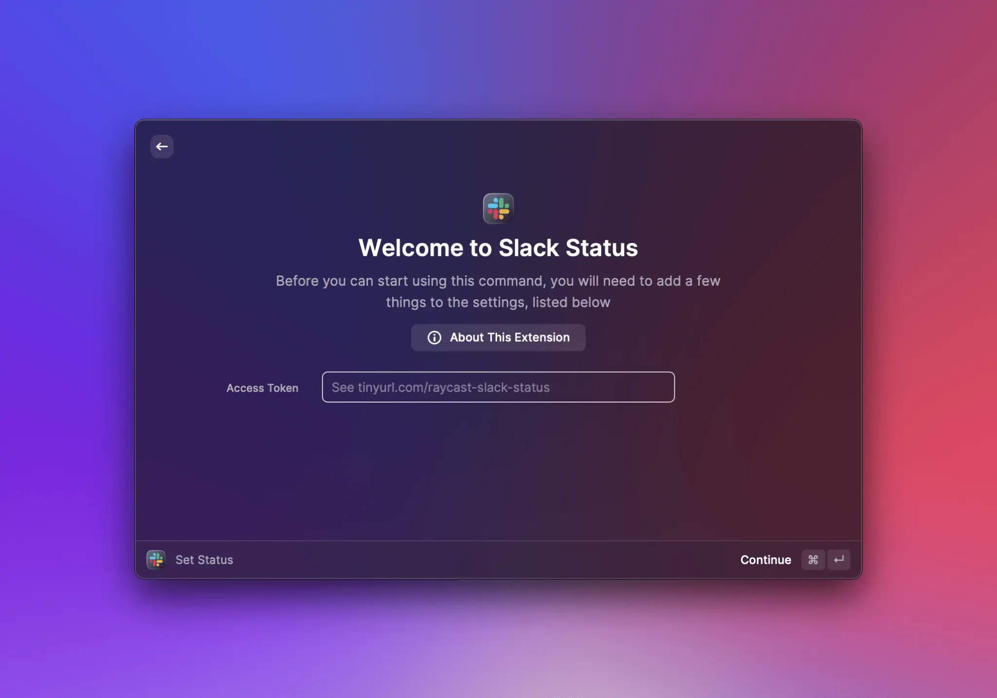
## Categories

* All extensions should be published with at least one category
* Categories are case-sensitive and should follow the [Title Case](https://titlecaseconverter.com/rules/) convention
* Add categories in the `package.json` [manifest](https://developers.raycast.com/information/manifest) file or select the categories when you create a new extension using the **Create Extension** command
### All Categories
| Category | Example |
| --------------- | --------------------------------------------------------------------------------------------------------------------------------------------------------------- |
| Applications | [Cleanshot X](https://www.raycast.com/Aayush9029/cleanshotx) – Capture and record your screen |
| Communication | [Slack Status](https://www.raycast.com/petr/slack-status) – Quickly change your Slack status. |
| Data | [Random Data Generator](https://www.raycast.com/loris/random) – Generate random data using Faker library. |
| Documentation | [Tailwind CSS Documentation](https://www.raycast.com/vimtor/tailwindcss) – Quickly search Tailwind CSS documentation and open it in the browser. |
| Design Tools | [Figma File Search](https://www.raycast.com/michaelschultz/figma-files-raycast-extension) – Lists Figma files allowing you to search and navigate to them. |
| Developer Tools | [Brew](https://www.raycast.com/nhojb/brew) – Search and install Homebrew formulae. |
| Finance | [Coinbase Pro](https://www.raycast.com/farisaziz12/coinbase-pro) – View your Coinbase Pro portfolio. |
| Fun | [8 Ball](https://www.raycast.com/rocksack/8-ball) – Returns an 8 ball like answer to questions. |
| Media | [Unsplash](https://www.raycast.com/eggsy/unsplash) – Search images or collections on Unsplash, download, copy or set them as wallpaper without leaving Raycast. |
| News | [Hacker News](https://www.raycast.com/thomas/hacker-news) – Read the latest stories of Hacker News. |
| Productivity | [Todoist](https://www.raycast.com/thomaslombart/todoist) – Check your Todoist tasks and quickly create new ones. |
| Security | [1Password 7](https://www.raycast.com/khasbilegt/1password7) – Search, open or edit your 1Password 7 passwords from Raycast. |
| System | [Coffee](https://www.raycast.com/mooxl/coffee) – Prevent the sleep function on your mac. |
| Web | [Wikipedia](https://www.raycast.com/vimtor/wikipedia) – Search Wikipedia articles and view them. |
| Other | To be used if you think your extension doesn’t fit in any of the above categories. |
## Screenshots
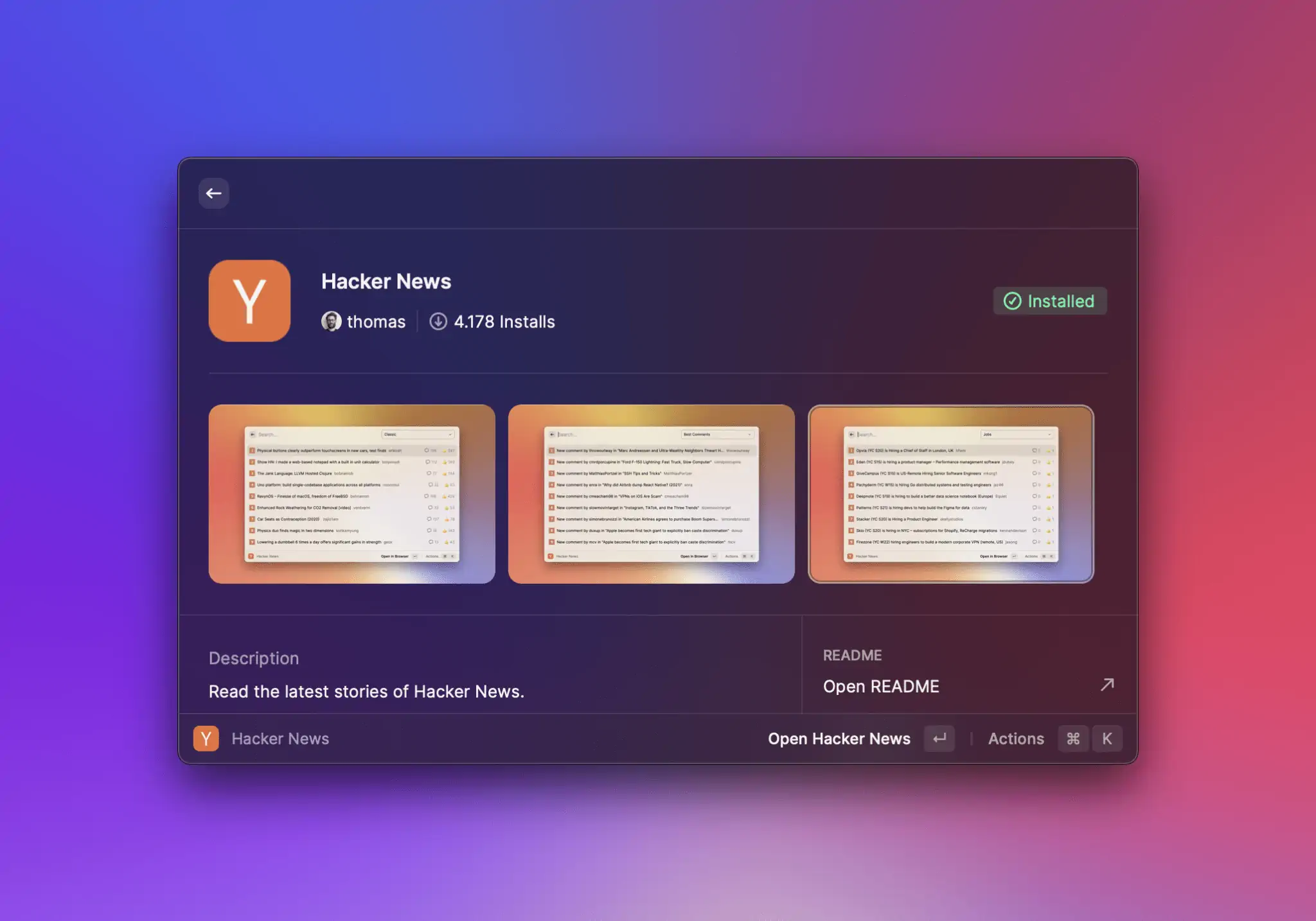
* Screenshots are displayed in the metadata of an extension details screen, where users can click and browse through them to understand what your extension does in greater detail, before installing
* You can add a maximum of six screenshots. We recommend adding at least three, so your extensions detail screen looks beautiful.
### Adding Screenshots
In Raycast 1.37.0+ we made it easy for you to take beautiful pixel perfect screenshots of your extension with an ease.
#### How to use it?
1. Set up Window Capture in Advanced Preferences (Hotkey e.g.: `⌘⇧⌥+M`)
2. Ensure your extension is opened in development mode (Window Capture eliminates dev-related menus/icons).
3. Open the command
4. Press the hotkey, remember to tick `Save to Metadata`
{% hint style="info" %}
This tool will use your current background. Choose a background image with a good contrast that makes it clear and easy to see the app and extension you've made.
You can use [Raycast Wallpapers](https://www.raycast.com/wallpapers) to make your background look pretty
{% endhint %}
### Specifications
| Screenshot size | Aspect ratio | Format | Dark mode support |
| ------------------------------ | ------------ | ------ | ----------------- |
| 2000 x 1250 pixels (landscape) | 16:10 | PNG | No |
### Do's & Dont's
* ✅ Choose a background with good contrast, that makes it clear and easy to see the app and extension you’ve made
* ✅ Select the most informative commands to showcase what your extension does – focus on giving the user as much detail as possible
* ❌ Do not use multiple backgrounds for different screenshots – be consistent and use the same across all screenshots
* ❌ Do not share sensitive data in your screenshots – these will be visible in the Store, as well as the Extension repository on GitHub
* ❌ Do not include screenshots of other applications - keep the focus entirely on your extension within Raycast
* ❌ Avoid using screenshots in different themes (light and dark), unless it is to demonstrate what your extension does
## Version History
* Make it easier for users to see exactly what notable changes have been made between each release of your extension with a `CHANGELOG.md` file in your extension metadata
* To add Version History to your extension, add a `CHANGELOG.md` file to the root folder of your extension
* See an extension files structure with [screenshots and a changelog file](#adding-screenshots)
* With each modification, provide clear and descriptive details regarding the latest update, accompanied by a title formatted as an h2 header followed by `{PR_MERGE_DATE}`. This placeholder will be automatically replaced when the pull request is merged. While you may still use the date timestamp format YYYY-MM-DD, it is often more practical to use `{PR_MERGE_DATE}` since merging of a pull request can take several days (depending on the review comments, etc.).
* Make sure your change title is within square brackets
* Separate your title and date with a hyphen `-` and spaces either side of the hyphen
* Below is an example of a changelog that follows the correct format
```markdown
# Brew Changelog
## [Added a bunch of new feedback] - {PR_MERGE_DATE}
- Improve reliability of `outdated` command
- Add action to copy formula/cask name
- Add cask name & tap to cask details
- Add Toast action to cancel current action
- Add Toast action to copy error log after failure
## [New Additions] - 2022-12-13
- Add greedy upgrade preference
- Add `upgrade` command
## [Fixes & Bits] - 2021-11-19
- Improve discovery of brew prefix
- Update Cask.installed correctly after installation
- Fix installed state after uninstalling search result
- Fix cache check after installing/uninstalling cask
- Add uninstall action to outdated action panel
## [New Commands] - 2021-11-04
Add support for searching and managing casks
## [Added Brew] - 2021-10-26
Initial version code
```

{% hint style="info" %}
You can use [Keep a Changelog](https://keepachangelog.com/en/1.0.0/) to help you format your changelog correctly
{% endhint %}
## Contributing to Existing Extensions vs Creating a New One
* **When you should contribute to an existing extension instead of creating a new one**
* You want to make a small improvement to an extension that is already published, e.g. extra actions, new preference, UX improvements, etc.. Usually, it's a non-significant change.
* You want to add a simple command that compliments an existing extension without changing the extension title or description, e.g. you want to add "Like Current Track" command for Spotify. It wouldn't make sense to create a whole new extension just for this when there is already the [Spotify Controls](https://www.raycast.com/thomas/spotify-controls) extension.
* **Important:** If your change is significant, it makes sense to contact the author of the extension before you invest a lot of time into it. We cannot merge significant contributions without the author's sign-off.
* **When you should consider creating a new extension instead of contributing to an existing one**
* The changes to an existing extension would be significant and might break other people's workflows. Check with the author if you want to proceed with the collaboration path.
* Your extension provides an integration with the same service but has a different configuration, e.g. one extension could be "GitHub Cloud", another "GitHub Enterprise". One extension could be "Spotify Controls" and only uses AppleScript to play/pause songs, while another extension can provide deeper integration via the API and require an access token setup. There is no reason to try to merge everything together as this would only make things more complicated.
* **Multiple simple extensions vs one large one**
* If your extension works standalone and brings something new to the Store, it's acceptable to create a new one instead of adding commands to an existing one. E.g. one extension could be "GitHub Repository Search", another one could be "GitHub Issue Search". It should not be the goal to merge all extensions connecting with one service into one mega extension. However, it's also acceptable to merge two extensions under one if the authors decide to do so.
## Binary Dependencies and Additional Configuration
* Avoid asking users to perform additional downloads and try to automate as much as possible from the extension, especially if you are targeting non-developers. See the [Speedtest](https://github.com/raycast/extensions/pull/302) extension that downloads a CLI in the background and later uses it under the hood.
* If you do end up downloading executable binaries in the background, please make sure it's done from a server that you don't have access to. Otherwise, we cannot guarantee that you won't replace the binary with malicious code after the review. E.g. downloading `speedtest-cli` from [`install.speedtest.net`](http://install.speedtest.net) is acceptable, but doing this from some custom AWS server would lead to a rejection. Add additional integrity checks through hashes.
* Don't bundle opaque binaries where sources are unavailable or where it's unclear how they have been built.
* Don't bundle heavy binary dependencies in the extension – this would lead to an increased extension download size.
* **Examples for interacting with binaries**
* ✅ Calling known system binaries
* ✅ Binary downloaded or installed from a trusted location with additional integrity checking through hashes (that is, verify whether the downloaded binary really matches the expected binary)
* ✅ Binary extracted from an npm package and copied to assets, with traceable sources how the binary is built; **note**: we have yet to integrate CI actions for copying and comparing the files; meanwhile, ask a member of the Raycast team to add the binary for you
* ❌ Any binary with unavailable sources or unclear builds just added to the assets folder
## Keychain Access
* Extensions requesting Keychain Access will be rejected due to security concerns. If you can't work around this limitation, reach out to us on [Slack](https://raycast.com/community) or via `feedback@raycast.com`.
## UI/UX Guidelines
### Preferences

* Use the [preferences API](https://developers.raycast.com/api-reference/preferences) to let your users configure your extension or for providing credentials like API tokens
* When using `required: true`, Raycast will ask the user to set preferences before continuing with an extension. See the example [here](https://github.com/raycast/extensions/blob/main/extensions/gitlab/package.json#L150).
* You should not build separate commands for configuring your extension. If you miss some API to achieve the preferences setup you want, please file a [GitHub issue](https://github.com/raycast/extensions/issues) with a feature request.
### Action Panel
* Actions in the action panel should also follow the **Title Case** naming convention
* ✅ `Open in Browser`, `Copy to Clipboard`
* ❌ `Copy url`, `set project`, `Set priority`
* Provide icons for actions if there are other actions with icons in the list
* Avoid having a list of actions where some have icons and some don't
* Add ellipses `…` for actions that will have a submenu. Don't repeat the parent action name in the submenu
* ✅ `Set Priority…` and submenu would have `Low`, `Medium`, `High`
* ❌ `Set Priority` and submenu would have `Set Priority Low`, `Set Priority Medium`, etc
### Navigation
* Use the [Navigation API](https://developers.raycast.com/api-reference/user-interface/navigation) for pushing new screens. This will ensure that a user can navigate within your extension the same way as in the rest of the application.
* Avoid introducing your own navigation stack. Extensions that just replace the view's content when it's expected to push a new screen will be rejected.
### Empty States
* When you update lists with an empty array of elements, the "No results" view will be shown. You can customize this view by using the [List.EmptyView](https://developers.raycast.com/api-reference/user-interface/list#list.emptyview) or [Grid.EmptyView](https://developers.raycast.com/api-reference/user-interface/grid#grid.emptyview) components.
* **Common mistake** - "flickering empty state view" on start
* If you try rendering an empty list before real data arrives (e.g. from the network or disk), you might see a flickering "No results" view when opening the extension. To prevent this, make sure not to return an empty list of items before you get the data you want to display. In the meantime, you can show the loading indicator. See [this example](https://developers.raycast.com/information/best-practices#show-loading-indicator).
### Navigation Title
* Don't change the `navigationTitle` in the root command - it will be automatically set to the command name. Use `navigationTitle` only in nested screens to provide additional context. See [Slack Status extension](https://github.com/raycast/extensions/blob/020f2232aa5579b5c63b4b3c08d23ad719bce1f8/extensions/slack-status/src/setStatusForm.tsx#L95) as an example of correct usage of the `navigationTitle` property.
* Avoid long titles. If you can't predict how long the navigation title string will be, consider using something else. E.g. in the Jira extension, we use the issue key instead of the issue title to keep it short.
* Avoid updating the navigation title multiple times on one screen depending on some state. If you find yourself doing it, there is a high chance you are misusing it.
### Placeholders in Text Fields
* For a better visual experience, add placeholders in text field and text area components. This includes preferences.
* Don't leave the search bar without a placeholder
### Analytics
* It’s not allowed to include external analytics in extensions. Later on, we will add support to give developers more insights into how their extension is being used.
### Localization / Language
* At the moment, Raycast doesn't support localization and only supports US English. Therefore, please avoid introducing your custom way to localize your extension. If the locale might affect functionality (e.g. using the correct unit of measurement), please use the preferences API.
* Use US English spelling (not British)
---
# Source: https://developers.raycast.com/teams/publish-a-private-extension.md
# Publish a Private Extension
To publish an extension, run `npm run publish` in the extension directory. The command verifies, builds and publishes the extension to the owner's store. The extension is only available to members of this organization. A link to your extension is copied to your clipboard to share it with your teammates. Happy publishing 🥳
To mark an extension as private, you need to set the `owner` field in your `package.json` to your organization handle. If you don't know your handle, open the Manage Organization command, select your organization in the dropdown on the top right and perform the Copy Organization Handle action (`⌘` `⇧` `.`).
{% hint style="info" %}
Use the Create Extension command to create a private extension for your organization.
{% endhint %}
To be able to publish a private extension to an organization, you need to be logged in. Raycast takes care of logging you in with the CLI as well. In case you aren't logged in or need to switch an account, you can run `npx ray login` and `npx ray logout`.
---
# Source: https://developers.raycast.com/basics/publish-an-extension.md
# Publish an Extension
Before you publish your extension, take a look at [how to prepare your extension](https://developers.raycast.com/basics/prepare-an-extension-for-store) for the Store. Making sure you follow the guidelines is the best way to help your extension pass the review.
### Validate your extension
Open your terminal, navigate to your extension directory, and run `npm run build` to verify your extension. The command should complete without any errors.
{% hint style="info" %}
`npm run build` validates your extension for distribution without publishing it to the store. Read more about it [here](https://developers.raycast.com/information/developer-tools/cli#build).
{% endhint %}
### Publish your extension
To share your extension with others, navigate to your extension directory, and run `npm run publish` to publish your extension.
{% hint style="info" %}
It is possible that the `publish` script doesn't exist (usually because the extension was created before the template was updated to include it). In that case, you can add the following line in the `scripts` object of the package.json `"publish": "npx @raycast/api@latest publish"` and then run `npm run publish` again.
{% endhint %}
You will be asked to authenticate with GitHub because the script will automatically open a pull request in our [`raycast/extensions`](https://github.com/raycast/extensions) repository.
The command will squash commits and their commit messages. If you want more control, see the [alternative way](#alternative-way) below.
{% hint style="info" %}
If someone contributes to your extension, or you make edits directly on GitHub, running `npm run publish` will fail until you run
```bash
npx @raycast/api@latest pull-contributions
```
in your git repository. This will merge the contributions with your code, asking you to fix the conflicts if any.
{% endhint %}
Once the pull request is opened, you can continue pushing more commits to it by running `npm run publish` again.
#### Alternative way
If you want more control over the publishing process, you can manually do what `npm run publish` does. You need to open a pull request in our [repository](https://github.com/raycast/extensions). For this, [fork our repository](https://docs.github.com/en/get-started/quickstart/fork-a-repo), add your extension to your fork, push your changes, and open a pull request [via the GitHub web interface](https://docs.github.com/en/github/collaborating-with-pull-requests/proposing-changes-to-your-work-with-pull-requests/creating-a-pull-request-from-a-fork) into our `main` branch.
### Waiting for review
After you opened a pull request, we'll review your extension and request changes when required. Once accepted, the pull request is merged and your extension will be automatically published to the [Raycast Store](https://raycast.com/store).
{% hint style="info" %}
We're still figuring things out and updating our guidelines. If something is unclear, please tell us in [our community](https://raycast.com/community).
{% endhint %}
### Share your extension
Once your extension is published in the Raycast Store, you can share it with our community. Open the Manage Extensions command, search for your extension and press `⌘` `⌥` `.` to copy the link.
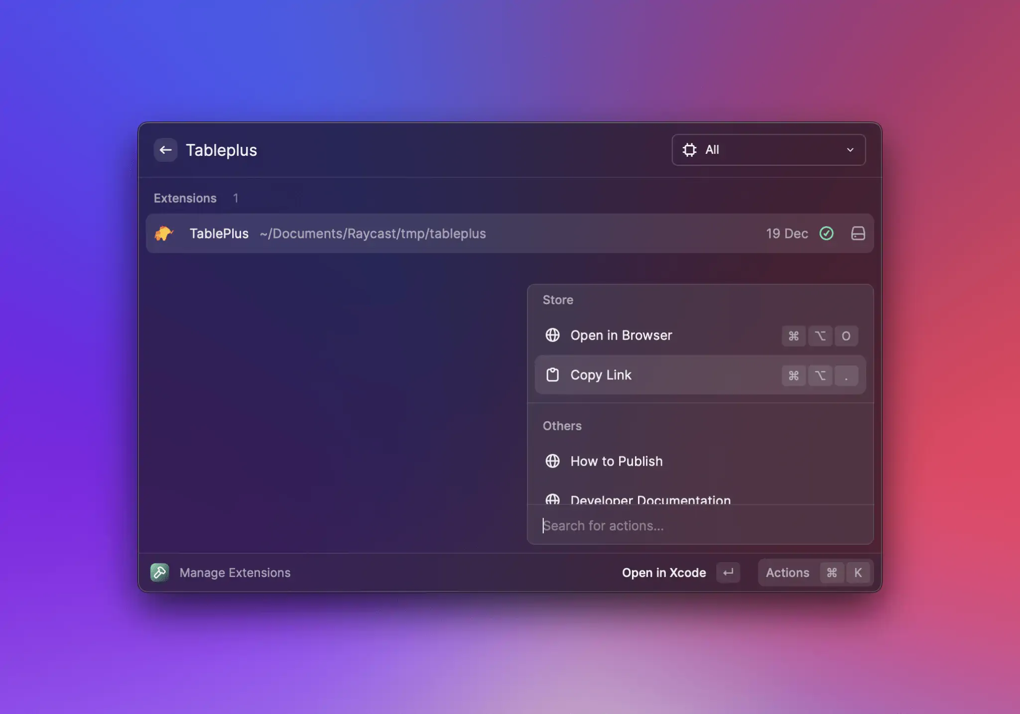
🚀 Now it's time to share your work! Tweet about your extension, share it with our [Slack community](https://raycast.com/community) or send it to your teammates.
---
# Source: https://developers.raycast.com/utilities/react-hooks.md
# React hooks
- [useCachedState](/utilities/react-hooks/usecachedstate.md)
- [usePromise](/utilities/react-hooks/usepromise.md)
- [useCachedPromise](/utilities/react-hooks/usecachedpromise.md)
- [useFetch](/utilities/react-hooks/usefetch.md)
- [useForm](/utilities/react-hooks/useform.md)
- [useExec](/utilities/react-hooks/useexec.md)
- [useSQL](/utilities/react-hooks/usesql.md)
- [useAI](/utilities/react-hooks/useai.md)
- [useFrecencySorting](/utilities/react-hooks/usefrecencysorting.md)
- [useStreamJSON](/utilities/react-hooks/usestreamjson.md)
- [useLocalStorage](/utilities/react-hooks/uselocalstorage.md)
---
# Source: https://developers.raycast.com/readme.md
# Introduction
Welcome, developers! Our docs cover guides, examples, references, and more to help you build extensions and share them with [our community](https://raycast.com/community) and [your team](https://developers.raycast.com/teams/getting-started).
The Raycast Platform consists of two parts:
* **API:** This allows developers to build rich extensions with React, Node.js, and TypeScript. The docs explain how to use the API to build top-notch experiences.
* **Store:** This lets developers share their extensions with all Raycast users. You'll learn how to [publish your extension](https://developers.raycast.com/basics/publish-an-extension).
## Key features
Here are a few points that make our ecosystem special:
* **Powerful and familiar tooling:** Extensions are built with TypeScript, React, and Node. Leverage npm's ecosystem to quickly build what you imagine.
* **No-brainer to build UI:** You concentrate on the logic, we push the pixels. Use our built-in UI components to be consistent with all our extensions.
* **Collaborate with our community:** Build your extension, share it with our community, and get inspired by others.
* **Developer experience front and foremost:** A strongly typed API, hot-reloading, and modern tooling that makes it a blast to work with.
* **Easy to start, flexible to scale:** Start with a simple script, add a static UI or use React to go wild. Anything goes.
## Overview
A quick overview about where to find what in our docs:
* [**Basics:**](https://developers.raycast.com/basics/getting-started) Go over this section to learn how to build extensions in our step-by-step guides.
* [**Teams:**](https://developers.raycast.com/teams/getting-started) Build and share extensions with your teammates to speed up common workflows.
* [**Examples:**](https://developers.raycast.com/examples/doppler) Kickstart your extension by using an open-source example and learn as you go.
* [**Information:**](https://developers.raycast.com/information/best-practices) Get the background knowledge to master your understanding of our platform.
* [**API Reference:**](https://developers.raycast.com/api-reference/ai) Go into details with the API reference that includes code snippets.
* [**Utilities:**](https://developers.raycast.com/utilities/getting-started) A set of utilities to streamline common patterns and operations used in extensions.
Now, let's build 💪
---
# Source: https://developers.raycast.com/basics/review-pullrequest.md
# Review an Extension in a Pull Request
All updates to an extension are made through a [Pull Request](https://github.com/raycast/extensions/pulls) - if you need to review whether the Pull Request works as expected, then you can checkout the fork within a few seconds.
## Steps
1. Open a terminal window
2. Navigate to a folder where you want the repository to land
3. Run the below commands
*There are a few things you'll need to find and insert manually in the snippet below*
**FORK\_URL**
Open the PR and click on the incoming ref as shown below
Now click the code button and copy the HTTPS path from the dropdown
**BRANCH**
You can see the branch on the above image (in this example it’s `notion-quicklinks`)
**EXTENSION\_NAME**
Click the `Files Changed` tab to see in which directory files have been changed (in this example it’s `notion`)
```
BRANCH="ext/soundboard"
FORK_URL="https://github.com/pernielsentikaer/raycast-extensions.git"
EXTENSION_NAME="soundboard"
git clone -n --depth=1 --filter=tree:0 -b ${BRANCH} ${FORK_URL}
cd raycast-extensions
git sparse-checkout set --no-cone "extensions/${EXTENSION_NAME}"
git checkout
cd "extensions/${EXTENSION_NAME}"
npm install && npm run dev
```
4. That's it, the extension should now be attached in Raycast
---
# Source: https://developers.raycast.com/utilities/functions/runapplescript.md
# runAppleScript
Function that executes an AppleScript script.
{% hint style="info" %}
Only available on macOS
{% endhint %}
## Signature
There are two ways to use the function.
The first one should be preferred when executing a static script.
```ts
function runAppleScript(
script: string,
options?: {
humanReadableOutput?: boolean;
language?: "AppleScript" | "JavaScript";
signal?: AbortSignal;
timeout?: number;
parseOutput?: ParseExecOutputHandler;
},
): Promise;
```
The second one can be used to pass arguments to a script.
```ts
function runAppleScript(
script: string,
arguments: string[],
options?: {
humanReadableOutput?: boolean;
language?: "AppleScript" | "JavaScript";
signal?: AbortSignal;
timeout?: number;
parseOutput?: ParseExecOutputHandler;
},
): Promise;
```
### Arguments
* `script` is the script to execute.
* `arguments` is an array of strings to pass as arguments to the script.
With a few options:
* `options.humanReadableOutput` is a boolean to tell the script what form to output. By default, `runAppleScript` returns its results in human-readable form: strings do not have quotes around them, characters are not escaped, braces for lists and records are omitted, etc. This is generally more useful, but can introduce ambiguities. For example, the lists `{"foo", "bar"}` and `{{"foo", {"bar"}}}` would both be displayed as ‘foo, bar’. To see the results in an unambiguous form that could be recompiled into the same value, set `humanReadableOutput` to `false`.
* `options.language` is a string to specify whether the script is using [`AppleScript`](https://developer.apple.com/library/archive/documentation/AppleScript/Conceptual/AppleScriptLangGuide/introduction/ASLR_intro.html#//apple_ref/doc/uid/TP40000983) or [`JavaScript`](https://developer.apple.com/library/archive/releasenotes/InterapplicationCommunication/RN-JavaScriptForAutomation/Articles/Introduction.html#//apple_ref/doc/uid/TP40014508-CH111-SW1). By default, it will assume that it's using `AppleScript`.
* `options.signal` is a Signal object that allows you to abort the request if required via an AbortController object.
* `options.timeout` is a number. If greater than `0`, the parent will send the signal `SIGTERM` if the script runs longer than timeout milliseconds. By default, the execution will timeout after 10000ms (eg. 10s).
* `options.parseOutput` is a function that accepts the output of the script as an argument and returns the data the hooks will return - see [ParseExecOutputHandler](#parseexecoutputhandler). By default, the function will return `stdout` as a string.
### Return
Returns a Promise which resolves to a string by default. You can control what it returns by passing `options.parseOutput`.
## Example
```tsx
import { showHUD } from "@raycast/api";
import { runAppleScript } from "@raycast/utils";
export default async function () {
const res = await runAppleScript(
`
on run argv
return "hello, " & item 1 of argv & "."
end run
`,
["world"],
);
await showHUD(res);
}
```
## Types
### ParseExecOutputHandler
A function that accepts the output of the script as an argument and returns the data the function will return.
```ts
export type ParseExecOutputHandler = (args: {
/** The output of the script on stdout. */
stdout: string;
/** The output of the script on stderr. */
stderr: string;
error?: Error | undefined;
/** The numeric exit code of the process that was run. */
exitCode: number | null;
/** The name of the signal that was used to terminate the process. For example, SIGFPE. */
signal: NodeJS.Signals | null;
/** Whether the process timed out. */
timedOut: boolean;
/** The command that was run, for logging purposes. */
command: string;
/** The options passed to the script, for logging purposes. */
options?: ExecOptions | undefined;
}) => T;
```
---
# Source: https://developers.raycast.com/utilities/functions/runpowershellscript.md
# runPowerShellScript
Function that executes an PowerShell script.
{% hint style="info" %}
Only available on Windows
{% endhint %}
## Signature
```ts
function runPowerShellScript(
script: string,
options?: {
signal?: AbortSignal;
timeout?: number;
parseOutput?: ParseExecOutputHandler;
},
): Promise;
```
### Arguments
* `script` is the script to execute.
With a few options:
* `options.signal` is a Signal object that allows you to abort the request if required via an AbortController object.
* `options.timeout` is a number. If greater than `0`, the parent will send the signal `SIGTERM` if the script runs longer than timeout milliseconds. By default, the execution will timeout after 10000ms (eg. 10s).
* `options.parseOutput` is a function that accepts the output of the script as an argument and returns the data the hooks will return - see [ParseExecOutputHandler](#parseexecoutputhandler). By default, the function will return `stdout` as a string.
### Return
Returns a Promise which resolves to a string by default. You can control what it returns by passing `options.parseOutput`.
## Example
```tsx
import { showHUD } from "@raycast/api";
import { runPowerShellScript } from "@raycast/utils";
export default async function () {
const res = await runPowerShellScript(
`
Write-Host "hello, world."
`,
);
await showHUD(res);
}
```
## Types
### ParseExecOutputHandler
A function that accepts the output of the script as an argument and returns the data the function will return.
```ts
export type ParseExecOutputHandler = (args: {
/** The output of the script on stdout. */
stdout: string;
/** The output of the script on stderr. */
stderr: string;
error?: Error | undefined;
/** The numeric exit code of the process that was run. */
exitCode: number | null;
/** The name of the signal that was used to terminate the process. For example, SIGFPE. */
signal: NodeJS.Signals | null;
/** Whether the process timed out. */
timedOut: boolean;
/** The command that was run, for logging purposes. */
command: string;
/** The options passed to the script, for logging purposes. */
options?: ExecOptions | undefined;
}) => T;
```
---
# Source: https://developers.raycast.com/information/security.md
# Security
{% hint style="info" %}
Note that this is *not* a guide on how to create secure Raycast extensions but rather an overview of security-related aspects on how extensions are built, distributed and run.
{% endhint %}
## Raycast
Raycast itself runs outside of the App Store as "Developer ID Application", **signed** with the Raycast certificate and verified by Apple's **notarization service** before the app is distributed. Raycast provides various commands that interact with OS-level functionality, some of which prompt the user for granting **permissions** when required. The app is **automatically kept up-to-date** to minimize the risk of running heavily outdated versions and to ship hotfixes quickly. Raycast is a local-first application that stores user data in a local **encrypted database**, makes use of the system **Keychain** where secure data is stored, and generally connects to third-party APIs directly rather than proxying data through Raycast servers.
## Publishing Process
All extensions are **open source** so the current source code can be inspected at all times. Before an extension gets merged into the **public repository**, members from Raycast and the community collaboratively **review** extensions, and follow our **store guidelines**. After the code review, the Continuous Integration system performs a set of **validations** to make sure that manifest conforms to the defined schema, required assets have the correct format, the author is valid, and no build and type errors are present. (More CI pipeline tooling for automated static security analysis is planned.) The built extension is then **archived and uploaded** to the Raycast Store, and eventually published for a registered user account. When an extension is installed or updated, the extension is downloaded from the store, unarchived to disk, and a record is updated in the local Raycast database. End-users install extensions through the built-in store or the web store.
## Runtime Model
In order to run extensions, Raycast launches a **single child Node.js process** where extensions get loaded and unloaded as needed; inter-process communication with Raycast happens through standard file handles and a thin RPC protocol that only exposes a **defined set of APIs**, that is, an extension cannot just perform any Raycast operation. The **Node runtime is managed** by Raycast and automatically downloaded to the user's machine. We use an official version and **verify the Node binary** to ensure it has not been tampered with.
An extension runs in its own **v8 isolate** (worker thread) and gets its own event loop, JavaScript engine and Node instance, and limited heap memory. That way, we ensure **isolation between extensions** when future Raycast versions may support background executions of multiple extensions running concurrently.
## Permissions
Extensions are **not further sandboxed** as far as policies for file I/O, networking, or other features of the Node runtime are concerned; this might change in the future as we want to carefully balance user/developer experience and security needs. By default and similar to other macOS apps, accessing special directories such as the user Documents directory or performing screen recording first requires users to give **permissions** to Raycast (parent process) via the **macOS Security & Preferences** pane, otherwise programmatic access is not permitted.
## Data Storage
While extensions can access the file system and use their own methods of storing and accessing data, Raycast provides **APIs for securely storing data**: *password* preferences can be used to ask users for values such as access tokens, and the local storage APIs provide methods for reading and writing data payloads. In both cases, the data is stored in the local encrypted database and can only be accessed by the corresponding extension.
## Automatic Updates
Both Raycast itself and extensions are **automatically updated** and we think of this as a security feature since countless exploits have happened due to outdated and vulnerable software. Our goal is that neither developers nor end-users need to worry about versions, and we **minimize the time from update to distribution** to end-users.
---
# Source: https://developers.raycast.com/utilities/functions/showfailuretoast.md
# showFailureToast
Function that shows a failure [Toast](https://developers.raycast.com/api-reference/feedback/toast) for a given Error.
## Signature
```ts
function showFailureToast(
error: unknown,
options?: {
title?: string;
primaryAction?: Toast.ActionOptions;
},
): Promise;
```
### Arguments
* `error` is the error to report.
With a few options:
* `options.title` is a string describing the action that failed. By default, `"Something went wrong"`
* `options.primaryAction` is a Toast [Action](https://developers.raycast.com/api-reference/feedback/toast#toast.actionoptions).
### Return
Returns a [Toast](https://developers.raycast.com/api-reference/feedback/toast).
## Example
```tsx
import { showHUD } from "@raycast/api";
import { runAppleScript, showFailureToast } from "@raycast/utils";
export default async function () {
try {
const res = await runAppleScript(
`
on run argv
return "hello, " & item 1 of argv & "."
end run
`,
["world"],
);
await showHUD(res);
} catch (error) {
showFailureToast(error, { title: "Could not run AppleScript" });
}
}
```
---
# Source: https://developers.raycast.com/examples/spotify-controls.md
# Spotify Controls
{% hint style="info" %}
The source code of the example can be found [here](https://github.com/raycast/extensions/tree/main/extensions/spotify-controls#readme). You can install it [here](https://www.raycast.com/thomas/spotify-controls).
{% endhint %}
This example shows how to build commands that don't show a UI in Raycast. This type of command is useful for interactions with other apps such as skipping songs in Spotify or just simply running some scripts that don't need visual confirmation.
## Control Spotify macOS app
Spotify's macOS app supports AppleScript. This is great to control the app without opening it. For this, we use the [`run-applescript`](https://www.npmjs.com/package/run-applescript) package. Let's start by toggling play pause:
```typescript
import { runAppleScript } from "run-applescript";
export default async function Command() {
await runAppleScript('tell application "Spotify" to playpause');
}
```
## Close Raycast main window
When performing this command, you'll notice that Raycast toggles the play pause state of the Spotify macOS app but the Raycast main window stays open. Ideally the window closes after you run the command. Then you can carry on with what you did before.
Here is how you can close the main window:
```typescript
import { closeMainWindow } from "@raycast/api";
import { runAppleScript } from "run-applescript";
export default async function Command() {
await closeMainWindow();
await runAppleScript('tell application "Spotify" to playpause');
}
```
Notice that we call the `closeMainWindow` function before running the AppleScript. This makes the command feel snappier.
With less than 10 lines of code, you executed a script and controlled the UI of Raycast. As a next step you could add more commands to skip a track.
---
# Source: https://developers.raycast.com/api-reference/storage.md
# Storage
The storage APIs can be used to store data in Raycast's [local encrypted database](https://developers.raycast.com/information/security#data-storage).
All commands in an extension have shared access to the stored data. Extensions can *not* access the storage of other extensions.
Values can be managed through functions such as [`LocalStorage.getItem`](#localstorage.getitem), [`LocalStorage.setItem`](#localstorage.setitem), or [`LocalStorage.removeItem`](#localstorage.removeitem). A typical use case is storing user-related data, for example entered todos.
{% hint style="info" %}
The API is not meant to store large amounts of data. For this, use [Node's built-in APIs to write files](https://nodejs.org/en/learn/manipulating-files/writing-files-with-nodejs), e.g. to the extension's [support directory](https://developers.raycast.com/environment#environment).
{% endhint %}
## API Reference
### LocalStorage.getItem
Retrieve the stored value for the given key.
#### Signature
```typescript
async function getItem(key: string): Promise;
```
#### Example
```typescript
import { LocalStorage } from "@raycast/api";
export default async function Command() {
await LocalStorage.setItem("favorite-fruit", "apple");
const item = await LocalStorage.getItem("favorite-fruit");
console.log(item);
}
```
#### Parameters
| Name | Description | Type |
| ------------------------------------- | ------------------------------------------ | -------- |
| key\* | The key you want to retrieve the value of. | `string` |
#### Return
A Promise that resolves with the stored value for the given key. If the key does not exist, `undefined` is returned.
### LocalStorage.setItem
Stores a value for the given key.
#### Signature
```typescript
async function setItem(key: string, value: Value): Promise;
```
#### Example
```typescript
import { LocalStorage } from "@raycast/api";
export default async function Command() {
await LocalStorage.setItem("favorite-fruit", "apple");
const item = await LocalStorage.getItem("favorite-fruit");
console.log(item);
}
```
#### Parameters
| Name | Description | Type |
| --------------------------------------- | --------------------------------------------------------- | ------------------------------------------- |
| key\* | The key you want to create or update the value of. | `string` |
| value\* | The value you want to create or update for the given key. | [`LocalStorage.Value`](#localstorage.value) |
#### Return
A Promise that resolves when the value is stored.
### LocalStorage.removeItem
Removes the stored value for the given key.
#### Signature
```typescript
async function removeItem(key: string): Promise;
```
#### Example
```typescript
import { LocalStorage } from "@raycast/api";
export default async function Command() {
await LocalStorage.setItem("favorite-fruit", "apple");
console.log(await LocalStorage.getItem("favorite-fruit"));
await LocalStorage.removeItem("favorite-fruit");
console.log(await LocalStorage.getItem("favorite-fruit"));
}
```
#### Parameters
| Name | Description | Type |
| ------------------------------------- | ---------------------------------------- | -------- |
| key\* | The key you want to remove the value of. | `string` |
#### Return
A Promise that resolves when the value is removed.
### LocalStorage.allItems
Retrieve all stored values in the local storage of an extension.
#### Signature
```typescript
async function allItems(): Promise;
```
#### Example
```typescript
import { LocalStorage } from "@raycast/api";
interface Values {
todo: string;
priority: number;
}
export default async function Command() {
const items = await LocalStorage.allItems();
console.log(`Local storage item count: ${Object.entries(items).length}`);
}
```
#### Return
A Promise that resolves with an object containing all [Values](#localstorage.values).
### LocalStorage.clear
Removes all stored values of an extension.
#### Signature
```typescript
async function clear(): Promise;
```
#### Example
```typescript
import { LocalStorage } from "@raycast/api";
export default async function Command() {
await LocalStorage.clear();
}
```
#### Return
A Promise that resolves when all values are removed.
## Types
### LocalStorage.Values
Values of local storage items.
For type-safe values, you can define your own interface. Use the keys of the local storage items as the property names.
#### Properties
| Name | Type | Description |
| -------------- | ----- | --------------------------------------- |
| \[key: string] | `any` | The local storage value of a given key. |
### LocalStorage.Value
```typescript
Value: string | number | boolean;
```
Supported storage value types.
#### Example
```typescript
import { LocalStorage } from "@raycast/api";
export default async function Command() {
// String
await LocalStorage.setItem("favorite-fruit", "cherry");
// Number
await LocalStorage.setItem("fruit-basket-count", 3);
// Boolean
await LocalStorage.setItem("fruit-eaten-today", true);
}
```
---
# Source: https://developers.raycast.com/information/developer-tools/templates.md
# Templates
Raycast provides a variety of templates to kickstart your extension.
Raycast provides 3 types of templates:
* **Commands:** These are templates for [commands](https://developers.raycast.com/information/terminology).
* **Tools:** These are templates for [tools](https://developers.raycast.com/terminology#tool). You can select a different one for each tool that you add to your extension.
* **Extension Boilerplates:** These are fully built extensions designed to be tweaked by organizations for internal use.
## Commands
### Show Detail
Renders a simple Hello World from a markdown string.
{% hint style="info" %}
See the [API Reference](https://developers.raycast.com/api-reference/user-interface/detail) for more information about customization.
{% endhint %}
### Submit Form
Renders a form that showcases all available form elements.
{% hint style="info" %}
See the [API Reference](https://developers.raycast.com/api-reference/user-interface/form) for more information about customization.
{% endhint %}
### Show Grid
Renders a grid of Icons available from Raycast.
Defaults to a large grid, but provides a selection menu to change the size.
{% hint style="info" %}
See the [API Reference](https://developers.raycast.com/api-reference/user-interface/grid) for more information about customization.
See here for information about [Icons](https://developers.raycast.com/api-reference/user-interface/icons-and-images).
{% endhint %}
### Show List and Detail
Renders a list of options. When an option is selected, a Detail view is displayed.
{% hint style="info" %}
See the [API Reference](https://developers.raycast.com/api-reference/user-interface/list) for more information about customization.
{% endhint %}
### Menu Bar Extra
Adds a simple Menu Bar Extra with a menu.
{% hint style="info" %}
See the [API Reference](https://developers.raycast.com/api-reference/menu-bar-commands) for more information about customization.
{% endhint %}
### Run Script
A example of a no-view command which shows a simple [HUD](https://developers.raycast.com/api-reference/feedback/hud).
### Show List
Renders a static list with each entry containing an icon, title, subtitle, and accessory.
{% hint style="info" %}
See the [API Reference](https://developers.raycast.com/api-reference/user-interface/list) for more information about customization.
{% endhint %}
### Show Typeahead Results
Renders a dynamic and searchable list of NPM packages. The command fetches new items as the search is updated by the user.
### AI
Renders the output of an AI call in a Detail view.
## Tools
A simple tool which asks for confirmation before executing.
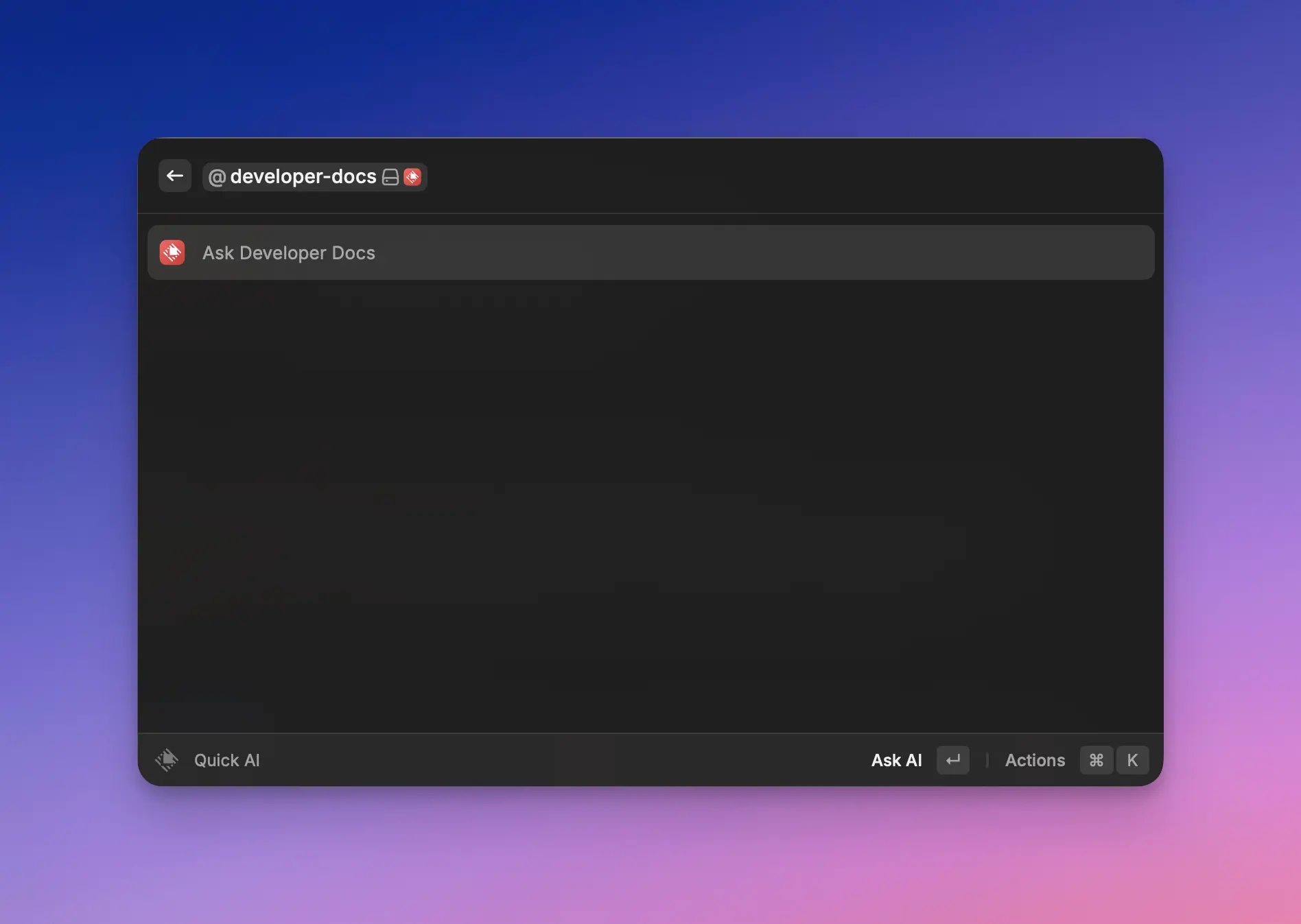
{% hint style="info" %}
See the [API Reference](https://developers.raycast.com/api-reference/tool) for more information about customization.
{% endhint %}
## Extension Boilerplates
The Raycast Team has created high-quality templates to reinforce team experiences with the Raycast API.
Run `npm init raycast-extension -t ` to get started with these extensions. All templates can be found on the [templates page](https://www.raycast.com/templates).
Specific instructions about customizing the template can be found on the relevant [template page](https://www.raycast.com/templates). Simply customize the template as you see fit, then run `npm run publish` in the extension directory to allow your team to install the extension.
---
# Source: https://developers.raycast.com/information/terminology.md
# Terminology
## Action
Actions are accessible via the [Action Panel](#action-panel) in a [command](#command). They are little functionality to control something; for example, to add a label to the selected GitHub issue, copy the link to a Linear issue, or anything else. Actions can have assigned keyboard shortcuts.
## Action Panel
Action Panel is located on the bottom right and can be opened with `⌘` `K`. It contains all currently available [actions](#action) and makes them easily discoverable.
## AI Extensions
AI Extensions are simply regular [extensions](#extension) that have [tools](#tool). Once an extension has some tools, a user can `@mention` the extension in Quick AI, or the AI Commands, or the AI Chat. When doing so, the AI will have the opportunity to call one or multiple tools of the extensions mentioned.
## Command
Commands are a type of entry point for an extension. Commands are available in the root search of Raycast. They can be a simple script or lists, forms, and more complex UI.
## Extension
Extensions add functionality to Raycast. They consist of one or many [commands](#command) and can be installed from the Store.
## Manifest
Manifest is the `package.json` file of an [extension](#extension). It's an npm package mixed with Raycast specific metadata. The latter is necessary to identify the package for Raycast and publish it to the Store.
## Tool
Tools are a type of entry point for an extension. As opposed to a [command](#command), they don’t show up in the root search and the user can’t directly interact with them. Instead, they are functionalities that the AI can use to interact with an extension.
---
# Source: https://developers.raycast.com/api-reference/feedback/toast.md
# Toast
When an asynchronous operation is happening or when an error is thrown, it's usually a good idea to keep the user informed about it. Toasts are made for that.
Additionally, Toasts can have some actions associated to the action they are about. For example, you could provide a way to cancel an asynchronous operation, undo an action, or copy the stack trace of an error.
{% hint style="info" %}
The `showToast()` will fallback to [showHUD()](https://developers.raycast.com/api-reference/hud#showhud) if the Raycast window is closed.
{% endhint %}

## API Reference
### showToast
Creates and shows a Toast with the given [options](#toast.options).
#### Signature
```typescript
async function showToast(options: Toast.Options): Promise;
```
#### Example
```typescript
import { showToast, Toast } from "@raycast/api";
export default async function Command() {
const success = false;
if (success) {
await showToast({ title: "Dinner is ready", message: "Pizza margherita" });
} else {
await showToast({
style: Toast.Style.Failure,
title: "Dinner isn't ready",
message: "Pizza dropped on the floor",
});
}
}
```
When showing an animated Toast, you can later on update it:
```typescript
import { showToast, Toast } from "@raycast/api";
import { setTimeout } from "timers/promises";
export default async function Command() {
const toast = await showToast({
style: Toast.Style.Animated,
title: "Uploading image",
});
try {
// upload the image
await setTimeout(1000);
toast.style = Toast.Style.Success;
toast.title = "Uploaded image";
} catch (err) {
toast.style = Toast.Style.Failure;
toast.title = "Failed to upload image";
if (err instanceof Error) {
toast.message = err.message;
}
}
}
```
#### Parameters
| Name | Description | Type |
| ----------------------------------------- | ----------------------------------- | ----------------------------------------------------------------------------------- |
| options\* | The options to customize the Toast. | [`Alert.Options`](https://developers.raycast.com/api-reference/alert#alert.options) |
#### Return
A Promise that resolves with the shown Toast. The Toast can be used to change or hide it.
## Types
### Toast
A Toast with a certain style, title, and message.
Use [showToast](#showtoast) to create and show a Toast.
#### Properties
| Property | Description | Type |
| ------------------------------------------------- | ------------------------------------------------------------------------------------------------------------------ | ----------------------------------------------------------------------------------------------- |
| message\* | An additional message for the Toast. Useful to show more information, e.g. an identifier of a newly created asset. | `string` |
| primaryAction\* | The primary Action the user can take when hovering on the Toast. | [`Alert.ActionOptions`](https://developers.raycast.com/api-reference/alert#alert.actionoptions) |
| secondaryAction\* | The secondary Action the user can take when hovering on the Toast. | [`Alert.ActionOptions`](https://developers.raycast.com/api-reference/alert#alert.actionoptions) |
| style\* | The style of a Toast. | [`Action.Style`](https://developers.raycast.com/user-interface/actions#action.style) |
| title\* | The title of a Toast. Displayed on the top. | `string` |
#### Methods
| Name | Type | Description |
| ---- | --------------------- | ---------------- |
| hide | `() => Promise` | Hides the Toast. |
| show | `() => Promise` | Shows the Toast. |
### Toast.Options
The options to create a [Toast](#toast).
#### Example
```typescript
import { showToast, Toast } from "@raycast/api";
export default async function Command() {
const options: Toast.Options = {
style: Toast.Style.Success,
title: "Finished cooking",
message: "Delicious pasta for lunch",
primaryAction: {
title: "Do something",
onAction: (toast) => {
console.log("The toast action has been triggered");
toast.hide();
},
},
};
await showToast(options);
}
```
#### Properties
| Property | Description | Type |
| --------------------------------------- | ------------------------------------------------------------------------------------------------------------------ | ----------------------------------------------------------------------------------------------- |
| title\* | The title of a Toast. Displayed on the top. | `string` |
| message | An additional message for the Toast. Useful to show more information, e.g. an identifier of a newly created asset. | `string` |
| primaryAction | The primary Action the user can take when hovering on the Toast. | [`Alert.ActionOptions`](https://developers.raycast.com/api-reference/alert#alert.actionoptions) |
| secondaryAction | The secondary Action the user can take when hovering on the Toast. | [`Alert.ActionOptions`](https://developers.raycast.com/api-reference/alert#alert.actionoptions) |
| style | The style of a Toast. | [`Action.Style`](https://developers.raycast.com/user-interface/actions#action.style) |
### Toast.Style
Defines the visual style of the Toast.
Use [Toast.Style.Success](#toast.style) for confirmations and [Toast.Style.Failure](#toast.style) for displaying errors.\
Use [Toast.Style.Animated](#toast.style) when your Toast should be shown until a process is completed.\
You can hide it later by using [Toast.hide](#toast) or update the properties of an existing Toast.
#### Enumeration members
| Name | Value |
| -------- | -------------------------------------------------------------------------------------------------------------------------------------------------------------------------------------------------------------- |
| Animated |  |
| Success |  |
| Failure |  |
### Toast.ActionOptions
The options to create a [Toast](#toast) Action.
#### Properties
| Property | Description | Type |
| ------------------------------------------ | ----------------------------------------------- | -------------------------------------------------------------------------------- |
| onAction\* | A callback called when the action is triggered. | `(toast:` [`Toast`](#toast)`) => void` |
| title\* | The title of the action. | `string` |
| shortcut | The keyboard shortcut for the action. | [`Keyboard.Shortcut`](https://developers.raycast.com/keyboard#keyboard.shortcut) |
---
# Source: https://developers.raycast.com/examples/todo-list.md
# Todo List
{% hint style="info" %}
The source code of the example can be found [here](https://github.com/raycast/extensions/tree/main/examples/todo-list#readme).
{% endhint %}
What's an example section without a todo list?! Let's put one together in Raycast. This example will show how to render a list, navigate to a form to create a new element and update the list.
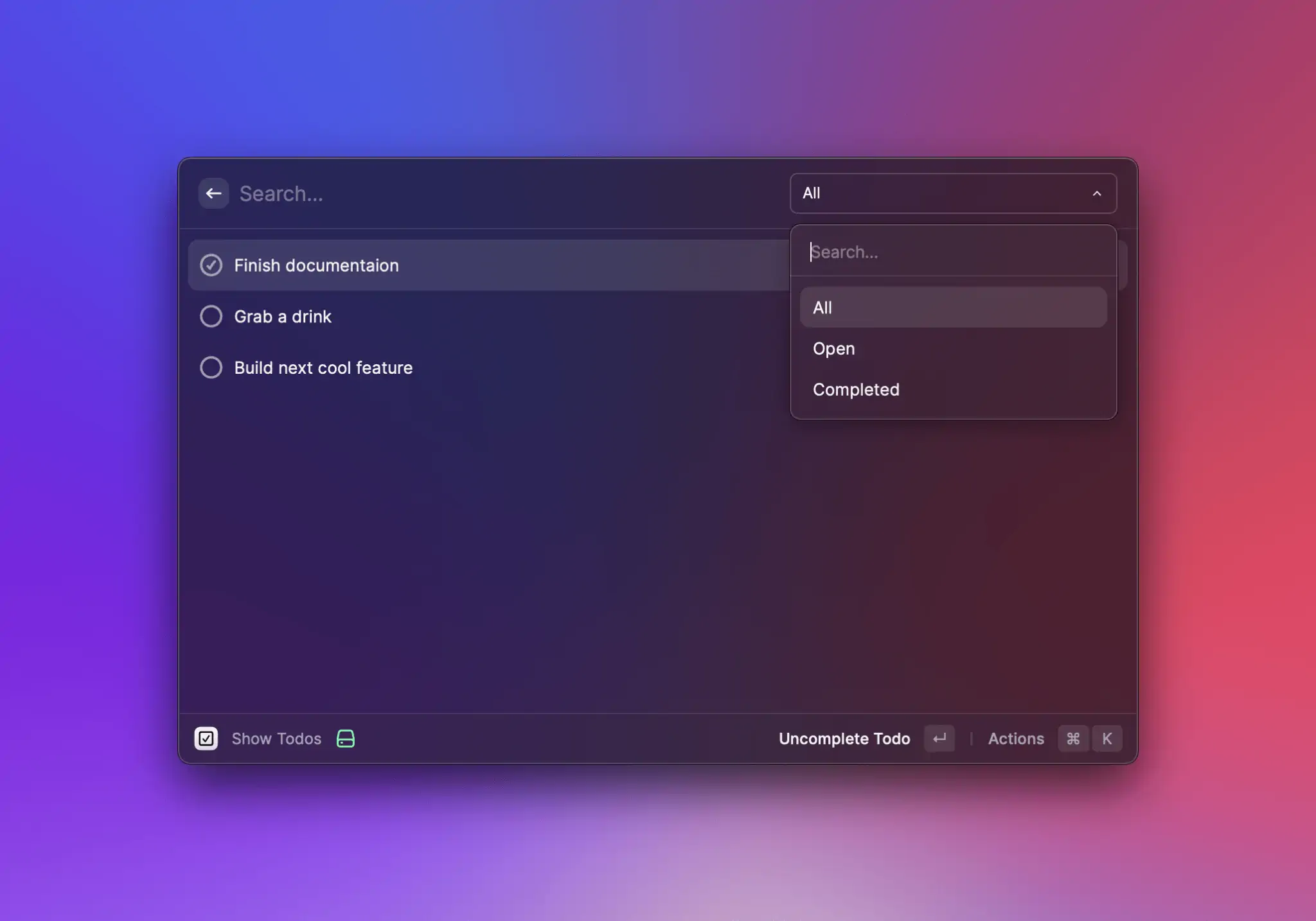
## Render todo list
Let's start with a set of todos and simply render them as a list in Raycast:
```typescript
import { List } from "@raycast/api";
import { useState } from "react";
interface Todo {
title: string;
isCompleted: boolean;
}
export default function Command() {
const [todos, setTodos] = useState([
{ title: "Write a todo list extension", isCompleted: false },
{ title: "Explain it to others", isCompleted: false },
]);
return (
{todos.map((todo, index) => (
))}
);
}
```
For this we define a TypeScript interface to describe out Todo with a `title` and a `isCompleted` flag that we use later to complete the todo. We use [React's `useState` hook](https://reactjs.org/docs/hooks-state.html) to create a local state of our todos. This allows us to update them later and the list will get re-rendered. Lastly we render a list of all todos.
## Create a todo
A static list of todos isn't that much fun. Let's create new ones with a form. For this, we create a new React component that renders the form:
```typescript
function CreateTodoForm(props: { onCreate: (todo: Todo) => void }) {
const { pop } = useNavigation();
function handleSubmit(values: { title: string }) {
props.onCreate({ title: values.title, isCompleted: false });
pop();
}
return (
);
}
function CreateTodoAction(props: { onCreate: (todo: Todo) => void }) {
return (
}
/>
);
}
```
The `` shows a single text field for the title. When the form is submitted, it calls the `onCreate` callback and closes itself.

To use the action, we add it to the `` component. This makes the action available when the list is empty which is exactly what we want to create our first todo.
```typescript
export default function Command() {
const [todos, setTodos] = useState([]);
function handleCreate(todo: Todo) {
const newTodos = [...todos, todo];
setTodos(newTodos);
}
return (
}
>
{todos.map((todo, index) => (
))}
);
}
```
## Complete a todo
Now that we can create new todos, we also want to make sure that we can tick off something on our todo list. For this, we create a `` that we assign to the ``:
```typescript
export default function Command() {
const [todos, setTodos] = useState([]);
// ...
function handleToggle(index: number) {
const newTodos = [...todos];
newTodos[index].isCompleted = !newTodos[index].isCompleted;
setTodos(newTodos);
}
return (
}
>
{todos.map((todo, index) => (
handleToggle(index)} />
}
/>
))}
);
}
function ToggleTodoAction(props: { todo: Todo; onToggle: () => void }) {
return (
);
}
```
In this case we added the `` to the list item. By doing this we can use the `index` to toggle the appropriate todo. We also added an icon to our todo that reflects the `isCompleted` state.
## Delete a todo
Similar to toggling a todo, we also add the possibility to delete one. You can follow the same steps and create a new `` and add it to the ``.
```typescript
export default function Command() {
const [todos, setTodos] = useState([]);
// ...
function handleDelete(index: number) {
const newTodos = [...todos];
newTodos.splice(index, 1);
setTodos(newTodos);
}
return (
}
>
{todos.map((todo, index) => (
handleToggle(index)} />
handleDelete(index)} />
}
/>
))}
);
}
// ...
function DeleteTodoAction(props: { onDelete: () => void }) {
return (
);
}
```
We also gave the `` a keyboard shortcut. This way users can delete todos quicker. Additionally, we also added the `` to the ``. This makes sure that users can also create new todos when there are some already.
Finally, our command looks like this:
```typescript
import { Action, ActionPanel, Form, Icon, List, useNavigation } from "@raycast/api";
import { useState } from "react";
interface Todo {
title: string;
isCompleted: boolean;
}
export default function Command() {
const [todos, setTodos] = useState([
{ title: "Write a todo list extension", isCompleted: false },
{ title: "Explain it to others", isCompleted: false },
]);
function handleCreate(todo: Todo) {
const newTodos = [...todos, todo];
setTodos(newTodos);
}
function handleToggle(index: number) {
const newTodos = [...todos];
newTodos[index].isCompleted = !newTodos[index].isCompleted;
setTodos(newTodos);
}
function handleDelete(index: number) {
const newTodos = [...todos];
newTodos.splice(index, 1);
setTodos(newTodos);
}
return (
}
>
{todos.map((todo, index) => (
handleToggle(index)} />
handleDelete(index)} />
}
/>
))}
);
}
function CreateTodoForm(props: { onCreate: (todo: Todo) => void }) {
const { pop } = useNavigation();
function handleSubmit(values: { title: string }) {
props.onCreate({ title: values.title, isCompleted: false });
pop();
}
return (
);
}
function CreateTodoAction(props: { onCreate: (todo: Todo) => void }) {
return (
}
/>
);
}
function ToggleTodoAction(props: { todo: Todo; onToggle: () => void }) {
return (
);
}
function DeleteTodoAction(props: { onDelete: () => void }) {
return (
);
}
```
And that's a wrap. You created a todo list in Raycast, it's that easy. As next steps, you could extract the `` into a separate command. Then you can create todos also from the root search of Raycast and can even assign a global hotkey to open the form. Also, the todos aren't persisted. If you close the command and reopen it, they are gone. To persist, you can use the [storage](https://developers.raycast.com/api-reference/storage) or [write it to disc](https://developers.raycast.com/api-reference/environment#environment).
---
# Source: https://developers.raycast.com/api-reference/tool.md
# Tool
Tools are a type of entry point for an extension. As opposed to a [command](https://developers.raycast.com/information/terminology#command), they don’t show up in the root search and the user can’t directly interact with them. Instead, they are functionalities that the AI can use to interact with an extension.
## Types
### Tool.Confirmation
A tool confirmation is used to ask the user to validate the side-effects of the tool.
{% hint style="info" %}
The tool confirmation is executed *before* the actual tool is executed and receives the same input as the tool. A confirmation returns an optional object that describes what the tool is about to do. It is important to be as clear as possible.
If the user confirms the action, the tool will be executed afterwards. If the user cancels the action, the tool will not be executed.
{% endhint %}
```ts
type Confirmation = (input: T) => Promise<
| undefined
| {
/**
* Defines the visual style of the Confirmation.
*
* @remarks
* Use {@link Action.Style.Regular} to display a regular action.
* Use {@link Action.Style.Destructive} when your action performs something irreversible like deleting data.
*
* @defaultValue {@link Action.Style.Regular}
*/
style?: Action.Style;
/**
* Some name/value pairs that represents the side-effects of the tool.
*
* @remarks
* Use it to provide more context about the tool to the user. For example, list the files that will be deleted.
*
* A name/value pair with an optional value won't be displayed if the value is `undefined`.
*/
info?: {
name: string;
value?: string;
}[];
/**
* A string that represents the side-effects of the tool.
*
* @remarks
* Often times this is a question that the user needs to answer. For Example, "Are you sure you want to delete the file?"
*/
message?: string;
/**
* An image that visually represents the side-effects of the tool.
*
* @remarks
* Use an image that is relevant to the side-effects of the tool. For example, a screenshot of the files that will be deleted.
*/
image?: Image.URL | FileIcon;
}
>;
```
You can return `undefined` to skip the confirmation. This is useful for tools that conditionally perform destructive actions. F.e. when moving a file, you don't need to confirm the action if the file doesn't overwrite another file.
#### Example
```typescript
import { Tool } from "@raycast/api";
type Input = {
/**
* The first name of the user to greet
*/
name: string;
};
export const confirmation: Tool.Confirmation = (input) => {
return {
message: `Are you sure you want to greet ${input.name}?`,
};
};
```
---
# Source: https://developers.raycast.com/utilities/react-hooks/useai.md
# useAI
Hook which asks the AI to answer a prompt and returns the [AsyncState](#asyncstate) corresponding to the execution of the query.
## Signature
```ts
function useAI(
prompt: string,
options?: {
creativity?: AI.Creativity;
model?: AI.Model;
stream?: boolean;
execute?: boolean;
onError?: (error: Error) => void;
onData?: (data: T) => void;
onWillExecute?: (args: Parameters) => void;
failureToastOptions?: Partial>;
}
): AsyncState & {
revalidate: () => void;
};
```
### Arguments
* `prompt` is the prompt to ask the AI.
With a few options:
* `options.creativity` is a number between 0 and 2 to control the creativity of the answer. Concrete tasks, such as fixing grammar, require less creativity while open-ended questions, such as generating ideas, require more.
* `options.model` is a string determining which AI model will be used to answer.
* `options.stream` is a boolean controlling whether to stream the answer or only update the data when the entire answer has been received. By default, the `data` will be streamed.
Including the [usePromise](https://developers.raycast.com/utilities/react-hooks/usepromise)'s options:
* `options.execute` is a boolean to indicate whether to actually execute the function or not. This is useful for cases where one of the function's arguments depends on something that might not be available right away (for example, depends on some user inputs). Because React requires every hook to be defined on the render, this flag enables you to define the hook right away but wait until you have all the arguments ready to execute the function.
* `options.onError` is a function called when an execution fails. By default, it will log the error and show a generic failure toast with an action to retry.
* `options.onData` is a function called when an execution succeeds.
* `options.onWillExecute` is a function called when an execution will start.
* `options.failureToastOptions` are the options to customize the title, message, and primary action of the failure toast.
### Return
Returns an object with the [AsyncState](#asyncstate) corresponding to the execution of the function as well as a couple of methods to manipulate it.
* `data`, `error`, `isLoading` - see [AsyncState](#asyncstate).
* `revalidate` is a method to manually call the function with the same arguments again.
## Example
```tsx
import { Detail } from "@raycast/api";
import { useAI } from "@raycast/utils";
export default function Command() {
const { data, isLoading } = useAI("Suggest 5 jazz songs");
return ;
}
```
## Types
### AsyncState
An object corresponding to the execution state of the function.
```ts
// Initial State
{
isLoading: true, // or `false` if `options.execute` is `false`
data: undefined,
error: undefined
}
// Success State
{
isLoading: false,
data: string,
error: undefined
}
// Error State
{
isLoading: false,
data: undefined,
error: Error
}
// Reloading State
{
isLoading: true,
data: string | undefined,
error: Error | undefined
}
```
---
# Source: https://developers.raycast.com/utilities/react-hooks/usecachedpromise.md
# useCachedPromise
Hook which wraps an asynchronous function or a function that returns a Promise and returns the [AsyncState](#asyncstate) corresponding to the execution of the function.
It follows the `stale-while-revalidate` cache invalidation strategy popularized by [HTTP RFC 5861](https://tools.ietf.org/html/rfc5861). `useCachedPromise` first returns the data from cache (stale), then executes the promise (revalidate), and finally comes with the up-to-date data again.
The last value will be kept between command runs.
{% hint style="info" %}
The value needs to be JSON serializable.\
The function is assumed to be constant (eg. changing it won't trigger a revalidation).
{% endhint %}
## Signature
```ts
type Result = `type of the returned value of the returned Promise`;
function useCachedPromise(
fn: T,
args?: Parameters,
options?: {
initialData?: U;
keepPreviousData?: boolean;
abortable?: RefObject;
execute?: boolean;
onError?: (error: Error) => void;
onData?: (data: Result) => void;
onWillExecute?: (args: Parameters) => void;
failureToastOptions?: Partial>;
},
): AsyncState> & {
revalidate: () => void;
mutate: MutatePromise | U>;
};
```
### Arguments
* `fn` is an asynchronous function or a function that returns a Promise.
* `args` is the array of arguments to pass to the function. Every time they change, the function will be executed again. You can omit the array if the function doesn't require any argument.
With a few options:
* `options.keepPreviousData` is a boolean to tell the hook to keep the previous results instead of returning the initial value if there aren't any in the cache for the new arguments. This is particularly useful when used for data for a List to avoid flickering. See [Promise Argument dependent on List search text](#promise-argument-dependent-on-list-search-text) for more information.
Including the [useCachedState](https://developers.raycast.com/utilities/react-hooks/usecachedstate)'s options:
* `options.initialData` is the initial value of the state if there aren't any in the Cache yet.
Including the [usePromise](https://developers.raycast.com/utilities/react-hooks/usepromise)'s options:
* `options.abortable` is a reference to an [`AbortController`](https://developer.mozilla.org/en-US/docs/Web/API/AbortController) to cancel a previous call when triggering a new one.
* `options.execute` is a boolean to indicate whether to actually execute the function or not. This is useful for cases where one of the function's arguments depends on something that might not be available right away (for example, depends on some user inputs). Because React requires every hook to be defined on the render, this flag enables you to define the hook right away but wait until you have all the arguments ready to execute the function.
* `options.onError` is a function called when an execution fails. By default, it will log the error and show a generic failure toast with an action to retry.
* `options.onData` is a function called when an execution succeeds.
* `options.onWillExecute` is a function called when an execution will start.
* `options.failureToastOptions` are the options to customize the title, message, and primary action of the failure toast.
### Return
Returns an object with the [AsyncState](#asyncstate) corresponding to the execution of the function as well as a couple of methods to manipulate it.
* `data`, `error`, `isLoading` - see [AsyncState](#asyncstate).
* `revalidate` is a method to manually call the function with the same arguments again.
* `mutate` is a method to wrap an asynchronous update and gives some control over how the `useCachedPromise`'s data should be updated while the update is going through. By default, the data will be revalidated (eg. the function will be called again) after the update is done. See [Mutation and Optimistic Updates](#mutation-and-optimistic-updates) for more information.
## Example
```tsx
import { Detail, ActionPanel, Action } from "@raycast/api";
import { useCachedPromise } from "@raycast/utils";
export default function Command() {
const abortable = useRef();
const { isLoading, data, revalidate } = useCachedPromise(
async (url: string) => {
const response = await fetch(url, { signal: abortable.current?.signal });
const result = await response.text();
return result;
},
["https://api.example"],
{
initialData: "Some Text",
abortable,
},
);
return (
revalidate()} />
}
/>
);
}
```
## Promise Argument dependent on List search text
By default, when an argument passed to the hook changes, the function will be executed again and the cache's value for those arguments will be returned immediately. This means that in the case of new arguments that haven't been used yet, the initial data will be returned.
This behaviour can cause some flickering (initial data -> fetched data -> arguments change -> initial data -> fetched data, etc.). To avoid that, we can set `keepPreviousData` to `true` and the hook will keep the latest fetched data if the cache is empty for the new arguments (initial data -> fetched data -> arguments change -> fetched data).
```tsx
import { useState } from "react";
import { List, ActionPanel, Action } from "@raycast/api";
import { useCachedPromise } from "@raycast/utils";
export default function Command() {
const [searchText, setSearchText] = useState("");
const { isLoading, data } = useCachedPromise(
async (url: string) => {
const response = await fetch(url);
const result = await response.json();
return result;
},
[`https://api.example?q=${searchText}`],
{
// to make sure the screen isn't flickering when the searchText changes
keepPreviousData: true,
},
);
return (
{(data || []).map((item) => (
))}
);
}
```
## Mutation and Optimistic Updates
In an optimistic update, the UI behaves as though a change was successfully completed before receiving confirmation from the server that it was - it is being optimistic that it will eventually get the confirmation rather than an error. This allows for a more responsive user experience.
You can specify an `optimisticUpdate` function to mutate the data in order to reflect the change introduced by the asynchronous update.
When doing so, you can specify a `rollbackOnError` function to mutate back the data if the asynchronous update fails. If not specified, the data will be automatically rolled back to its previous value (before the optimistic update).
```tsx
import { Detail, ActionPanel, Action, showToast, Toast } from "@raycast/api";
import { useCachedPromise } from "@raycast/utils";
export default function Command() {
const { isLoading, data, mutate } = useCachedPromise(
async (url: string) => {
const response = await fetch(url);
const result = await response.text();
return result;
},
["https://api.example"],
);
const appendFoo = async () => {
const toast = await showToast({ style: Toast.Style.Animated, title: "Appending Foo" });
try {
await mutate(
// we are calling an API to do something
fetch("https://api.example/append-foo"),
{
// but we are going to do it on our local data right away,
// without waiting for the call to return
optimisticUpdate(data) {
return data + "foo";
},
},
);
// yay, the API call worked!
toast.style = Toast.Style.Success;
toast.title = "Foo appended";
} catch (err) {
// oh, the API call didn't work :(
// the data will automatically be rolled back to its previous value
toast.style = Toast.Style.Failure;
toast.title = "Could not append Foo";
toast.message = err.message;
}
};
return (
appendFoo()} />
}
/>
);
}
```
## Pagination
{% hint style="info" %}
When paginating, the hook will only cache the result of the first page.
{% endhint %}
The hook has built-in support for pagination. In order to enable pagination, `fn`'s type needs to change from
> an asynchronous function or a function that returns a Promise
to
> a function that returns an asynchronous function or a function that returns a Promise
In practice, this means going from
```ts
const { isLoading, data } = useCachedPromise(
async (searchText: string) => {
const response = await fetch(`https://api.example?q=${searchText}`);
const data = await response.json();
return data;
},
[searchText],
{
// to make sure the screen isn't flickering when the searchText changes
keepPreviousData: true,
},
);
```
to
```ts
const { isLoading, data, pagination } = useCachedPromise(
(searchText: string) => async (options) => {
const response = await fetch(`https://api.example?q=${searchText}&page=${options.page}`);
const { data } = await response.json();
const hasMore = options.page < 50;
return { data, hasMore };
},
[searchText],
{
// to make sure the screen isn't flickering when the searchText changes
keepPreviousData: true,
},
);
```
or, if your data source uses cursor-based pagination, you can return a `cursor` alongside `data` and `hasMore`, and the cursor will be passed as an argument the next time the function gets called:
```ts
const { isLoading, data, pagination } = useCachedPromise(
(searchText: string) => async (options) => {
const response = await fetch(`https://api.example?q=${searchText}&cursor=${options.cursor}`);
const { data, nextCursor } = await response.json();
const hasMore = nextCursor !== undefined;
return { data, hasMore, cursor: nextCursor };
},
[searchText],
{
// to make sure the screen isn't flickering when the searchText changes
keepPreviousData: true,
},
);
```
You'll notice that, in the second case, the hook returns an additional item: `pagination`. This can be passed to Raycast's `List` or `Grid` components in order to enable pagination.\
Another thing to notice is that the async function receives a [PaginationOptions](#paginationoptions) argument, and returns a specific data format:
```ts
{
data: any[];
hasMore: boolean;
cursor?: any;
}
```
Every time the promise resolves, the hook needs to figure out if it should paginate further, or if it should stop, and it uses `hasMore` for this.\
In addition to this, the hook also needs `data`, and needs it to be an array, because internally it appends it to a list, thus making sure the `data` that the hook *returns* always contains the data for all of the pages that have been loaded so far.
### Full Example
```tsx
import { setTimeout } from "node:timers/promises";
import { useState } from "react";
import { List } from "@raycast/api";
import { useCachedPromise } from "@raycast/utils";
export default function Command() {
const [searchText, setSearchText] = useState("");
const { isLoading, data, pagination } = useCachedPromise(
(searchText: string) => async (options: { page: number }) => {
await setTimeout(200);
const newData = Array.from({ length: 25 }, (_v, index) => ({
index,
page: options.page,
text: searchText,
}));
return { data: newData, hasMore: options.page < 10 };
},
[searchText],
);
return (
{data?.map((item) => (
))}
);
}
```
## Types
### AsyncState
An object corresponding to the execution state of the function.
```ts
// Initial State
{
isLoading: true, // or `false` if `options.execute` is `false`
data: undefined,
error: undefined
}
// Success State
{
isLoading: false,
data: T,
error: undefined
}
// Error State
{
isLoading: false,
data: undefined,
error: Error
}
// Reloading State
{
isLoading: true,
data: T | undefined,
error: Error | undefined
}
```
### MutatePromise
A method to wrap an asynchronous update and gives some control about how the `useCachedPromise`'s data should be updated while the update is going through.
```ts
export type MutatePromise = (
asyncUpdate?: Promise,
options?: {
optimisticUpdate?: (data: T) => T;
rollbackOnError?: boolean | ((data: T) => T);
shouldRevalidateAfter?: boolean;
},
) => Promise;
```
### PaginationOptions
An object passed to a `PaginatedPromise`, it has two properties:
* `page`: 0-indexed, this it's incremented every time the promise resolves, and is reset whenever `revalidate()` is called.
* `lastItem`: this is a copy of the last item in the `data` array from the last time the promise was executed. Provided for APIs that implement cursor-based pagination.
* `cursor`: this is the `cursor` property returned after the previous execution of `PaginatedPromise`. Useful when working with APIs that provide the next cursor explicitly.
```ts
export type PaginationOptions = {
page: number;
lastItem?: T;
cursor?: any;
};
```
---
# Source: https://developers.raycast.com/utilities/react-hooks/usecachedstate.md
# useCachedState
Hook which returns a stateful value, and a function to update it. It is similar to React's `useState` but the value will be kept between command runs.
{% hint style="info" %}
The value needs to be JSON serializable.
{% endhint %}
## Signature
```ts
function useCachedState(
key: string,
initialState?: T,
config?: {
cacheNamespace?: string;
},
): [T, (newState: T | ((prevState: T) => T)) => void];
```
### Arguments
* `key` is the unique identifier of the state. This can be used to share the state across components and/or commands (hooks using the same key will share the same state, eg. updating one will update the others).
With a few options:
* `initialState` is the initial value of the state if there aren't any in the Cache yet.
* `config.cacheNamespace` is a string that can be used to namespace the key.
## Example
```tsx
import { List, ActionPanel, Action } from "@raycast/api";
import { useCachedState } from "@raycast/utils";
export default function Command() {
const [showDetails, setShowDetails] = useCachedState("show-details", false);
return (
setShowDetails((x) => !x)} />
}
>
...
);
}
```
---
# Source: https://developers.raycast.com/utilities/react-hooks/useexec.md
# useExec
Hook that executes a command and returns the [AsyncState](#asyncstate) corresponding to the execution of the command.
It follows the `stale-while-revalidate` cache invalidation strategy popularized by [HTTP RFC 5861](https://tools.ietf.org/html/rfc5861). `useExec` first returns the data from cache (stale), then executes the command (revalidate), and finally comes with the up-to-date data again.
The last value will be kept between command runs.
## Signature
There are two ways to use the hook.
The first one should be preferred when executing a single file. The file and its arguments don't have to be escaped.
```ts
function useExec(
file: string,
arguments: string[],
options?: {
shell?: boolean | string;
stripFinalNewline?: boolean;
cwd?: string;
env?: NodeJS.ProcessEnv;
encoding?: BufferEncoding | "buffer";
input?: string | Buffer;
timeout?: number;
parseOutput?: ParseExecOutputHandler;
initialData?: U;
keepPreviousData?: boolean;
execute?: boolean;
onError?: (error: Error) => void;
onData?: (data: T) => void;
onWillExecute?: (args: string[]) => void;
failureToastOptions?: Partial>;
}
): AsyncState & {
revalidate: () => void;
mutate: MutatePromise;
};
```
The second one can be used to execute more complex commands. The file and arguments are specified in a single `command` string. For example, `useExec('echo', ['Raycast'])` is the same as `useExec('echo Raycast')`.
If the file or an argument contains spaces, they must be escaped with backslashes. This matters especially if `command` is not a constant but a variable, for example with `environment.supportPath` or `process.cwd()`. Except for spaces, no escaping/quoting is needed.
The `shell` option must be used if the command uses shell-specific features (for example, `&&` or `||`), as opposed to being a simple file followed by its arguments.
```ts
function useExec(
command: string,
options?: {
shell?: boolean | string;
stripFinalNewline?: boolean;
cwd?: string;
env?: NodeJS.ProcessEnv;
encoding?: BufferEncoding | "buffer";
input?: string | Buffer;
timeout?: number;
parseOutput?: ParseExecOutputHandler;
initialData?: U;
keepPreviousData?: boolean;
execute?: boolean;
onError?: (error: Error) => void;
onData?: (data: T) => void;
onWillExecute?: (args: string[]) => void;
failureToastOptions?: Partial>;
}
): AsyncState & {
revalidate: () => void;
mutate: MutatePromise;
};
```
### Arguments
* `file` is the path to the file to execute.
* `arguments` is an array of strings to pass as arguments to the file.
or
* `command` is the string to execute.
With a few options:
* `options.shell` is a boolean or a string to tell whether to run the command inside of a shell or not. If `true`, uses `/bin/sh`. A different shell can be specified as a string. The shell should understand the `-c` switch.
We recommend against using this option since it is:
* not cross-platform, encouraging shell-specific syntax.
* slower, because of the additional shell interpretation.
* unsafe, potentially allowing command injection.
* `options.stripFinalNewline` is a boolean to tell the hook to strip the final newline character from the output. By default, it will.
* `options.cwd` is a string to specify the current working directory of the child process. By default, it will be `process.cwd()`.
* `options.env` is a key-value pairs to set as the environment of the child process. It will extend automatically from `process.env`.
* `options.encoding` is a string to specify the character encoding used to decode the `stdout` and `stderr` output. If set to `"buffer"`, then `stdout` and `stderr` will be a `Buffer` instead of a string.
* `options.input` is a string or a Buffer to write to the `stdin` of the file.
* `options.timeout` is a number. If greater than `0`, the parent will send the signal `SIGTERM` if the child runs longer than timeout milliseconds. By default, the execution will timeout after 10000ms (eg. 10s).
* `options.parseOutput` is a function that accepts the output of the child process as an argument and returns the data the hooks will return - see [ParseExecOutputHandler](#parseexecoutputhandler). By default, the hook will return `stdout`.
Including the [useCachedPromise](https://developers.raycast.com/utilities/react-hooks/usecachedpromise)'s options:
* `options.keepPreviousData` is a boolean to tell the hook to keep the previous results instead of returning the initial value if there aren't any in the cache for the new arguments. This is particularly useful when used for data for a List to avoid flickering. See [Argument dependent on user input](#argument-dependent-on-user-input) for more information.
Including the [useCachedState](https://developers.raycast.com/utilities/react-hooks/usecachedstate)'s options:
* `options.initialData` is the initial value of the state if there aren't any in the Cache yet.
Including the [usePromise](https://developers.raycast.com/utilities/react-hooks/usepromise)'s options:
* `options.execute` is a boolean to indicate whether to actually execute the function or not. This is useful for cases where one of the function's arguments depends on something that might not be available right away (for example, depends on some user inputs). Because React requires every hook to be defined on the render, this flag enables you to define the hook right away but wait until you have all the arguments ready to execute the function.
* `options.onError` is a function called when an execution fails. By default, it will log the error and show a generic failure toast with an action to retry.
* `options.onData` is a function called when an execution succeeds.
* `options.onWillExecute` is a function called when an execution will start.
* `options.failureToastOptions` are the options to customize the title, message, and primary action of the failure toast.
### Return
Returns an object with the [AsyncState](#asyncstate) corresponding to the execution of the command as well as a couple of methods to manipulate it.
* `data`, `error`, `isLoading` - see [AsyncState](#asyncstate).
* `revalidate` is a method to manually call the function with the same arguments again.
* `mutate` is a method to wrap an asynchronous update and gives some control over how the `useFetch`'s data should be updated while the update is going through. By default, the data will be revalidated (eg. the function will be called again) after the update is done. See [Mutation and Optimistic Updates](#mutation-and-optimistic-updates) for more information.
## Example
```tsx
import { List } from "@raycast/api";
import { useExec } from "@raycast/utils";
import { cpus } from "os";
import { useMemo } from "react";
const brewPath = cpus()[0].model.includes("Apple") ? "/opt/homebrew/bin/brew" : "/usr/local/bin/brew";
export default function Command() {
const { isLoading, data } = useExec(brewPath, ["info", "--json=v2", "--installed"]);
const results = useMemo<{ id: string; name: string }[]>(() => JSON.parse(data || "{}").formulae || [], [data]);
return (
{results.map((item) => (
))}
);
}
```
## Argument dependent on user input
By default, when an argument passed to the hook changes, the function will be executed again and the cache's value for those arguments will be returned immediately. This means that in the case of new arguments that haven't been used yet, the initial data will be returned.
This behaviour can cause some flickering (initial data -> fetched data -> arguments change -> initial data -> fetched data, etc.). To avoid that, we can set `keepPreviousData` to `true` and the hook will keep the latest fetched data if the cache is empty for the new arguments (initial data -> fetched data -> arguments change -> fetched data).
```tsx
import { useState } from "react";
import { Detail, ActionPanel, Action } from "@raycast/api";
import { useFetch } from "@raycast/utils";
export default function Command() {
const [searchText, setSearchText] = useState("");
const { isLoading, data } = useExec("brew", ["info", searchText]);
return ;
}
```
{% hint style="info" %}
When passing a user input to a command, be very careful about using the `shell` option as it could be potentially dangerous.
{% endhint %}
## Mutation and Optimistic Updates
In an optimistic update, the UI behaves as though a change was successfully completed before receiving confirmation from the server that it was - it is being optimistic that it will eventually get the confirmation rather than an error. This allows for a more responsive user experience.
You can specify an `optimisticUpdate` function to mutate the data in order to reflect the change introduced by the asynchronous update.
When doing so, you can specify a `rollbackOnError` function to mutate back the data if the asynchronous update fails. If not specified, the data will be automatically rolled back to its previous value (before the optimistic update).
```tsx
import { Detail, ActionPanel, Action, showToast, Toast } from "@raycast/api";
import { useFetch } from "@raycast/utils";
export default function Command() {
const { isLoading, data, revalidate } = useExec("brew", ["info", "--json=v2", "--installed"]);
const results = useMemo<{}[]>(() => JSON.parse(data || "[]"), [data]);
const installFoo = async () => {
const toast = await showToast({ style: Toast.Style.Animated, title: "Installing Foo" });
try {
await mutate(
// we are calling an API to do something
installBrewCask("foo"),
{
// but we are going to do it on our local data right away,
// without waiting for the call to return
optimisticUpdate(data) {
return data?.concat({ name: "foo", id: "foo" });
},
},
);
// yay, the API call worked!
toast.style = Toast.Style.Success;
toast.title = "Foo installed";
} catch (err) {
// oh, the API call didn't work :(
// the data will automatically be rolled back to its previous value
toast.style = Toast.Style.Failure;
toast.title = "Could not install Foo";
toast.message = err.message;
}
};
return (
{(data || []).map((item) => (
installFoo()} />
}
/>
))}
);
}
```
## Types
### AsyncState
An object corresponding to the execution state of the function.
```ts
// Initial State
{
isLoading: true, // or `false` if `options.execute` is `false`
data: undefined,
error: undefined
}
// Success State
{
isLoading: false,
data: T,
error: undefined
}
// Error State
{
isLoading: false,
data: undefined,
error: Error
}
// Reloading State
{
isLoading: true,
data: T | undefined,
error: Error | undefined
}
```
### MutatePromise
A method to wrap an asynchronous update and gives some control about how the `useFetch`'s data should be updated while the update is going through.
```ts
export type MutatePromise = (
asyncUpdate?: Promise,
options?: {
optimisticUpdate?: (data: T) => T;
rollbackOnError?: boolean | ((data: T) => T);
shouldRevalidateAfter?: boolean;
},
) => Promise;
```
### ParseExecOutputHandler
A function that accepts the output of the child process as an argument and returns the data the hooks will return.
```ts
export type ParseExecOutputHandler = (args: {
/** The output of the process on stdout. */
stdout: string | Buffer; // depends on the encoding option
/** The output of the process on stderr. */
stderr: string | Buffer; // depends on the encoding option
error?: Error | undefined;
/** The numeric exit code of the process that was run. */
exitCode: number | null;
/** The name of the signal that was used to terminate the process. For example, SIGFPE. */
signal: NodeJS.Signals | null;
/** Whether the process timed out. */
timedOut: boolean;
/** The command that was run, for logging purposes. */
command: string;
/** The options passed to the child process, for logging purposes. */
options?: ExecOptions | undefined;
}) => T;
```
---
# Source: https://developers.raycast.com/utilities/react-hooks/usefetch.md
# useFetch
Hook which fetches the URL and returns the [AsyncState](#asyncstate) corresponding to the execution of the fetch.
It follows the `stale-while-revalidate` cache invalidation strategy popularized by [HTTP RFC 5861](https://tools.ietf.org/html/rfc5861). `useFetch` first returns the data from cache (stale), then sends the request (revalidate), and finally comes with the up-to-date data again.
The last value will be kept between command runs.
## Signature
```ts
export function useFetch(
url: RequestInfo,
options?: RequestInit & {
parseResponse?: (response: Response) => Promise;
mapResult?: (result: V) => { data: T };
initialData?: U;
keepPreviousData?: boolean;
execute?: boolean;
onError?: (error: Error) => void;
onData?: (data: T) => void;
onWillExecute?: (args: [string, RequestInit]) => void;
failureToastOptions?: Partial>;
},
): AsyncState & {
revalidate: () => void;
mutate: MutatePromise;
};
```
### Arguments
* `url` is the string representation of the URL to fetch.
With a few options:
* `options` extends [`RequestInit`](https://github.com/nodejs/undici/blob/v5.7.0/types/fetch.d.ts#L103-L117) allowing you to specify a body, headers, etc. to apply to the request.
* `options.parseResponse` is a function that accepts the Response as an argument and returns the data the hook will return. By default, the hook will return `response.json()` if the response has a JSON `Content-Type` header or `response.text()` otherwise.
* `options.mapResult` is an optional function that accepts whatever `options.parseResponse` returns as an argument, processes the response, and returns an object wrapping the result, i.e. `(response) => { return { data: response> } };`.
Including the [useCachedPromise](https://developers.raycast.com/utilities/react-hooks/usecachedpromise)'s options:
* `options.keepPreviousData` is a boolean to tell the hook to keep the previous results instead of returning the initial value if there aren't any in the cache for the new arguments. This is particularly useful when used for data for a List to avoid flickering. See [Argument dependent on List search text](#argument-dependent-on-list-search-text) for more information.
Including the [useCachedState](https://developers.raycast.com/utilities/react-hooks/usecachedstate)'s options:
* `options.initialData` is the initial value of the state if there aren't any in the Cache yet.
Including the [usePromise](https://developers.raycast.com/utilities/react-hooks/usepromise)'s options:
* `options.execute` is a boolean to indicate whether to actually execute the function or not. This is useful for cases where one of the function's arguments depends on something that might not be available right away (for example, depends on some user inputs). Because React requires every hook to be defined on the render, this flag enables you to define the hook right away but wait until you have all the arguments ready to execute the function.
* `options.onError` is a function called when an execution fails. By default, it will log the error and show a generic failure toast with an action to retry.
* `options.onData` is a function called when an execution succeeds.
* `options.onWillExecute` is a function called when an execution will start.
* `options.failureToastOptions` are the options to customize the title, message, and primary action of the failure toast.
### Return
Returns an object with the [AsyncState](#asyncstate) corresponding to the execution of the fetch as well as a couple of methods to manipulate it.
* `data`, `error`, `isLoading` - see [AsyncState](#asyncstate).
* `revalidate` is a method to manually call the function with the same arguments again.
* `mutate` is a method to wrap an asynchronous update and gives some control over how the `useFetch`'s data should be updated while the update is going through. By default, the data will be revalidated (eg. the function will be called again) after the update is done. See [Mutation and Optimistic Updates](#mutation-and-optimistic-updates) for more information.
## Example
```tsx
import { Detail, ActionPanel, Action } from "@raycast/api";
import { useFetch } from "@raycast/utils";
export default function Command() {
const { isLoading, data, revalidate } = useFetch("https://api.example");
return (
revalidate()} />
}
/>
);
}
```
## Argument dependent on List search text
By default, when an argument passed to the hook changes, the function will be executed again and the cache's value for those arguments will be returned immediately. This means that in the case of new arguments that haven't been used yet, the initial data will be returned.
This behaviour can cause some flickering (initial data -> fetched data -> arguments change -> initial data -> fetched data, etc.). To avoid that, we can set `keepPreviousData` to `true` and the hook will keep the latest fetched data if the cache is empty for the new arguments (initial data -> fetched data -> arguments change -> fetched data).
```tsx
import { useState } from "react";
import { List, ActionPanel, Action } from "@raycast/api";
import { useFetch } from "@raycast/utils";
export default function Command() {
const [searchText, setSearchText] = useState("");
const { isLoading, data } = useFetch(`https://api.example?q=${searchText}`, {
// to make sure the screen isn't flickering when the searchText changes
keepPreviousData: true,
});
return (
{(data || []).map((item) => (
))}
);
}
```
## Mutation and Optimistic Updates
In an optimistic update, the UI behaves as though a change was successfully completed before receiving confirmation from the server that it was - it is being optimistic that it will eventually get the confirmation rather than an error. This allows for a more responsive user experience.
You can specify an `optimisticUpdate` function to mutate the data in order to reflect the change introduced by the asynchronous update.
When doing so, you can specify a `rollbackOnError` function to mutate back the data if the asynchronous update fails. If not specified, the data will be automatically rolled back to its previous value (before the optimistic update).
```tsx
import { Detail, ActionPanel, Action, showToast, Toast } from "@raycast/api";
import { useFetch } from "@raycast/utils";
export default function Command() {
const { isLoading, data, mutate } = useFetch("https://api.example");
const appendFoo = async () => {
const toast = await showToast({ style: Toast.Style.Animated, title: "Appending Foo" });
try {
await mutate(
// we are calling an API to do something
fetch("https://api.example/append-foo"),
{
// but we are going to do it on our local data right away,
// without waiting for the call to return
optimisticUpdate(data) {
return data + "foo";
},
},
);
// yay, the API call worked!
toast.style = Toast.Style.Success;
toast.title = "Foo appended";
} catch (err) {
// oh, the API call didn't work :(
// the data will automatically be rolled back to its previous value
toast.style = Toast.Style.Failure;
toast.title = "Could not append Foo";
toast.message = err.message;
}
};
return (
appendFoo()} />
}
/>
);
}
```
## Pagination
{% hint style="info" %}
When paginating, the hook will only cache the result of the first page.
{% endhint %}
The hook has built-in support for pagination. In order to enable pagination, `url`s type needs to change from `RequestInfo` to a function that receives a [PaginationOptions](#paginationoptions) argument, and returns a `RequestInfo`.
In practice, this means going from
```ts
const { isLoading, data } = useFetch(
"https://api.ycombinator.com/v0.1/companies?" + new URLSearchParams({ q: searchText }).toString(),
{
mapResult(result: SearchResult) {
return {
data: result.companies,
};
},
keepPreviousData: true,
initialData: [],
},
);
```
to
```ts
const { isLoading, data, pagination } = useFetch(
(options) =>
"https://api.ycombinator.com/v0.1/companies?" +
new URLSearchParams({ page: String(options.page + 1), q: searchText }).toString(),
{
mapResult(result: SearchResult) {
return {
data: result.companies,
hasMore: result.page < result.totalPages,
};
},
keepPreviousData: true,
initialData: [],
},
);
```
or, if your data source uses cursor-based pagination, you can return a `cursor` alongside `data` and `hasMore`, and the cursor will be passed as an argument the next time the function gets called:
```ts
const { isLoading, data, pagination } = useFetch(
(options) =>
"https://api.ycombinator.com/v0.1/companies?" +
new URLSearchParams({ cursor: options.cursor, q: searchText }).toString(),
{
mapResult(result: SearchResult) {
const { companies, nextCursor } = result;
const hasMore = nextCursor !== undefined;
return { data: companies, hasMore, cursor: nextCursor, };
},
keepPreviousData: true,
initialData: [],
},
);
```
You'll notice that, in the second case, the hook returns an additional item: `pagination`. This can be passed to Raycast's `List` or `Grid` components in order to enable pagination. Another thing to notice is that `mapResult`, which is normally optional, is actually required when using pagination. Furthermore, its return type is
```ts
{
data: any[],
hasMore?: boolean;
cursor?: any;
}
```
Every time the URL is fetched, the hook needs to figure out if it should paginate further, or if it should stop, and it uses the `hasMore` for this. In addition to this, the hook also needs `data`, and needs it to be an array, because internally it appends it to a list, thus making sure the `data` that the hook *returns* always contains the data for all of the pages that have been fetched so far.
### Full Example
```tsx
import { Icon, Image, List } from "@raycast/api";
import { useFetch } from "@raycast/utils";
import { useState } from "react";
type SearchResult = { companies: Company[]; page: number; totalPages: number };
type Company = { id: number; name: string; smallLogoUrl?: string };
export default function Command() {
const [searchText, setSearchText] = useState("");
const { isLoading, data, pagination } = useFetch(
(options) =>
"https://api.ycombinator.com/v0.1/companies?" +
new URLSearchParams({ page: String(options.page + 1), q: searchText }).toString(),
{
mapResult(result: SearchResult) {
return {
data: result.companies,
hasMore: result.page < result.totalPages,
};
},
keepPreviousData: true,
initialData: [],
},
);
return (
{data.map((company) => (
))}
);
}
```
## Types
### AsyncState
An object corresponding to the execution state of the function.
```ts
// Initial State
{
isLoading: true, // or `false` if `options.execute` is `false`
data: undefined,
error: undefined
}
// Success State
{
isLoading: false,
data: T,
error: undefined
}
// Error State
{
isLoading: false,
data: undefined,
error: Error
}
// Reloading State
{
isLoading: true,
data: T | undefined,
error: Error | undefined
}
```
### MutatePromise
A method to wrap an asynchronous update and gives some control about how the `useFetch`'s data should be updated while the update is going through.
```ts
export type MutatePromise = (
asyncUpdate?: Promise,
options?: {
optimisticUpdate?: (data: T) => T;
rollbackOnError?: boolean | ((data: T) => T);
shouldRevalidateAfter?: boolean;
},
) => Promise;
```
### PaginationOptions
An object passed to a `PaginatedRequestInfo`, it has two properties:
* `page`: 0-indexed, this it's incremented every time the promise resolves, and is reset whenever `revalidate()` is called.
* `lastItem`: this is a copy of the last item in the `data` array from the last time the promise was executed. Provided for APIs that implement cursor-based pagination.
* `cursor`: this is the `cursor` property returned after the previous execution of `PaginatedPromise`. Useful when working with APIs that provide the next cursor explicitly.
```ts
export type PaginationOptions = {
page: number;
lastItem?: T;
cursor?: any;
};
```
---
# Source: https://developers.raycast.com/utilities/react-hooks/useform.md
# useForm
Hook that provides a high-level interface to work with Forms, and more particularly, with Form validations. It incorporates all the good practices to provide a great User Experience for your Forms.
## Signature
```ts
function useForm(props: {
onSubmit: (values: T) => void | boolean | Promise;
initialValues?: Partial;
validation?: {
[id in keyof T]?: ((value: T[id]) => string | undefined | null) | FormValidation;
};
}): {
handleSubmit: (values: T) => void | boolean | Promise;
itemProps: {
[id in keyof T]: Partial> & {
id: string;
};
};
setValidationError: (id: keyof T, error: ValidationError) => void;
setValue: (id: K, value: T[K]) => void;
values: T;
focus: (id: keyof T) => void;
reset: (initialValues?: Partial) => void;
};
```
### Arguments
* `onSubmit` is a callback that will be called when the form is submitted and all validations pass.
With a few options:
* `initialValues` are the initial values to set when the Form is first rendered.
* `validation` are the validation rules for the Form. A validation for a Form item is a function that takes the current value of the item as an argument and must return a string when the validation is failing. We also provide some shorthands for common cases, see [FormValidation](#formvalidation).
### Return
Returns an object which contains the necessary methods and props to provide a good User Experience in your Form.
* `handleSubmit` is a function to pass to the `onSubmit` prop of the `` element. It wraps the initial `onSubmit` argument with some goodies related to the validation.
* `itemProps` are the props that must be passed to the `` elements to handle the validations.
It also contains some additions for easy manipulation of the Form's data.
* `values` is the current values of the Form.
* `setValue` is a function that can be used to programmatically set the value of a specific field.
* `setValidationError` is a function that can be used to programmatically set the validation of a specific field.
* `focus` is a function that can be used to programmatically focus a specific field.
* `reset` is a function that can be used to reset the values of the Form. Optionally, you can specify the values to set when the Form is reset.
## Example
```tsx
import { Action, ActionPanel, Form, showToast, Toast } from "@raycast/api";
import { useForm, FormValidation } from "@raycast/utils";
interface SignUpFormValues {
firstName: string;
lastName: string;
birthday: Date | null;
password: string;
number: string;
hobbies: string[];
}
export default function Command() {
const { handleSubmit, itemProps } = useForm({
onSubmit(values) {
showToast({
style: Toast.Style.Success,
title: "Yay!",
message: `${values.firstName} ${values.lastName} account created`,
});
},
validation: {
firstName: FormValidation.Required,
lastName: FormValidation.Required,
password: (value) => {
if (value && value.length < 8) {
return "Password must be at least 8 symbols";
} else if (!value) {
return "The item is required";
}
},
number: (value) => {
if (value && value !== "2") {
return "Please select '2'";
}
},
},
});
return (
);
}
```
## Types
### FormValidation
Shorthands for common validation cases
#### Enumeration members
| Name | Description |
| -------- | ------------------------------------------------- |
| Required | Show an error when the value of the item is empty |
---
# Source: https://developers.raycast.com/utilities/react-hooks/usefrecencysorting.md
# useFrecencySorting
Hook to sort an array by its frecency and provide methods to update the frecency of its items.
Frecency is a measure that combines frequency and recency. The more often an item is visited, and the more recently an item is visited, the higher it will rank.
## Signature
```ts
function useFrecencySorting(
data?: T[],
options?: {
namespace?: string;
key?: (item: T) => string;
sortUnvisited?: (a: T, b: T) => number;
},
): {
data: T[];
visitItem: (item: T) => Promise;
resetRanking: (item: T) => Promise;
};
```
### Arguments
* `data` is the array to sort
With a few options:
* `options.namespace` is a string that can be used to namespace the frecency data (if you have multiple arrays that you want to sort in the same extension).
* `options.key` is a function that should return a unique string for each item of the array to sort. By default, it will use `item.id`. If the items do not have an `id` field, this option is required.
* `options.sortUnvisited` is a function to sort the items that have never been visited. By default, the order of the input will be preserved.
### Return
Returns an object with the sorted array and some methods to update the frecency of the items.
* `data` is the sorted array. The order will be preserved for items that have never been visited
* `visitItem` is a method to use when an item is visited/used. It will increase its frecency.
* `resetRanking` is a method that can be used to reset the frecency of an item.
## Example
```tsx
import { List, ActionPanel, Action, Icon } from "@raycast/api";
import { useFetch, useFrecencySorting } from "@raycast/utils";
export default function Command() {
const { isLoading, data } = useFetch("https://api.example");
const { data: sortedData, visitItem, resetRanking } = useFrecencySorting(data);
return (
{sortedData.map((item) => (
visitItem(item)} />
visitItem(item)} />
resetRanking(item)} />
}
/>
))}
);
}
```
---
# Source: https://developers.raycast.com/utilities/react-hooks/uselocalstorage.md
# useLocalStorage
A hook to manage a value in the local storage.
## Signature
```ts
function useLocalStorage(key: string, initialValue?: T): {
value: T | undefined;
setValue: (value: T) => Promise;
removeValue: () => Promise;
isLoading: boolean;
}
```
### Arguments
* `key` - The key to use for the value in the local storage.
* `initialValue` - The initial value to use if the key doesn't exist in the local storage.
### Return
Returns an object with the following properties:
* `value` - The value from the local storage or the initial value if the key doesn't exist.
* `setValue` - A function to update the value in the local storage.
* `removeValue` - A function to remove the value from the local storage.
* `isLoading` - A boolean indicating if the value is loading.
## Example
```tsx
import { Action, ActionPanel, Color, Icon, List } from "@raycast/api";
import { useLocalStorage } from "@raycast/utils";
const exampleTodos = [
{ id: "1", title: "Buy milk", done: false },
{ id: "2", title: "Walk the dog", done: false },
{ id: "3", title: "Call mom", done: false },
];
export default function Command() {
const { value: todos, setValue: setTodos, isLoading } = useLocalStorage("todos", exampleTodos);
async function toggleTodo(id: string) {
const newTodos = todos?.map((todo) => (todo.id === id ? { ...todo, done: !todo.done } : todo)) ?? [];
await setTodos(newTodos);
}
return (
{todos?.map((todo) => (
toggleTodo(todo.id)} />
toggleTodo(todo.id)} />
}
/>
))}
);
}
```
---
# Source: https://developers.raycast.com/utilities/react-hooks/usepromise.md
# usePromise
Hook which wraps an asynchronous function or a function that returns a Promise and returns the [AsyncState](#asyncstate) corresponding to the execution of the function.
{% hint style="info" %}
The function is assumed to be constant (eg. changing it won't trigger a revalidation).
{% endhint %}
## Signature
```ts
type Result = `type of the returned value of the returned Promise`;
function usePromise(
fn: T,
args?: Parameters,
options?: {
abortable?: RefObject;
execute?: boolean;
onError?: (error: Error) => void;
onData?: (data: Result) => void;
onWillExecute?: (args: Parameters) => void;
failureToastOptions?: Partial>;
},
): AsyncState> & {
revalidate: () => void;
mutate: MutatePromise | undefined>;
};
```
### Arguments
* `fn` is an asynchronous function or a function that returns a Promise.
* `args` is the array of arguments to pass to the function. Every time they change, the function will be executed again. You can omit the array if the function doesn't require any argument.
With a few options:
* `options.abortable` is a reference to an [`AbortController`](https://developer.mozilla.org/en-US/docs/Web/API/AbortController) to cancel a previous call when triggering a new one.
* `options.execute` is a boolean to indicate whether to actually execute the function or not. This is useful for cases where one of the function's arguments depends on something that might not be available right away (for example, depends on some user inputs). Because React requires every hook to be defined on the render, this flag enables you to define the hook right away but wait until you have all the arguments ready to execute the function.
* `options.onError` is a function called when an execution fails. By default, it will log the error and show a generic failure toast with an action to retry.
* `options.onData` is a function called when an execution succeeds.
* `options.onWillExecute` is a function called when an execution will start.
* `options.failureToastOptions` are the options to customize the title, message, and primary action of the failure toast.
### Returns
Returns an object with the [AsyncState](#asyncstate) corresponding to the execution of the function as well as a couple of methods to manipulate it.
* `data`, `error`, `isLoading` - see [AsyncState](#asyncstate).
* `revalidate` is a method to manually call the function with the same arguments again.
* `mutate` is a method to wrap an asynchronous update and gives some control about how the `usePromise`'s data should be updated while the update is going through. By default, the data will be revalidated (eg. the function will be called again) after the update is done. See [Mutation and Optimistic Updates](#mutation-and-optimistic-updates) for more information.
## Example
```tsx
import { Detail, ActionPanel, Action } from "@raycast/api";
import { usePromise } from "@raycast/utils";
export default function Command() {
const abortable = useRef();
const { isLoading, data, revalidate } = usePromise(
async (url: string) => {
const response = await fetch(url, { signal: abortable.current?.signal });
const result = await response.text();
return result;
},
["https://api.example"],
{
abortable,
},
);
return (
revalidate()} />
}
/>
);
}
```
## Mutation and Optimistic Updates
In an optimistic update, the UI behaves as though a change was successfully completed before receiving confirmation from the server that it was - it is being optimistic that it will eventually get the confirmation rather than an error. This allows for a more responsive user experience.
You can specify an `optimisticUpdate` function to mutate the data in order to reflect the change introduced by the asynchronous update.
When doing so, you can specify a `rollbackOnError` function to mutate back the data if the asynchronous update fails. If not specified, the data will be automatically rolled back to its previous value (before the optimistic update).
```tsx
import { Detail, ActionPanel, Action, showToast, Toast } from "@raycast/api";
import { usePromise } from "@raycast/utils";
export default function Command() {
const { isLoading, data, mutate } = usePromise(
async (url: string) => {
const response = await fetch(url);
const result = await response.text();
return result;
},
["https://api.example"],
);
const appendFoo = async () => {
const toast = await showToast({ style: Toast.Style.Animated, title: "Appending Foo" });
try {
await mutate(
// we are calling an API to do something
fetch("https://api.example/append-foo"),
{
// but we are going to do it on our local data right away,
// without waiting for the call to return
optimisticUpdate(data) {
return data + "foo";
},
},
);
// yay, the API call worked!
toast.style = Toast.Style.Success;
toast.title = "Foo appended";
} catch (err) {
// oh, the API call didn't work :(
// the data will automatically be rolled back to its previous value
toast.style = Toast.Style.Failure;
toast.title = "Could not append Foo";
toast.message = err.message;
}
};
return (
appendFoo()} />
}
/>
);
}
```
## Pagination
The hook has built-in support for pagination. In order to enable pagination, `fn`'s type needs to change from
> an asynchronous function or a function that returns a Promise
to
> a function that returns an asynchronous function or a function that returns a Promise
In practice, this means going from
```ts
const { isLoading, data } = usePromise(
async (searchText: string) => {
const data = await getUser(); // or any asynchronous logic you need to perform
return data;
},
[searchText],
);
```
to
```ts
const { isLoading, data, pagination } = usePromise(
(searchText: string) =>
async ({ page, lastItem, cursor }) => {
const { data } = await getUsers(page); // or any other asynchronous logic you need to perform
const hasMore = page < 50;
return { data, hasMore };
},
[searchText],
);
```
or, if your data source uses cursor-based pagination, you can return a `cursor` alongside `data` and `hasMore`, and the cursor will be passed as an argument the next time the function gets called:
```ts
const { isLoading, data, pagination } = usePromise(
(searchText: string) =>
async ({ page, lastItem, cursor }) => {
const { data, nextCursor } = await getUsers(cursor); // or any other asynchronous logic you need to perform
const hasMore = nextCursor !== undefined;
return { data, hasMore, cursor: nextCursor };
},
[searchText],
);
```
You'll notice that, in the second case, the hook returns an additional item: `pagination`. This can be passed to Raycast's `List` or `Grid` components in order to enable pagination.\
Another thing to notice is that the async function receives a [PaginationOptions](#paginationoptions) argument, and returns a specific data format:
```ts
{
data: any[];
hasMore: boolean;
cursor?: any;
}
```
Every time the promise resolves, the hook needs to figure out if it should paginate further, or if it should stop, and it uses `hasMore` for this.\
In addition to this, the hook also needs `data`, and needs it to be an array, because internally it appends it to a list, thus making sure the `data` that the hook *returns* always contains the data for all of the pages that have been loaded so far.\
Additionally, you can also pass a `cursor` property, which will be included along with `page` and `lastItem` in the next pagination call.
### Full Example
```tsx
import { setTimeout } from "node:timers/promises";
import { useState } from "react";
import { List } from "@raycast/api";
import { usePromise } from "@raycast/utils";
export default function Command() {
const [searchText, setSearchText] = useState("");
const { isLoading, data, pagination } = usePromise(
(searchText: string) => async (options: { page: number }) => {
await setTimeout(200);
const newData = Array.from({ length: 25 }, (_v, index) => ({
index,
page: options.page,
text: searchText,
}));
return { data: newData, hasMore: options.page < 10 };
},
[searchText],
);
return (
{data?.map((item) => (
))}
);
}
```
## Types
### AsyncState
An object corresponding to the execution state of the function.
```ts
// Initial State
{
isLoading: true, // or `false` if `options.execute` is `false`
data: undefined,
error: undefined
}
// Success State
{
isLoading: false,
data: T,
error: undefined
}
// Error State
{
isLoading: false,
data: undefined,
error: Error
}
// Reloading State
{
isLoading: true,
data: T | undefined,
error: Error | undefined
}
```
### MutatePromise
A method to wrap an asynchronous update and gives some control about how the `usePromise`'s data should be updated while the update is going through.
```ts
export type MutatePromise = (
asyncUpdate?: Promise,
options?: {
optimisticUpdate?: (data: T) => T;
rollbackOnError?: boolean | ((data: T) => T);
shouldRevalidateAfter?: boolean;
},
) => Promise;
```
### PaginationOptions
An object passed to a `PaginatedPromise`, it has two properties:
* `page`: 0-indexed, this it's incremented every time the promise resolves, and is reset whenever `revalidate()` is called.
* `lastItem`: this is a copy of the last item in the `data` array from the last time the promise was executed. Provided for APIs that implement cursor-based pagination.
* `cursor`: this is the `cursor` property returned after the previous execution of `PaginatedPromise`. Useful when working with APIs that provide the next cursor explicitly.
```ts
export type PaginationOptions = {
page: number;
lastItem?: T;
cursor?: any;
};
```
---
# Source: https://developers.raycast.com/api-reference/user-interface.md
# User Interface
Raycast uses React for its user interface declaration and renders the supported elements to our native UI. The API comes with a set of UI components that you can use to build your extensions. Think of it as a design system. The high-level components are the following:
* [List](https://developers.raycast.com/api-reference/user-interface/list) to show multiple similar items, f.e. a list of your open todos.
* [Grid](https://developers.raycast.com/api-reference/user-interface/grid) similar to a List but with more legroom to show an image for each item, f.e. a collection of icons.
* [Detail](https://developers.raycast.com/api-reference/user-interface/detail) to present more information, f.e. the details of a GitHub pull request.
* [Form](https://developers.raycast.com/api-reference/user-interface/form) to create new content, f.e. filing a bug report.
Each component can provide interaction via an [ActionPanel](https://developers.raycast.com/api-reference/user-interface/action-panel). The panel has a list of [Actions](https://developers.raycast.com/api-reference/user-interface/actions) where each one can be associated with a [keyboard shortcut](https://developers.raycast.com/api-reference/keyboard). Shortcuts allow users to use Raycast without using their mouse.
## Rendering
To render a user interface, you need to do the following:
* Set the `mode` to `view` in the [`package.json` manifest file](https://developers.raycast.com/information/manifest#command-properties)
* Export a React component from your command entry file
As a general rule of thumb, you should render something as quickly as possible. This guarantees that your command feels responsive. If you don't have data available to show, you can set the `isLoading` prop to `true` on top-level components such as [``](https://developers.raycast.com/api-reference/user-interface/detail), [`


